
 Photo by Isaac Smith on Unsplash
This article is about plotting different types of graphs such as line chart, bar chart, pie-chart, and scatter plot using Matplotlib, which is arguably the most popular graphing and data visualization library for Python.
Graphs are mathematical structures that represent pairwise relationships between objects.
Matplotlib
Matplotlib is a Python 2D plotting library. The easiest way to install matplotlib is to use pip. Type following command in terminal:
pip install matplotlib
or, you can download it from here and install it manually.
Steps involved in plotting a graph
- Define the x-axis and corresponding y-axis values as lists.
- Plot them on canvas using .plot() function.
- Give a name to x-axis and y-axis using .xlabel() and .ylabel() functions.
- Give a title to your plot using .title() function.
- Finally, to view your plot, we use .show() function.
The pseudocode looks like this.
import the library
define the x-axis list
define the y-axis list
plot function(plt.plot(), plt.scatter(), plt.bar(), plt.pie(), plt.histi())
xlabel
ylabel
legend
show function
Plotting a line
python program to plot lines
The code seems self-explanatory. Following steps were followed:
- Define the x-axis and corresponding y-axis values as lists.
- Plot them on canvas using .plot() function.
- Give a name to x-axis and y-axis using .xlabel() and .ylabel() functions.
- Give a title to your plot using .title() function.
- Finally, to view your plot, we use .show() function.
The output of the above code looks like this.
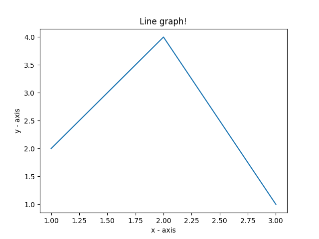 line graph
Plotting two or more lines on the same plot
The following code plots the marks secured by three different students. Three lines will be plotted in this case.
plot multiple lines
- We differentiate between the lines by giving them a name(label) which is passed as an argument of .plot() function.
- The small rectangular box giving information about the type of line and its color is called ?legend?. We can add a legend to our plot using .legend() function. This will take the label?s value.
The output looks like this.
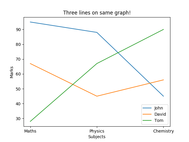 multiple lines graph
Scatter plot
Scatter plots are used to plot data points on a horizontal and a vertical axis in the attempt to show how much one variable is affected by another. Each row in the data table is represented by a marker whose position depends on its values in the columns set on the X and Y axes.
scatter() function is used to plot the scatter-plot graph.
plt.scatter(x, y, label= “stars”, color= “green”, marker= “*”, s=30)
- The label is the marker?s name on the legend. All the possible marker values can be found here.
- ?s? is the size of the marker.
The plotted graph looks like this.
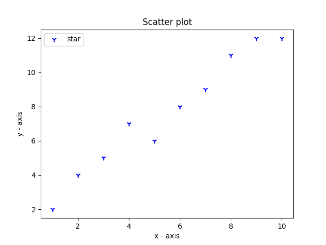 scatter plot
Pie-chart
A pie chart (or a circle chart) is a circular statistical graphic, which is divided into slices to illustrate numerical proportions. In a pie chart, the arc length of each slice (and consequently its central angle and area), is proportional to the quantity it represents.
pie() function is used to plot the pie-chart graph.
plt.pie(proprotions, labels = items, colors=colors, startangle=90, shadow = True, explode = (0, 0, 0.1, 0),radius = 1.2, autopct = ‘%1.1f%%’)
These attributes can be explained easily with the following code.
- explode : array-like, optional, default: None. I am setting an explode value to the first item and hence the slice corresponding to ?Samsung? gets a split-effect.
If not None, is a len(x) array that specifies the fraction of the radius with which to offset each wedge.
- labels : list, optional, default: None
A sequence of strings providing the labels for each wedge
- colors : array-like, optional, default: None
A sequence of matplotlib color args through which the pie chart will cycle. If None, will use the colors in the currently active cycle.
- autopct : None (default), string, or function, optional
If not None, is a string or function used to label the wedges with their numeric value. The label will be placed inside the wedge. If it is a format string, the label will be fmt%pct. If it is a function, it will be called.
- shadow : bool, optional, default: False
Draw a shadow beneath the pie.
- startangle : float, optional, default: None
If not None, rotates the start of the pie chart by angle degrees counterclockwise from the x-axis.
- radius : float, optional, default: None
The radius of the pie, if the radius is None it will be set to 1.
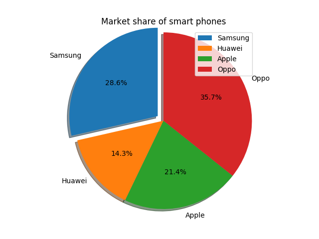 pie chart
Bar Chart
A bar chart or bar graph is a chart or graph that presents categorical data with rectangular bars with heights or lengths proportional to the values that they represent. The bars can be plotted vertically or horizontally. A vertical bar chart is sometimes called a column chart.
The output of the bar chart looks like this.
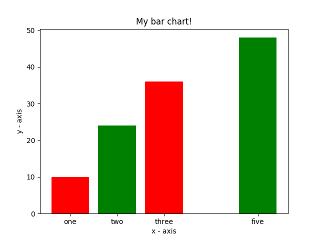 vertical bar graph
- tick_label : string or array-like, optional. The tick labels of the bars. Default: None (Use default numeric labels.)
- user plt.barh() function to draw horizontal graphs.
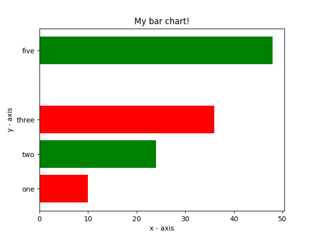 horizontal bar chart
Histogram
A histogram is a graphical display of data using bars of different heights. In a histogram, each bar group numbers into ranges. Taller bars show that more data falls in that range.
histogram.py
histtype : {?bar?, ?barstacked?, ?step?, ?stepfilled?}, optional. The function uses the bar for default.
bins: number of bars that we want in our graph.
range: units on the x-axis. Specify this value according to the values you have in the list.
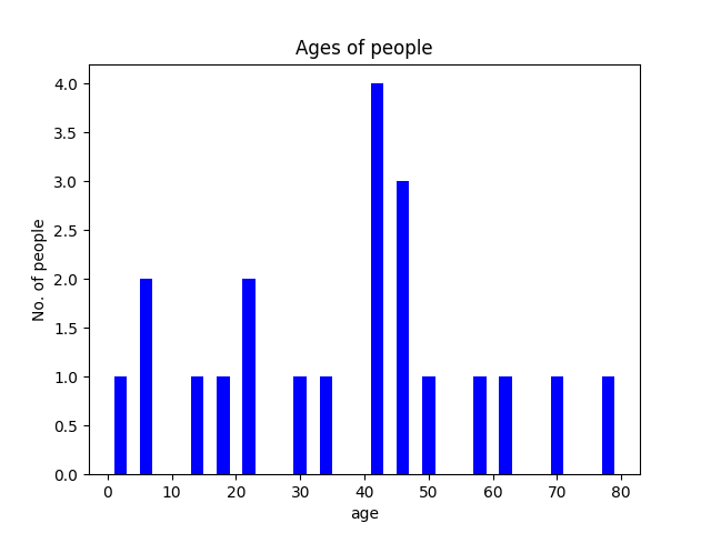 histogram
Customization of graphs
Graphs can be customized by altering various properties such as color, line style, line width, marker, markerfacecolor, marker size, etc.
example
plt.plot(x, y, color=’green’, linestyle=’dashed’, linewidth = 3, marker=’o’, markerfacecolor=’blue’, markersize=12)
various other properties can be found here.
The below graph is a customized graph.
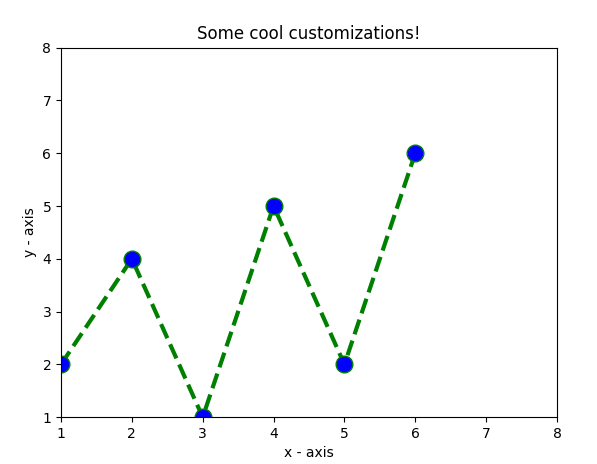 customized graph
References
matplotlib.pyplot.plot – Matplotlib 3.3.1 documentation
Plot y versus x as lines and/or markers. Call signatures: The coordinates of the points or line nodes are given by x?
matplotlib.org
Conclusion
Hope this article is helpful. If you want to read more python articles check out the blog below.
Happy coding!
