
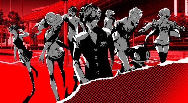
In my previous post, I mentioned that I love RPG?s. Two of my favorite RPG franchises are Monster Hunter and the Persona series. The Persona series has always stood out, especially within its last three entries for its unique game flow, mixing life simulation elements, with turn-based combat, and what would essentially boil down to monster collection a la Pokemon. Enter Persona 5, the most recent entry to the series, which was my favorite game of 2017.
Why do I Love Persona 5?
There?s a lot to love for me in this game specifically. I love anime, and this game is like playing an anime. I love turn-based combat, but my favorite thing about the Persona series as a whole is how you progress. In order to progress, you have to meet with characters and get to know them better, as they encompass different arcana from tarot cards. Being that each confidant/connection represents a tarot card, it gives aware players some idea as to what role they will play in their character’s journey. What makes this special, is that you get to know characters at your own volition, and it makes you care a lot more, as you personally chose to hang out with that character for the day, instead of another. Persona 5 in particular, has my favorite menus of all-time.
What About the Menus?
Take a look at this image:
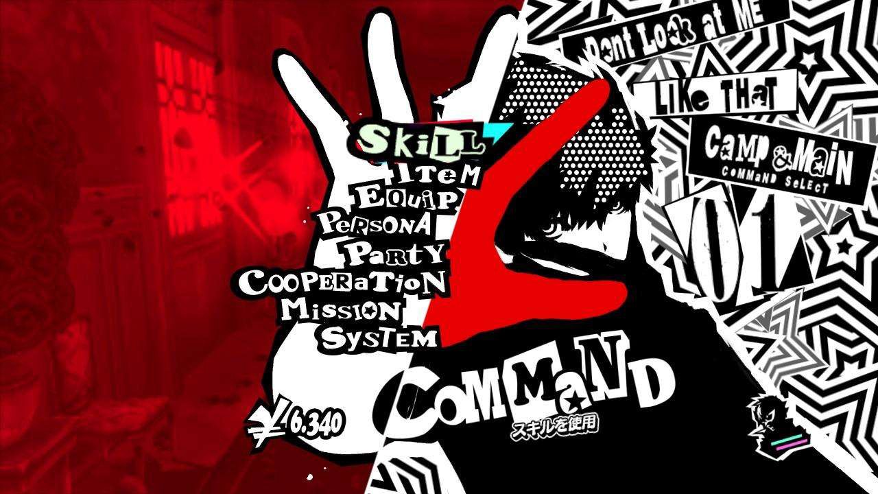
This is your start menu, the menu you enter when you pause the game. Wanna do basically any sort of organizing, equip any equipment, or use an item? You go to this menu.
So Why Do I Love it? Let?s Break it Down:
- Take a look at how the menu is split down the middle, one side black and white, and the other red. That line splitting the sides, combined with the text makes my eyes focus on the center, right where the text is.
- Now, look at the typography. The text is blocky, but stylized, with a thick black outline. I can read every important word based on typography and placement.
- Now that little blue spot is highlighting what you?ve selected as the player. I know where my cursor is and what I am selecting.
- The player character in the center is animated and changes as you select different inventories. I know and can see when I am transitioning between each new menu.
This is the perfect marriage between UI and UX in my book. When I think of menu design in games, I think Persona 5, instantly. Check out this video, with other in-game menus:
They?re Busy, High Contrast, but Guess What? I can Read and Navigate Each Menu With Ease, and see Characters? Personalities.
This is why these menus are pretty critically acclaimed. Inherently, we need to be able to read through a menu in an RPG, it?s where everything happens. Wanna equip that cool sword you just found? Inventory menu. Need to use an elixir to heal? Item menu. Need to switch out party members for a fight? Party menu. In an RPG you can spend a lot of time in menus, and poorly designed menus really take away from the experience.
It?s all About Player Enjoyment, the User?s Experience.
The developers and designers for Persona 5 wanted to create something flashy, something cool, something that would make you think you?re a phantom thief. But, they also designed in a way that emphasized readability. I?ve played RPG?s with bad menus. I?ve played games with bland, hard to navigate, and poorly created user interfaces. Persona 5?s menus are a visual treat, that is pushed to the absolute limit in terms of design and UX.

