What defines a neutral color?
Neutral colors are most clearly defined as hues that appear to be without color, and that don?t typically appear on the color wheel. Neutral colors, therefore, do not compete with primary and secondary colors and instead compliment them.
Categories of Neutral Colors
The four most common neutrals are black, white, brown and grey, and are created by mixing two complementary colors. These neutrals don?t have hue undertones, causing them to be considered ?pure?.
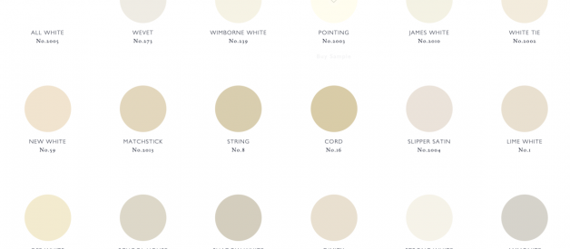
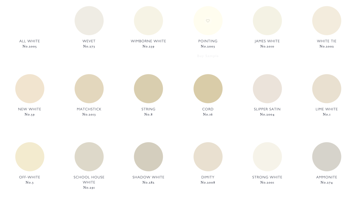
All other neutrals are considered near-neutrals. Near neutrals appear to be without color, or have neutral-like tendencies, but have a hue undertone. Near neutral examples are tans and darker colors.
Near Neutrals
Near neutrals are colors that have a low saturation. They are created by combining a pure (primary) color with a pure neutral: this tones them down from their original hue to such an extreme that they appear to be without color (ex. a color very similar to a light gray). However, since they are derived from a particular hue, they have undertones that keep the color from being a pure neutral (ex. tan, ivory, eggshell).
Near neutrals can be lighter or darker than their original hue, making them similar to shades, tones, and tints. However, for the former to be neutral it has to have a low enough intensity to not be considered a real color ? unlike shades or tints such a navy blue or pale pink. Near neutrals can also be referred too as chromatic grays.
Importance and Uses
Since many neutrals appear to be without color, they are easy on the eye. In interior design, this makes them popular as a background: the neutral complements the other colors in an arrangement and allows the eye to easily flow between each focal point. Many colors in interior design are considered neutral, such as olive green. This is because they complement and highlight other colors particularly well in a room. Oliver green, however, has a very clear green undertone. Not all colors with neutral-like tendencies are actual neutral colors, though they may function in much of the same way.
Neutral colors, when paired with a brighter hue, make the hue appear more vibrant. The human eye is naturally attracted to such colors with a higher intensity. If an art piece has too many saturated colors, however, the eye is overwhelmed and people don?t know where to look. This can make an art piece come across as unpleasant, unnatural, or disconcerting. Neutrals can enhance the variation in a piece, creating subtle visual interest that both diminishes the vibrancy of the piece as a whole and highlights the focal points.
Neutrals have many other visual effects: when combined with shades, tones, and tints, they allow for shading, as darker or lighter neutrals help to create a realistic lighting effect. Another example is painting an item in the distance: the item is going to be less saturated than one up close. Using neutrals to create that difference allows an artist to create depth in a piece.
Symbolism
?Genius and virtue are to be more often found clothed in gray than in peacock bright.? ? Van Wyck Brooks
All neutrals, due to being easy to look at, commonly symbolize relaxation, neutrality, and tranquility. ?
White, specifically, symbolizes purity, cleanliness, peace, new beginnings, simplicity, coziness, light, and potential for new ideas/inventions. Near neutral whites (off-whites) are often considered subtle, elegant, and classic. All whites generally have a positive connotation.
Gray symbolism varies, as this neutral has neutral hues ranging from black to white. Darker grays can appear mysterious, dramatic, steadfast, sophisticated, enduring, solid, constrained, and solemn. Lighter grays appear soothing, calming, and enlightening. Metallic grays ? such as silver ? appear sleek, elegant, and modern. All grays, in general, are associated with being timeless, designer, classic, corporate, methodical, balanced, and emotionless. They represent responsibility, fairness, loyalty, wisdom, selflessness, practicality, depression and loss.
Black is often considered the strongest of neutrals. It is associated with dominance, darkness, sophistication, authority, seriousness, affluence, quality, mystery, drama, fear, death, evil, and grief. All blacks generally have a negative connotation.
Brown is the most commonly seen neutral in nature. It?s considered simple, inexpensive, natural, stabilizing, approachable, authentic, warm, modest, strong, wholesome, healing and grounding. It reminds people of home and honesty.
Additional Sources
1 https://thelandofcolor.com/gray-area-how-to-identify-near-neutrals/
2 https://www.apartmenttherapy.com/neutral-colors-262805
3 https://www.finearttips.com/2013/11/importance-using-neutrals-art/
4 https://www.cmbell.com/blog/2011/3/14/color-psychology-know-when-to-use-neutrals.html

