It?s Easier Than You Think?And It?s Compelling!
 Dow Jones Index ? Heat Map of Standard Deviation on Performance
Overview
I?m working on a data analytics presentation using a dataset of the Dow Jones Index DAILY performance (this is a hot topic lately, so might as well grab the data for analysis?).
The common ?process? for data analytics that I frequently see is ?ELTR?, which stands for:
- Extract
- Transform
- Load
- Report
This post will focus on a simple ?heat map? REPORT. Note that all the work of Extract, Transform and Load has been done before this. Reporting starts the fun part of data analytics. 🙂
Excel ?heat map? visualizations are popular for certain data sets. The performance of the DOW over a historical time period is one of those data ?fits?. So, let?s explore how that visualization is created ? fortunately Excel makes it pretty straightforward and simple.
What?s the Question?
The question? that this answers is ?What is the volatility of the Dow Index performance over time??
Here is what I calculated / summarized out of the data:
- Grouping data by decade (1970?s through 2010’s),
- Using a pivot table, I showed the Standard Deviation (measure of volatility) of the Dow 30 % Change peformance for each month of each decade
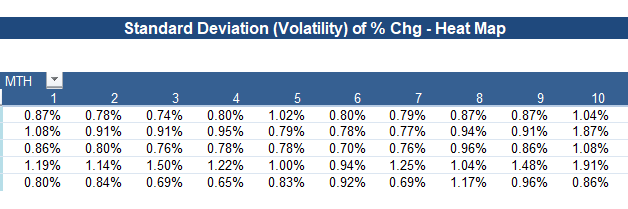
It appears like this:
 Pivot Table on Dow Index Standard Deviation of % Chang
Let?s Do This
As you can see, it?s not too informative in this format, so I want to format it as a ?heat map? so that outliers stand out with a quick glance of the report.
Apply Conditional formating
- Highlight the data range and select ?Home ? Conditional Formatting?
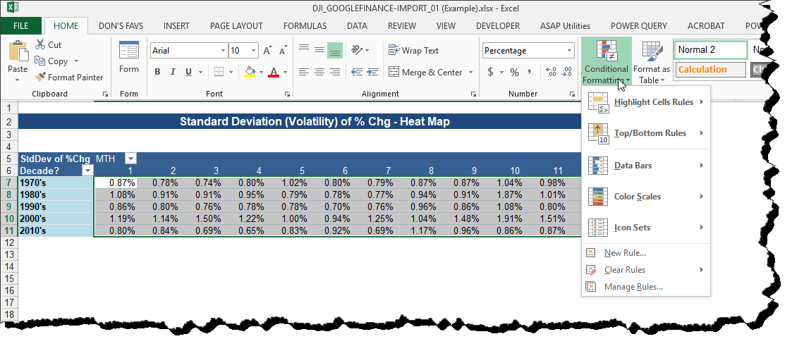 Apply Conditional Formatting to Pivot Analysis
- Select the ?Color Scales? option
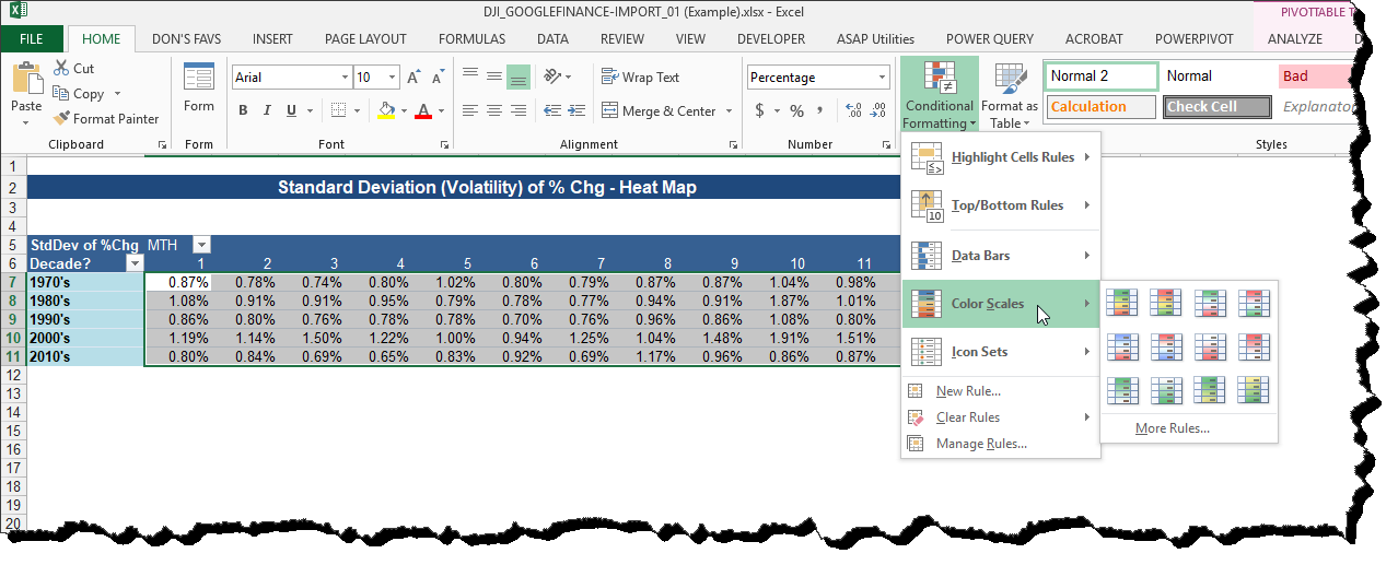 Select the Color Scales Option
- I want the format that shows the MOST volatile (highest standard deviation) to be highlighted RED. As you ?hover? over the choice, the table formatting changes. I have the one I want!
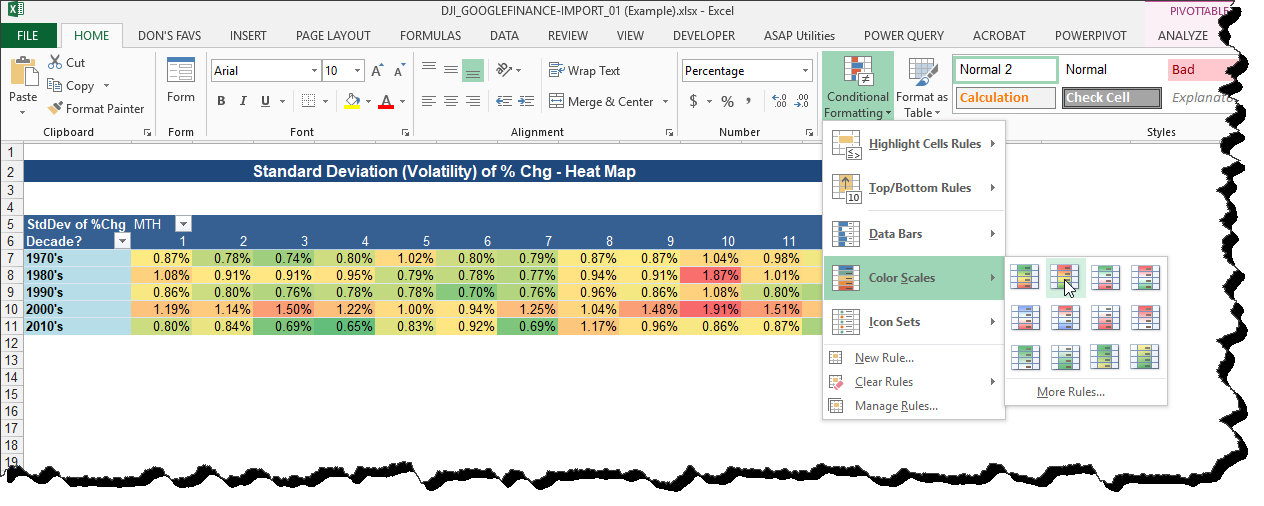 Hover over the Options ? Select Desired Format
- Select that option and here is your report view now.
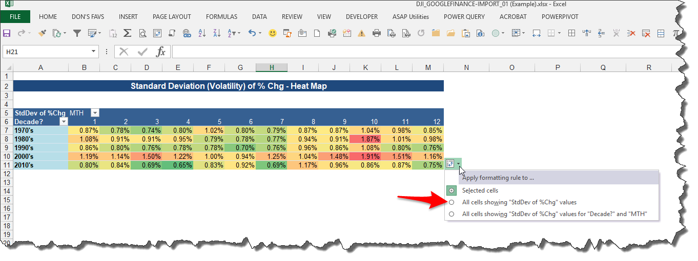
- Click the drop-down menu that appears, and select the option for ?All cells showing ?StdDev of %Chg? values?.
The report now looks like this:
 Conditional Formatting Applied to Pivot Table Analysis
Remove the Numbers ? Meaningless for this Report
Ok, we?re getting there, but there is one more formatting step. The % values are really meaningless as far as this visual is concerned, so let?s remove them.
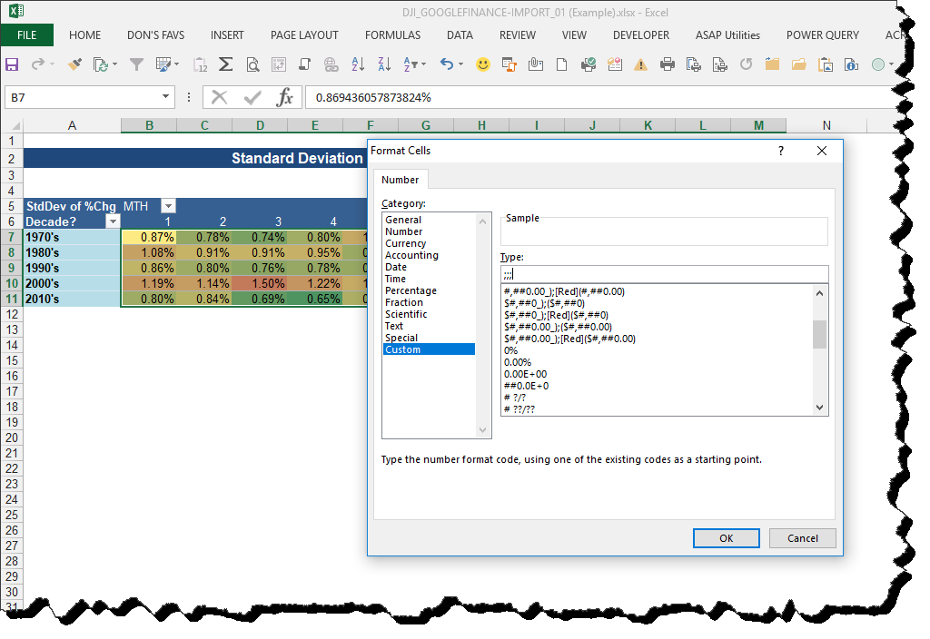
- Highlight the range again, right-click the mouse and select format cells
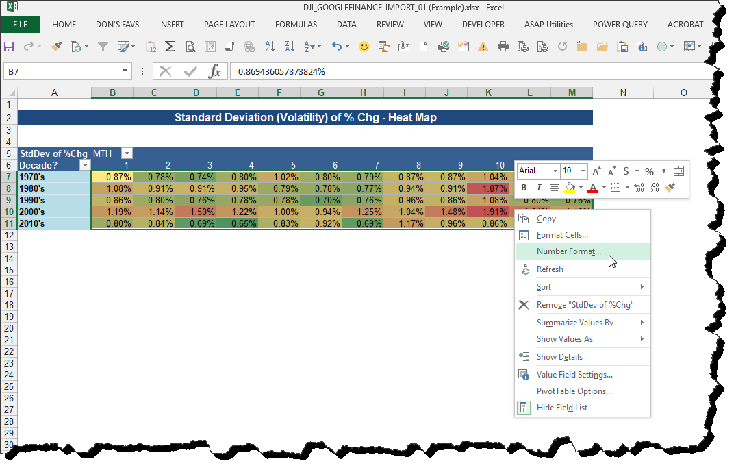 Modify Number Formatting
- Select ?Custom? format and type ?;;;? (3 semi-colons) into the ?Type? field. This will hide the values from the report.
 Change Custom Formatting to ?;;;? ? this hides values
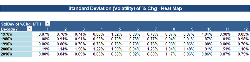
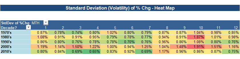
- Final report ? no numbers and the report ?tells the story?.
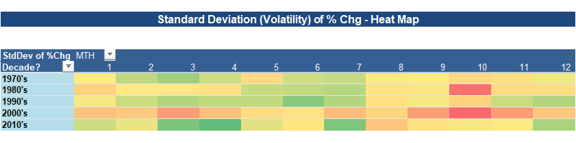 Final ?Heat Map? Report
Now, Can I Modify The Report?
How easy is it to modify the report? Easy!
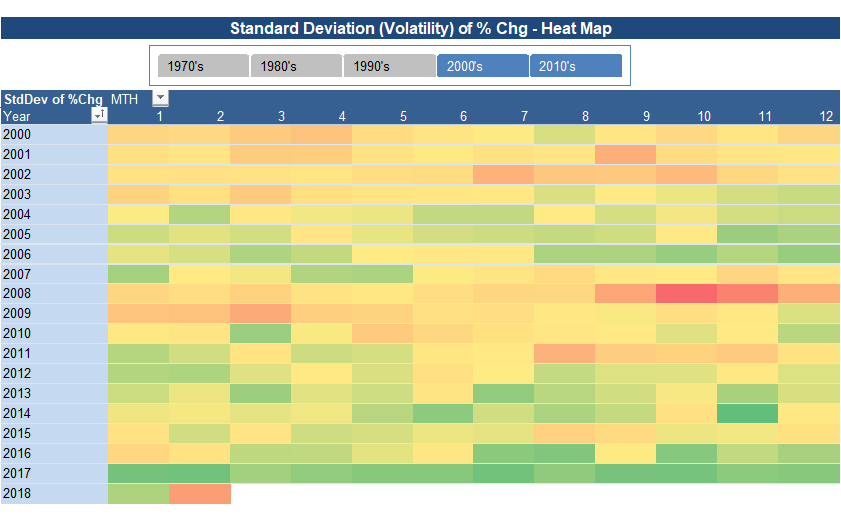
Let?s say I want to look at the report, by YEAR (rather than decade), for the years 2000 forward?
- Insert a Pivot Table Slicer for ?Decade?? ? this allows me to easily select just the decades I want.
- Add Year as a Pivot Table row field.
Now it looks like this. And the user has the flexibility to quickly get a report on any decade they want.
Revised Heat Map ? Change by Year / Over Two Decades
Can you apply this approach to any of your reporting? Let me know in the comments!
About Don

?It?s time for different?
Don is passionate about helping professionals and organizations keep up and adapt to the changing business world that we operate in.
?What Do You Do??
Connect with Don!
LinkedIn, Flipboard, Twitter, Snapchat
Or, just Google me?I?m everywhere

