Credit where it?s due
Notepad++ is old, at-least by today?s software standards. But it?s still a very capable editor. Launched in November 2003 (that?s 14 years if you?re counting), it has definitely seen it?s fair share of glorious days.
- In 2011, Lifehacker described Notepad++ as ?The Best Programming Text Editor for Windows?. (Though even they couldn?t resist criticizing it?s user interface and calling it ugly)
- In 2014, Lifehacker readers voted Notepad++ as the ?Most Popular Text Editor?. 40% of the 16,294 respondents specified it as their most-loved editor.
- In 2015, Stack Overflow conducted a worldwide Developer Survey. In it Notepad++ was voted as the most used text editor worldwide, with 34.7% of the 26,086 respondents claiming to use it daily. In 2016 the number rose to 35.6%. Even in 2017 it held it?s own, falling only behind Visual Studio Code.
What makes Notepad++ so popular is that it?s free, highly customizable and is well maintained with regular patches and bug fixes.
But it doesn?t look pretty
Notepad++ looks like an application straight out of the Windows XP era. Let?s face it, it?s not pretty and can?t hold a candle to it?s younger siblings like Visual Studio Code, Atom, Sublime text, etc.
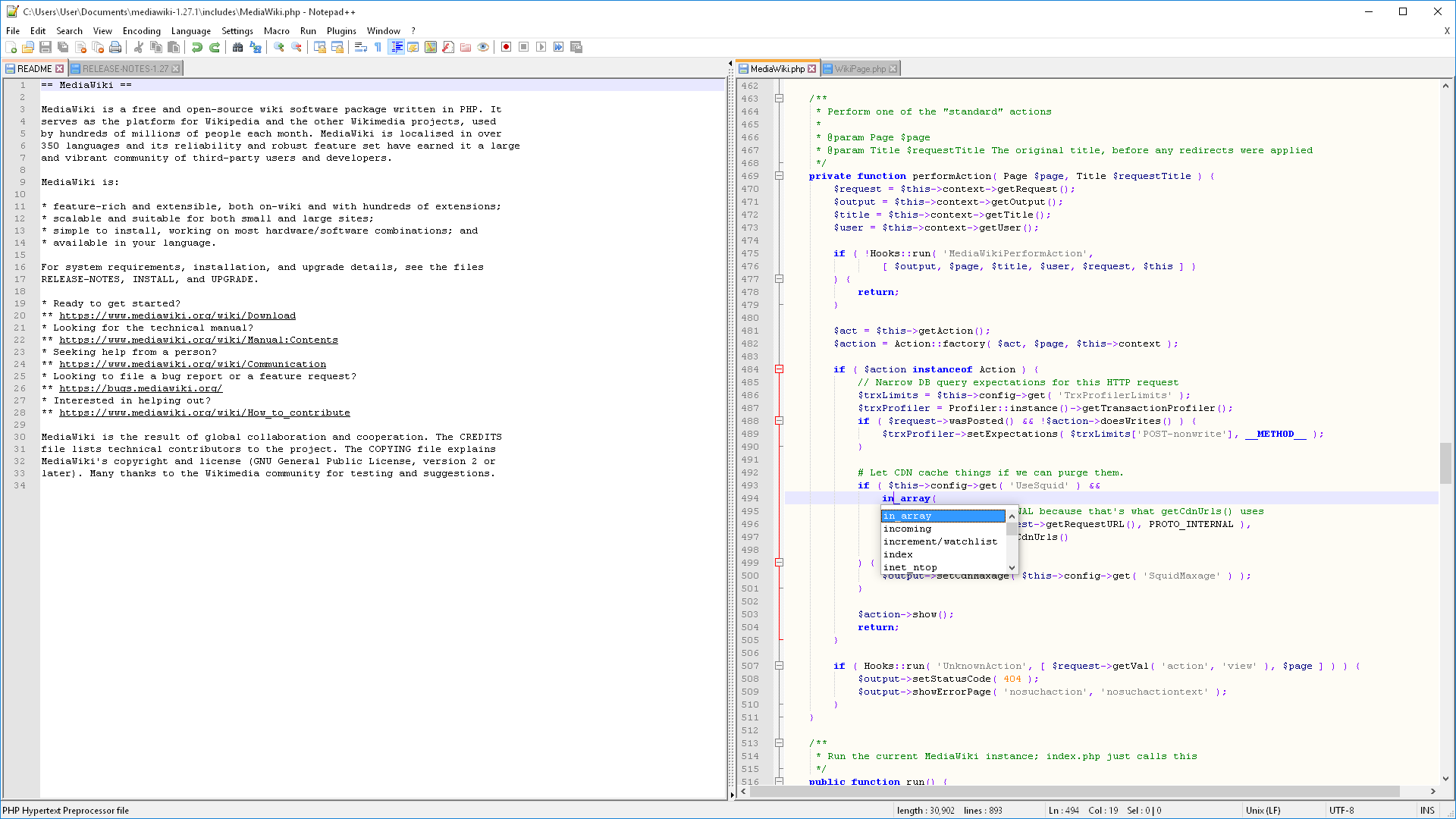 File:Notepad++ v7 on Windows 10, as on it?s Wikipedia Page
Some people might find the familiarity of the interface comforting. It?s understandable as Notepad++ looks similar to Notepad and Wordpad, which come pre-installed with Windows. Some would argue that the application is fully functional and ?if it ain?t broke don?t fix it?. But for others who are spoilt by the newer generation editors with their modern and sleek designs (including me), we can?t help but dream of a time when Notepad++ gets a UI refresh.
What to do then?
While a full fledged UI overhaul isn?t on the cards, we can still take advantage of Notepad++?s custom themes feature.
Notepad++ was developed by Don Ho because he was dissatisfied with the poor performance of the editor his company made him use. I was dissatisfied with the looks of Notepad++, the editor my organization expects me to use. So like Don, I took matters into my own hands and created a new theme for Notepad++.
Material Theme for Notepad++
Material theme for Notepad++ is inspired by another set of material design themes. Material Design for Sublime Text and Visual Studio Code are both developed by Mattia Astorino. I love these themes and use them everyday. That?s why when it came to making a theme for Notepad++, I decided to use them as a foundation.
This is what Notepad++ looks like after applying the theme
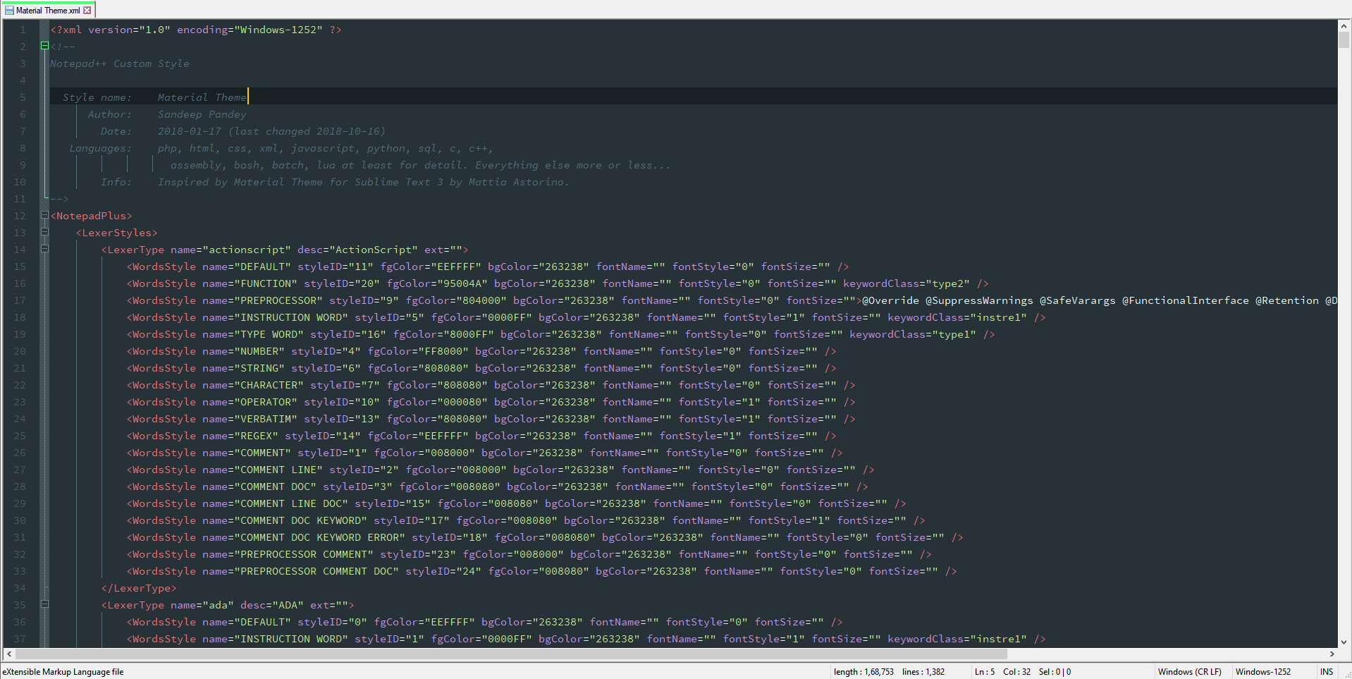 File:Notepad++ v7.5.9 on Windows 10, with Material Design theme
Installation
To get started with the theme, follow the instructions below:
- Right Click HERE and select Save As to download the theme.
- Go to %APPDATA%Notepad++.
- Open the themes folder, create a new folder named themes if it doesn?t exists.
- Place the downloaded.xml file inside the folder.
- Restart Notepad++.
- Open Settings->Style Configurator.
- Select Material Theme from the theme drop-down box.
- Click Save & Close
Getting the Font
The theme makes use of the following font:
- Source Code Pro for the main text. Get it HERE
Alternately, you can also use the font of your choice by changing it in the settings menu after selecting the theme
Settings -> Style Configurator -> Global override
Settings -> Style Configurator -> Default Style
Recommended settings for a better experience
After applying the theme and selecting the font, your work is done. But for a better experience, using the following settings is recommended
- Darken inactive tabs : EnabledSettings -> Preferences -> General
- Draw a colored bar on active tab : EnabledSettings -> Preferences -> General
- Caret Width : 2Settings -> Preferences -> Editing
- Folder Margin Style : Box treeSettings -> Preferences -> Editing
- Current line highlighting : EnabledSettings -> Preferences -> Editing
- Highlight Matching Tags : DisabledSettings -> Preferences -> Highlight Matching Tags
- Mariana theme for Notepad++: If you like our material theme, you might also like our other theme Mariana. Inspired from the Sublime Text 3 theme of the same name. (get itHERE)
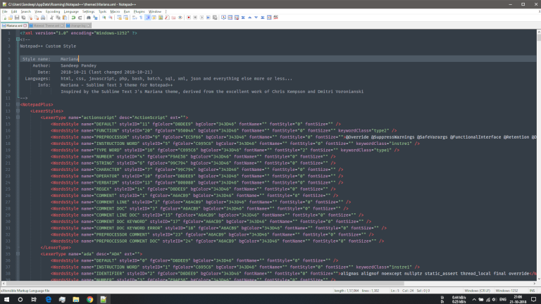 File:Notepad++ v7.5.9 on Windows 10, with Mariana theme
Material Theme for Notepad++ is a good option for those who like dark themes and material design. However, if changing the theme alone doesn?t please you, you can try changing the application icon too.
- AppIcon: If you?re bored of your default Notepad++ icon, you can try this awesome one created by Piksely. (visit him HERE)
 Notepad++ Icon by Piksely
Download Icon
instructions on using the icon are in the download
What we end up with is a much more modern looking and sleek editor window, and is definitely much better than the boring default theme. I?ll keep working on more customization for Notepad++ UI but this is it for now.
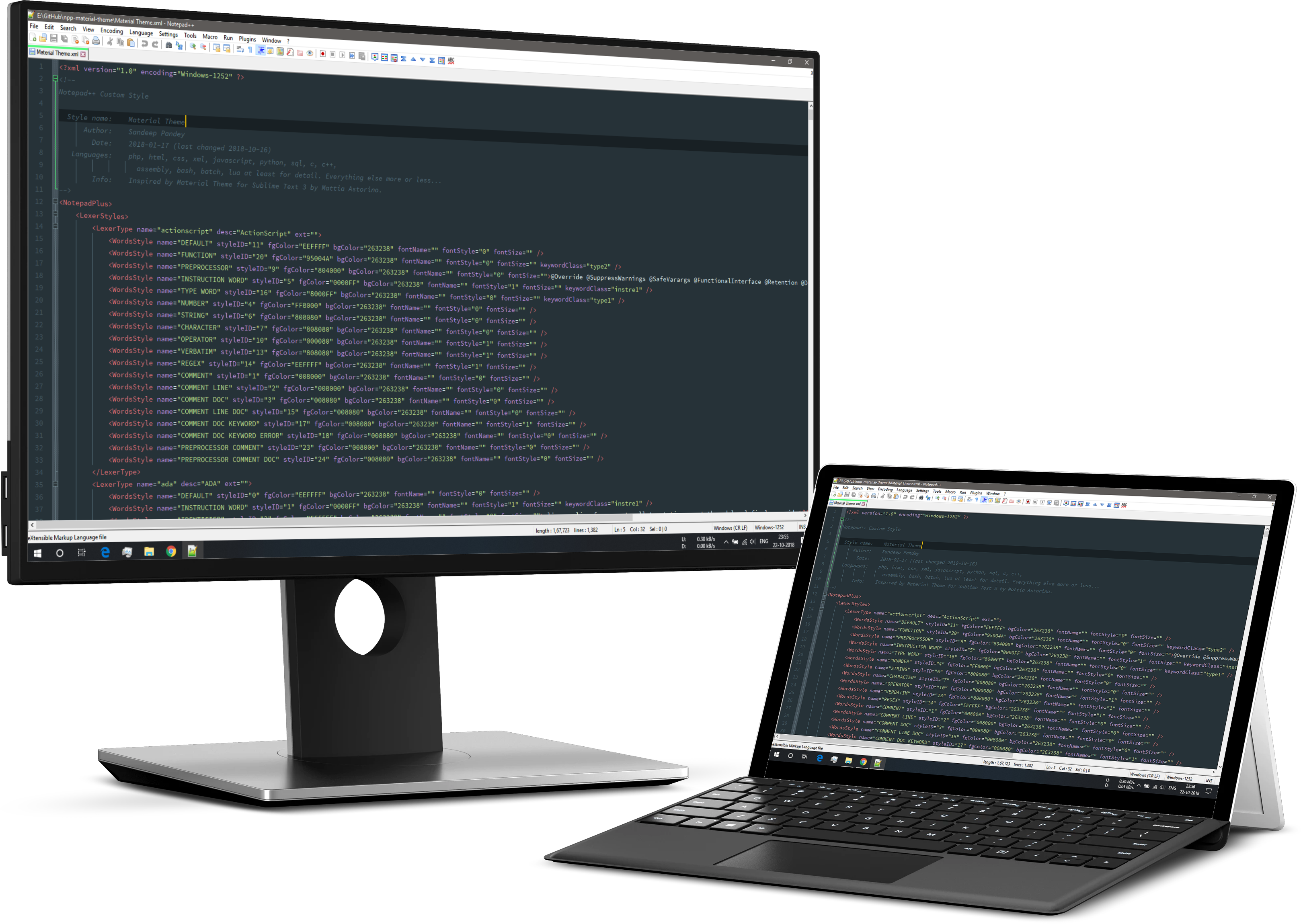 File:Notepad++ v7.5.9 with Material Design theme on a Surface Pro & Dell Monitor
