Circos plots are a great way to show genomic data and are famous (and infamous!) for their ability to show several different data types across dozens of chromosomes in a single plot. But it isn?t always easy to make these plots ? this article covers some of your best options.
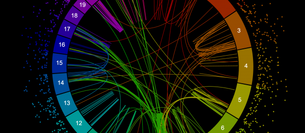
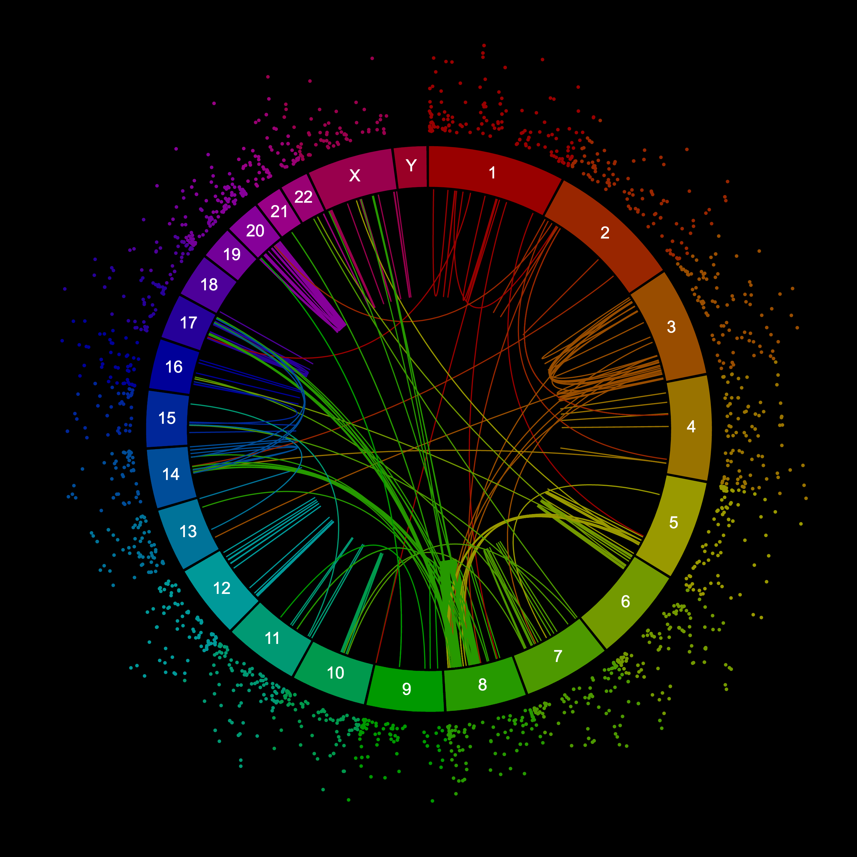 A circos plot of structural variations in a breast cancer cell line. This plot shows long-range variants as connections and variants smaller than 10 kb as dots, where the further out the bigger they are. This plot was created with Circa, one of the options for creating circos plots listed below.
Circos is really the brainchild of Martin Krzywinski, who released it to the world in 2009 with this brilliant paper: ?Circos: an Information Aesthetic for Comparative Genomics.?
What are circos plots for?
There are a few different types of data that circos plots can be very useful for within biology/genomics research. One way to think about this is what determines the coordinates around the circle.
Chromosomes
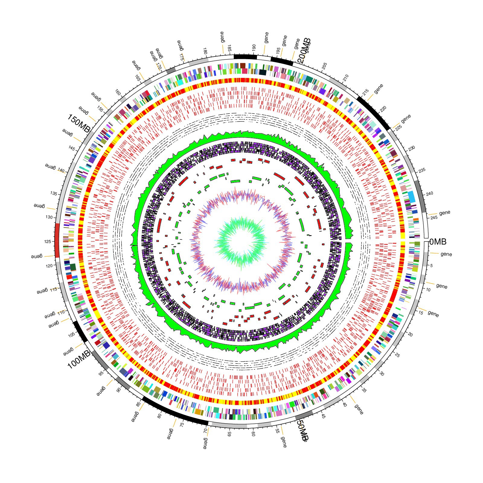
The first type is genomic data, where each chromosome is a segment around the circle, and all of the data points for a chromosome are plotted onto specific positions within that chromosome?s slice of the pie. Chromosome-based circos plots are the ones that can take a lot of different types of data, as long as all the data points know which chromosomes they are on and what their positions are within those chromosomes.
 Chromosome-based circos plot from R circlize package examples.
A standard data format for a genomic circos plot would be where each row is a data point and each column represents a variable like chromosome, position, p-value, gene expression, etc.
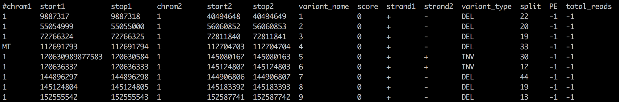 Example of data that can be plotted in chromosome-based circos plots. Each row is a data point, and it contains columns that specify chromosomes (chrom1) and positions within those chromosomes (start1 and stop1). This dataset has two sets of chromosomal positions, so it can be used to draw connections between two points like in the rainbow plot.
The data for these chromosome-based circos plots can be any features that have chromosomes and positions: structural variants, repetitive elements, homology, evolutionary conservation scores, SNPs, genes, differential gene expression, DHS peaks, copy number profiles, ChIP-seq peaks, CpG islands, ? the list goes on. This kind of data can be downloaded from the UCSC genome browser?s table browser, or generated yourself from sequencing data by running any of hundreds of different bioinformatics tools.
Chord diagram
The second type is a chord diagram, which describes relationships or flow between different things.
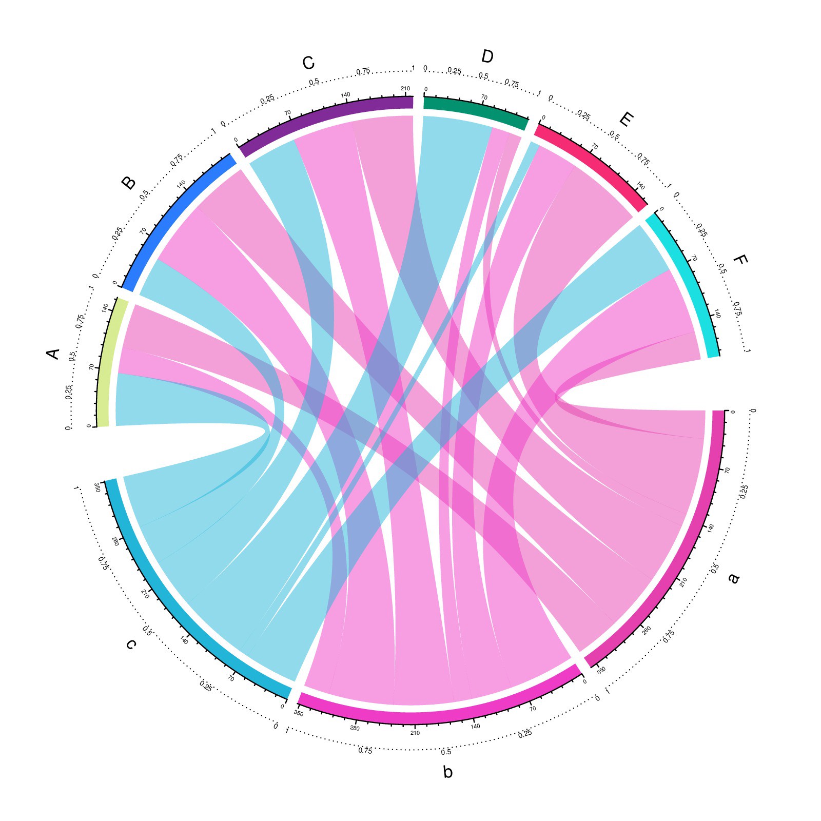 Chord diagram from R circlize package examples.
Chord diagrams have been used to show people changing jobs into different sectors, international migrations, and other quantifiable connections between different segments. For example, each segment is a country, and the coordinates within the segment correspond to a percentage of the population that emigrated from that country. Generally these chords can be arranged differently within each segment and still show the same information, which is clearly different from chromosome-based coordinates where the positions within a chromosome segment are important.
 Adjacency matrix perfect for a chord diagram (source)
The data for a chord diagram usually takes the form of an adjacency matrix, such that the rows and columns have the same names, and the values in the matrix determine how wide the chords are between any two segments. The size of a segment is then the sum across a row or column in that adjacency matrix. Notice that the chord diagram above has two halves, one of which may be column names and the other row names. This is one way to deal with asymmetric adjacency matrices where you need to distinguish flow from A to B with flow from B to A. Other ways include showing both in the same chord but varying the sizes of the attachments to represent the difference between A->B and B->A flow.
Phylogeny
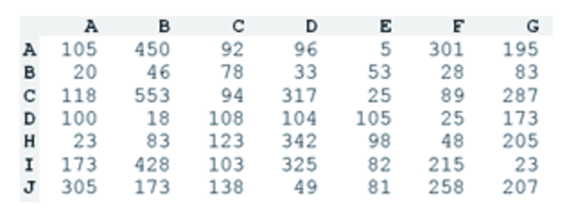
Another distinct type of circos plot is a circular phylogenetic tree. Here the radial coordinates correspond to leaf nodes on the phylogenetic tree. This is distinct from both chromosomal coordinates and from chord diagrams. The data to use for this type of circos plot is any dataset from which you could create a regular phylogenetic tree. One benefit to making the tree circular is increased space for the leaf nodes because you get the whole circumference of the tree to spread them out rather than just its diameter.
 A circos plot containing two phylogenetic trees with associated heatmaps. This is an example from the R circlize package documentation.
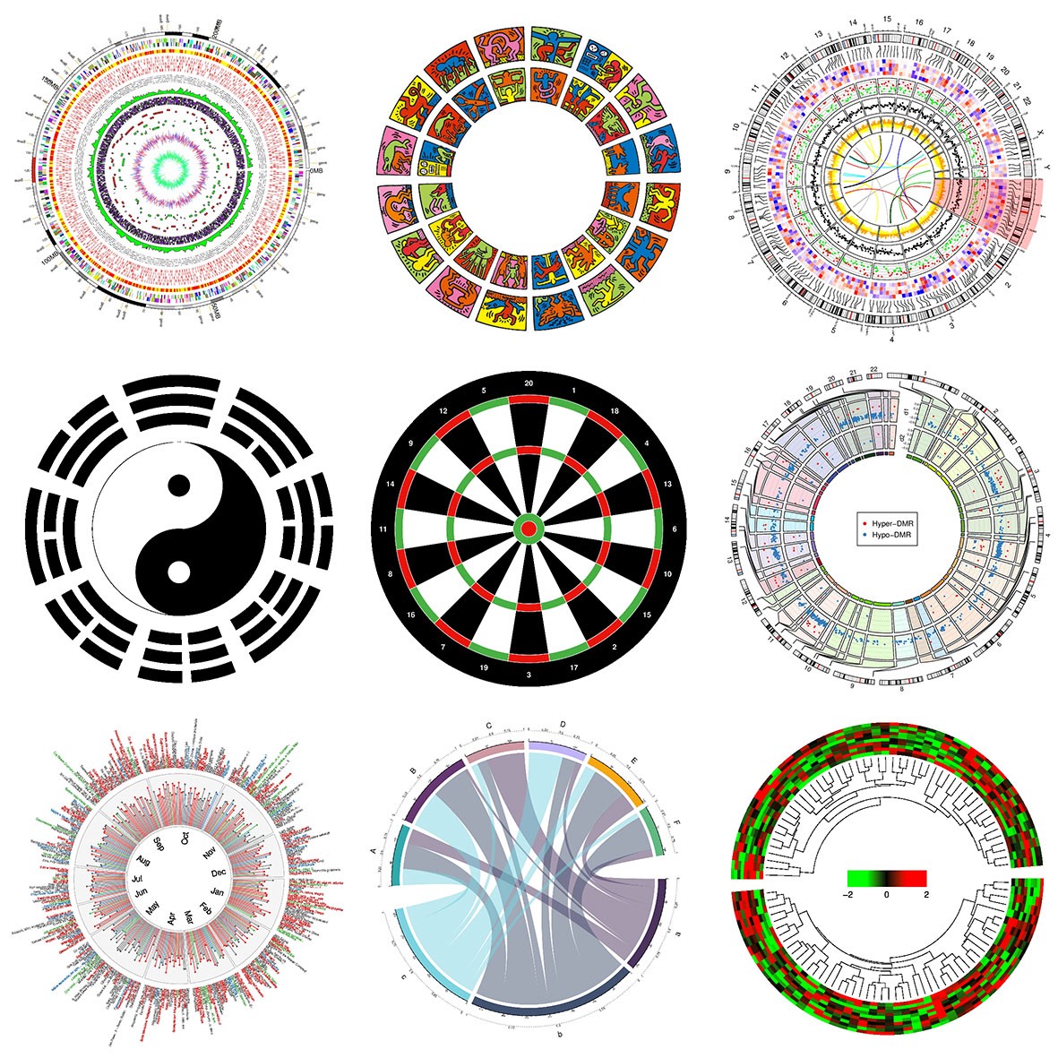
Those were some of the most common types of circos plots used in genomics. There are many more examples out there with months of the year, sports, and all sorts of other applications, many of which will still fall loosely into these categories ? if you turn the chromosomes into general segments like months, seasons, etc.
The dark side of circos plots
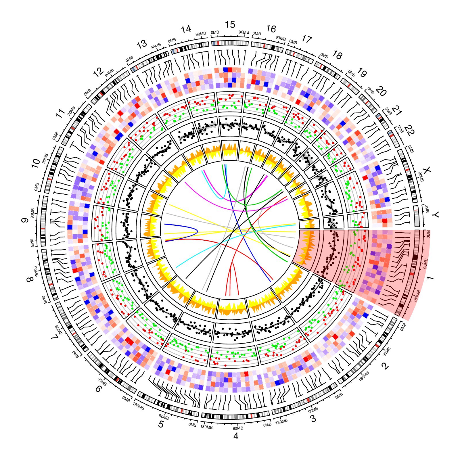
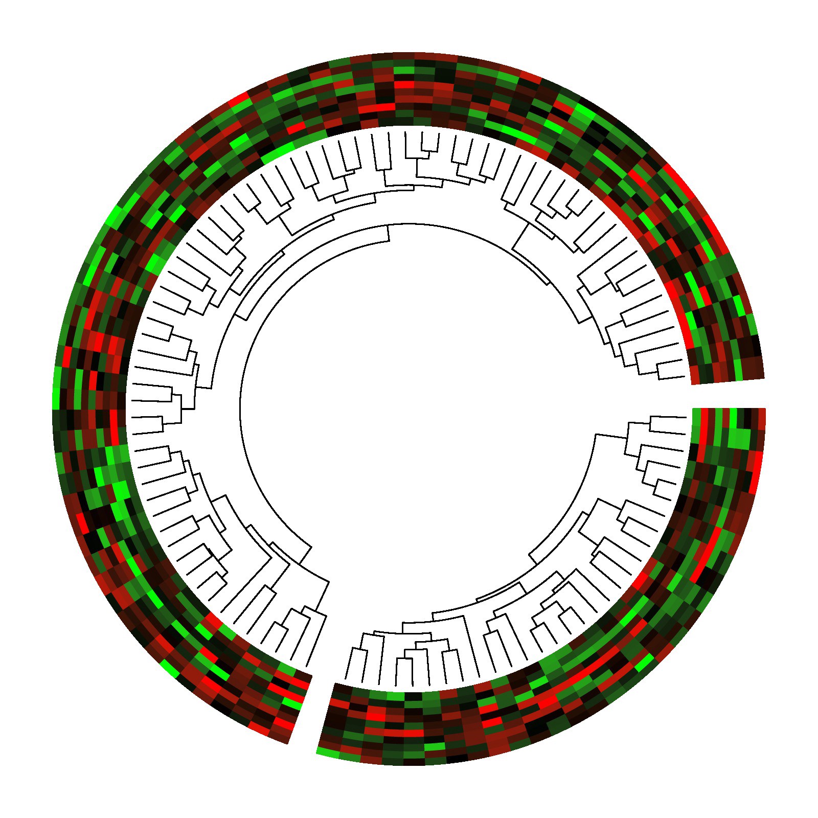
For chromosome-based circos plots where many different kinds of data can fit on the same plot, there is a clear trend in the literature of cramming as much information in there as possible. Some people go overboard and plot upwards of 10 different datasets with clashing color schemes and tiny points. This leads other people to hate on circos plots, which is unfair since many circos plots show perfectly respectable amounts of data. The key as with all visualization is to focus on showing the patterns in the data that are actually interesting, rather than plotting everything you have.
 A genomic circos plot from R circlize package examples, showing just how much data it is possible to pack into one circos plot.
On the other hand, a complicated circos plot can make a standard paper look quite impressive. If the sentiment you are going for is ?we did every analysis under the sun? then an overcrowded circos plot is a great way to make that point.
How to actually make a circos plot?
You have a number of options for creating your circos plots, which range from extremely flexible to very limited applications and from taking days writing hundreds of lines of configuration to clicking around for 20 minutes.
The original circos
Circos itself is software written in Perl, and the way that you create a plot is by writing a long configuration file that says exactly how your plot should look. This option is very flexible and lets you make literally any kind of circos plot. The downside is that for most people I have talked to, it takes them at least a few days to make their first circos plot ? and trust me those people were not lacking technical skills. Circos is a serious power tool, but it can be difficult to install (oh dependency hell) and takes a lot of reading and iteration to get the configuration file right. However, circos also has the most flexibility, so it is up to you to decide if it is worth the effort to create your super-customized masterpiece of a circos plot without taking any of the shortcuts below.
R packages
Various R packages now exist that let you create a circos plot by writing R code. These include circlize, RCircos, CIRCUS, and OmicCircos. Each of these packages have pros and cons relative to each other, so I recommend finding one with examples that resemble what you want to do and seeing if you can adapt the example code to your needs.
 Gallery of examples from R circlize package.
Circos table viewer
For making chord diagrams from an adjacency matrix, there is a great web tool called the circos table viewer, that makes the process much easier than working with the original circos software in perl.
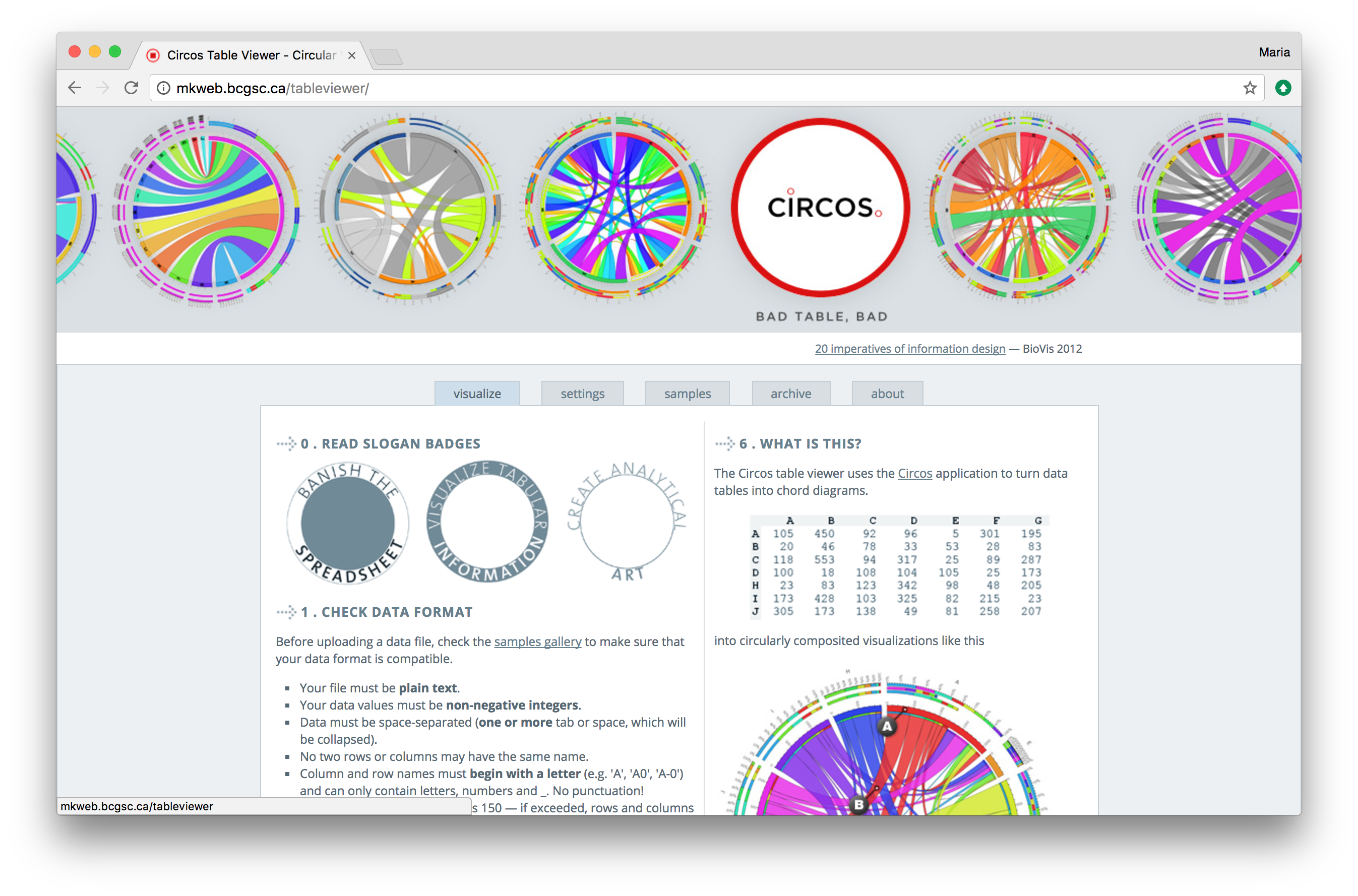 Circos table viewer website. This site lets you create the chord diagram type of circos plot without installing software or writing any code.
Circa
For chromosome-based circos plots, Circa allows you to make circos plots without writing any code. It doesn?t do everything imaginable like the original circos does, but it is very easy to use and allows you to tweak everything in real time.
Full disclosure: I made Circa myself after struggling with circos plotting for weeks during graduate school, and it is a paid tool. But check out this 1-minute demo video if you want to see it in action.
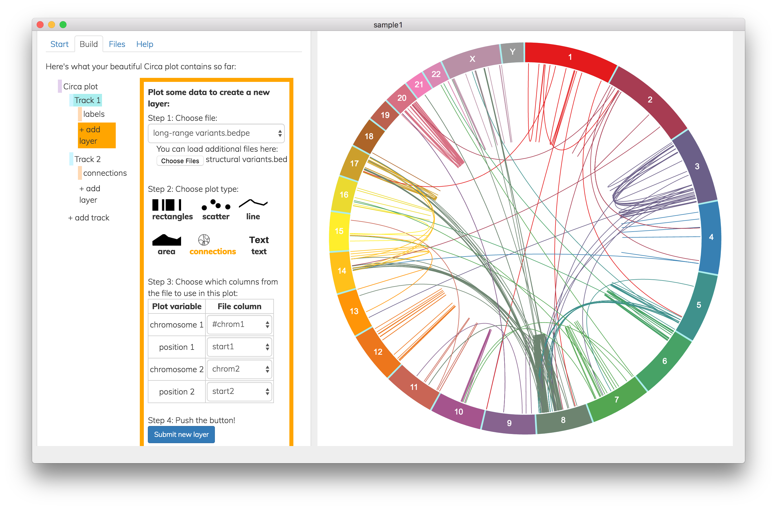 Screenshot from Circa software showing how to create a new track by plotting connecting lines to represent long-range variants.
If you find the original circos software and the R packages too time-consuming, Circa will get you results much faster and without any coding, but only for the chromosome-based circos plots. For chord diagrams, check out the free circos table viewer, and for phylogeny circos plots, try the circlize R package.
Circos plots are awesome, but?
A wise man once said ?With great power comes great responsibility?
With the power to create beautiful circos plots from your genomic data comes the responsibility to avoid the dark side and resist stuffing twenty datasets into a single plot. Regardless of your motivations for good or evil, the options above will help you get there.
Leave a comment and tell me if you love/hate circos plots!

