Minimalism in design might not be a new notion, but the idea of minimalism has now gone beyond the current trends of digital design.
Many notable brands such as Apple, FedEx and Nike did not have the simple looking logos that they have today.
Instead, their logos have only further evolved due to the successful rebranding qualities minimalistic design possesses.
Existing logos can be improved gradually only if you manage to find a befitting trend for your logo to follow.
However, not all logo design trends stick around for long.
Some are merely seasonal fads, so the best option that you can possibly think of is minimalism since this trend has stayed in the design industry for years already.
If you intend to design a logo from scratch, then you can commence with following the ?less is more? strategy.
Come up with a design that is minimalistic yet contains all the visual attributes that convey the identity of your brand.
Supposedly, you have to design a logo for a branding agency or an app development firm such as Retrocube.
Your focus would be to add such elements that convey what your firm does without letting your customers read further into your services.
That is exactly what the minimalist approach advocates ? for you to bring simplicity, ample space, and appeal in a single design.
Prime Characteristics Of Minimal Logos
1 ? Create a visual focus through contrast
Minimal logo designs usually follow a monochromatic colour theme.
Supposedly, if you look into the details of the Yin and Yang symbol, you will notice how the two colours compliment the colour contrast of one another.
Minimal logos are not always meant to have black and white colours but if you want to make the colour contrast more visible, then these two colours befit each other most.
This logo design example by mimoYmima does not use either black or white, and yet the colour scheme contrasts the sharp lines immaculately.
2 ? Select the right typography style
Typography design elements in a logo should always fit a brand?s visual identity.
Carefully select the typeface as the final design might not suit the visual image you intend to portray.
This notion involves the perfect selection of font styles since the focus of typography logos is on the font itself.
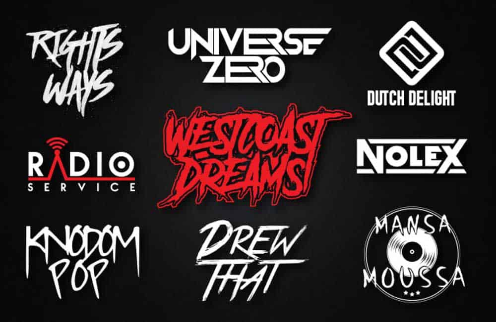
If you intend to highlight the typeface the most, then you can change it by either increasing its size, density and style.
This logo design example for Affinity showcases how the logo designs for rock bands can be incorporated with both the elements of minimalism and typography at once.
3 ? Know that less is more
With fewer elements in a logo, the message or story you want to convey through your logo becomes more direct and precise.
It is true when it is said that less is always more since bloating a logo with additional design elements just to make it unique ruins the design even further.
The concept of being direct does not only work for logos, but it is also a befitting option for designing web interfaces.
Never bloat your website with unnecessary text or images as it spoils the readability and accessibility levels for the users.
Always be straightforward and use simple elements to convey the meaning behind your logo.
This design concept for Minima Electronics by Swetank Rathi is a prime example as to why the ?less is more? concept should never be overlooked.
4 ? Do not reinvent the wheel
It is not set in stone for a minimal logo to follow a specific design pattern.
If that were the case, all such logos with minimalistic concepts would look dull and boring.
You can liven up the design with either subliminal messages, or you can just compose the design in such a way that it fits to what the brand is representing.
Such as this P Whistle logo by Jeroen van Eerden represents both the alphabet P and the whistle icon merged in a colourful yet straightforward minimal logo.
The positioning of the font or design matters the most as that is the only way it can add appeal to a logo.
5 ? Minimalism is more than black and white
It is not definite that for a logo to be minimalistic, you would have to choose monochromatic colours for it each time.
While using not more than two colours, surely make the logo look more simple and easy to view, but you can include a third colour to bring contrast to its overall aesthetics.
Keep a few colour combinations in your palette and then use the dominant colour to enhance the design further.
This logo design example by Paulius Kairevicius highlights the notion of both creativity and minimalism altogether.
The word ?Paint? is then complemented with a streak of yellow paint emerging from the roller on the Letter P.
6 ? Fill in the negative spaces
Hoarding unnecessary elements into a logo makes it lose its original essence and uniqueness.
If you want your logo to be direct and yet look complete, you can adjust the layout according to the negative spaces in the logo design.
For that reason, you would need to fill in the negative spaces but do it with a purpose in mind.
This logo example of Sava Stoic is named the ?Fountain Fox?, and it is an incredible play with both the design and its name.
In the negative space present in the middle, a fountain pen has been added that completely blends with the shape of the fox.
7 ? Always be creative and clever at once
The misconception that many designers have is that minimalism represents only the absence of additional design elements, but that is not what it represents.
You can add more than three elements to the design, but it should make the design optimised and simple.
The way you design your logo should relate to what your brand is all about.
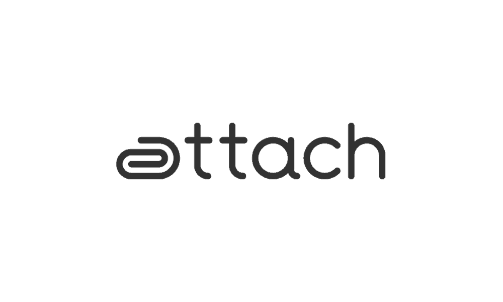
Such as this logo concept by Paulius Kairevicius called ?Attach? smartly combines the idea of a paper pin that connects to the name of the logo but in a highly minimalistic manner.
8 ? Make use of symbolism for a cause
Both colour and aspects of symbolism can be used in a minimal logo.
However, to make sure it does not look too obscure, you can incorporate symbolic elements to it but for a cause.
It does not imply that symbolism can only be a choice made for different causes, but it is one way to utilise it.
Logos for mental wellbeing tend to have light and pastel colours to be easy on the eyes.
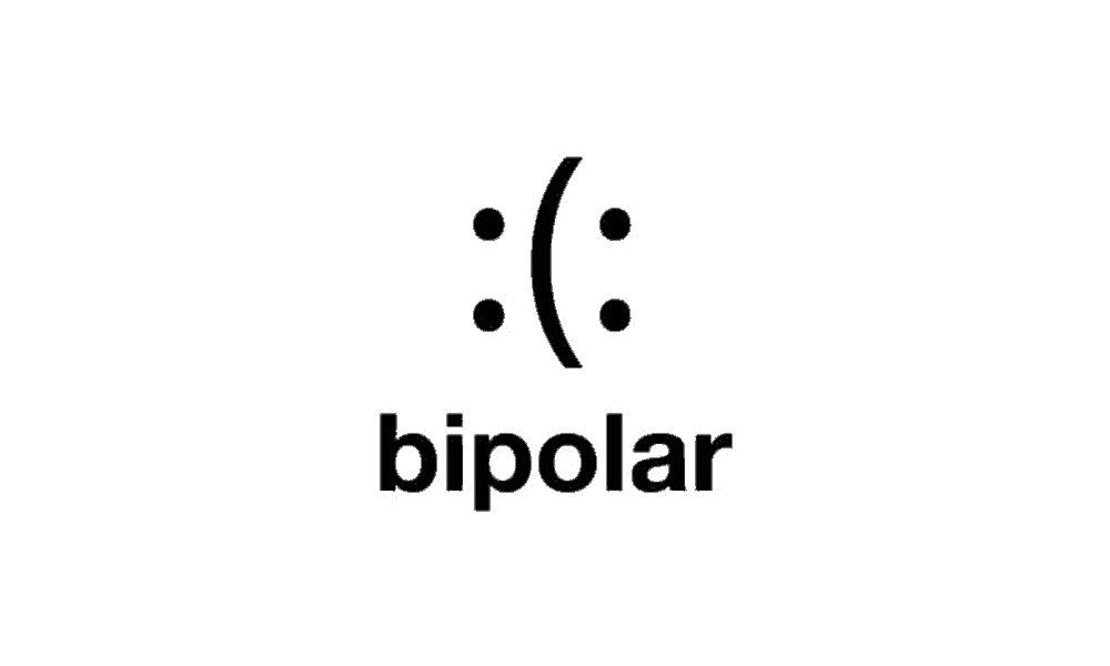
Siah Design has made one such logo for a similar cause, and it is named ?Bipolar.
The logo has been carefully crafted to display ambiguous reactions and emotions that those with the bipolar disease tend to exhibit.
The logo is both smart, unique and targets a sound cause altogether.
9 ? Bring scalability into the design
Using the concepts of minimalism, you can always highlight what you want your viewers to lay their eyes on first.
This is easier to add into a book or a set of branding stationery, but you would need to be very careful when doing so in a logo.
Look for all the possible ways your logo can be scaled into an adaptive design for numerous digital and offline publications.
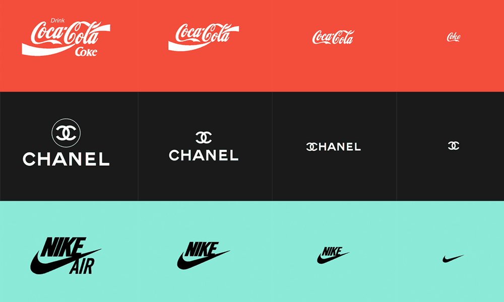
This set of fully scalable and responsive logos of famous brands by responsivelogos.co.uk displays how a single logo can be adapted into different forms only by reducing the size.
However, the logos still kept the elements that make each of them recognisable and renowned.
10 ? Make small yet effective changes
Even if you only use a typographic font for your logo and not add anything else, it is still going to exhibit its unique appeal.
However, if you do not want to stick to plain typography, then you can make intricate changes to the design.
Such changes might look trivial but possess the power to change a logo?s aesthetics completely.
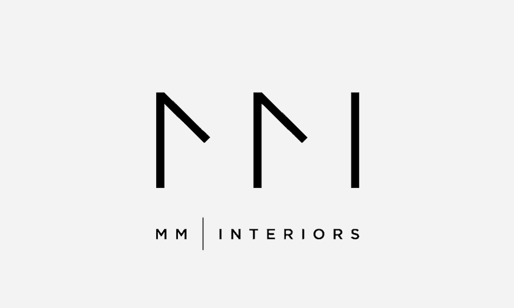
This logo concept by Dimitar Petrov can be a prime example of this idea.
The typeface has been cut from the sides of both the two M?s to make it look sleek and smart.
The alignment is also very symmetrical with only small adjustments in the letters.
The Verdict
Minimalism is not only an option that you can select for your logo design; instead, it is a concept that stems from the idea of making logos memorable, unique and adaptable with logo venture.
It is an influential trend that might never go out of style.
The creation of a minimal logo surely does look simple, but it takes one much practice to perfect it.
If you already have a logo and all it needs are a few tweaks, look into how you can make your logo scalable and simple.
Just remove all the elements that prove to be extra for you and surely, the results you will get are going to be worth it.
Author Bio: Zeeshan Hussain Bhatti is a Digital strategist & Tech Geek, He?s always exploring new skills with different platforms in writing and marketing industry.
Originally published at https://inkbotdesign.com on June 4, 2019.
