 Tesla, SpaceX and The Boring Company logos.
Based on my review of Elon Musk?s brands and the academic literature related to branding and my expertise, I?m convinced that logo needs to be simple, memorable and appropriate in order to work.
Just by looking at the logos above, you can tell that they?re hypnotizing, they all have something that makes them special.
They?re simple, yet all of them capture the essence of the company.
And they do so in the simplest, most appropriate way that makes them just burn into your mind in an instant and create meaningful associations.
 Elon Musk
For those who don?t know: Elon Musk is a visionary, inventor and CEO of the following (among others) companies:
- Tesla, self-driving, electric cars.
- SpaceX, with the mission to conquer Mars.
- The Boring Company, that is trying to build a hole under LA
Tesla builds fancy sports cars.
SpaceX currently offers its services to governments and the rich.
The Boring Company aims to change how thousands, if not millions, of people commute on a day-to-day basis.
So let?s look closer into the visual aspects of this logos.
Tesla
An automaker?s logo can and perhaps should be as recognizable as its cars, if not more. A logo is something that can hold everything.
That makes logo design a very important task.
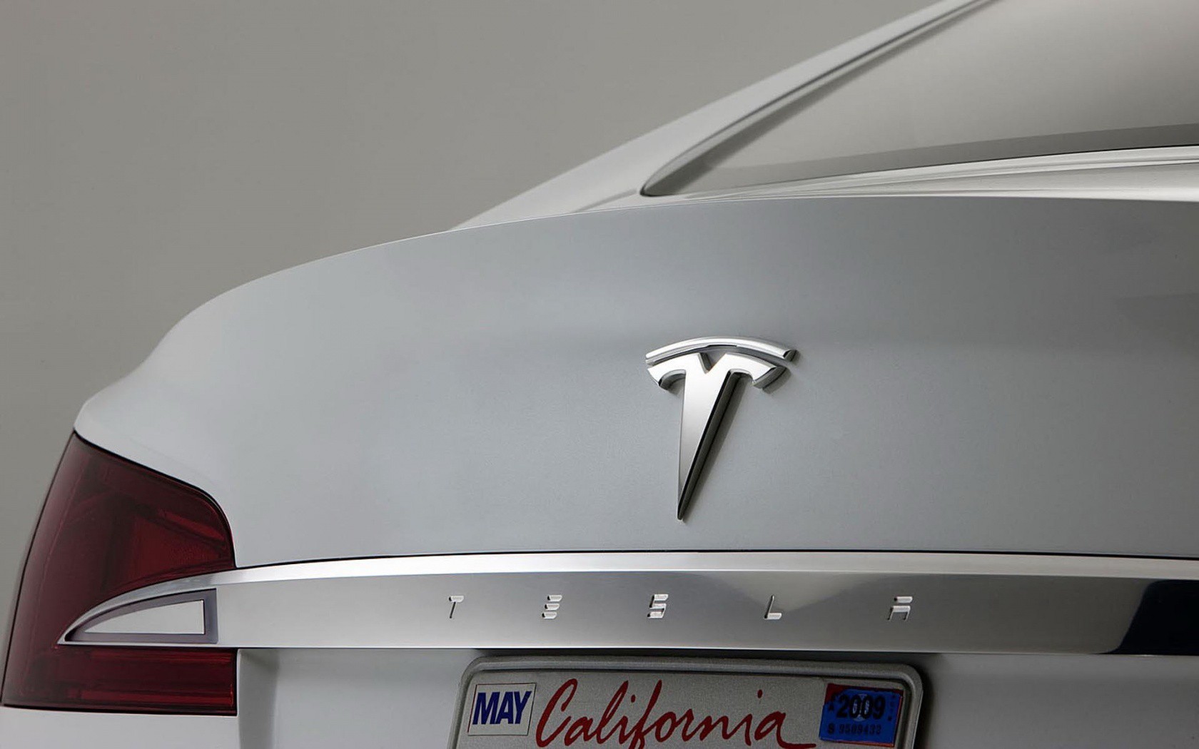 Tesla logo on car
Tesla?s logo is certainly not anonymous, but it turns out there?s more to it than may be immediately apparent.
What looks like a fancy T is actually a reference to the company?s products, Tesla CEO Elon Musk said in a recent tweet:
the T is like a cross section of an electric motor.
Musk seemed to be referring to the main body of the ?T? as representing one of the poles that stick out of a motor?s rotor, with the second line on top representing a section of the stator.
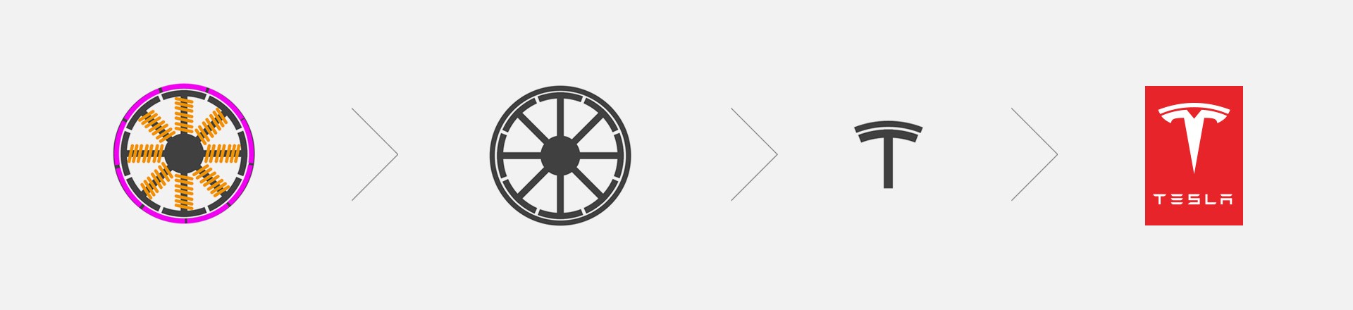 Tesla logo explained
Logo is the compression of meaning into just a few memorable marks.
Electric motor was first designed by the company?s namesake, physicist and inventor Nikola Tesla.
The name itself is set in a very modern and futuristic-looking typeface that adds to dynamism and precision.
 Tesla logo construction
It goes well with the stylized T. Very similar if not the same typography is being used in the next logo I want to talk about ? SpaceX.
SpaceX
The name is an abbreviation of Space Exploration Technologies and it takes on a similar approach as the Tesla logo, not only in terms of typography but also by stylizing one of it?s letters.
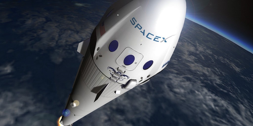 SpaceX logo on rocket
However, in this case not the first ? but the last letter is stylized, which seems to be perfect for the job.
The X is like a rocket trajectory.
One of the diagonal strokes forming the X letter resembles the trajectory of a rocket launched into space. As simple as it can be.
This typographic treatment is 100% accurate and it seems that it couldn?t be done any differently.
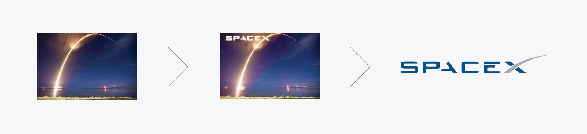 SpaceX logo explained
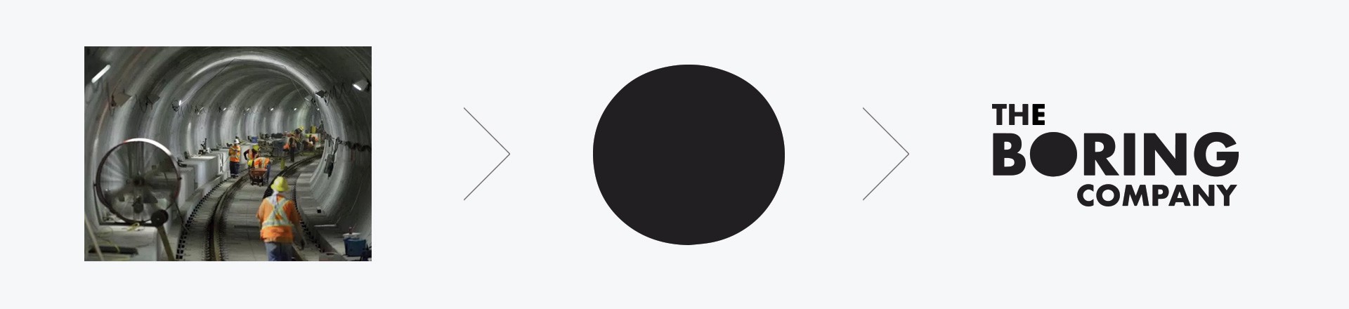
Comparing to those of Tesla and SpaceX, the logo of Musk?s third major venture is relatively straightforward.
The Boring Company
The name itself takes on a playful approach. The word boring ? meaning digging a whole, rather than being boring of course.
On the contrary, the company doesn?t seem to be boring at all with it?s mission to build an underground net of tunnels in order to alleviate congestion.
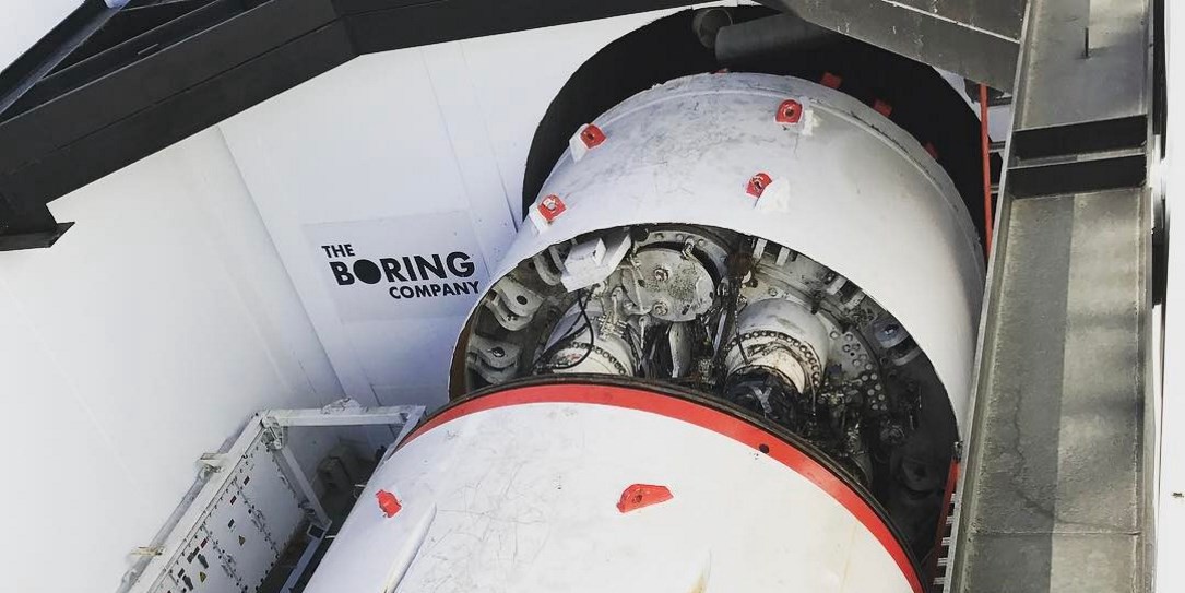 The Boring Company ? digging machinery
Fully enclosed space within the O letter skillfully symbolizes the cross section of a tunnel.
Aligning the words ?the? to the left and ?company? to the right of the prominent ?boring? makes it much more interesting. And most of all, it makes the logotype work.
 The Boring Company logo explained.
After all, what would be simpler and more appropriate than a hole in the logo for a company that digs holes?
The hole is like a tunnel.
Simple solutions often works best. But achieving simplicity is not necessary simple. Actually it requires designers to test and tweak many concepts, go through many revision until the results are satisfactory.
Read more about the Logo Design Process on my blog.
A logo cannot survive unless it is designed with the utmost simplicity and restraint.
This logo presents a true minimalistic approach in the purest of its forms.
 The Boring Company logo ? minimalistic approach.
A logo is a distillation of something big and complex into something simple and unique. A logo needs to be simple, memorable and appropriate in order to work for a company, service or product.
And obviously each of these three logos ? just got it right.
The logos of Tesla, SpaceX and The Boring Company were designed with remarkable simplicity and accuracy. It enables people to remember them in an instant and create desirable associations.
If you enjoyed reading this article ? like it, comment and share.

