Founded in 1971 in Seattle, Starbucks has undergone some of the most well-known brand redesigns in history. Selling some of the most popular and beloved coffee in the world can put tremendous pressure on a brand to maintain a certain image. Their logo, presence, and branding have met the challenges well and helped create one of the most recognizable brands in the world.
Starbucks has a nautical theme running throughout its name, branding, and logo that helps capture the spirit of its story. It is named after Starbuck, the first mate in Moby Dick. The founders originally intended on naming the coffeehouse ?Pequod?, after Ahab?s whaleship. Can you imagine a Pequod on every street corner or picking up the Pequod house blend every morning? Doesn?t have quite the same ring to it.
At the brand?s core is the Starbucks siren. The bare-breasted, two-tailed mermaid, or siren, is intended to be as seductive as the coffee itself. It is based on an old sixteenth-century Norse woodcut.
The Challenges Faced
As the world?s largest roaster and retailer of specialty coffee, Starbucks has an impressive internal Global Creative team that worked with Lippincott to create the brand and brand redesigns we all know and love today.
According to the Lippincott case study, ?Starbucks wanted the new logo and visual identity system to say as much about its future as it did about its past. Past the logo, they wanted a program that afforded them the freedom and flexibility to explore new product, regional and experience opportunities, while keeping them in step with their current and future customers.?
One of the ongoing challenges faced by the creative team includes finding a design and branding that will appeal to people worldwide. Operating in more than 55 countries, the international coffeehouse has a very broad clientele they need to appeal to.
How the Logo and Packaging Have Evolved
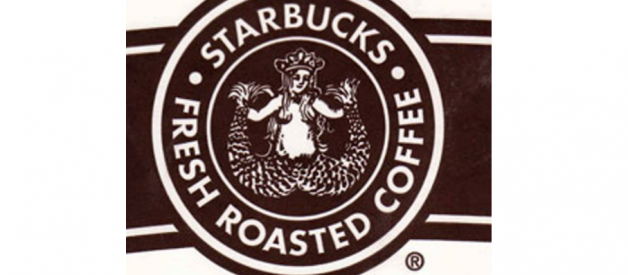
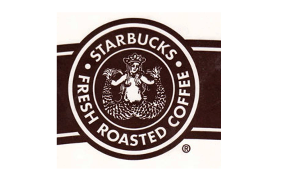
In 1971, Starbucks began selling coffee beans in Seattle?s Pike Place Market. The original black and white logo focused on the mermaid and the fact that Starbucks sells more than coffee.
In 1986, Howard Schultz tried convincing Starbucks to add espresso drinks to the menu. They denied his idea, so he started his own company, called Il Giornale. Their original logo still serves as inspiration in Starbucks? logo today.

In 1987, the original owners of Starbucks decided to sell and Schultz took the opportunity while he had the chance. He purchased Starbucks for $3.8 million and transformed it into his ideal image, what he had just begun at Il Giornale. With the addition of handcrafted espresso beverages and melding of the two companies, Starbucks unveiled a cleaner, crisper image. This updated logo and brand redesign more clearly resembles the original Il Giornale logo. The Starbucks siren remained, but was cleaned up, made more contemporary, and featured in front of a black background, allowing it to jump to the forefront. The color scheme was also changed from brown to something closer to Il Giornale?s green. The name also changed from ?Starbucks Coffee, Tea, and Spices? to ?Starbucks Coffee?.
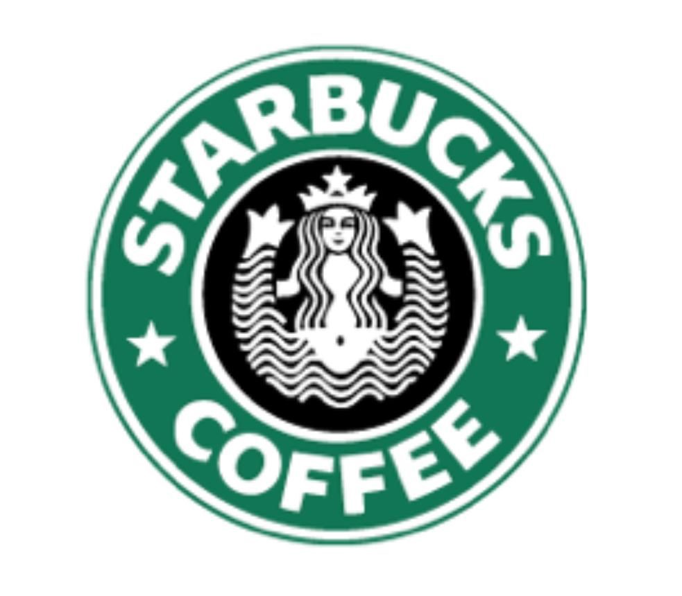
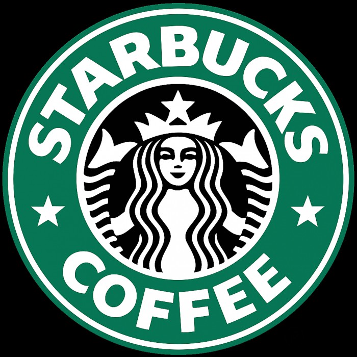
In 1992, Starbucks decided to change the black outer strip of their logo to a green one, which began the change to a purely green color scheme. green is most commonly associated with growth and peace which emphasizes Starbuck?s mission statement to ?inspire and nurture the human spirit.? At this time, the text, font, and logo were also drastically changed. The mermaid was updated, cropped, and repositioned so that only above the navel is displayed.
In 2008, Starbucks attempted to take a leap into the future, but instead, fell further into the past. They inexplicably attempted to reimagine the original 1971 logo, possibly to appeal to the new hipster movement. The rebrand attempt failed with both designers and the public at large. The green logo, cups, and branding had become so familiar to the public that attempting a large, significant change like this was doomed from the start.

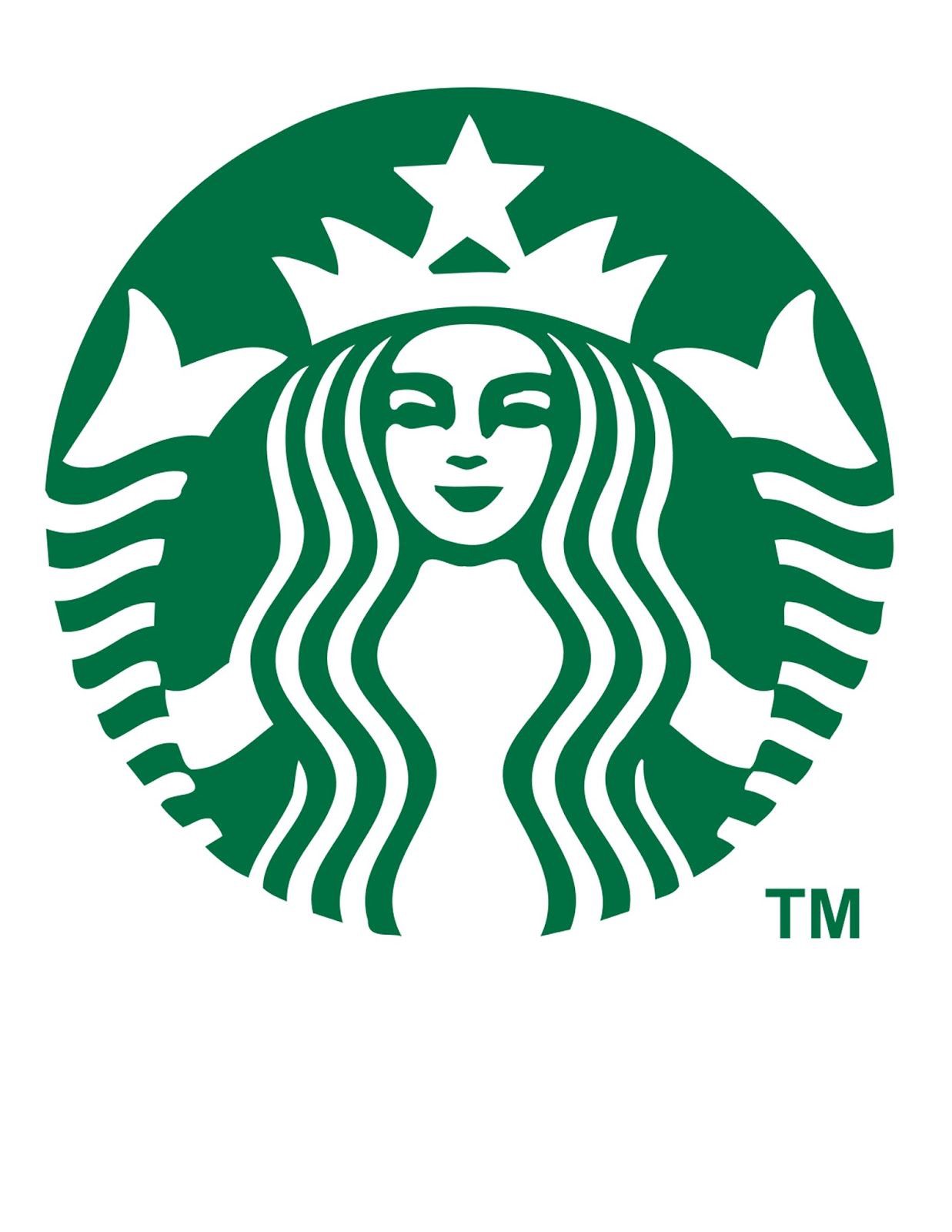
In 2011, Starbucks introduced a new identity, branding, and logo, going back to their original green success. Now, the outer strip has been removed completely and there is no mention of ?Starbucks? anywhere on the cup. This was an incredibly gutsy attempt, especially after the 2008 rebrand flop.The new logo and packaging focuses instead on the Starbucks siren, bright green color palette, and playing with the size and location of the logo. For instance, the bags and merchandise often feature off-center application of the logo to mix up the otherwise clean, crisp packaging.
Today, the coffeehouse offers much more than just coffee. Their teas, handcrafted beverages, ice creams, fresh food, packaged goods, consumer products, and merchandise have amassed a multi-billion dollar empire.
Over the years, Starbucks has continually refreshed their logos and packaging design without losing their core image. The green color scheme, Starbucks siren, and branding have also carried over to their stores, website, online branding, gifts, and all other packaging.
