Or, ?How I Learned to Stop Worrying and Love Leading?
At some point, everybody has to format a document. And lawyers do this more than most people. And yet, very basic concepts about document formatting are poorly understood, and Microsoft doesn?t do anybody any favors by making it easier. In my opinion, the first step in learning how to efficiently create nicer-looking documents is to understand exactly what you?re doing. So, for anyone who has ever wondered, here?s a short primer on font size and line spacing.
Point Size
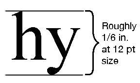
If you type documents in Word for a living, you probably use 12-point Times New Roman. What does that mean? One point is 1/72 of an inch. Thus, a 12-point font is 1/6 of an inch high, as measured from the lowest descender (the tails on letters such as g, j, and y) to the highest ascender (the top parts of letters such as b, d, and h).
But even this is a bit simplified. In reality, a ?12-point? font is what looks good with other ?12-point fonts.? Here are two letters, in Times New Roman and in Courier New, at the same font size (e.g., 12 pt), with line next to them that is exactly that length (e.g., 1/6 inch).
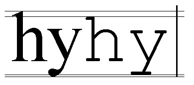
As you can see, the two fonts are not the same size, and neither one is a full 12-points high. ?12-point? Times New Roman really takes up about 11 points of vertical space, and ?12-point? Courier New really takes up about 10 point of vertical space. Nonetheless, they are both called ?12-point? fonts, and that is important for how Word treats them.
Leading
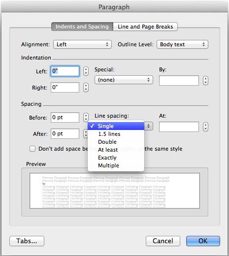
Leading (rhymes with ?wedding?) is the distance from one line of text to the next line; its name reflects the fact that typographers used to alter the line spacing by putting strips of lead between lines. Today, it?s found as the ?line spacing? option in the ?Paragraph? formatting menu of Word:
The most common line spacings used are ?Single? spacing and ?Double? spacing. But even these are misnomers. Time for a brief (but important!) history lessson.
<history> Back in the old days of typewriters, line spacing was always 6 lines per inch (12 points per line). This was a mechanical feature of the type writer; it could not be changed. Your only real options for line spacing were to type single-spaced with 12 points per line, or to insert a carriage return between line to double-space the text at 24 points per line.
Double-spacing ? 24 points per line or 3 lines per inch ? became the norm in much writing, in particular legal writing. On a standard letter-sized page, one left a one-inch top margin and a half-inch bottom margin, leaving 9.5 inches of usable space. At 3 lines per inch, this left room for 28 lines per page. Old legal pleadings (and legal pleadings in jurisdictions that require pleading paper) thus have 28 numbered lines per page.
But, the simple days are behind us. In Word, Times New Roman actually has about 2 points of extra white space built in. So, single spacing for a 12-point font is actually 14 points per line, and double spacing is 28 points per line. Combine that with standard word processor margins of one inch (top and bottom), and you?re left with 23 lines per page. Even today, there is some confusion in the legal industry about whether ?double-spaced? means 28 lines per page or 23 lines per page. </history>
The Important Part: Multiple vs. Exactly
Enough with the history lesson. The important part about line spacing is knowing how to edit it.
When you go into the Paragraph formatting panel in Word, there are six settings: Single, 1.5 lines, Double, At least, Exactly, and Multiple. Single, 1.5 lines, Double, and Multiple are all straightforward: the line spacing is 14 points, 21 points, 28 points, or 14x points per line.
Where possible, never use the ?Exactly? or ?At Least? settings.
The ?Exactly? setting seems like it should be straightforward. If you want 2 points of space between each line of 12-point text, set ?Exactly? to 14 points. (I am ignoring the ?at least? setting, for now.) Easy enough, right?
Wrong.
This being Microsoft Word, it has to go and complicate things. Here are two text samples. The first is set to ?1.5 lines? (which is 21 points per line). The other is set to ?Exactly? 21. See if you can spot the difference:
Yes, Microsoft in its infinite wisdom has different algorithms for how it spaces a given number of points per line, depending on whether you select ?Exactly? or ?Multiple.?
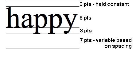
In a ?multiple? setting (Single, Double, etc.), all of the variation in white space occurs underneath the text:
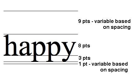
In the ?exactly? setting, Word adds space below and above the text, in a 20/80 ratio.
This is annoying for several reasons. The ?exactly? setting adds most of the white space above the text, and I find it much easier to format a document effectively when the variations in white space are below the text. Particularly when you are dealing with multiple styles (headers, body text, block quotes, etc.), these features make ?exactly? spaced text difficult to work with.
The math involved also means that at any ?exactly? setting less than 15, Word is going to ?clip? the bottom of the descenders.
This clipping only changes how the text appears in Word ? i.e. it should print to PDF or paper correctly ? but it is annoying nonetheless.

