
Last updated on January 21, 2019.
Pure CSS off-canvas hamburger menus aren?t a recent discovery. After all, Chris Coyier wrote about this technique back in November of 2012.
- If this is an old trick for you, then hang with me for a bit. I?ve improved upon Chris?s example, and would love your feedback.
- If this is new to you, don?t worry. You have plenty of company, as it seems much of the web hasn?t actually caught on yet.
With that, we?re going to build a simple, responsive off-canvas hamburger menu using only CSS that will be easy to incorporate into your own project. But first?
What?s wrong with JavaScript?
Nothing.
Aaron Gustafson explains the importance of Progressive Enhancements and JavaScript?s role in web development better than I ever could. You should read his post. But for the sake of brevity, I?ll try to sum it up:
- ?Core tasks can always be achieved without JavaScript.?
- Core tasks should be done on the most stable layer (i.e. not JavaScript).
- Progressive Enhancements is not anti-JavaScript. It is just about embracing the right technologies on the right layer.
- ?Because there is some chance JavaScript won?t run, we must always account for that chance.?
- It?s never a good idea to ignore potential users.
- Progressive Enhancements is just good engineering.
So, we?re going to do as much as we can with HTML and CSS. Then have JavaScript do its magic on a more appropriate layer ? improving the already existing UI.
Step 1: HTML
As you may know, the first step is always writing a solid, well-thought-out, base-layer of HTML.
Note: I?m using Font Awesome for the icons in my example.
Step 1: Initial HTML for a pure CSS responsive hamburger menu
Looks rather standard, right? We have:
- Our parent <header> element
- The hamburger (?fa-bars?) icon
- A main heading (or potentially a logo)
- The navigation in a <nav> element
- A close icon (?fa-close?) inside the navigation (more on this later)
- A ?backdrop? after the navigation. Why is it an anchor tag? I?ll explain later.
Step 2: Let?s make it more accessible
Accessibility should never be an after thought ? like after you?ve written your application. It should be planned from the beginning. Adding a few basic considerations now will not only improve the overall accessibility of your site, but it will provide you (the developer) with better markup to utilize in your JavaScript!
With that, we?re going to add a few more attributes and some screen-reader-only text:
Step 2: Improving the HTML to be more accessible.
Here?s quick breakdown off all these attributes and how they function:
- We?ve added unique IDs for targeting our HREFs (more on how this works later).
- We?ve provided an informative label of the buttons for screen readers using [aria-label].
- We?ve hidden the icons from screen readers with [aria-hidden=?true?], because they?re visual representations, and added screen-reader-only text with the <span class=?sr-only?> elements.
- We?ve taken the ?backdrop? out of the tabbing index with a [tabindex=?-1?]. It?s purely visual in nature and we don?t want to confuse our visually impaired and keyboard-only users.
- We?ve added the amazing [hidden] attribute to set the initial (and semantic) state of the ?backdrop?. No more [class=?hidden?] garbage ? how exciting!
Here?s the result so far:
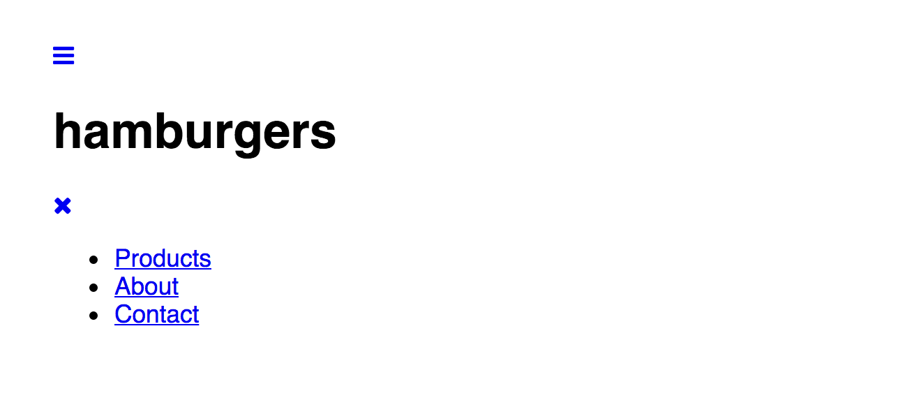 Figure 1: Resulting display of the HTML after steps 1 and 2.
Step 3: Let?s style it!
We?re going to approach this mobile-first, so let?s knock out the mobile, ?hamburger-y? view (the interesting part).
First, we?re going to just get the layout of the header right (without the interactivity):
Step 3: Add some CSS to style the header (without interactivity, for now).
The result:
 Figure 2: Resulting display of the HTML & CSS after step 3.
Step 4: Interactivity with pure CSS
When making widgets interactive with CSS, you have a couple options:
- Use radios or checkboxes
- Use the :target pseudo-class.
Radios and checkboxes work amazingly well for most widgets, like tabs, modals, dropdowns and accordions. Chris Coyier dubbed this technique ?the checkbox hack.? Several developers have used this ?hack? for their off-canvas menus, like in Paul Lewis?s tutorial for Chrome Dev Summit or Luis Manuel?s morphing hamburger menu.
However, the :target pseudo-class is more semantic in this use case, since we?re directly dealing with navigation. You might disagree, and that?s completely ok! It would be incredibly easy and perfectly acceptable to swap out the :target pseudo-class for a checkbox.
Either technique has its caveats, though.
Using a checkbox:
- Requires JavaScript to close the off-canvas menu if one of the links within the menu was an anchor link to a specific section of the same page.
- Requires the <input> field to be a sibling of the menu or at least a sibling of the menu?s ancestor. In other words, the CSS is a bit trickier. You can have the <label> (even multiple labels) elsewhere, though.
- The <label> element will not be directly focusable or tab-able, requiring some slightly trickier CSS for handling the focus on the checkbox while changing the visible appearance of the <label>.
- The keyboard navigation around opening/closing the menu will be wonky. Affecting a state change on a checkbox is done through the [spacebar] not the [return] key. While blind users may understand that the widget is operated by a checkbox, sighted keyboard users will be confused since the checkbox is not apparent ? something I felt was a deal breaker in this use case.
Using the :target pseudo-class:
- Adds the opening/closing of the off-canvas menu to the browser history (pushing the hash into the address bar). It will require JavaScript to run Event.preventDefault() to avoid this (and the potentially annoying jumping to the top of the page).
And there may be other caveats I missed. Either way, choosing which technique is both a matter of preference and subject to your project?s requirements. Anyway, I?ve digressed?
Here?s the interactive part of the CSS:
Step 4: Add some CSS for the interactivity.
The result when clicked:
 Figure 3: Resulting display of the hamburger menu when it?s opened.
How all this works
Essentially, the :target pseudo-class gives us a new ?state? for styling the targeted navigation. When main-menu has been targeted (with its hash added to the URL) we can now slide out the menu. It?s a bit like a :focus pseudo-class for the targeted element (not the link itself).
We?ve also allowed the ?backdrop? to display when the navigation is targeted.
You?ll notice that the main hamburger icon is linked to the ID of the navigation, while both the close icon and the backdrop buttons are linked to the main hamburger icon. This allows us to click the close icon or the backdrop to remove the ?focus? ? or really :target ? from the navigation. If the backdrop wasn?t a link, it wouldn?t be clickable without JavaScript.
I?ve also chained the :target selectors along with the [aria-expanded=?true?] attribute in the CSS. This will eventually be where we progressively enhance the hamburger menu with JavaScript to not jump to the header when clicked ? avoiding the caveat I mentioned earlier. Having the JavaScript hijack the browser?s hash behavior means that the :target pseudo-class will no longer work. When this happens, we?ll take advantage of the [aria-expanded] attribute to style the toggling with true/false values much like we might have in the past with classes.
In the meantime, though, this works beautifully without JavaScript.
I?ve added the @supports media query to provide the preferred position:fixed CSS to browsers (both mobile and desktop) that support it. Otherwise, lame browsers and devices ? I?m looking at you iOS ? will get position:absolute.
Step 5: Larger screen styles
Since we don?t want the hamburger menu to display for non-mobile devices (or larger screens in general), we?ll add the necessary media query for that. Then we?ll style it to look like a horizontal navigation:
Step 5: CSS for styling the navigation on larger screens.
The result:
 Figure 4: Resulting display of the navigation styled for larger screens.
Voila! We?re done!
Putting it altogether
Here?s the final HTML:
Final HTML for the responsive hamburger menu using only CSS.
Here?s the final CSS:
Final CSS for the responsive hamburger menu.
Demo
Try out my CodePen for yourself: ? Pure CSS Hamburger Menu without JavaScript.
Note: you can demo the checkbox version of the menu too.
Want to add JavaScript to make it slicker?
While we can make the off-canvas menu function entirely with CSS ? improving its performance and reliability ? we will still need JavaScript to assist in some way to improve the interactivity surrounding either technique?s downfalls. You can also utilize JavaScript to prevent scrolling on the page while the menu is open.
It is also worth noting that a decent level (and arguably the most important level) of accessibility can be achieved without JavaScript. However, it is difficult to provide a robust level of accessibility without JavaScript?s ability to manipulate the DOM (e.g. focus management, ARIA attribute updates, etc.).
For more information on improving your website?s accessibility through JavaScript, checkout the following articles:
- Using ARIA attributes for JavaScript state setting & styling
- Writing JavaScript with accessibility in mind
Have other thoughts or suggestions?
I?d love to hear your comments with my approach to a pure CSS hamburger menu.
Edits and later ruminations
January 21, 2019: Edited article and updated code examples to remove unnecessary ARIA attributes and improve accessibility.
As I?ve learned more about using ARIA and developing & testing for accessibility in general, I?ve realized a few things:
- JavaScript definitely has its place, and should be part of any robust accessibility UI pattern.
- Except for ARIA landmarks, JavaScript is required for using ARIA properly. And, many of the attributes I?ve used, like [aria-expanded] are better left for JavaScript to add once loaded instead of adding it directly in the markup. This concept follows good Progressive Enhancement practices?ARIA states and properties along with JavaScript are an upgrade and should be handled on a separate layer.
- Previously, I didn?t handle the focus properly as focus would disappear as it progressed through the visually hidden links (when collapsed). I added a display: none; to the menu CSS to fix this.
So, if you?ve implemented a previous version of my Pure CSS Off-Canvas Hamburger Menu, please consider updating it to this simpler and more accessible version!
Reviews/critiques, comments and questions are always welcome.
