Steve Harvey had the misfortune of being a victim of terrible design on live television in front of (probably) 50 million viewers (I didn?t take the time to Google it). Due to the very, very poor design of the Miss Universe 2015 show finals announcement card, Steve crowned the wrong winner of the Miss Universe title.
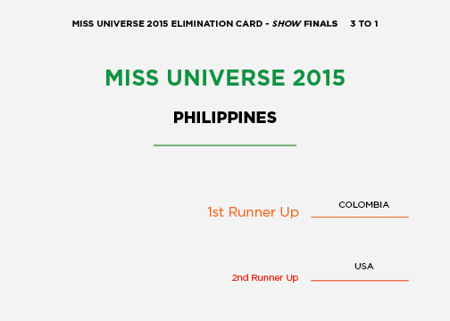
Let?s have a look at why the super awkward situation wasn?t entirely his fault. This is a screenshot of the card Steve was given to announce the winner.
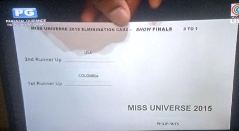
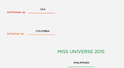
Would you just look at it? Terrible. So many things went wrong here. Applying just a few basic design principles could have prevented this whole debacle; starting with color.
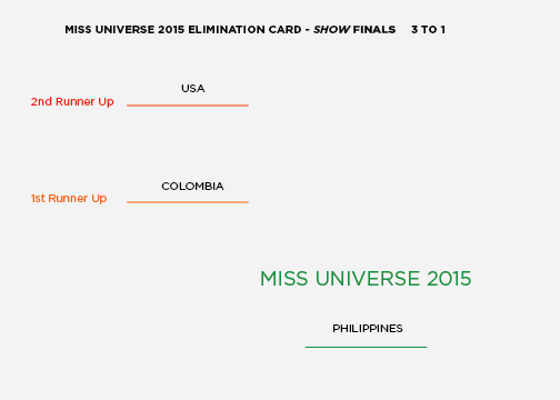
Color
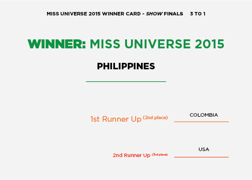
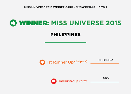
By simply changing the ?losers? to red, and the ?winner? to green, Steve would have easily seen which beautiful lady won the title (assuming he isn?t red/green colorblind). It looks as though the country names are stickers placed on the cards, so we didn?t change the color of those.
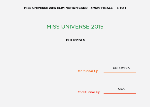
Positioning
How about that positioning though? Why on earth would the designer put the most important name/title at the bottom of the card? Perhaps that?s how the judges? scorecards appear; I don?t know. Regardless, the designer needs to keep the user in mind. In this case, the user is our friend Steve Harvey and the positioning needs to address his needs and knowledge. Let?s go ahead and fix that too.
Hierarchy
There isn?t much hierarchy to the card either. Some minor tweaks and printing two sets of stickers ? one large and one small (I?m sure they can afford it) ? would have drastically reduced Steve?s likelihood of messing it up.
Language
The wording of the whole thing is pretty confusing isn?t it? At least to those of us who aren?t totally entrenched in the pageant world. It?d probably be helpful to put additional context to the titles.
Flair
Finally, we all know reading is hard, especially when there?s a lot of pressure to get it right. So, let?s throw a couple icons on there to make it impossible for poor Steve Harvey to embarrass himself.
We?d like to thank Steve Harvey and the Miss America Pageant for giving us this opportunity to share some of our design knowledge with our friends and family. Without them, we wouldn?t be writing this post. God bless you, and feel free to use these tips when designing next year?s announcement cards.
Header Image Copyright 2015 by The Associated Press. All Rights Reserved.

