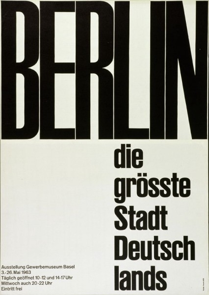
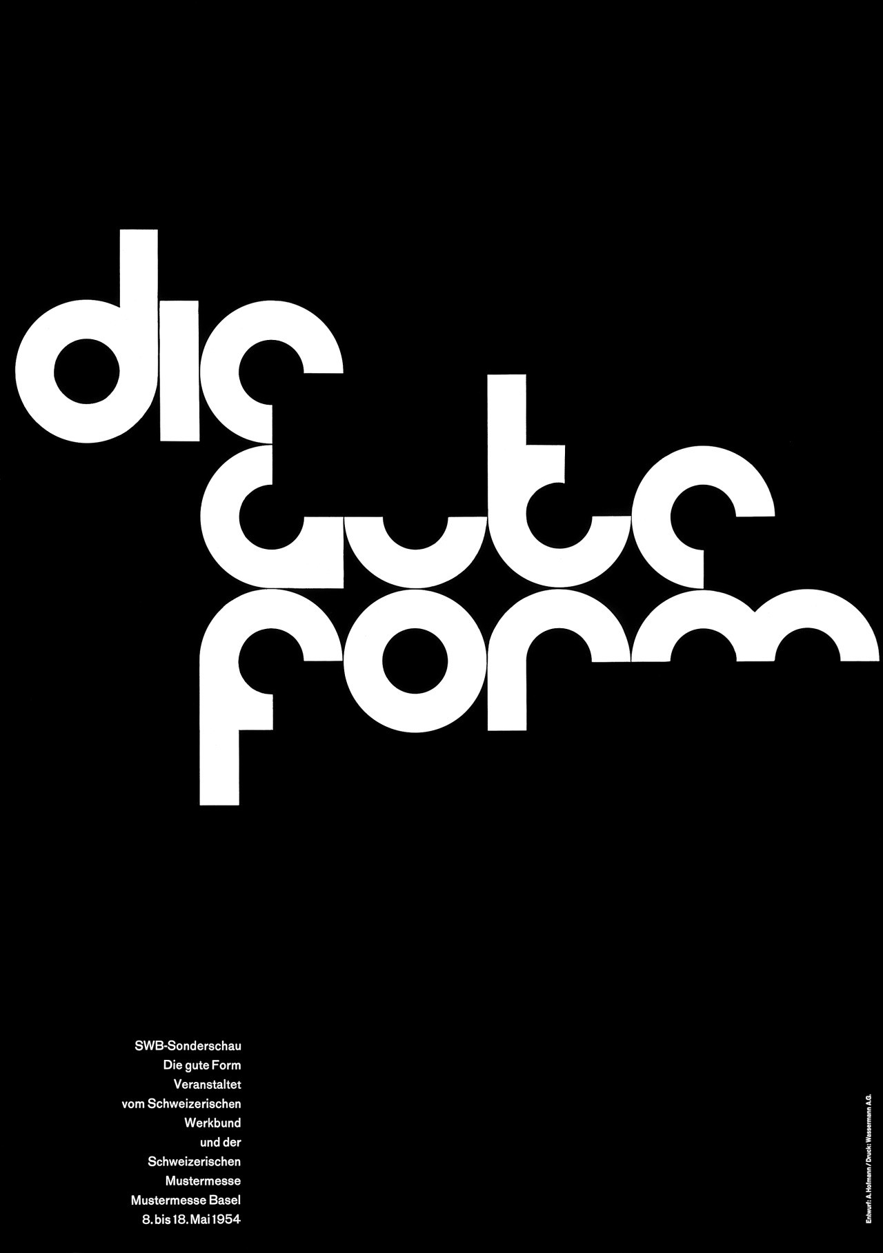
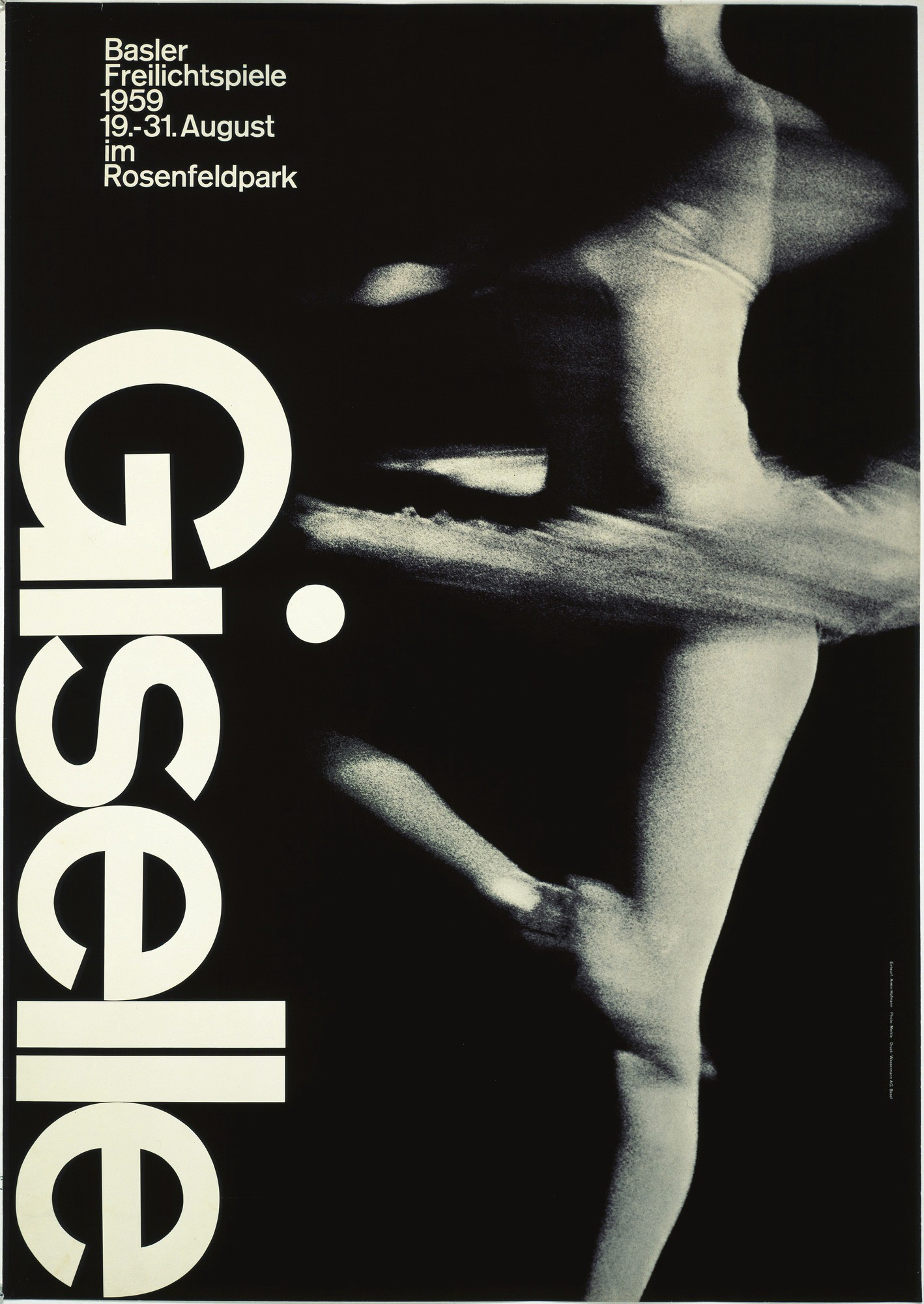
The ?International Typographic Style? also know as the ?Swiss Style? is a graphic design style developed in Switzerland, Europe in the 1950s that values and focuses on cleanliness, readability and objectivity.
Typical features of the style are asymmetric layouts, use of a sans-serif typefaces and flush left, ragged right text. Many of the early International Typographic Style works featured ?Typography? as a primary design element, which means they focused more on typography because it?s the root of communication and then pictures and other design elements comes as a secondary design elements and this is the reason the title ?International Typographic Style? has the word ?Typography? with it.
This blog manifests the key events and people that helped in the development of this International Typographic Style.
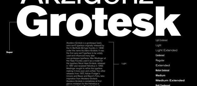
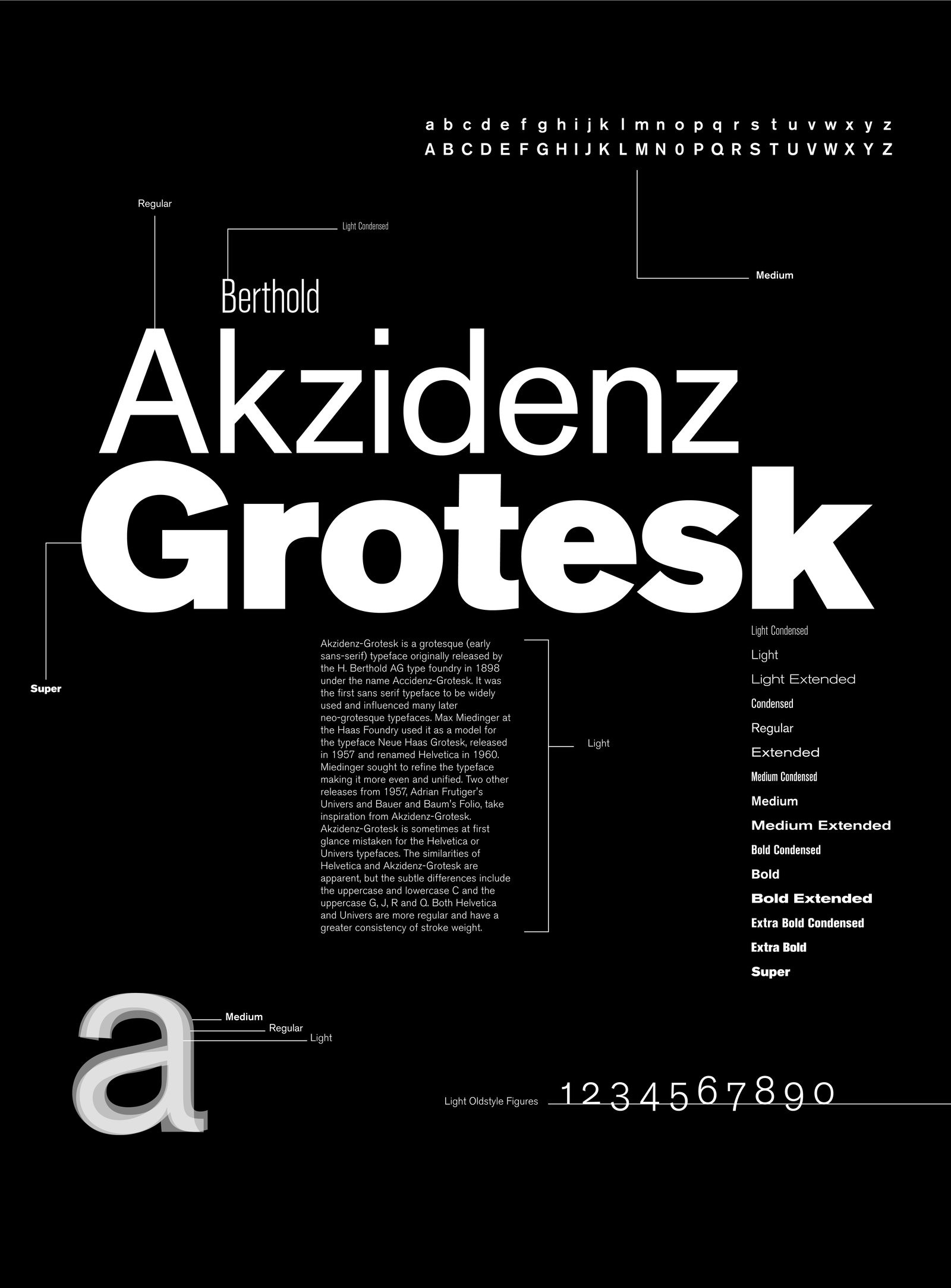
1. Akzidenz Grotesk, The Typeface (1896)
A short video of History of the typeface ? Akzidenz Grotesk Source: Youtube
Akzidenz-Grotesk is a sans-serif typeface (the typefaces which do not use serifs, which means that these typefaces does not have tails on the end of their characters) originally released by the H. Berthold AG type foundry in 1896 under the title Akzidenz-Grotesk. It was the first sans-serif typeface to be widely used and influenced many later Neo-Grotesque typefaces.
Akzidenz means a ?commercial? typeface for trade printing such as publicity, tickets and forms, as opposed to typefaces intended for decorative or book use.
The typeface is one of the major events which helped in development of International Typographic Style because Max Miedinger at the Haas Foundry used it as a example to follow for another typeface ?Neue Haas Grotesk? released in 1957 which was renamed as ?Helvetica? in 1960, and it was a huge success. Miedinger sought to refine the typeface by making it more even, unified an neutral. There were Two other releases from 1957, Adrian Frutiger?s Univers & Bauer and Baum?s Folio, which took the inspiration from Akzidenz-Grotesk.
 Akzidenz-Grotesk Poster Source: Google Images
2. De Stijl, The Movement(1917?1931)
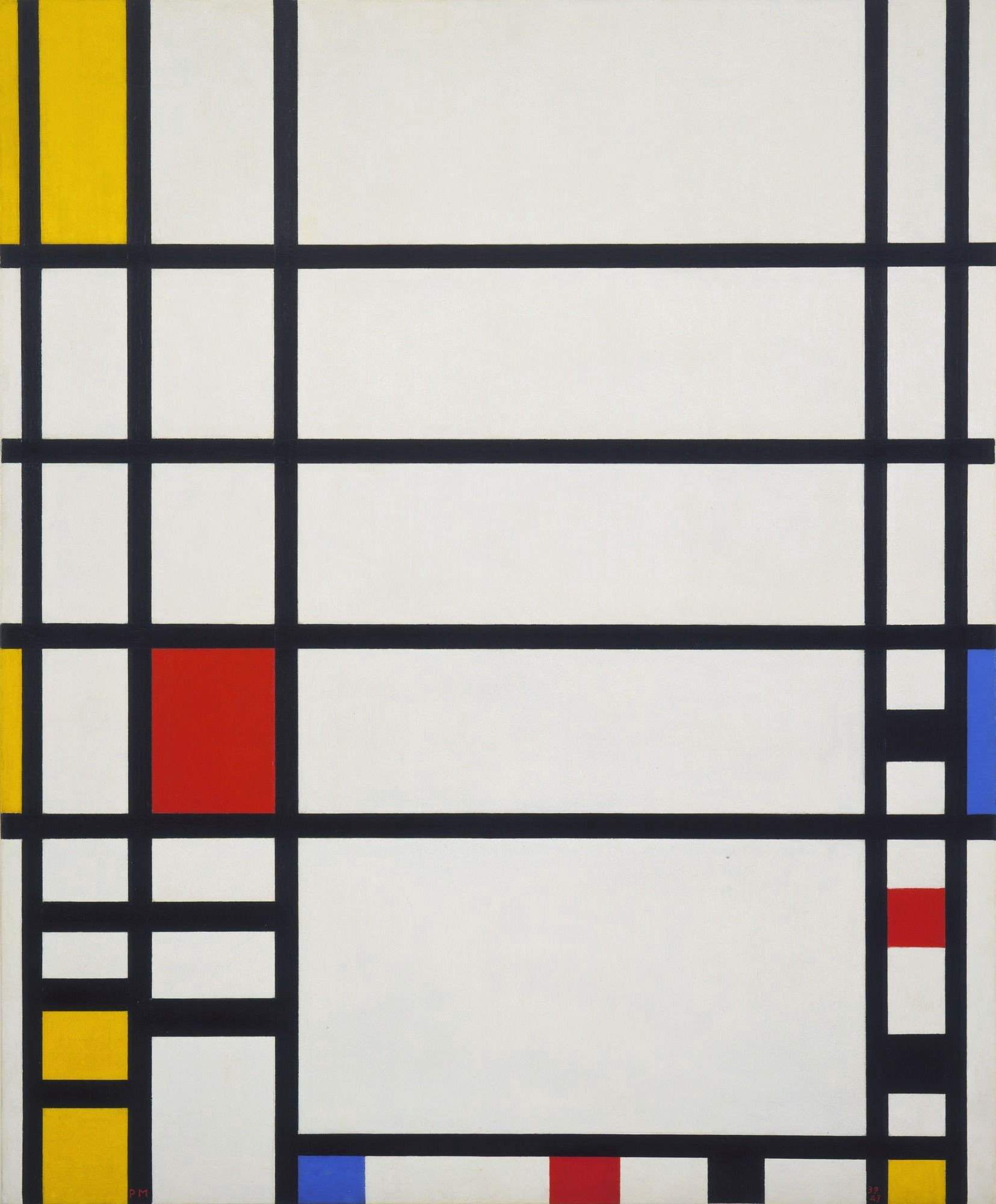 Piet Mondrian ?Trafalgar Square? Source: Google Images
De Stijl also known as neoplasticism (a style of abstract painting developed by Piet Mondrian, using only vertical and horizontal lines and rectangular shapes in black, white, grey, and primary colours.) was a Dutch artistic movement founded in 1917 in Leiden. The term De Stijl is used to refer to a body of work from 1917 to 1931 founded in the Netherlands
Proponents of De Stijl sought to express a new Utopian (aiming for a state in which everything is perfect) ideal of spiritual harmony and order.
They advocated pure abstraction and universality by a reduction to the essentials of form and colour, they simplified visual compositions to the vertical and horizontal directions, and used only primary colors with black and white.
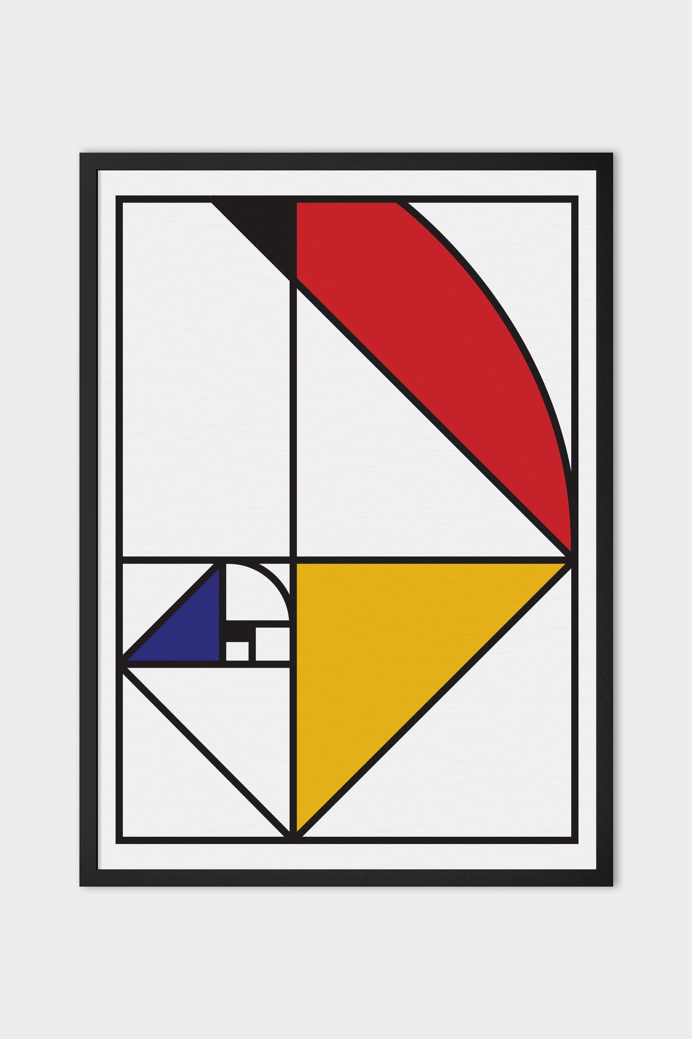 Fibonacci De Stijl Source: Google Images
De Stijl wanted something new, they felt the need of redefining the art, to bring it back to its essence and give a new set of rules & principles. They said that ?Art is all line and colour? and to express this relationship through the pure language of abstraction. They wanted not only to bring about a new art, but to create a broad base for an entirely new, modern society. De Stijl wasn?t limited only to painting but they also focused on the transformation of interior design, typography, graphic art and architecture. De Stijl had a major influence on Bauhaus in Germany and on much modern art through the 20th century, and this is the reason it comes in the events of ?International Typographic Style.?
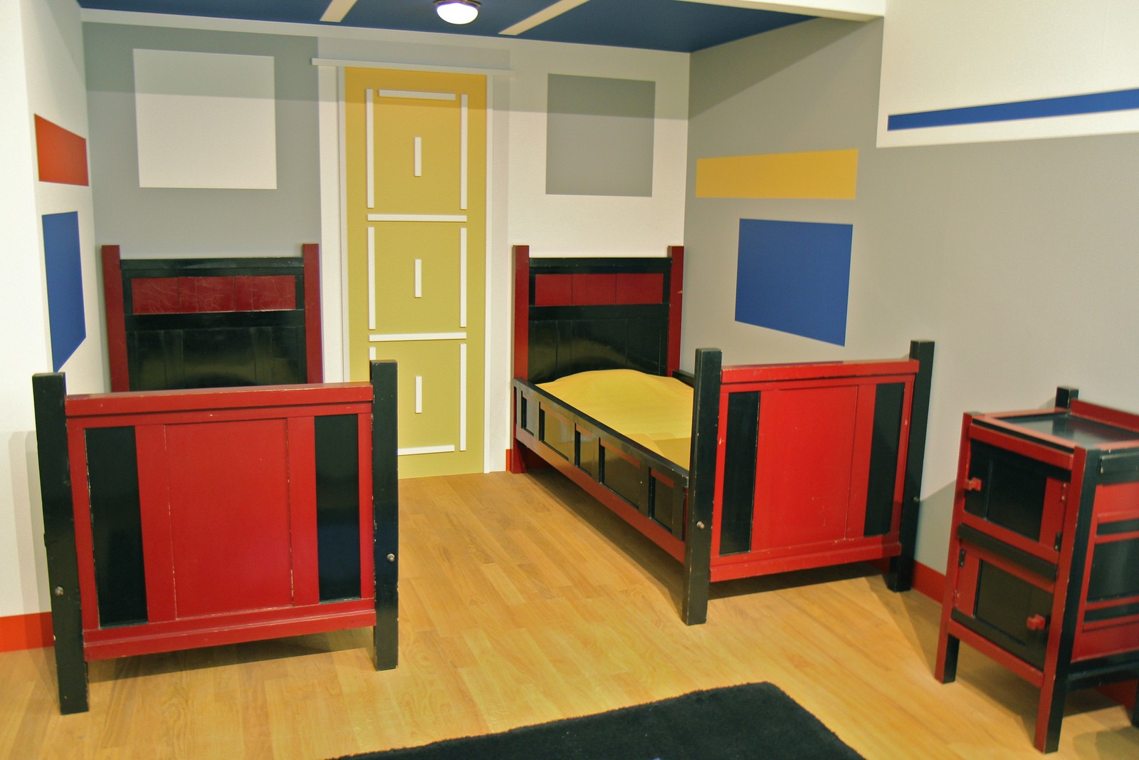 De Stijl Kids Room In The Hague Source: Google Images
Key figures in De Stijl movement were ? Theo van Doesburg, painters Piet Mondrian, Vilmos Huszar and Bart van der Leck and architects Gerrit Rietveld, Robert van ?t Hoff, and J.J.P. Oud.
3. Bauhaus, The School(1919?1933)
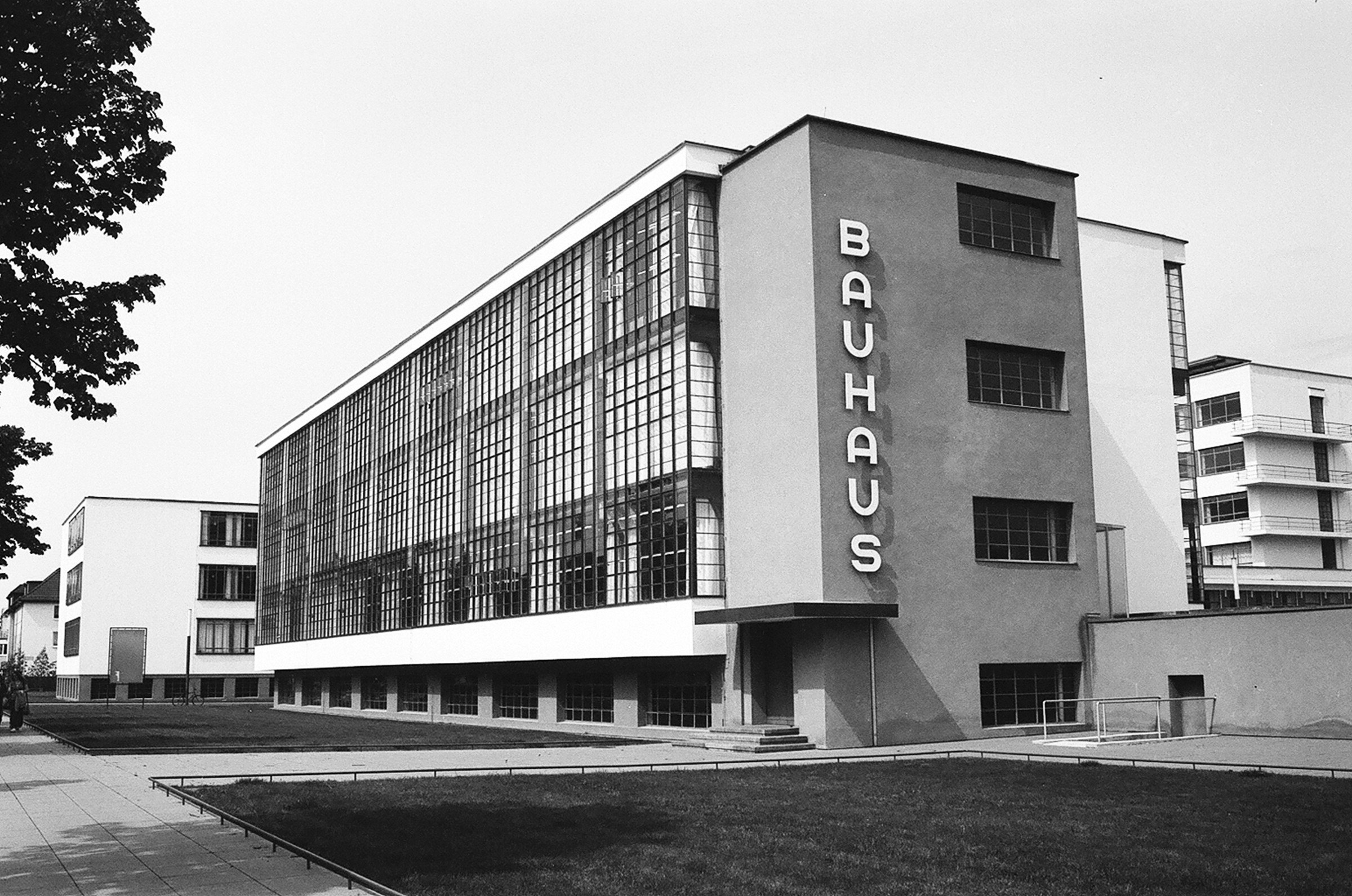 Bauhaus Building in Dessau Source: Google Images
Staatliches Bauhaus commonly known as Bauhaus was a school in Germany which operated from 1919 to 1933 that combined crafts and the fine arts, and was known for the approach to design that it publicized and taught. The Bauhaus school was founded by Walter Gropius in Weimar. It had a intense influence upon subsequent developments in art, architecture, graphic design, interior design, industrial design, and typography.
The Bauhaus style also known as the International Style became one of the most influential currents in Modernist architecture and modern design. It was marked by the absence of ornamentation and by harmony between the function of an object or a building and its design. The Bauhaus had a major impact on design trends in Western Europe, the United States, Canada and Israel in the decades following its demise and that?s why it is the part of this ?International Typographic Style?.
The courses at Bauhaus encouraged students to incorporate technology into their designs, as well as emphasizing the need to create design that could be mass-produced. This is what led to the utilitarian-style design typically attributed to the Bauhaus movement. Using ?form follows function?, students were taught to make everyday objects more beautiful, while still being accessible. In all, the Bauhaus movement believed ?less is more?, in everything from colors to furniture to teapots to architecture.
The school existed in three German cities: Weimar from 1919 to 1925, Dessau from 1925 to 1932 and Berlin from 1932 to 1933, under three different architect-directors: Walter Gropius from 1919 to 1928, Hannes Meyer from 1928 to 1930 and Ludwig Mies van der Rohe from 1930 until 1933. When the school was closed by its own leadership under pressure from the Nazi regime, having been painted as a centre of communist intellectualism. Although the school was closed, the staff continued to spread its idealistic precepts as they left Germany and emigrated all over the world.
Following are the some of Typography Projects at Bauhaus School
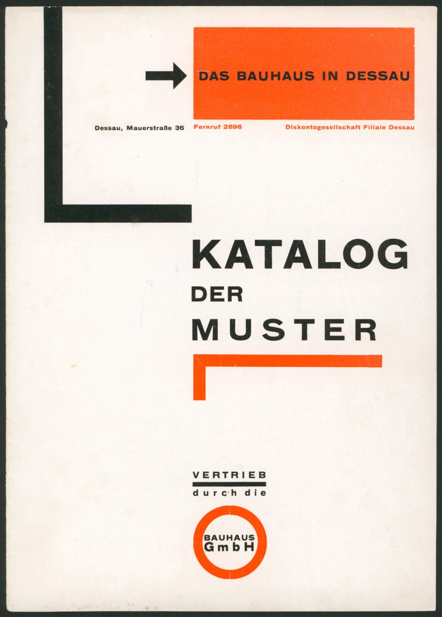 Catalogue of Designs, cover. Author: Herbert Bayer, 1925. Source: bauhaus100.de
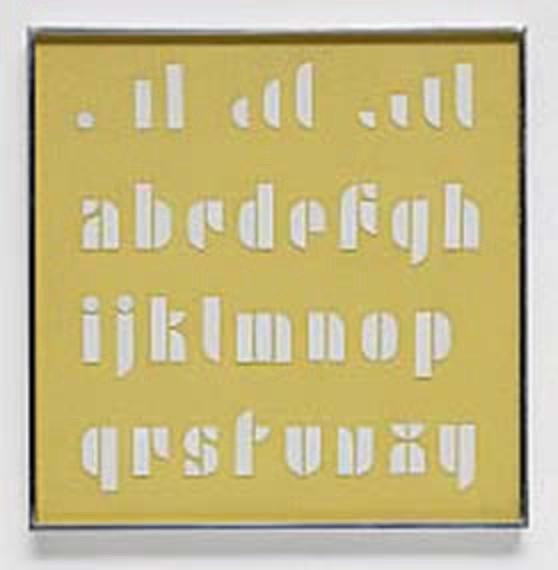 Lettering Set, author: Josef Albers, around 1928. Source: bauhaus100.de
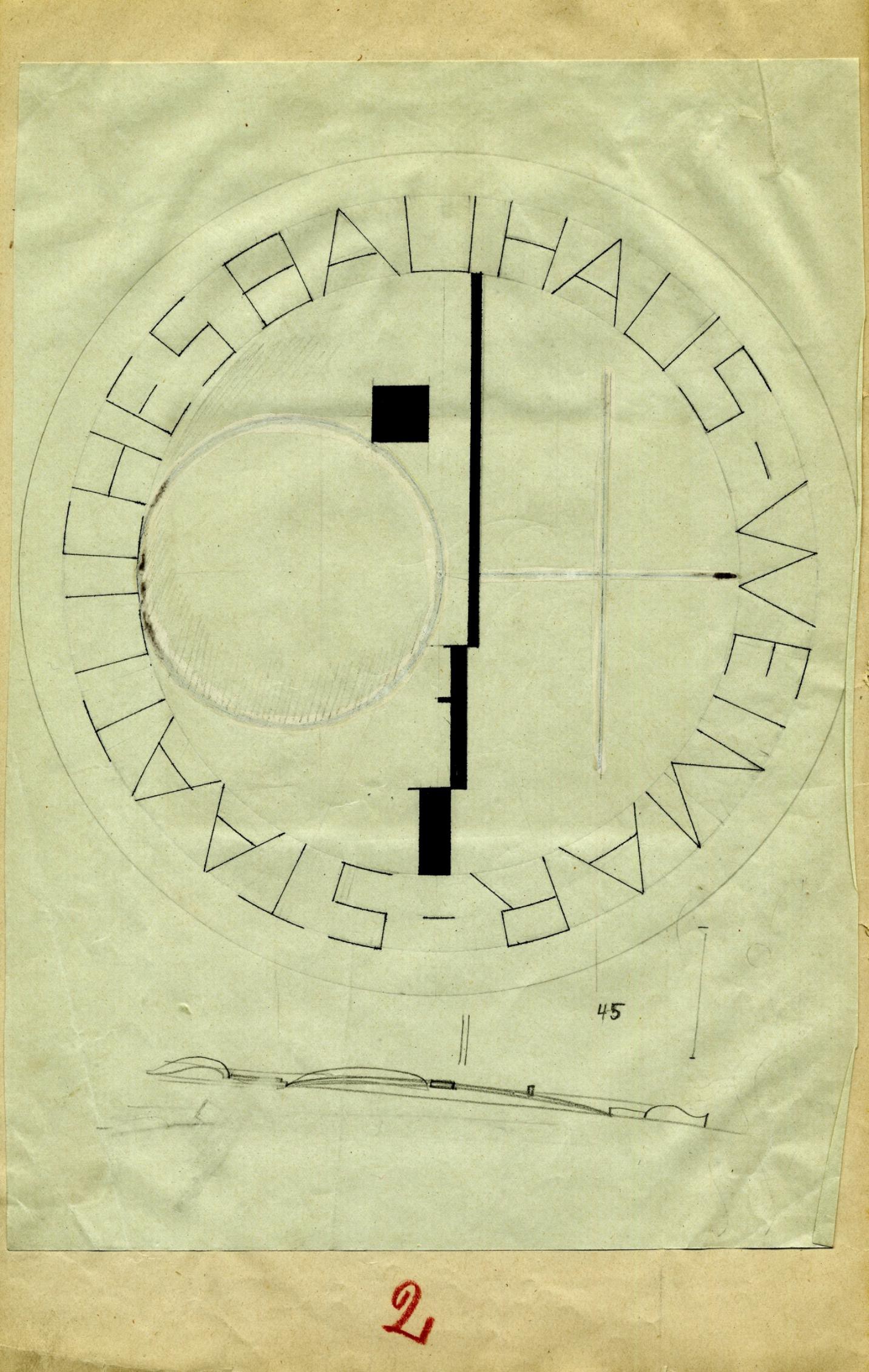 Two designs for the Bauhaus signet, author: Oskar Schlemmer. Source: bauhaus100.de
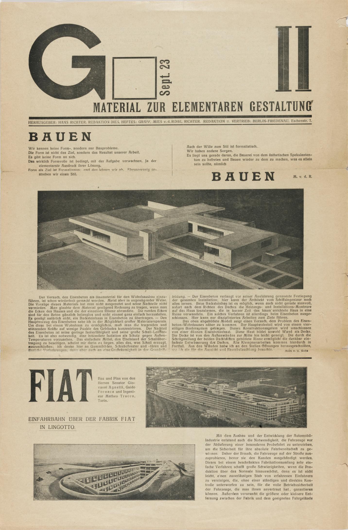 G II. material for elementary design, September 1923, cover, publisher: Hans Richter / editors: Werner Graeff and Ludwig Mies van der Rohe, 1923. Source: bauhaus100.de
4. Josef Mller-Brockmann, The Designer (1936)
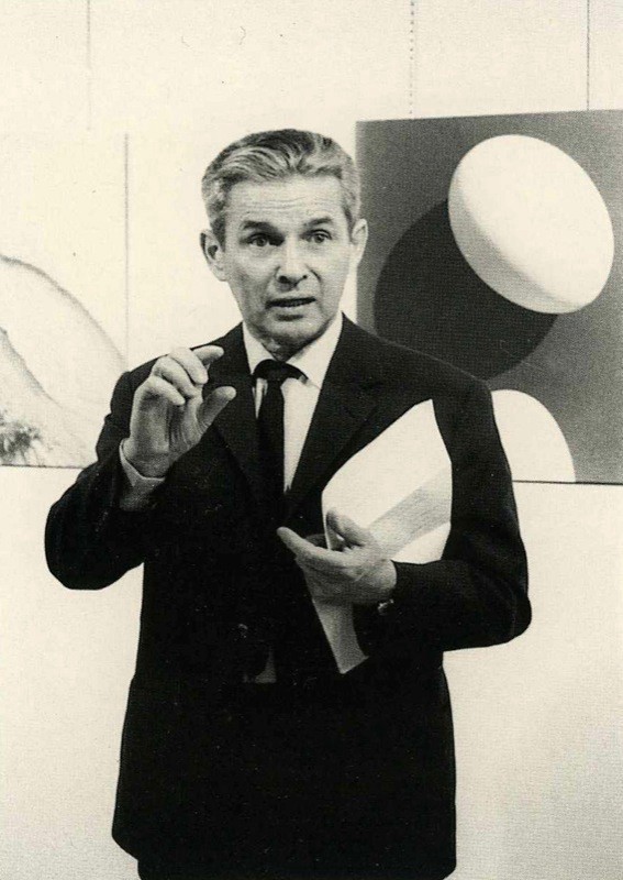 Josef Mller-Brockmann Source: Google Images
Josef Mller-Brockmann (May 9, 1914 ? August 30, 1996) was a Swiss graphic designer and teacher. He studied architecture, design and history of art at both the University and Kunstgewerbeschule in Zurich.
In 1936 he opened his Zurich studio specialising in graphic design, exhibition design and photography.
Mller-Brockman was author of ?The Graphic Artist and his Design Problems?, ?Grid Systems in Graphic Design?, the publications ?History of the Poster? and ?A History of Visual Communication?.
He is recognised for his simple designs and his clean use of typography, notably Helvetica, shapes and colours which inspires many graphic designers in the 21st century and also made him precursors of the International Typographic Style.
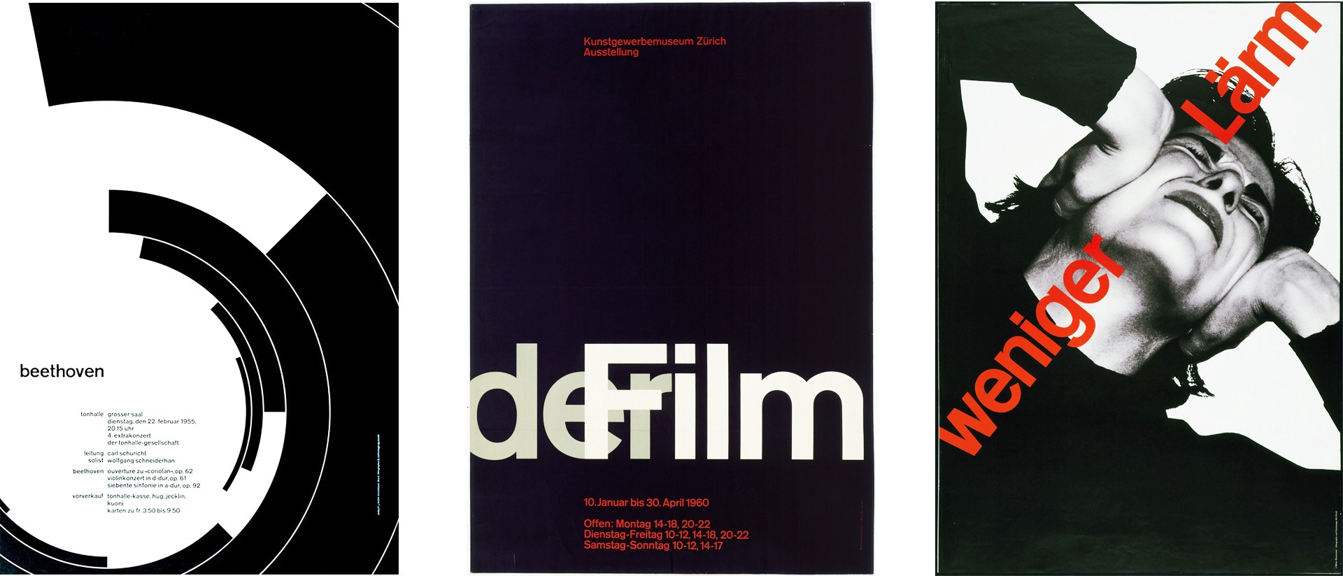 Josef Mller-Brockmann Works Source: Google Images
5. Graphis, The Publications (1944)
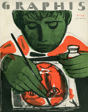 Graphis Issue 1/2 Source: graphis.com
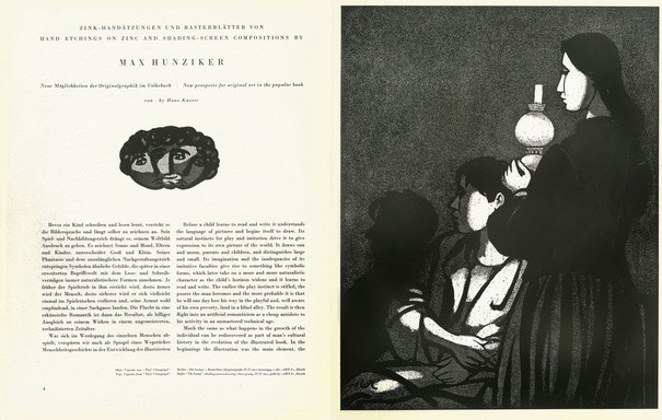 Graphis Issue 1/2 Source: graphis.com
Graphis, The International Journal of Visual Communication, was first published in 1944 by Walter Herdeg in Zurich, Switzerland.
Graphis Inc. is the international publisher of books and magazines on communication design, advertising, photography, annual reports, posters, logos, packaging, book design, brochures, corporate identity, letterhead, interactive design and other design associated with graphic arts. Graphis was (and still is) one of the most important and influential European graphic design publication. In 1986, B. Martin Pedersen purchased the company from Mr. Herdeg and later moved the headquarters to New York City.
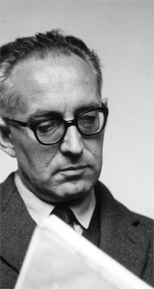
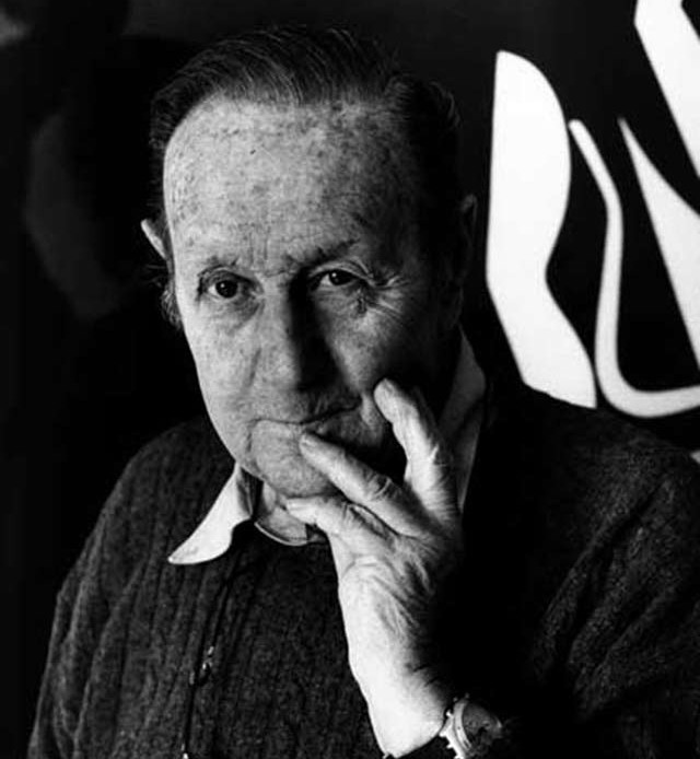
6. Max Bill, The Designer (1944)
 Max Bill in 1970 Source: Wikipedia
Max Bill (December 22, 1908 ? December 9, 1994) was a Swiss architect, artist, painter, typeface designer, and graphic designer. After an apprenticeship as a silversmith during 1924?1927. Bill took up studies at the Bauhaus in Dessau. From 1937 onwards he was a prime mover behind the Allianz group of Swiss artists.
In 1944, he became a professor at the school of arts in Zurich. In 1953, he, Inge Aicher-Scholl and Otl Aicher founded the Hochschule fr Gestaltung in Ulm, Germany, a design school in the tradition of the Bauhaus. The school is notable for its inclusion of semiotics as a field of study. The school closed in 1968.
Here are some of his works
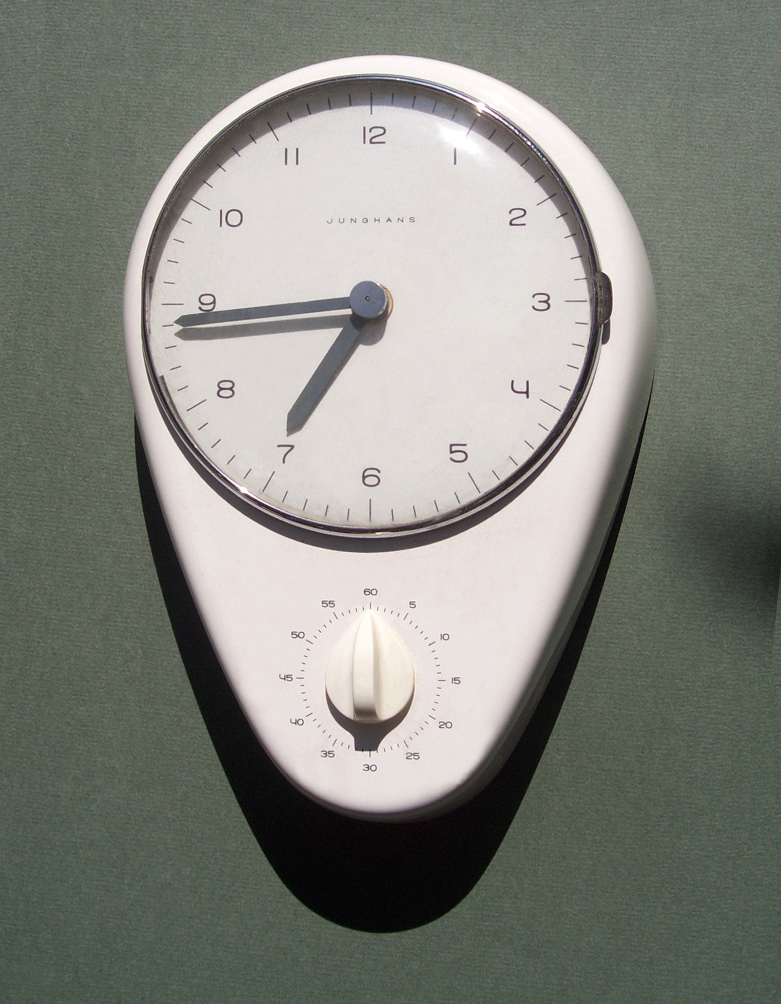 Pavillon-Skulptur (1983), Zrich and Junghans clock, design by Max Bill Source: Wikipedia
7. Emil Ruder, The Designer (1947)
 Picture of Emil Ruder
Emil Ruder (March 20, 1914?13 March 1970), played a key part in the development of the International Typographic Style. Ruder began his design education at the age of fifteen when he took a compositor?s apprenticeship. By his late twenties Ruder began attending the Zurich School of Arts and Crafts where the principles of Bauhaus and Tschichold?s New Typography were taught, leaving an lasting impression on Ruder. He helped Armin Hofmann form the Basel School of Design and establish the style of design known as Swiss Design. He taught that, above all, typography?s purpose was to communicate ideas through writing. He placed a heavy importance on sans-serif typefaces and his work is both clear and concise, especially his typography. His artwork is distinguished from others on the basis of his holistic approach to designing and teaching. He employed a systematic practical method of teaching that not only involved theory but philosophy as well.
Like most designers classified as part of the Swiss Design movement he favored asymmetrical compositions, placing a high importance on the counters of characters and the negative space of compositions. A friend and associate of Hofmann, Frutiger and Mller Brockmann, Ruder played a key role in the development of graphic design in the 1940s and 50s. His style has been emulated by many designers, and his use of grids in design has influenced the development of web design on many levels.
In addition to that Ruder?s twenty-five year of teaching enabled him to compile a heavily illustrated book, titled Typographie: A Manual of Design. It featured his approach, ideas and methods and a life-time of accumulated knowledge. A critical reflection on Ruder?s teaching and practice is encapsulated in the work.
Also Ruder was a significant member who helped establishing the International Center for the Typographic Arts, New York (ICTA). Emil Ruder passed away in the spring of 1970.
Here are some of his works
 Some works of Emil Ruder
8. Armin Hofmann, The Designer (1947)
 Picture of Armin Hofmann
Armin Hofmann (born 29 June 1920)is a Swiss graphic designer. Hoffman followed Emil Ruder as head of the graphic design department at the Basel School of Art and was instrumental in developing the graphic design style known as the International Typographic Style.
His teaching methods were uncommon and broad based, setting new standards that became widely known in design education institutions throughout the world. His independent insights as an educator, married with his rich and innovative powers of visual expression, created a body of work enormously varied ? books, exhibitions, stage sets, logotypes, symbols, typography, posters, sign systems, and environmental graphics. His work is recognized for its reliance on the fundamental elements of graphic form ? point, line, and shape ? while subtly conveying simplicity, complexity, representation, and abstraction.
He is well known for his posters, which emphasised economical use of colour and fonts, in reaction to what Hofmann regarded as the ?trivialization of colour?. He was an influential educator, retiring in 1987. In 1965 he wrote the ?Graphic Design Manual?, a popular textbook in the field.
Here are some of his works
 Works of Armin Hofmann
9. Univers, The Typeface (1957)
 Univers Typeface
In 1954 the French type foundry Deberny & Peignot wanted to add a linear sans serif type in several weights to the range of the Lumitype fonts. Adrian Frutiger, the foundry?s art director, suggested refraining from adapting an existing alphabet. He wanted to instead make a new font that would, above all, be suitable for the typesetting of longer texts ? quite an exciting challenge for a sans-serif font at that time. Starting with his old sketches from his student days at the School for the Applied Arts in Zurich, he created the Univers type family. In 1957, the family was released by Deberny & Peignot, and afterwards, it was produced by Linotype.
Univers is classified as a neo-grotesque sans-serif, based on the model of nineteenth-century German typefaces such as Akzidenz-Grotesk, it was notable for its availability from the moment of its launch in a comprehensive range of weights and widths
Univers was one of the first typeface families to fulfil the idea that a typeface should form a family of consistent, related designs. Past sans-serif designs such as Gill Sans had much greater differences between weights, while loose families such as Franklin Gothic family often were advertised under different names for each style, to emphasise that they were not completely matching. By creating a matched range of styles and weights, Univers allowed documents to be created in one consistent typeface for all text, making it easier to artistically set documents in sans-serif type. This matched the desire among practitioners of the International Typographic Style of typography for neutral sans-serif typefaces avoiding artistic excesses.
10. Neue Haas Grotesk a.k.a. Helvetica, The Typeface (1957)
 Helvetica Typeface
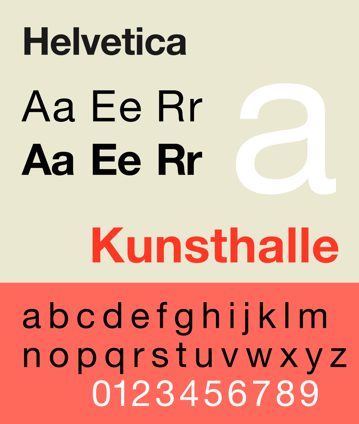
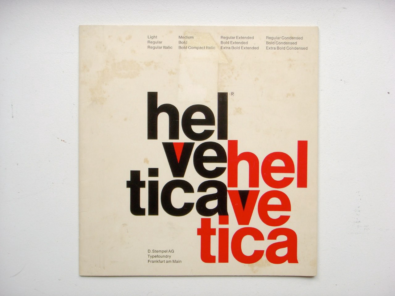
Helvetica or Neue Haas Grotesk is a widely used sans-serif typeface developed in 1957 by Swiss typeface designer Max Miedinger with input from Eduard Hoffmann at the Haas foundry in Switzerland. Haas set out to design a new sans-serif typeface that could compete with Akzidenz-Grotesk in the Swiss market. Originally called Neue Haas Grotesk, it was created based on Schelter-Grotesk. The aim of the new design was to create a neutral typeface that had great clarity, had no intrinsic meaning in its form, and could be used on a wide variety of signage.
Helvetica is a neo-grotesque or realist design, one influenced by the famous 19th century typeface Akzidenz-Grotesk and other German and Swiss designs. Its use became a hallmark of the International Typographic Stylethat emerged from the work of Swiss designers in the 1950s and 60s, becoming one of the most popular typefaces of the 20th century. Over the years, a wide range of variants have been released in different weights, widths and sizes, as well as matching designs for a range of non-Latin alphabets. Notable features of Helvetica as originally designed include a high x-height, the termination of strokes on horizontal or vertical lines and an unusually tight spacing between letters, which combine to give it a dense, compact appearance.
In 1960, the typeface?s name was changed by Haas? German parent company Stempel to ?Helvetica? ? derived from Confoederatio Helvetica, the Latin name for Switzerland ? in order to make it more marketable internationally.
 Helvetica Specimen
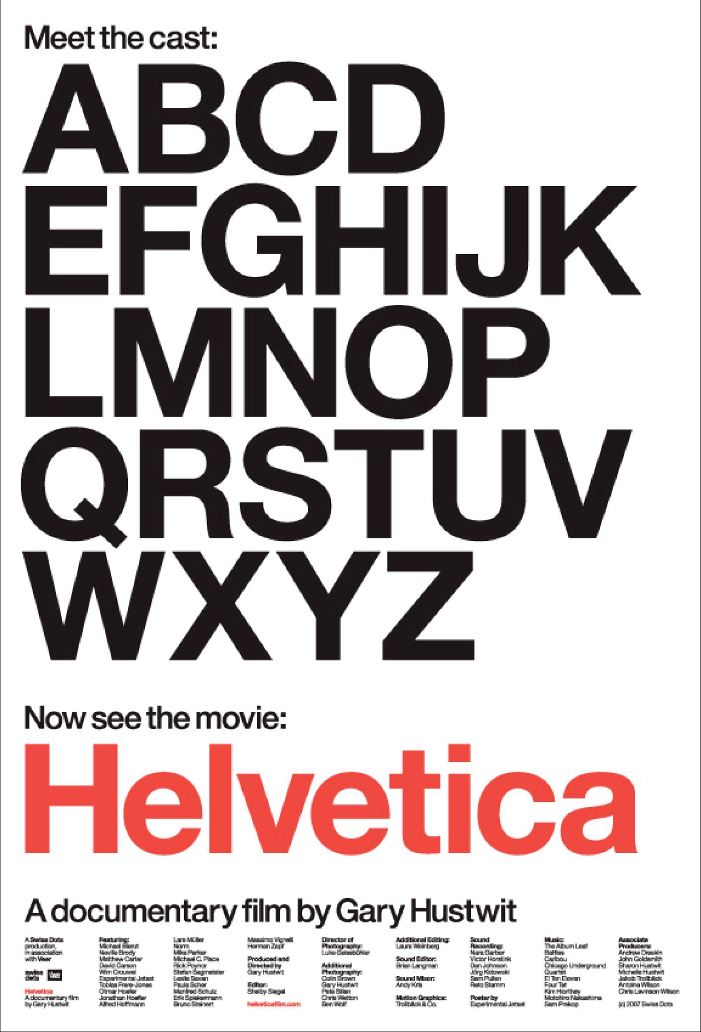 Helvetica Movie Poster Source: Google Images
A feature-length film/documentary directed by Gary Hustwit was released on September 12, 2007 to coincide with the 50th anniversary of the typeface?s introduction in 1957
The documentary is about Typography and Graphic Design.
Its content consists of a history of the typeface interspersed with candid interviews with leading graphic and type designers. The film aims to show Helvetica?s beauty and ubiquity, and illuminate the personalities that are behind typefaces. It also explores the rift between modernists and postmodernists, with the latter expressing and explaining their criticisms of the famous typeface.
Watch the trailer of this documentary.
Helvetica Movie Trailer
11. Die Neue Grafik, The Magazine (1959)
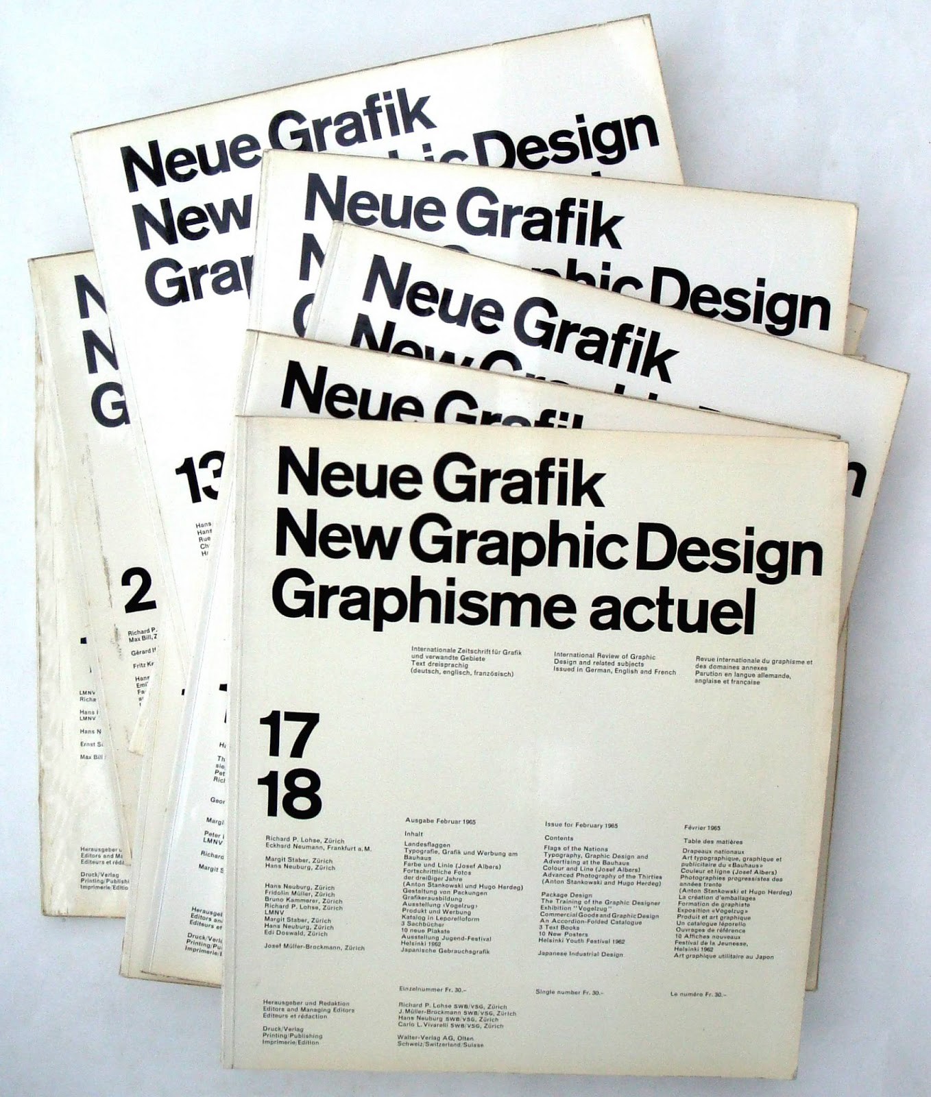 Die Neue Grafik Magazines
In 1959 four zrich-based graphic designers launched the first issue of Neue Grafik Magazine. A Magazine devoted to the International Typoographic Style of design and typography. The team of editors constisted of Richard Paul Lohse, Josef Mller-Brockmann, Hans Neuburg and Carlo Vivarelli. The team signed some of their jointly written articles with the acronym ?lmnv?, formed from their initials.?Neue Grafik? epitomizes Swiss typography of the 1950s. It was the new age manifesto for the design world and it was strongly influential on international graphic design after World War 2. The publication of the magazine proved an international success making the Swiss Style the ?International Typographic Style.?

