

I think most front-end developers have accepted that fonts in the browser, and especially the ones on those large headings, look very different than what we see in Photoshop.
The fonts are a bit thinner, smoother, and generally much, much better in PS. We can?t really change the way fonts are rendered in the browser, but for some of them, we can use a simple CSS trick to achieve Photoshop-like quality. In WebKit, we will use the -webkit-font-smoothing property. Firefox has also implemented a similar property called -moz-osx-font-smoothing, and it?s available from version 25. Try adding these properties to your heading tags or to the whole body:
-webkit-font-smoothing: antialiased;-moz-osx-font-smoothing: grayscale;
Let?s have a look at the dramatic difference this makes on OSX:
 Without and with antialiasing
This will work nicely on Chrome, Safari, and Firefox on a Macintosh computer. If your text is a bit too thin and blurred in WebKit browsers (especially when CSS transform is applied to the container), you can try adding some -webkit-text-stroke with a value lower than half a pixel. Something around 0.15?0.45px should work. For other font sizes or colours, adding a similarly thin text-shadow might also work. Finally, with some fonts, the antialiased property might be a bit too dramatic, so try subpixel-antialiased.
-webkit-text-stroke: 0.45px;// or-webkit-text-stroke: 0.45px rgba(0, 0, 0, 0.1);// ortext-shadow: #fff 0px 1px 1px;
This will also improve the text on mobile browsers, but unfortunately, none of these tricks will work on Windows. Before using these techniques in a real-life project, please keep in mind that these are only workarounds and hacks. They?re not actual solutions for the poor and inconsistent rendering across browsers. They might fix or change the way your text is rendered in a new release, so you would have to keep an eye on the project in the future. On the other hand, I use -webkit-font-smoothing on all my projects to treat all my Mac visitors with a nicely rendered font.
Improving Rendering on Windows
Unfortunately, we have the same inconsistency across operating systems, not just browsers. The first time I researched this question was when one of my projects was sent back during quality control because ?font looks blocky and very much different to the Photoshop design.? The QA tester even questioned if I used the correct font.
I did some research and it turned out that Windows doesn?t apply much antialiasing to text in most cases. The good news is that in Microsoft?s latest browsers, things actually look quite good. The font rendering is much, much better compared to Chrome and Firefox.
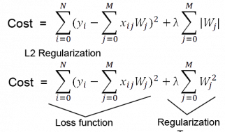
There is a trick to fix the issue on Windows, and we will need to use SVG for that. SVG fonts to be specific. As it turns out, there is actually no way to control antialiasing on EOT, WOFF or TTF fonts. But the SVG one is antialiased on both operating systems by default!
Here?s your regular font-face declaration:
@font-face { font-family: ?MyWebFont?; src: url(?webfont.eot?); src: url(?webfont.eot?#iefix?) format(?embedded-opentype?), url(?webfont.woff?) format(?woff?), url(?webfont.ttf?) format(?truetype?), url(?webfont.svg#svgFontName?) format(?svg?); }
As you can see, at the end of that declaration you have the SVG font. The only thing we have to do to force Windows to use it is bump it up on this list.
 Left: TTF font in Chrome/Win 7 Right: SVG font in Chrome/Win 7
Now, this looks good, but there are unfortunately a few issues as expected. These issues are the reasons why I decided not to use this method on my projects.
Firstly, SVG fonts are quite heavy in file size, so that?s something to consider. They could go up to 200kb per file. This font type is also not as flexible as others like TTF in terms of changing kerning or line spacing. Finally, the rendering performance of it might be too slow for long body text.
So even though this might not be the ideal approach for most websites, it?s definitely something to keep in mind. For example, this solution might be great for projects where the website is built around a large, 80px title that?s the most important element of the website (an average 2016 flat website). This solution would work if you just want the title to look good on as many browsers and OS as possible and don?t mind the extra file size it adds. Or, maybe one day you end up building a kiosk web app for Chrome on a Windows PC.
