We all know that the best error message is the one that never shows up. But no matter how good our design is, errors are unavoidable. When people interact with products, eventually, something is bound to go wrong.

Error messages may seem trivial, but they are a critical component of user experience. Users often evaluate the quality of the product by the quality of error messages. Poorly written error messages are one of the things that annoy users. Good error message UX design, on the other hand, can increase the speed of use and users? subjective satisfaction.
In this article, I want to share the top six recommendations on how to write and design user-friendly error messages. The recommendations are based on guidelines created by Microsoft and Apple design guidelines.

1. Clarity is key
When it comes to writing error messages, clarity is your top priority. You need to describe what happened, why it happened, and what the user can do about it. The message should be written in plain language so that the target users can easily understand both the problem and the solution.
Avoid abstract error messages
Abstract error messages don?t contain enough information about the problem. In many cases, they simply state the fact that something went wrong and don?t help users understand the root cause of the problem. Don?t just assume people know about the context of a message ? be explicit and indicate what exactly has gone wrong.

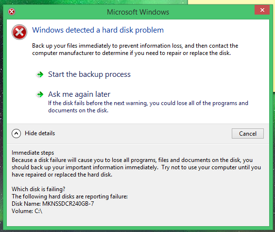
Get rid of technical terms
If an error message contains technical terms or jargon, the user gets confused. The error message should always describe the problem in terms of target user actions or goals. Even when your users are tech-savvy, it?s still better to use non-technical terms that everyone can easily understand.

2. Write concisely, but precisely
People rarely read pages word-by-word; instead, they scan the page, picking out individual sentences. The more text on a page, the harder the text is to scan, and the more likely users won?t read the text at all. Research by the American Press Institute found that shorter sentences resulted in greater understanding:
- If sentences contain eight words or less, readers understand 100 percent of the information.
- If sentences contain 43 words or longer, the reader?s comprehension drops to less than 10 percent.
Try to reduce the text down to its essentials in all parts of your GUI, including error messages. Your goal is to write short but meaningful error messages.
Don?t over-communicate the problem
Error messages should enable users to easily resolve a problem. Messages should only contain the information required to help them achieve this. Understand what you want to communicate and get rid of the unnecessary details that don?t help you do this.
Well-designed error messages often try to explain how to fix the error. However, in some cases, it?s hard to explain the problem in a single sentence, so designers use troubleshooters ? step-by-step instructions on how to solve the problem. In the following example, the error message attempts to explain every troubleshooting step. As a result, the error message becomes unreadable.

Don?t try to explain a complicated troubleshooting process within an error message. Instead, use progressive disclosure to provide this information. The section that contains the steps should be hidden by default, and when the users want to learn more about the problem, they click ?How to fix it.?
3. Don?t blame users
Human tone and language play a tremendous impact on how users comprehend the message. Use proper tone to help users relate better to a situation with an error, and help them understand it.
Avoid phrases like?You did,? ?Your action caused.?
Some error messages are phrased in a way that accuses the user of making an error; errors are already frustrating, and there?s no need to add to frustration with judgment. In the end, these messages are an important, albeit, small way that we communicate and build relationships with our users. Always focus on the problem, not the user action that led to the problem.
Here are two ways you can handle a situation when the user enters incorrect login credentials:
- Don?t say: You have entered an incorrect login or password.
- Do say: Your login and password do not match.
Quick tip: A good way to incorporate a more human tone in error message UX design is to think about explaining them out loud to the person you care about.

Avoid using upper case text and (or) exclamation marks in the messages
Both upper case text and exclamation marks create a lousy user experience. The upper case text makes the error message difficult to read. When an error message ends with an exclamation mark, it creates an impression that the system is yelling at the users.
4. Give users a solution
Imagine you wrote a very important email and clicked the ?Send? button. Right after that you see the message, ?Your email could not be sent,? without any details. As a result, you don?t know what you can do about it. You have to pause your task and invest your time in finding the solution to the problem.

When the user has to stop their task in order to correct an error, it defeats the foundation of user-centered design ? help your audience get through a task efficiently and effectively.
Effective error message UX design not only informs users that a problem occurred and explains why it happened, but it also provides the next steps for users so they can fix the problem. The next step can be contextually-relevant actions.
Do not explain the meaning of buttons
Error message UX design typically provides buttons that let users complete certain operations. In many cases, the buttons allow users to either proceed with the operation, or cancel, if they have changed their mind. The basic rule of good button design is simple ? users should understand what buttons will do by reading their labels. If your error message text and button labels are clear, there should be no need to explain what the buttons do.

5. Using the right format for your error messages
Error messages are typically presented using modal dialog boxes ? overlays that prevent users from interacting with underlying content. Putting error messages in modal dialog boxes has a major benefit ? it gets 100 percent of the user?s attention. However, this quickly becomes a drawback if that attention isn?t necessary. In many cases, it?s possible to show the error messages using alternative patterns such as inline or as a status message.
When designing error messages, ask a simple question, ?Does the user need to be interrupted to read this message?? If not, consider alternatives to using a modal dialog box.
6. Limit the number of error messages that users see
Frequently displayed error messages are a sign of bad error message UX. Error messages disrupt the user experience and create friction. Thus, they should only be used in important situations like destructive actions (such as deletions). The infrequency of alerts helps ensure that people take them seriously.
Use constrained controls
It?s usually better to prevent an error than to report one. Many errors can be avoided through better design. UI elements like sliders and date and time pickers should be constrained to valid values. For example, for an experience that lets you book with a hotel date picker, you should disable the dates in the past.

It?s also possible to constrain text boxes to accept only certain characters. For example, if you expect users to enter a phone number in the text field, you can accept only numbers and create a phone number mask for this field.

Last but not least, you can disable the call-to-action buttons for input forms at times when clicking them would result in an error. This point is valid for data submission forms ? as long as it?s obvious why the control is disabled, it prevents users from making unnecessary actions.
Do not report errors that users don?t care about
Software developers often rely on error messages that indicate some error system conditions. The messages that indicate that there is a bug in a system have meaning only to the programmer, but users don?t care about them. Aside from dismissing the error message, there is nothing users can do about such messages.
Correct errors automatically
If the problem can be corrected automatically, it should be corrected automatically. For example, the search form should automatically correct mistyping.

Have an error message design strategy
When it comes to designing error messages, it?s vital to think holistically. Start with research and analysis and think about all the places in your product that things could go wrong. List them out, and then start to design a concise and friendly error message for each.
Work with UX writers to review existing error messages. UX writers will take both the context and the user?s state of mind into account when reviewing the errors and update error text where required. And don?t forget to validate your solutions. Always test your error messages with real users.
Error message design might seem like an insignificant thing, but it can have a tremendous impact on user experience. By reducing friction, you keep users on track and help them complete what they?ve planned.
For more unique insights and authentic points of view on the practice, business and impact of design, visit Adobe XD Ideas.
To learn about Adobe XD, our all-in-one design and prototyping tool:
- Download Adobe XD
- Adobe XD Twitter account ? also use #adobexd to talk to the team!
- Adobe XD UserVoice ideas database
- Adobe XD forum
Originally published at https://xd.adobe.com.

