Principal component analysis (PCA) has been gaining popularity as a tool to bring out strong patterns from complex biological datasets. We have answered the question ?What is a PCA?? in this jargon-free blog post ? check it out for a simple explanation of how PCA works. In a nutshell, PCA capture the essence of the data in a few principal components, which convey the most variation in the dataset.
1. A PCA plot shows clusters of samples based on their similarity.
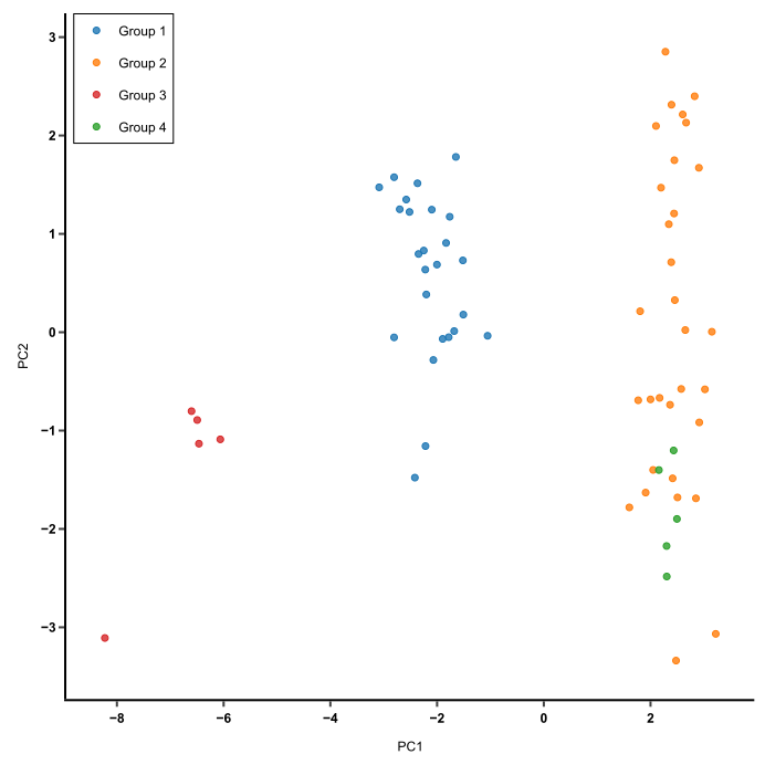
Figure 1. PCA plot. For how to read it, see this blog post
PCA does not discard any samples or characteristics (variables). Instead, it reduces the overwhelming number of dimensions by constructing principal components (PCs). PCs describe variation and account for the varied influences of the original characteristics. Such influences, or loadings, can be traced back from the PCA plot to find out what produces the differences among clusters.
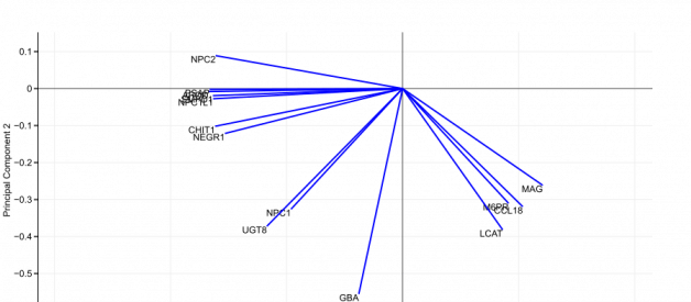
2. A loading plot shows how strongly each characteristic influences a principal component.
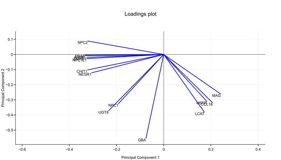
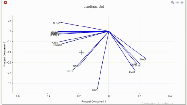
Figure 2. Loading plot
See how these vectors are pinned at the origin of PCs (PC1 = 0 and PC2 = 0)? Their project values on each PC show how much weight they have on that PC. In this example, NPC2 and CHIT1 strongly influence PC1, while GBA and LCAT have more say in PC2.
Another nice thing about loading plots: the angles between the vectors tell us how characteristics correlate with one another. Let?s look at Figure 2.
- When two vectors are close, forming a small angle, the two variables they represent are positively correlated. Example: APOD and PSAP
- If they meet each other at 90, they are not likely to be correlated. Example: NPC2 and GBA.
- When they diverge and form a large angle (close to 180), they are negative correlated. Example: NPC2 and MAG.
Now that you know all that, reading a PCA biplot is a piece of cake.
3. PCA biplot = PCA score plot + loading plot
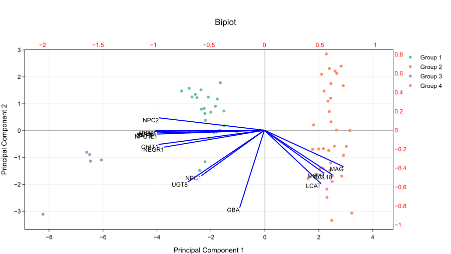
Figure 3. PCA biplot
You probably notice that a PCA biplot simply merge an usual PCA plot with a plot of loadings. The arrangement is like this:
- Bottom axis: PC1 score.
- Left axis: PC2 score.
- Top axis: loadings on PC1.
- Right axis: loadings on PC2.
In other words, the left and bottom axes are of the PCA plot ? use them to read PCA scores of the samples (dots). The top and right axes belong to the loading plot ? use them to read how strongly each characteristic (vector) influence the principal components.
4. A scree plot displays how much variation each principal component captures from the data
A scree plot, on the other hand, is a diagnostic tool to check whether PCA works well on your data or not. Principal components are created in order of the amount of variation they cover: PC1 captures the most variation, PC2 ? the second most, and so on. Each of them contributes some information of the data, and in a PCA, there are as many principal components as there are characteristics. Leaving out PCs and we lose information.
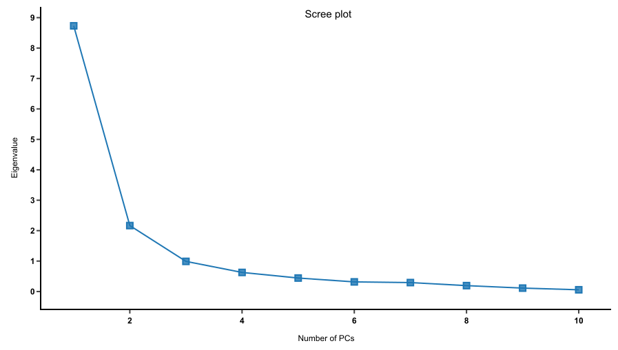
Figure 4. PCA scree plot
The good news is, if the first two or three PCs have capture most of the information, then we can ignore the rest without losing anything important. A scree plot shows how much variation each PC captures from the data. The y axis is eigenvalues, which essentially stand for the amount of variation. Use a scree plot to select the principal components to keep. An ideal curve should be steep, then bends at an ?elbow? ? this is your cutting-off point ? and after that flattens out. In Figure 4, just PC 1,2, and 3 are enough to describe the data.
To deal with a not-so-ideal scree plot curve, there are a couple ways:
- Kaiser rule: pick PCs with eigenvalues of at least 1.
- Proportion of variance plot: the selected PCs should be able to describe at least 80% of the variance.
If you end up with too many principal components (more than 3), PCA might not be the best way to visualize your data. Instead, consider other dimension reduction techniques, such as t-SNE and MDS.
In summary: A PCA biplot shows both PC scores of samples (dots) and loadings of variables (vectors). The further away these vectors are from a PC origin, the more influence they have on that PC. Loading plots also hint at how variables correlate with one another: a small angle implies positive correlation, a large one suggests negative correlation, and a 90 angle indicates no correlation between two characteristics. A scree plot displays how much variation each principal component captures from the data. If the first two or three PCs are sufficient to describe the essence of the data, the scree plot is a steep curve that bends quickly and flattens out.
Looking for a way to create PCA biplots and scree plots easily? Try BioVinci, a drag and drop software that can run PCA and plot everything like nobody?s business in just a few clicks.
Originally published at blog.bioturing.com on June 18, 2018.

