Beautiful portraits of women are easy to draw once you get the hang of it. We asked Loish to show us how it?s done with a step-by-step process.

This tutorial is a walkthrough of my own process for drawing a face, and is by no means intended as strict instructions. As an artist, the best thing you can do is develop a technique and approach that feels right to you, which is how I developed this process. The most important things to keep in mind throughout the drawing process are:
- Expression: What kind of emotion do you want the face to portray? Try to choose an expression that says something about the state of the character (peaceful, angry, vulnerable, etc). For the sake of this tutorial, I will be drawing a face with a fairly neutral expression and straightforward angle, but it is worthwhile to explore more expressions than simply neutral or blank ones.
- Life: I try not to focus too much on getting things ?right? (symmetry, perfect details, smoothness, etc) but instead concentrate on giving the face a sense of life and personality. I try to keep the personality of the original sketch preserved in the end result, and leave the smaller details until the way end.
Setup
The process I describe here can be applied to basically any digital drawing program that has basic layer and brush functions. When starting out, the most important things for me are:
- A large canvas: I usually work on A3 format, 300DPI, so that the quality is suitable for printing.
- Clutter-free workspace: I keep only the essential panels open, which for me are mainly my tools, layers, and color editor.
- Useful shortcuts: If I have access to my eyedropper and navigation shortcuts, I?m good to go!
Basic Shapes
I try to keep my rough sketches as expressive as possible, trying to capture a sense of gesture and movement first and foremost. The details come later.
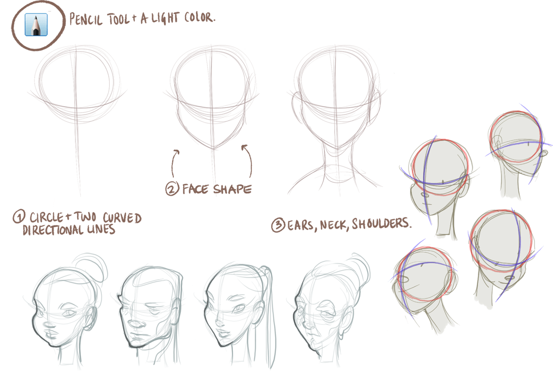
Angles and Direction: This basic circles and lines technique works great for drawing a variety of angles. By keeping the features simple and using dots for eyes, you can achieve a lot of movement with just these simple shapes, and get a good sense of the angle and positioning of the face.
Head shape: For variety, you can experiment with different head shapes and jawlines. Different shapes create different character types.
Rough Sketch
New layer: Turn visibility on/off to quickly compare your sketch with the basic shapes from the previous step. When laying down the first rough sketch, I continue to think in shapes and curved lines rather than details. This is not only easier, but also helps give the face volume and depth.
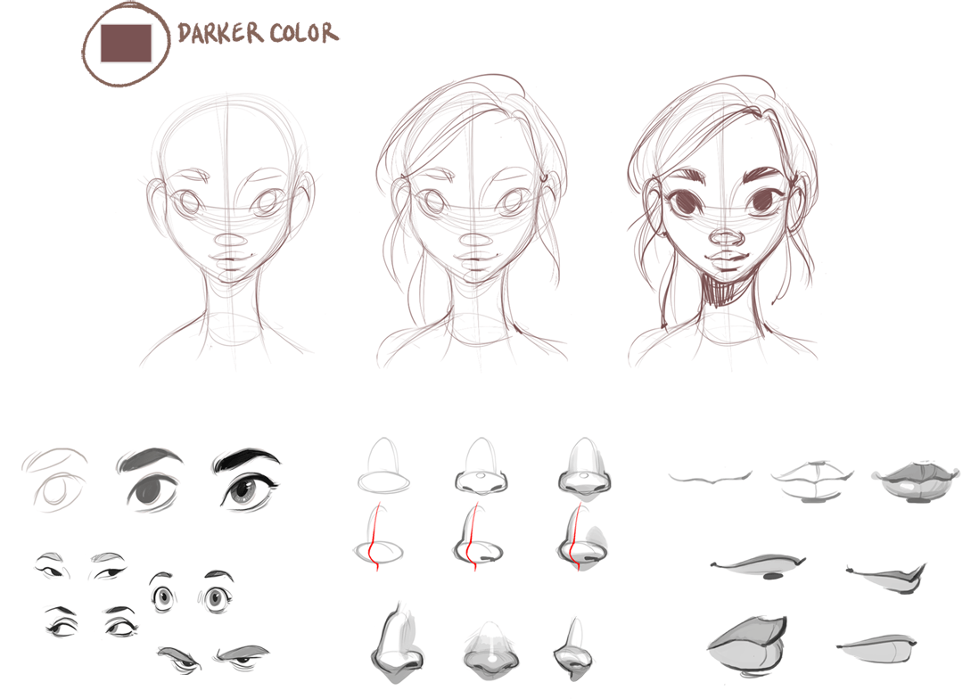
Eyes: I keep the eyes as simple as I can during the rough sketching phase, so I can focus on the expression before adding detail. I don?t draw the iris or reflections until later on. For variety, you can experiment with different shapes and styles, and also look at how the eye interacts with the eyebrows and creases around it.
Nose: I always start with a circle for the base, then a simple arched shape for the bridge. For variety, you can try different nose shapes (larger bridge, wider base, etc) as well as different positioning of the nose on the face (higher, lower, etc).
Mouth: I always start with the mouth shape and then add the lips around it. The mouth is a very important feature for communicating emotion, especially the corners of the mouth ? are they downturned, pinched, smiling?
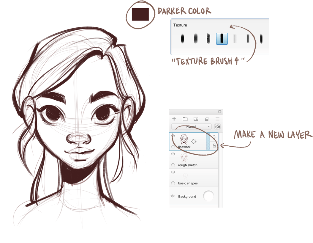
Line work
I personally like to keep the linework sketchy, since I like the texture and life it gives to the drawing. I mainly focus on drawing defined and strong lines in this phase, as opposed to the light, scribbly lines from previous phases. I used to make the linework as clean as possible in this phase, getting rid of all of my sketch lines. If you prefer a more clean drawing style, you can make neater linework than I do here, and turn off your sketch layers afterwards. Finer details (eyelids, eyelashes, nostrils, etc) can now be drawn in, with the sketch lines from previous steps as a guide.
Base colors
At this point, I merge the sketch layers together, using the method below to keep the separated layers as a backup. If the guide lines or rough sketch are showing through too strongly, I lower the opacity on those layers before merging, but you can also just turn them off completely.
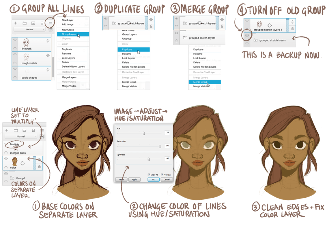
In a layer below, I lay down the base colors, and then set the merged linework layer to ?multiply?. I then modify the colors of this layer using hue/saturation, so that they blend nicely with the base colors below. I like to experiment with this, sometimes choosing very bright colors for the lines, sometimes more neutral colors. It depends entirely on how the lines interact with the base layer, and what feels right to me.
Skin tones
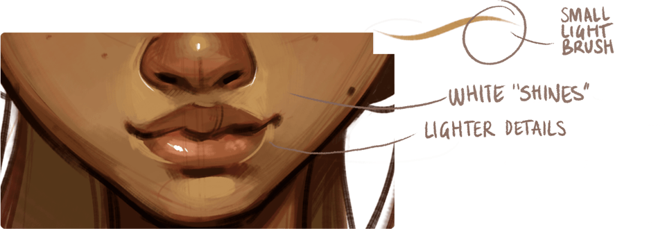
In order to give life to the skin, it?s important to add some variations in the skin tone. I added color variations on the cheeks, nose, lips and ears. I choose colors manually from the color editor panel. I like to pick colors that aren?t just lighter/darker versions of the base color, which can result in flat or lifeless skin. I try to choose rich colors that give depth and texture to the base color.
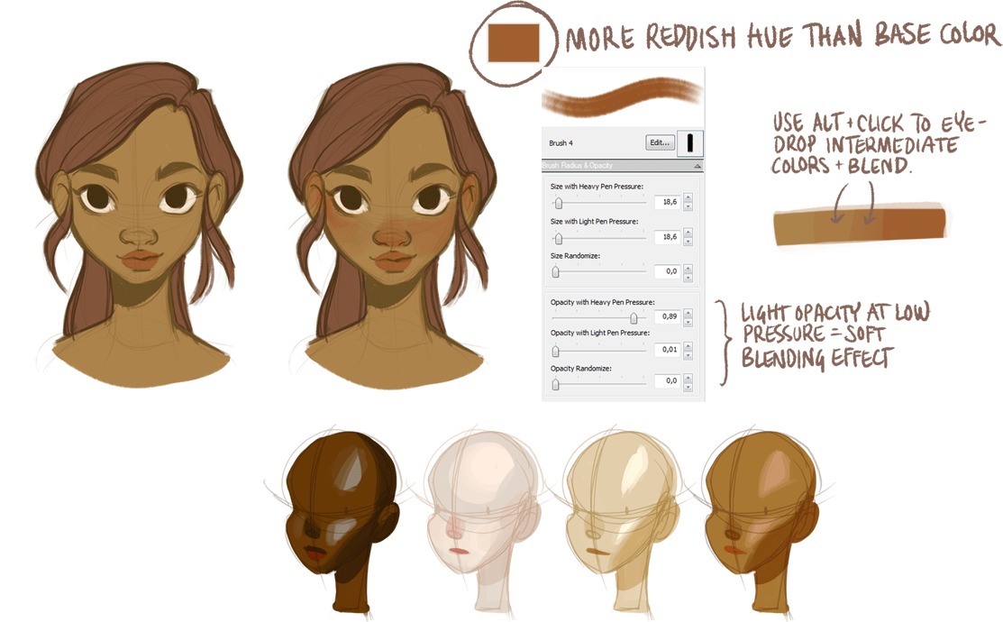
Different skin tones: There is a huge variety of skin colors and tone variations that exist, and it?s interesting and fun to explore them. Different skin tones have different highlight and shadow colors. I learned the most from doing quick color studies based on photo reference.
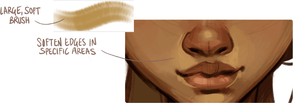
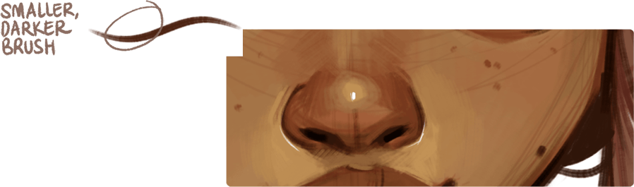
Shading
Now I add shading to the face. I try to envision how the three dimensional shape of the head would interact with a light source, so the first step is to figure out where the light is coming from. In this case, I chose a soft light coming from above. I also modify the colors a bit because I felt the colors were becoming a bit dull. A common mistake for people starting out with digital art is to paint very soft, gradual shading in hues that are simply lighter/darker versions of the base color. The end result tends to be a bit flat and lifeless. I personally recommend making your shadows and highlights a slightly different hue than the base color, and to also add some sharp, crisp shadows alongside the softer shading.
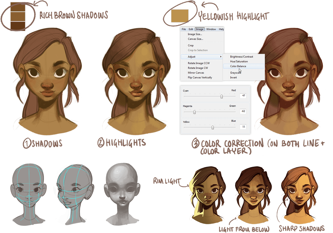
Dimensions: When shading the face, you?re dealing with the shadows being cast onto the face by its own features (nose, lips etc), as well as softer shadows of the 3D form. Envisioning the volume of the head and face, and picturing it as a 3 dimensional shape, is a great help when shading.
Lighting: When deciding the strength, direction, color, and type of the lighting, there are many options. Besides envisioning the head as a 3D object, you can also learn a lot from making studies of different lighting situations.
Details and Finishing Touches
At this point, I merge the color and line layer. Many artists prefer to keep line work separated from the color layer, but I prefer having everything in one place. This way, I can paint over the lines, and erase parts of the drawing without having to switch layers. Be sure to make a backup of the layers before merging (described in step 5) so that you can always go back to your old version if needed. Depending on how realistic and detailed I want the end result to be, I can spend a lot of time on this final phase, sometimes painting over the lines completely. In this case, I?m leaving it rough with some of the sketch lines still showing through.
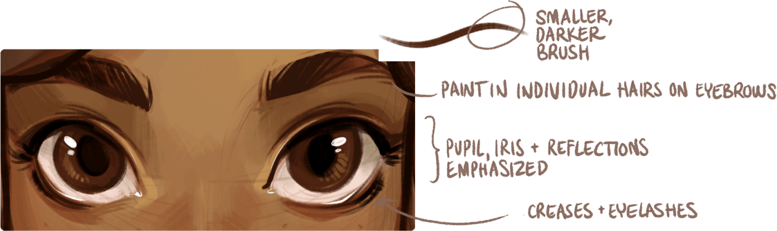
Adding freckles, wrinkles, moles, and other marks to the skin helps add more detail to a piece, as well as give the face personality.
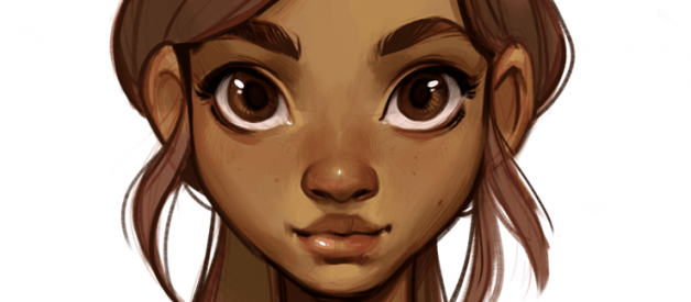
Finished Result
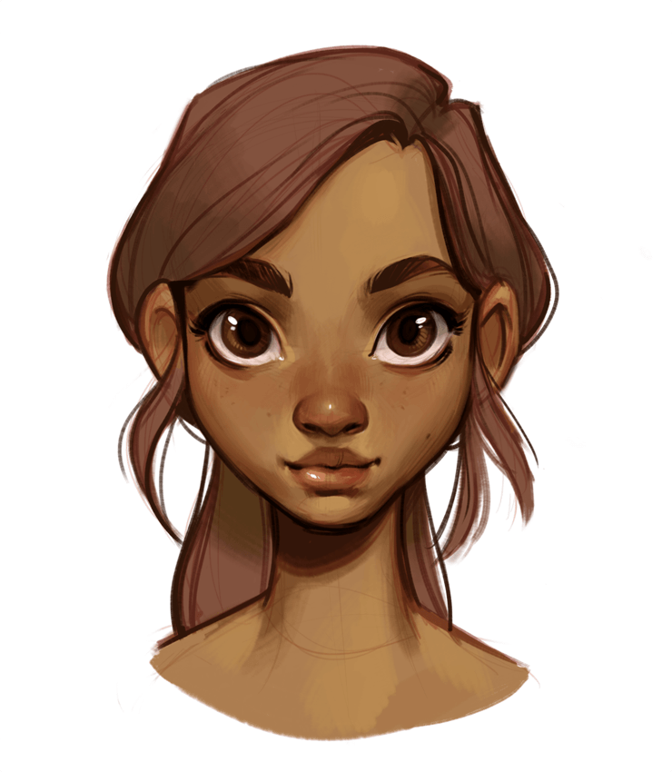
As you can see, I don?t mind a rough or sketchy end result, and I?m also not very concerned with symmetry. I personally think imperfections add a lot to the character and personality of a face, and I also really like the effect of sketch lines. If you are seeking a cleaner and smoother end result, an option is to turn off your sketch layers early on and spend more time on the final phase, smoothing out the colors more and refining the details. I hope you guys found this tutorial useful!
Originally published at www.sketchbook.com on September 14, 2016.

