And when not to
The form wizard is a user interface design pattern that enables untrained users to achieve a goal through a series of steps. The user enters data in each view and proceeds to the next step until completion.
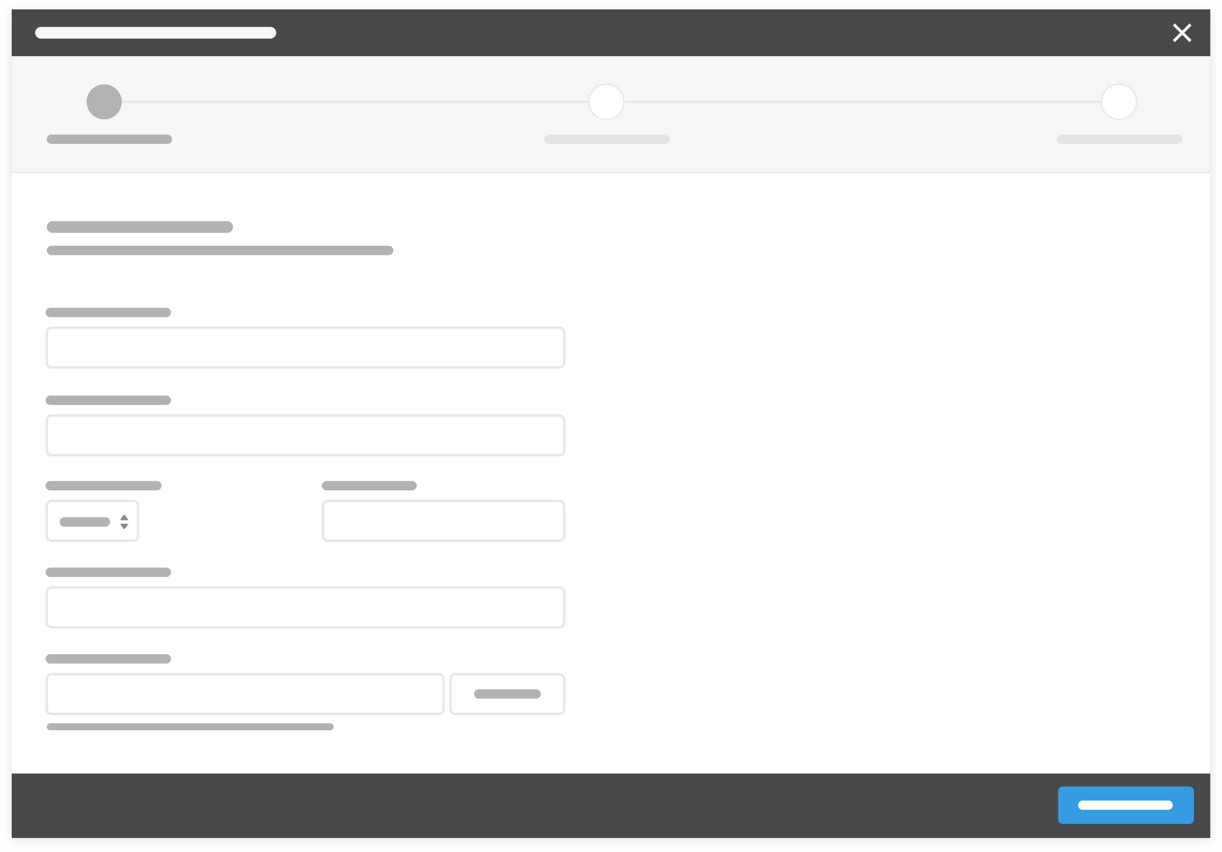
 Wireframe of a wizard in a takeover modal.
Wizards are best employed for long and unfamiliar tasks that the user needs to complete once or rarely. Wizards are shown to reduce errors by making the user follow sequential steps. Wizards are often used for onboarding flows, where the user needs to enter a set of information to get started in an application.
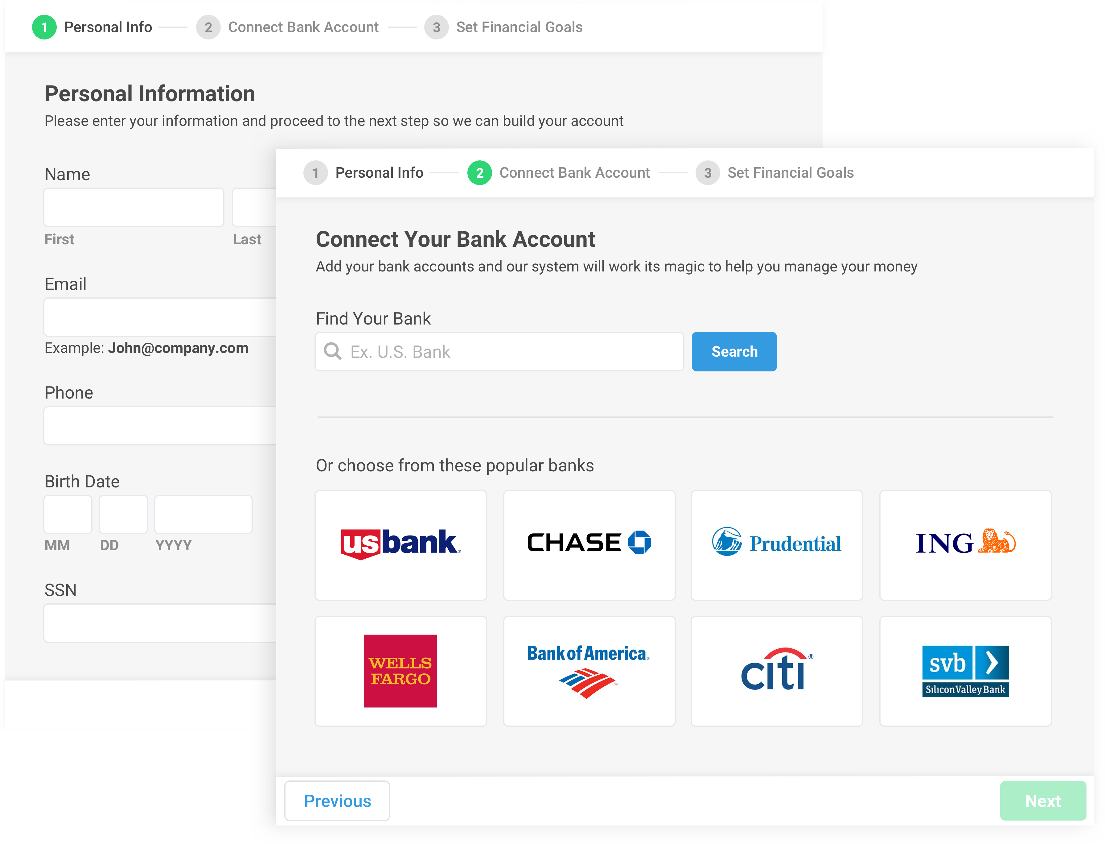
 Example of two screens from a personal finance app?s onboarding flow presented in a wizard.
For example, a personal finance application may ask new users to connect their bank account, verify their identity, and set financial goals. The information entered in this flow is needed to make the app useful.
Wizards are best used:
- For a fixed sequence of data entry that occurs infrequently.
- For untrained users who need to be guided through a stepped process.
- For a series of dependable and branched data input flows.
- When users need to accomplish a goal that relies on complex task and sub-task completion.
Wizards are a poor choice for expert users who commit actions frequently because it reduces their locus of control. Trained users often find wizards to be patronizing because of their inflexibility. Basic and sectioned forms are better alternatives for power users.
Designing a Wizard
 A snapshot of the iteration that went into creating Flexport?s on-boarding flow
1. Determine requirements and conduct research
The need for the incorporation of a wizard is determined after requirements of the system and user goals are understood. If the information needs occur more than once, entered by experienced users, or are limited, consider using other methods of data collection.
After system requirements are known, designers often employ task analysis to inform the wizard?s information architecture. It is important to allow the user?s needs to guide the process, instead of relying on the creator?s biases. The goal is to bridge the gap between a user?s mental model, and the system?s data requirements.
Let?s pretend we are creating a personal finance application. We learn from the research that our target users want to see all their transactions categorized and accounted for, and have a desire to set financial goals. Based on this insight, we determine some general startup tasks.
 General user startup tasks for the personal finance application: add personal info to create an account, connect banks, set financial goals.
From there, we determine the information requirements based on these general tasks.
 Information requirements for the personal finance application.
And start to think of logical groupings.
 Information requirement groupings for the personal finance application.
2. Create a task flow
Once the information requirements have been determined, it?s time to start thinking of the interaction flow. Information needs are categorized and batched into a dependable sequence of tasks and sub-tasks (and even sub-sub tasks). Grouping related actions and ordering steps sequentially reduce cognitive load by reducing the dexterity of data entry and providing a clear path to completion.
 Example of a branching task flow
Often, the user flow will branch into different paths, dependent on previous inputs. A user may be prompted with a question that determines a new information need or sequence. This information is then either presented in another view, or on the current view. Populating additional inputs in a view is known as responsive disclosure.
For example, our personal finance onboarding flow could incorporate different flows for connecting a user?s bank information. Perhaps a user doesn?t know their credentials, or they have set up security measures that make it hard to connect. This could be mitigated with a conditional flow, where the user is presented with an alternative way to connect their bank account or information on how to attain the proper credentials.
 Personal finance on-boarding task groupings represented in a stepper.
3. Create a prototype and conduct usability tests
Continuing with the personal finance app, below is the first view of the prototype. A prototype doesn?t have to be this put together. It can be anything from a basic paper prototype to an HTML/CSS prototype. Different apps and contexts will require different levels of fidelity. What matters is your ability to collect qualitative feedback from your target users.
 The first step of the personal-finance app?s wizard onboarding flow.
Usability tests are a good way to collect qualitative feedback from a prototype. During the usability tests, ask the user to perform tasks, and describe what they are seeing and thinking. This will provide insights that will drive further design iterations.
4. Iterate and implement
Make design iterations based on the results of the usability tests, and then work with engineers to implement the wizard in the app. It is important to conduct further usability tests after it launches to ensure it accomplishes the goal, meets user needs, and is bug-free. From there, consider implementing quantitative analysis like A/B testing to further validate the design through data.
Form Wizard Best Practices
 Incorporate a progress indication affordance.
 Reduce the number of steps. The more steps included, the greater the chance of user abandonment and annoyance. Try to keep wizards under 10 steps.
 Minimize the ability to navigate outside of the wizard. This will keep users focused on completion.
 Include labels and a brief explanation of purpose.
 Incorporate clear action buttons and allow users to navigate back and forth.
It takes hours of research and attention to create content like this article. Please give it a few claps to motivate me to keep writing. It?s free for you but means a lot to me.
For more:


