
In this tutorial we will be going over how create a sticky navigation bar using HTML, CSS, and Javascript. As our user scrolls down the page, the navigation bar is going invert the color of the text and the navigation bars background, creating a pretty neat fade in effect.
To begin lets open up our command line and create a new directory called navbar and migrate our way into it.
mkdir navbar cd navbar
Now that we are in our new directory we need to create an index page and a style page.
touch index.htmltouch style.css
The index.hmtl page is where we will be writing our html and javascript code, as well as how our browser will be viewing the content. The style.css page is where our page is going to get its ascetics from.
Lets go ahead and open index.html with your preferred text editor and get started by adding the following.
<!DOCTYPE html><html lang=”en” dir=”ltr”> <head> <meta charset=”utf-8″> <link rel=”stylesheet” type=”text/css” href=”style.css”> <link href=”https://fonts.googleapis.com/css?family=QuickSand:500″ rel =”stylesheet”> <script src=”https://code.jquery.com/jquery-3.2.1.js”></script> </head> <body> </body> </html>
This is going to create the link between our index.html file and the style.css page, and gives us access to some cool fonts we have pulled from google. Within the script tags we are calling our jQuery library so we can play-around with our html using Javascript.
Now in between the body tags we are going to create the links we want embedded in our nav bar. To do this we will need a div class we can call ?wrapper? and within it a second div with a class of logo. The logo is going to live opposite of links.
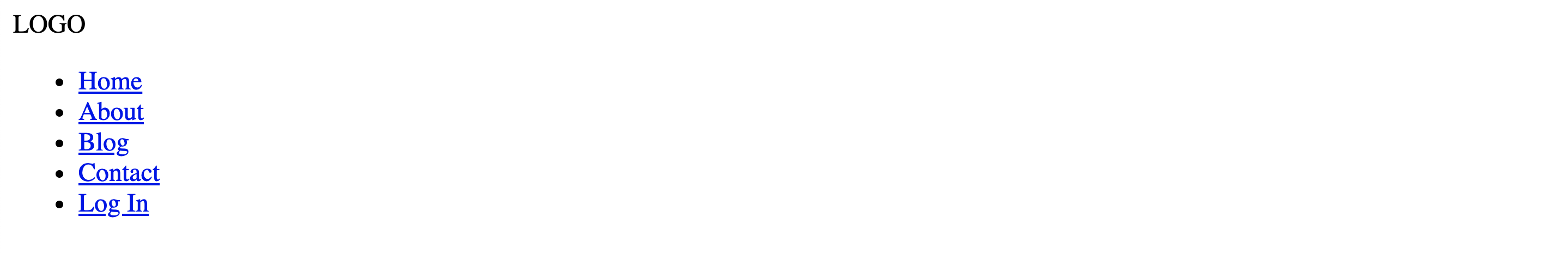
<div class=”wrapper”> <nav> <div class=”logo”>LOGO</div> <ul> <li><a href=”#”>Home</a></li> <li><a href=”#”>About</a></li> <li><a href=”#”>Blog</a></li> <li><a href=”#”>Contact</a></li> <li><a class=”active” href=”#”>Log In</a></li> </ul> </nav> </div>
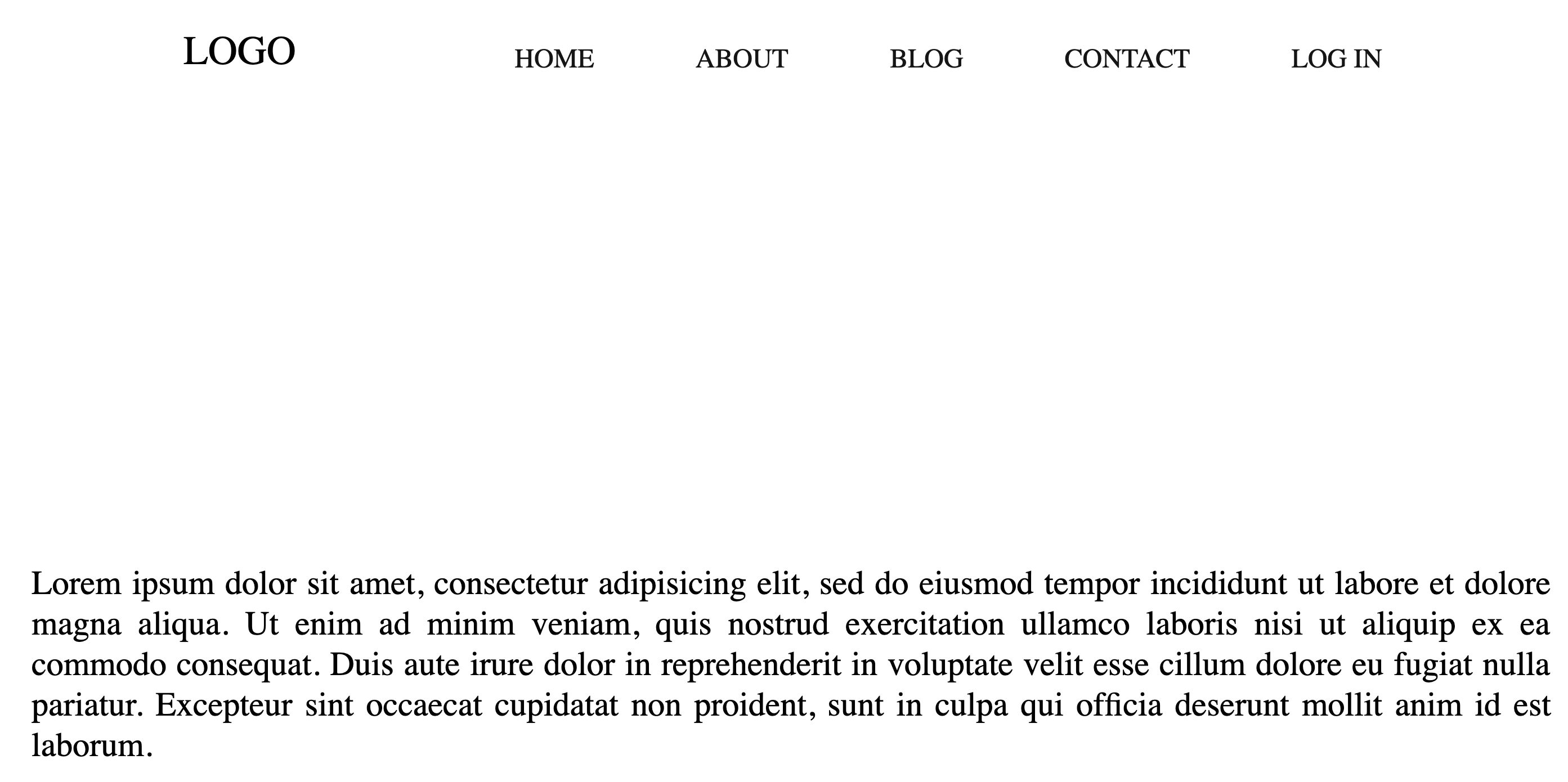
To test our code lets open a new tab in your web browser and in the search bar type /// and then navigate your systems file tree to the index.html document we are currently working on. If done correctly we should have a screen that looks like this.
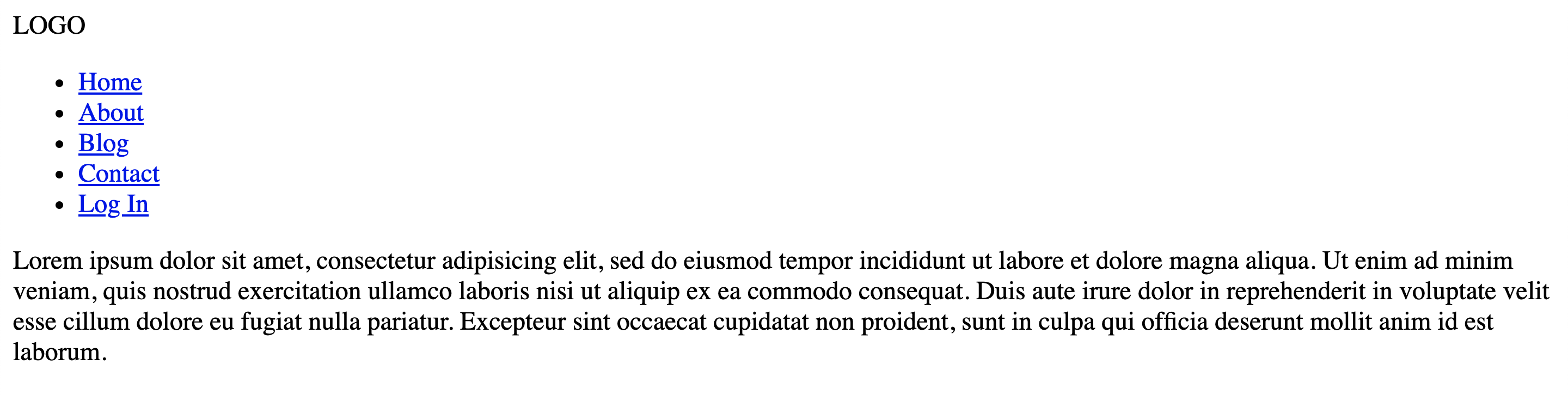
Awesome, what website dosent have some kind of content for us to read on it though. Lets put in some dummy data now. After the </nav> we want to create a section a new section and fill it with some content. We will do that by creating two new divs, one with a class of sec1 and the second with a class called content.
<section class=”sec1″></section><section class=”content”><p></p></section>
Notice the two <p></p> tags there. This is where you would want to fill in some text. If you are using a code editor such as atom type lorem and press tab, the editor will automatically fill in a paragraphs worth of jiberish. Lets refresh our page and hopefully you will see something like this.
Alright, now that the html is done jump over to your style.css page and lets get to making this look pretty.
body { margin: 0; padding: 0; font-family: QuickSand;}nav { position: fixed; top: 0; left: 0; width: 100%; height: 100px; padding: 10px 100px; box-sizing: border-box; transition: .3s;}
If we go ahead and refresh our window lets look at what this did.
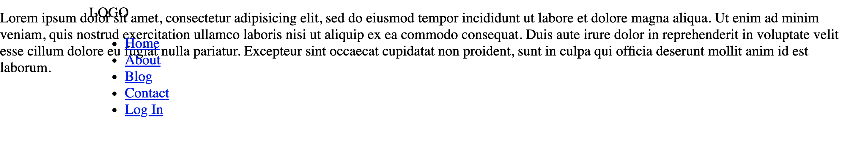
Thats no good, we are going to need a way to get that text from jumping to the top of the screen. A good idea would be to work on the selection tags that this content lives within.
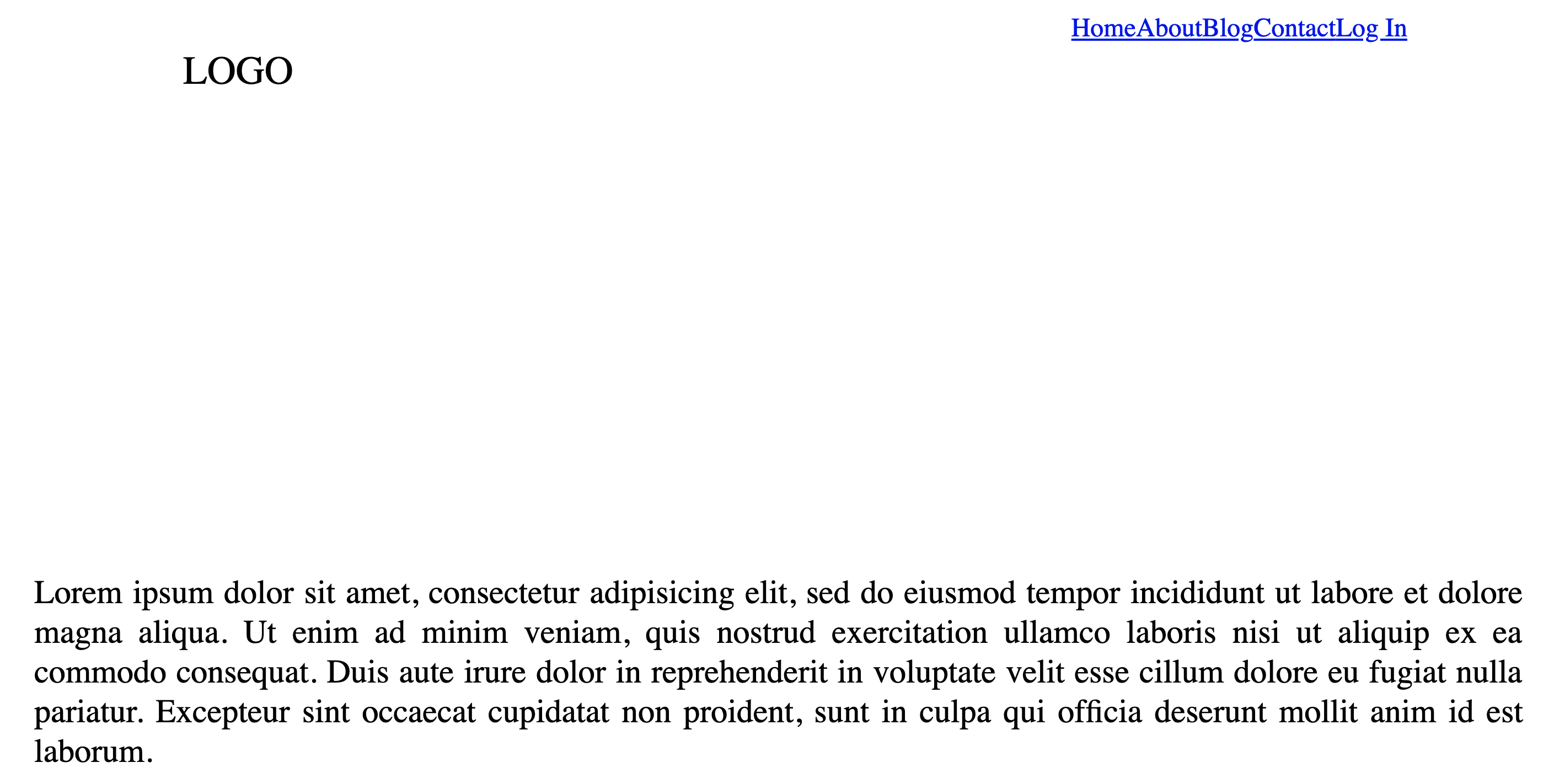
section.sec1{ width: 100%; height: 100vh;}.content { magin-top:80px;}.content p{ width: 900px; margin: 30px auto; text-align: justify; font-size: 20px; line-hieght: 30px;}
Now we have given the section and its content a defined placement as well as changed the font size a bit.
Cool, that nav bar is looking pretty janky though. Maybe we could move that logo a bit to the right and put those links to the left. While were at it lets also space the links out in a horizontal order.
nav .logo { padding: 22px 20px; height: 80px; float: left; font-size: 24px; transition: .3s;}nav ul{ list-style: none; float: right; margin: 0; padding: 0; display: flex;}nav ul li { list-style: none;}
And lets check our work out by refreshing our browser.
Looking good! theres still so much to do. How about we bring those links down to the same level as the logo, space them out a bit, and make them black.
nav ul li a { line-height: 80px; color: #151515; padding: 12px 30px; text-decoration: none; text-transform: uppercase; transition: .3s;}
and?.
So cool, I want that login button to be red however, with white text, and the button should be round a bit.
nav ul li a:focus{ outline: none;}nav ul li a.active{ background: #E247; color: #fff; border-radius: 6px;}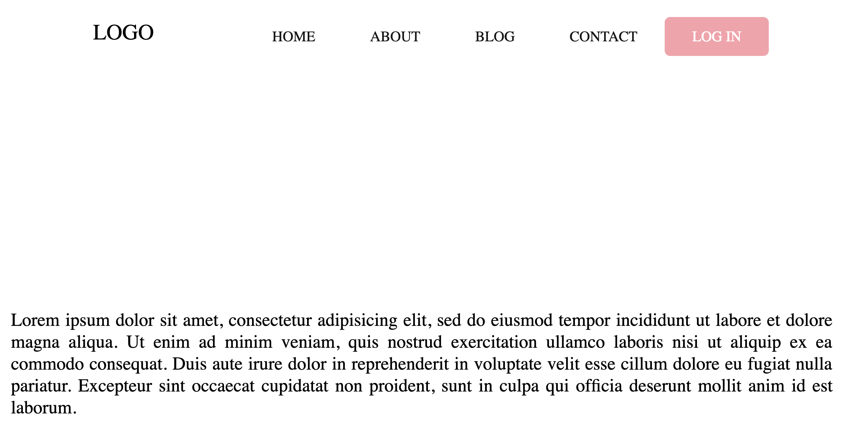
Amazing! Now this part wont make too much sense yet, but we want to have a second color scheme to this bar. In our style sheet we are going to add the following in combination with the existing code already implemented.
nav.black { background: rgba(0,0,0,0.8); height: 100px; padding: 10px 100px;}nav.black .logo { color: #fff;}nav.black ul li a{ color: #fff;}nav ul li a.active{ background: #E247; color: #fff; border-radius: 6px;}
No need to refresh the page, because these additions will do nothing?.YET!!! Now we need to put a little java script into the mix. If you navigate back you your index.html page. In between the last script tag and the end of the head tag add this?
<script type=”text/javascript”> $(window).on(‘scroll’, function(){ if($(window).scrollTop()){ $(‘nav’).addClass(‘black’); } else { $(‘nav’).removeClass(‘black’); } }) </script>
Now, lets take a moment to explain what this is doing. In our web browsers there is a scroll bar, and that scroll bar has a value depending on where it is. When its in the very most top portion you could say it has a value of 0, and when you scroll that number changes to 1, 2, 3, 4, 5 etc? So what this Javascript code is doing, is telling the web browser that if my position is not at the upmost position than I want to add a class to my nav called black. This logic will be true every time the webpage is loaded because it loading in the upright position.
So cool, but i feel like we are missing something?.. Oh yes! we need a sweet image to fill up the body of this website. Go google a nice high res photo of something you like, save it in the same directory as your index and style sheets. Navigate to your style.css page and lets update section.sec1 with the following.
section.sec1{ width: 100%; height: 100vh; background: url(img.jpg); background-size: cover; background-position: center;}
And just like that, we have our finished project.
This is a fun entry level project for incorporating javascript logic with traditional html and css. Thank you for following.
