History of the Domino?s Logo Design ? What does it Mean?
Domino?s is an established brand whose logo is recognised globally. Who would?ve thought that such a simple design would make a permanent mark?
While its service and taste characterise success, the Domino?s logo is the main symbol of this brand that helps us to recognise them around the world.
The logo which proudly depicts this franchise for 80 years is worthy of our interest.
To get more acquainted with this logo and its design, let?s look back into the past and learn more about the history of Domino?s logo design.
But before we head to exploring the logo?s origins, we should say a few words about the company.
The Phenomenon Called Domino?s

Being a globally recognised brand isn?t something that many companies can be praised for. Especially in the food industry.
Although many have tried to reach up to McDonald?s, a food chain that is known in every corner of the world, that mission can?t be accomplished easily.
Domino?s pizza is loved and adored by many happy and returning customers. So, here are a few main facts that will help you to have a better understanding of this brand.
? It was established in 1960 in Michigan.
? The founders were Tom Monaghan and James Monaghan but after 8 months James traded his half of this business.
? In 2018 Domino?s became the largest pizza company in the world (considering the global retail sales)
? In 1993, the master franchisees were purchased in the UK and Ireland.
? Domino?s market in the UK and Ireland is the third-largest market right after the US and India.
? Domino?s has 16,500 stores spread across 85 countries worldwide.
Domino?s world map

What Do Dominos Have to Do With Pizza?
This is probably the first question that comes to your mind. Since the logo is correlated to the franchise?s name that is Domino?s, what should be clarified is how the name came into existence. The name that inspired the Domino?s logo.
The name certainly has nothing to do with pizza. It was chosen strategically.
Before the two brothers took over the small pizza restaurant from where it all started, that place was owned by Dominick DiVarti. Not surprisingly, the restaurant was called DomiNick?s.
You may also like: How to Do Startup Branding for Gaining Competitive Edge
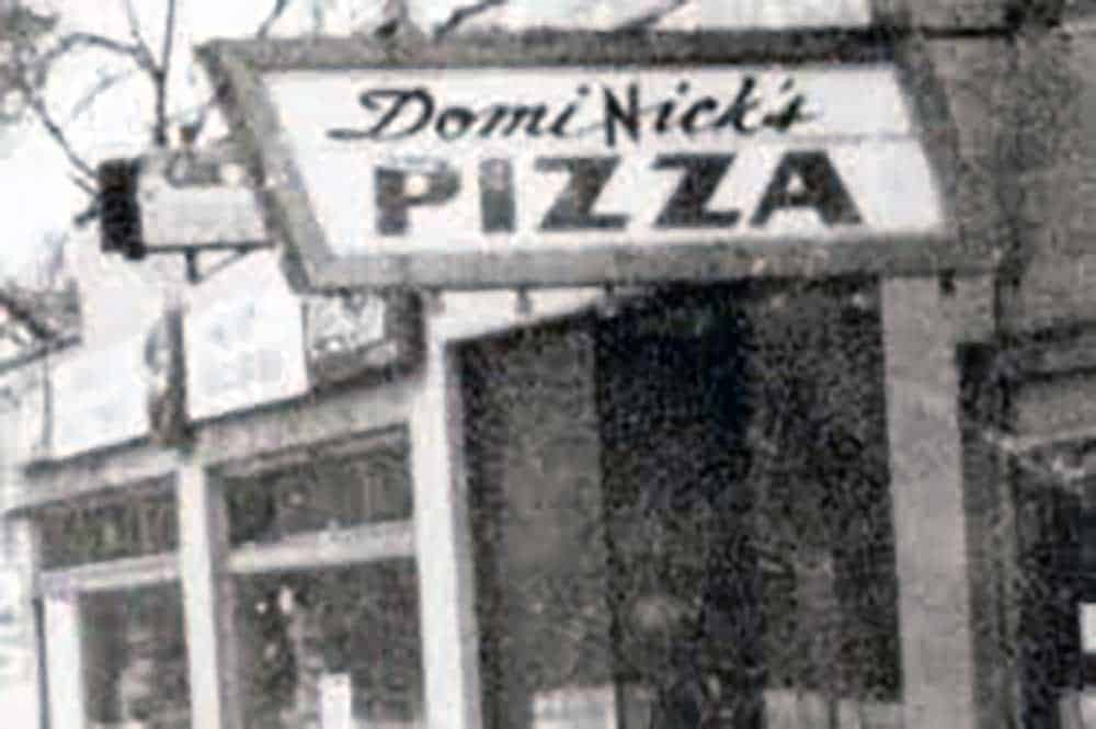
By 1965, Tom purchased two more restaurants. The problem arose when Tom wanted to establish the brand by sharing the same branding across all three pizzerias, but the initial owner didn?t allow him to use DomiNick?s name.
The idea of naming the restaurant Domino?s came from an employee, a pizza delivery guy. In 1965, the name was changed from DomiNick?s to Domino?s Pizza, and this is where it all started.
While the choice of this name seems random, it is a very strategic and intelligent option.
Domino?s sounds similar to the previous name DomiNick?s which helped him to stay recognisable among his customers at the time.
Additionally, this name also allowed him to work on spreading brand awareness which leads us straight to the logo design.
The Logo?s Origin
1960
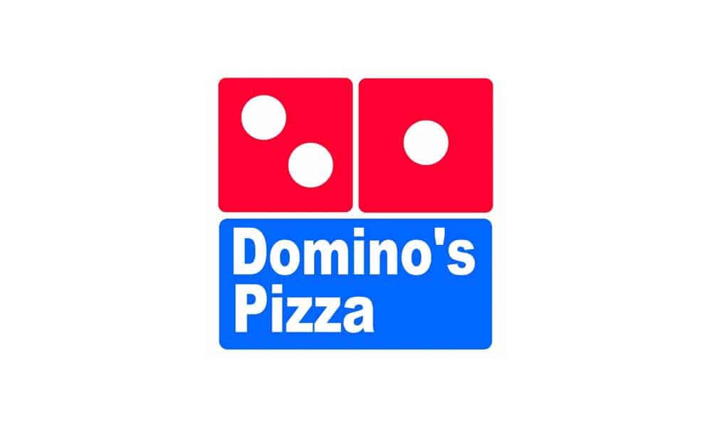
The first logo came into existence in the 1960s inspired by the name of the company. The first impression is that it is noticeable but straightforward.
It consists of two parts, the upper part is a red domino with three dots, and the lower part is a blue domino with the name of the restaurant.
The dominos are placed horizontally one above the other.
The Domino has three dots because they symbolise the three restaurants where it all started.
Tom planned to add a new dot each time when a new restaurant opens. However, the business spread quickly which made this plan unachievable.
Considering that 200 stores were opened in the next 12 years, it is understandable why he gave up on this idea.
In 2003, Tom explained the three dots idea to CNN,
?I decided we?d put three dots on the Domino because we had three stores, and every time we added one, we?d add a dot. You can see I wasn?t thinking of a national chain back then.?
When it comes to the form, the slightly rounded shape of the dominos gives this logo design a modern look.
The font quite resembles Futura Condensed ExtraBold and is easy to read and plays well with the overall design. It merely reflects the brand?s style.
The colour scheme can seem like it was chosen because of the contrast, which ensures that the logo is noticed by people who are passing by.
The colour combination can also be tied to the colours of the American flag.
This assumption is supported by the idea of adding a new dot to the Domino, which will represent the Domino?s restaurant just as the stars on the American flag represent its countries.
You may also like: 4 Reasons Why Businesses Should Create Engaging Presentation Designs
While red is an energetic colour that stands out in any combination and evokes urgency, blue conveys strength and dependability.
The two colours create a balance and evoke just the right emotion in the customers.
The eye-catching colours were also very adequate for the ?60s.
The combination of a domino with the representation of three original stores with a domino that carries the company?s name wrapped up in a square that symbolises a pizza box makes a well-rounded, meaningful, and functional design.
How the Logo Transformed with Time
As the years passed by, the Domino?s logo has changed several times.
Although changing the logo often isn?t recommendable, when a company exists as long as Domino?s it is a necessity.
Trends change, business?s success changes, and therefore, the need for innovation and adaptation arises.
The first change was made in 1977.
1977
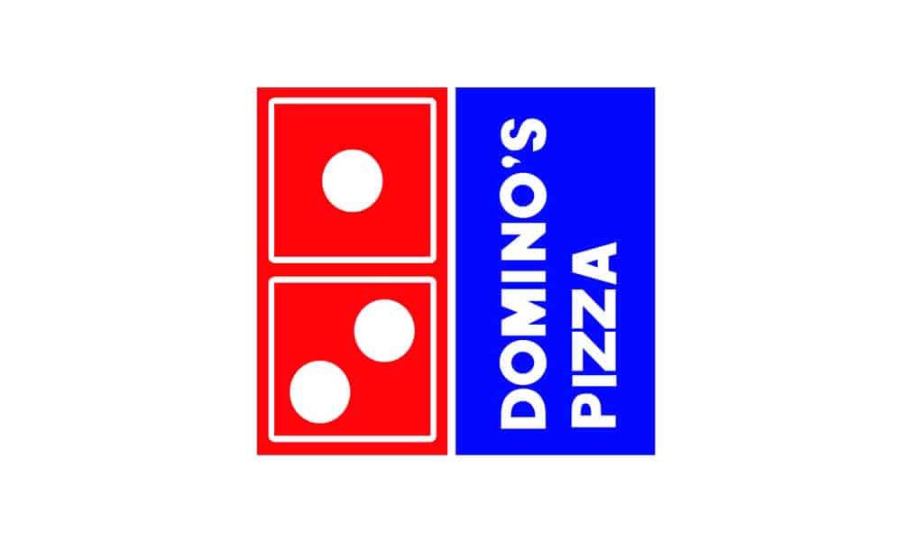
The logo was slightly redesigned, but the change was noticeable. It was flipped on the side, so the name of the company was vertical.
The colours were a bit brighter and darker. The rounded corners were eliminated, and the shape was squared.
What you can also notice is that the writing has the capitalised letters.
There were some other additions such as white squared which rounded the one and three in the Domino.
This design brought some new elements and details were added, which were probably meant to emphasise the logo some more.
Out of all the logo?s they?ll have, you?ll notice that this one was the most different.
It seems as if it was an experimental modification of the previous logo, which didn?t quite satisfy their expectations, which leads us to the year 1996.
In 1996, the logo was redesigned once more.
1996
They probably decided that the first logo was better and more efficient since they went back to the very first design and made a few changes.
The rounded corners and the white background were back, and the capitalised company name was eliminated.
While they kept the signifying blue and red combination, the colour tone?s were different this time.
The colours were more soothing and pleasant to the eye, unlike the previous logo whose brightness couldn?t be unnoticed.
Considering that by this time Domino?s was a well-known company, they no longer needed to attract passersby with overly bright colours. The darker colours give the logo a more classy look.
The most notable change is probably the logo?s position; that is, it was flipped one more time.
You may also like: 7 Hidden Signs It?s Time to Change Your Company Logo Design
The new change was that the logo was rotated. This look gave it a modern and unusual vibe that goes along with the new time.
The font has changed as well, and you will notice that it follows the quirky vibe, unlike the previous, more classical choice of font.
While this logo was exciting and fun, with the company?s growth, another logo change came around.
As the company expanded, so did their menu.
Domino?s has more to offer than just pizza since its menu features sandwiches, pasta, and much more.
This leads them to change the name from Domino?s Pizza to just Domino?s. It was shorter and more appropriate since they surpassed the time when they were just a pizzeria.
The name changed happened in 2012. The fourth logo refreshes followed this change.
2012
The logo changed followed the whole concept of helping people grasp that Domino?s is not just a pizza place but a recognisable food chain with a variety of products.
The lower, blue part of the logo was removed, leaving just the symbolic Domino with three dots.
The colours from the previous design were kept, but since there was no longer the blue portion of the logo, the Domino is now split between the blue and the red.
This logo design is situated next to the name of the company.
The logo became so recognisable that a discreet image of blue and red Domino with three dots is enough to make people understand which company is that.
What Domino?s Logo History Has Thought Us?
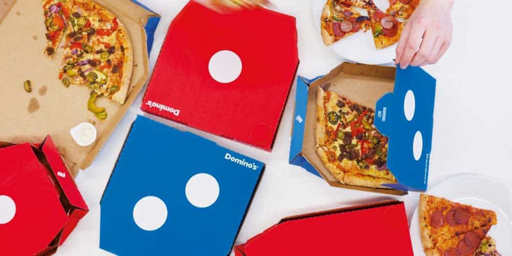
Companies and businesses can learn a lot from this prominent food chain but what graphic designers can learn is how to craft a logo thoughtfully.
They?ve thought about everything.
From the representations of the first three restaurants to a colour combination that is now recognisable across the globe.
One of the most important lessons that we can learn is that the logo design must adapt to the company?s progress and time.
They redesigned the logo several times but still kept the core of the design that is essential for the branding.
Author Bio: Kristin Savage nourishes, sparks and empowers using the magic of a word. Along with pursuing her degree in Creative Writing, Kristin was gaining experience in the publishing industry, with expertise in marketing strategy for publishers and authors. Now she works as a freelance writer at TopEssayWriting.
Originally published at https://inkbotdesign.com on January 21, 2020.


