In this article we explore what happens when we abandon the century-old five borough partitioning of New York City and remap the city to reflect the realities of 2017.
The boroughs of New York City ? The Bronx, Brooklyn, Manhattan, Queens and Staten Island ? have existed in their present form since the consolidation of New York City in 1898. In the interim 119 years, the city has radically transformed; the individual boroughs are now inter-connected in ways that would have been unimaginable at the time of their formation. A vast network of bridges, tunnels and the largest rapid transit system in the world connect the populations, establishments, and institutions of each borough ? to say nothing of the connections enabled by the explosion of digital and mobile technologies.
In this article we explore what happens when we abandon this century-old partitioning and remap the city to reflect the realities of New York City in 2017.
Using data from dozens of different sources and techniques from a wide range of technologies and disciplines including computer vision, natural language processing, statistics, machine learning, network science, topology, architecture and urbanism, we constructed a new partitioning of the city that resonates with our contemporary moment ? 5 boroughs for the 21st century.
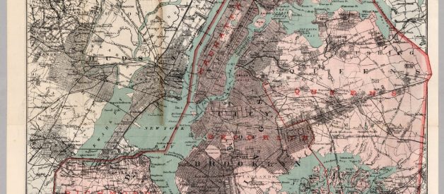
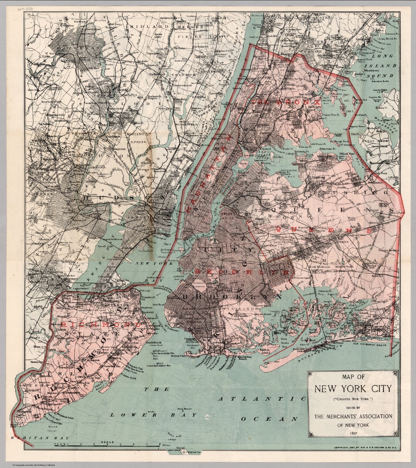 Map of New York City boroughs, 1898. Source: David Rumsey Map Collection
A Brief History of the New York City Boroughs
Formation of the Boroughs
When New York City was consolidated in 1898, forming a city of 3.4 million, the term ?borough? was adopted to describe the five constituent areas brought together under the consolidation. Each borough was represented by a ?borough president?, an elected officer who sat on the New York City Board of Estimate, an 8-member governing body responsible for budget and land-use decisions which also included the Mayor, the Comptroller and the President of the New York City Council.
Connection of the Boroughs
With the exception of Queens/Brooklyn, all boroughs are separated from one another by water. The implications and limitations of this physical partitioning of land have changed considerably since the initial formation of the boroughs. New York City is now connected by over 2000 bridges and tunnels, the vast majority of which were built after 1898.
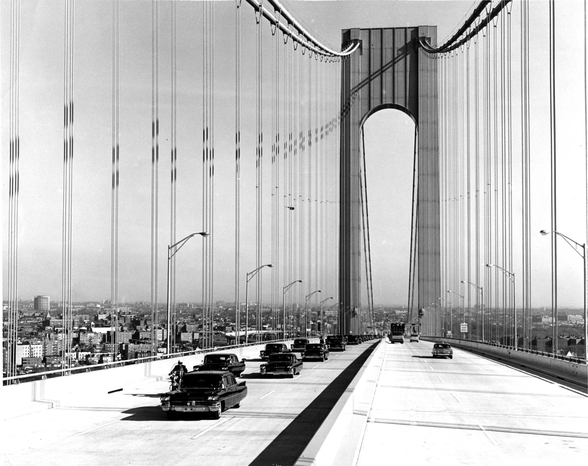
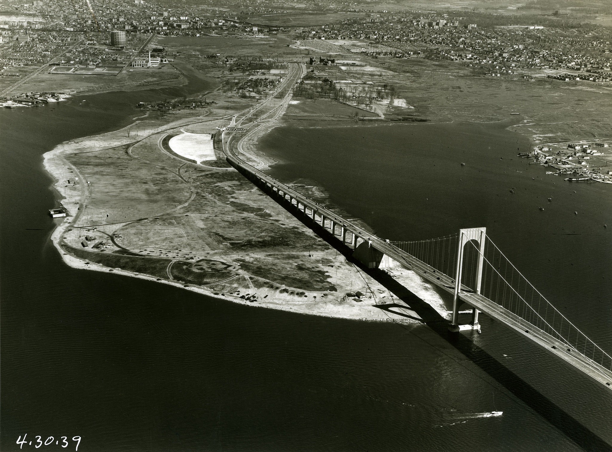
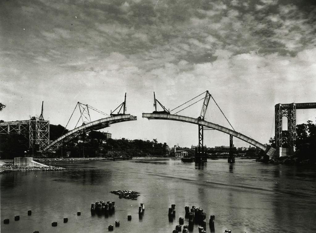 Verrazano-Narrows Bridge 1964, Bronx-Whitestone Bridge 1939, The Henry Hudson Bridge 1936. Source: MTA Flickr
The formation of the boroughs also predated the opening of the New York City subway system by 6 years. The ambition to connect the boroughs of NYC via subway was made clear in the naming of the first subway company to operate in the city: The Interborough Rapid Transit Company. From its first day of operation (when it transported over 150,000 passengers) to it?s current status as the busiest rapid transit rail system in the western world, the New York City Subway has had a radical impact on the life of New York City and the mobility of its denizens.
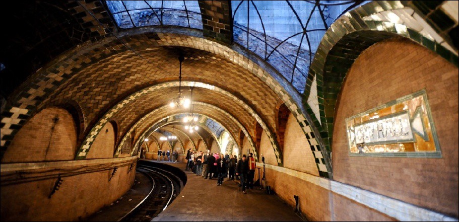 City Hall Station: one of the first stations opened by The Interborough Rapid Transit Subway (IRT). Photo by Fred Guenther
Disenfranchisement of the Boroughs as a Unit
In 1989 the Supreme Court unanimously declared the NYC Board of Estimate to be unconstitutional. This decision was made on the grounds that Brooklyn (pop: 2,504,706 according to the 2010 census) had no greater representation than Staten Island (pop: 468,730), thereby violating the Fourteenth Amendment?s Equal Protection Clause. In the wake of this decision, the NYC Board of Estimate was abolished, and most of its governing responsibilities were transferred to the New York City Council, which consists of members drawn from a much more granular partitioning of the city with 51 council districts distributed (unevenly) across the 5 boroughs. Thus, while the constituent council districts of a borough have substantial political power in the New York City government (via their representative council members), the boroughs as a unit have far less political significance.
Using Data and Artificial Intelligence to Understand New York City
We formed Topos earlier this year to advance the understanding of cities through the interconnected lenses of data and artificial intelligence. While there are well-known tools such as the United States Census that use manual techniques to collect information about different locations, using data and AI enables a dynamic, highly granular, and globally scalable understanding of place ? an understanding we think is valuable given the rapidly evolving nature of cities and neighborhoods around the world (the US Census, for example, takes place every 10 years, divides the country into 9 regions, and only covers the US).
Furthermore, we were interested in going beyond more familiar demographic viewpoints to capture the personality of a place, and what it feels like to actually be there. In a sense, we?ve developed a ?psychographics? of neighborhoods. As part of this endeavor, we have constructed a suite of features and indices about neighborhoods and cities that encompasses everything from topological analysis of urban form, to ambient light levels, to the prevalence of craft cocktails within a neighborhood.
From this starting point, we decided to re-envision what a five borough partitioning of NYC might look like in 2017 using techniques from Artificial Intelligence: vector construction, dimensionality reduction, and clustering.
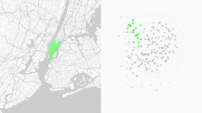 Neighborhoods represented on a map (left) and as vectors (right)
From a 2D map to a 65D hyperspace
Mathematically, we can understand this suite of neighborhood features as a high dimensional vector space, where each feature is represented by a unique dimension; creating, in the case of this article, a 65-dimensional space. Each neighborhood[*] becomes a vector in this space, which can now be transformed and analyzed using a wide range of mathematical, statistical and computational techniques.
[*]: Here we make the problematic assumption that neighborhood = zipcode. We promise to tackle this assumption in an upcoming blog post.
From 65D to 16D
One of the challenges in constructing a collection of features is understanding the interrelationship between features. 4 dimensions that are tightly correlated reveal much less than 4 completely independent dimensions. This becomes especially important in understanding the ways that entities described by features relate to one another ? an understanding that forms the basis of several machine learning applications. For this reason, high dimensional spaces are often transformed through the use of various dimensionality reduction techniques.
Starting with a 65 dimensional space, we applied Principal Component Analysis (PCA), resulting in a 16 dimensional, linearly independent space that captures 86% of the variance of the original 65 dimensional space.
 The 16 reduced dimensions arrayed in parallel, with inter-dimensional spacing determined by the amount of variance each dimension explains
Dimensional Exploration
Principal Component Analysis outputs a set of reduced dimensions that are ordered by how much variance they explain; in our case, the first outputted dimension (d1) explains 30% of the variance, the second dimension (d2) explains 14% of the variance, the third dimension (d3) explains 7% of the variance, and so on.
Understanding what information is conveyed by a particular reduced dimension can prove to be challenging since PCA isn?t optimized for interpretability. We decided to explore the two most significant dimensions (d1, d2) in two ways:
- via visual analysis using a Choropleth map
- via an examination of some of the top correlates in our original 65 dimensional feature space
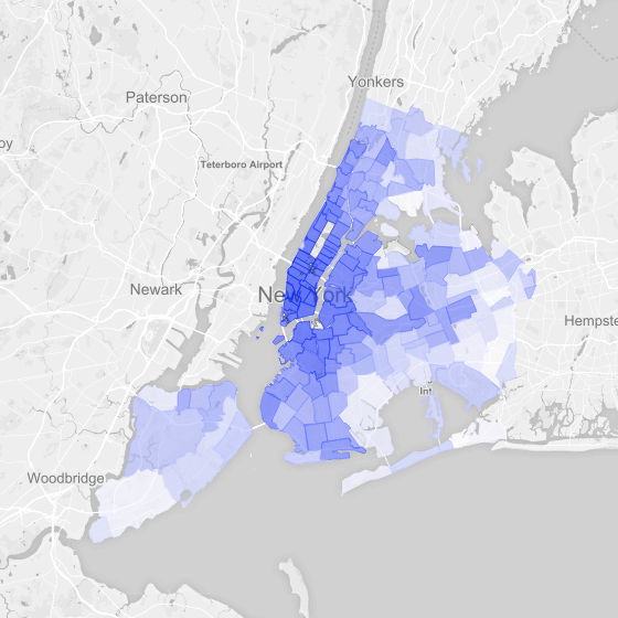 d1 Choropleth
d1 reaches it?s highest intensity in downtown manhattan (highest values: Soho, West Village, Union Square) and generally diminishes moving geographically outward in all directions, with lowest values in Arverne [Queens], Castle Hill [Bronx] and Far Rockaway [Queens]. Contrasting the West Village with the beachy Rockaways, it is perhaps unsurprising to find that the top positive correlates of d1 are metrics relating to nightlife (bars, clubs, late night pizza spots, etc), while the top negative correlates are metrics that capture the visual presence of nature via deep learning based Image Recognition technology.
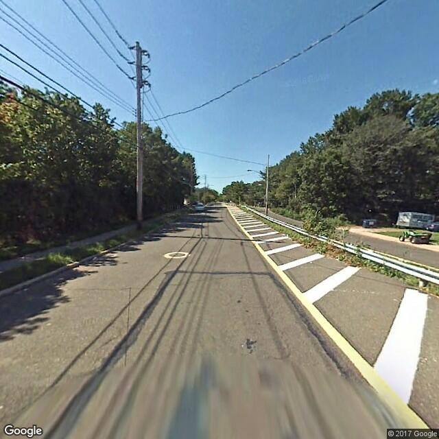
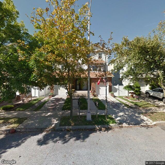
 Image Recognition technology allows us to detect the visible presence of nature within neighborhoods
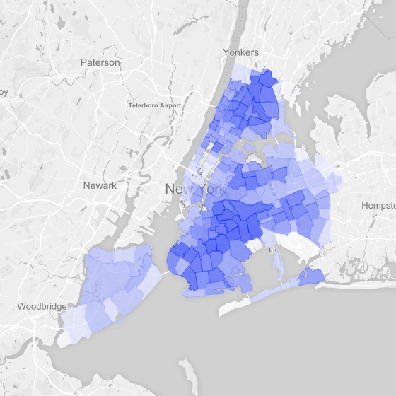 d2 Choropleth
d2 tends to be highest in dense, predominantly residential areas of Brooklyn, Queens and The Bronx (top values: Flatbush [Brooklyn], East New York [Brooklyn], Allerton [Bronx]) and lowest in lower Manhattan, Staten Island, and remote parts of Queens (lowest values: JFK Airport [Queen], Battery Park [Manhattan], Breezy Point [Queens]). The largely residential orientation of this dimension is captured by some of its top correlates ? dimensions that relate to noise and party complaints.
Division by 5
Having a linearly independent, dimensionally reduced vector space is a powerful starting point for several machine learning applications. In particular, such a space allows the application of clustering algorithms, which group entities (neighborhoods) together in various ways.
We used K-means clustering to produce our new 5 borough mapping of New York City. K-means clustering is an algorithm that partitions a set of data points into a predefined number of groups. One of the limitations of K-means in general is that it requires a priori assumptions to define K; however, in our case we thought taking the original number of boroughs would be a provocative starting point for our new partitioning.
It should be noted that we could just as easily have chosen 4 or 6 boroughs; the Topos platform allows clustering using a range of values for K, enabling users to vary the number of partitions to best suits their strategic goals.
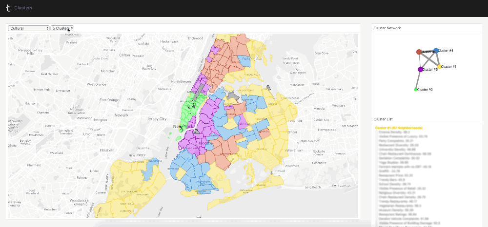 The Topos platform allows clustering using a range of values for K. It also allows user to change the set of inputs that power the clustering.
The set of input features that powers the clustering can also be altered, resulting in completely different partitions. For the purposes of this article, we selected dimensions that fall under the broad bucket of ?Culture?; We could instead have selected dimensions relating to, for example, ?Infrastructure?.
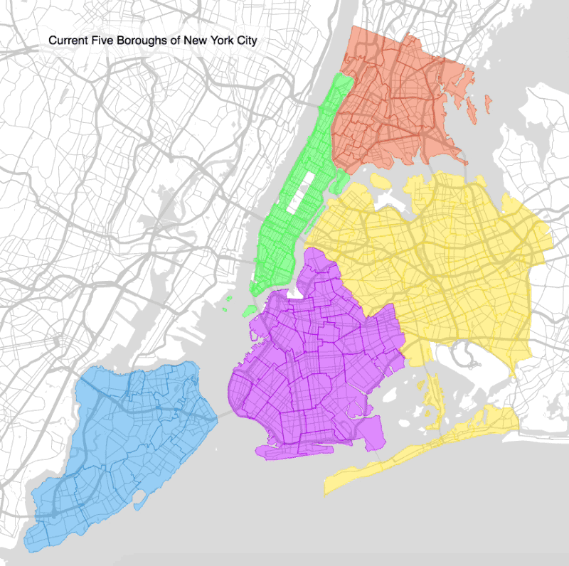
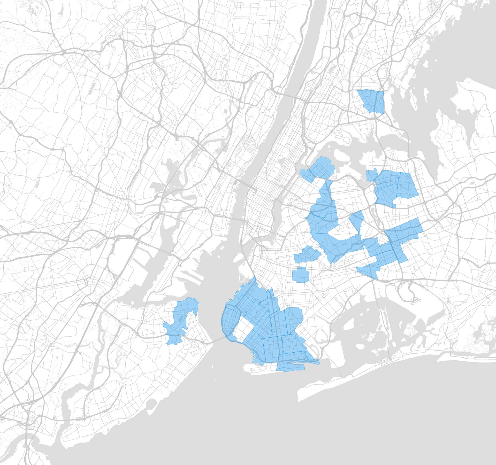
The New 5 Boroughs
Looking at our new 5 borough mapping of New York, one thing is immediately clear: geographic boundaries and proximities are much less important than they were in the original boroughs. With the exception of the green cluster, all other clusters are spread across a minimum of 3 of the original, geographically defined boroughs, and divided by at least one body of water.
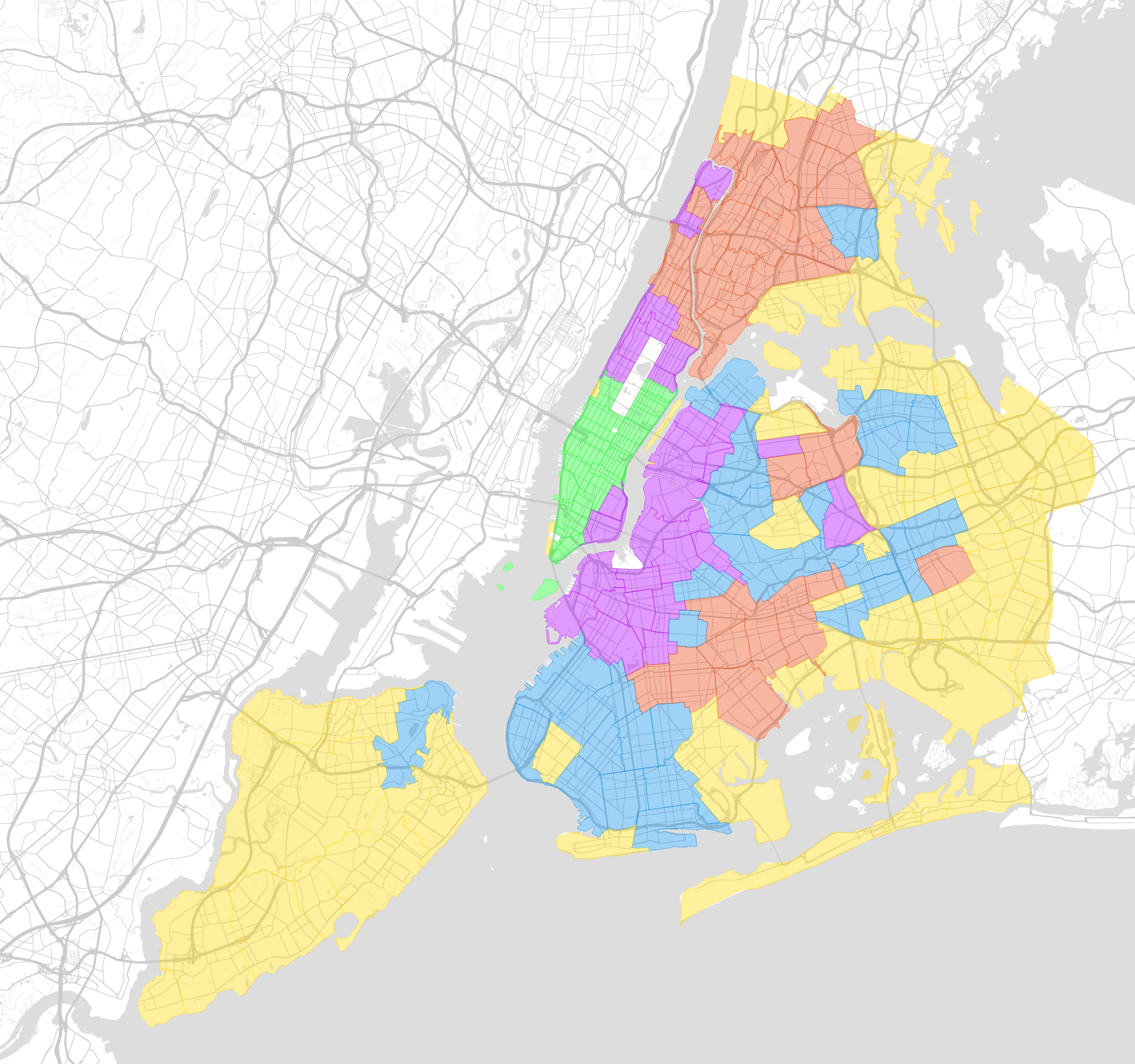
There is also a clear pattern of concentric rings radiating from downtown Manhattan, despite the fact that we didn?t include commute time or distance to transport hubs as an input. In this sense, geography reasserts itself as an organizing principle of the new boroughs. On average, we find the following distances to the center of downtown Manhattan:
Average distances to the center of downtown Manhattan
- [1] Green cluster: 1.99 miles
- [2] Purple cluster: 4.34 miles
- [3] Blue cluster: 7.92 miles
- [4] Red cluster: 7.86 miles
- [5] Yellow cluster: 11.09 miles
This striking pattern of concentric, differentiated rings resonates with the formal organization of Ernest Burgess? Urban Land Use Model, though it differs in the specific substance of the concentric rings.
Alongside commuter distance, explicit economic indicators such as income, housing and rental prices were not included in our input data. Despite this, there are clear, dramatic differences that emerge when economic data is aggregated to the cluster level, with the Median Household Income of cluster 1 (101,555 USD) almost triple that of cluster 4 (35,828 USD). Given the intertwined nature of commute time and income inequality, it is perhaps unsurprising that capturing one of these factors implies the other.
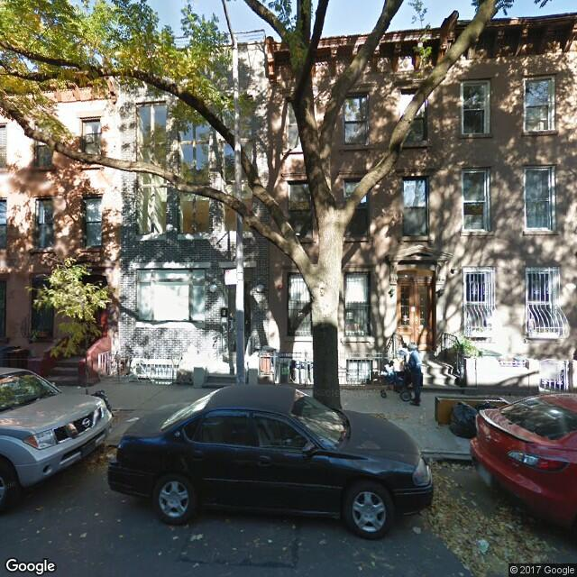
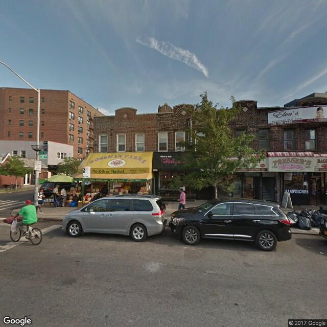
[1] Green cluster ? ?Minhattan?Heavily built up, Vertical borough, Highest establishment density
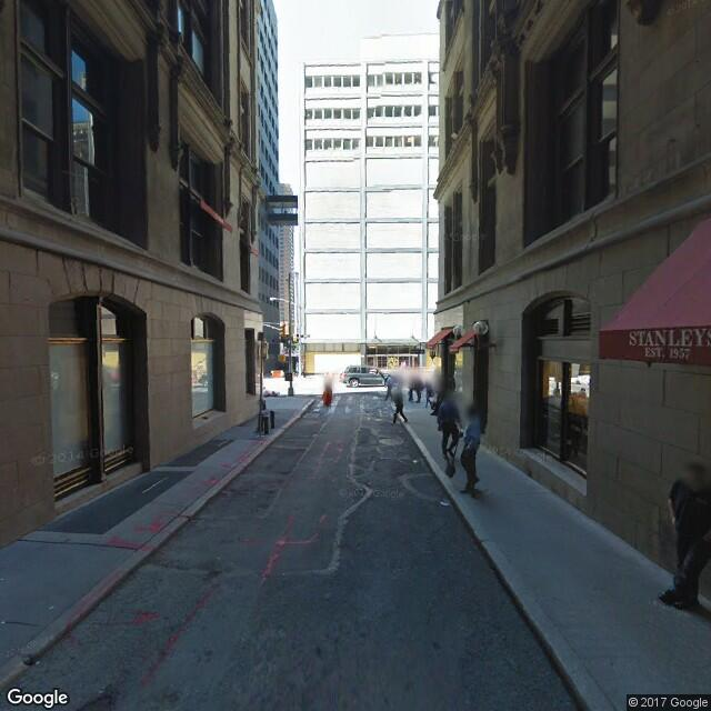
 Typical Minhattan photos
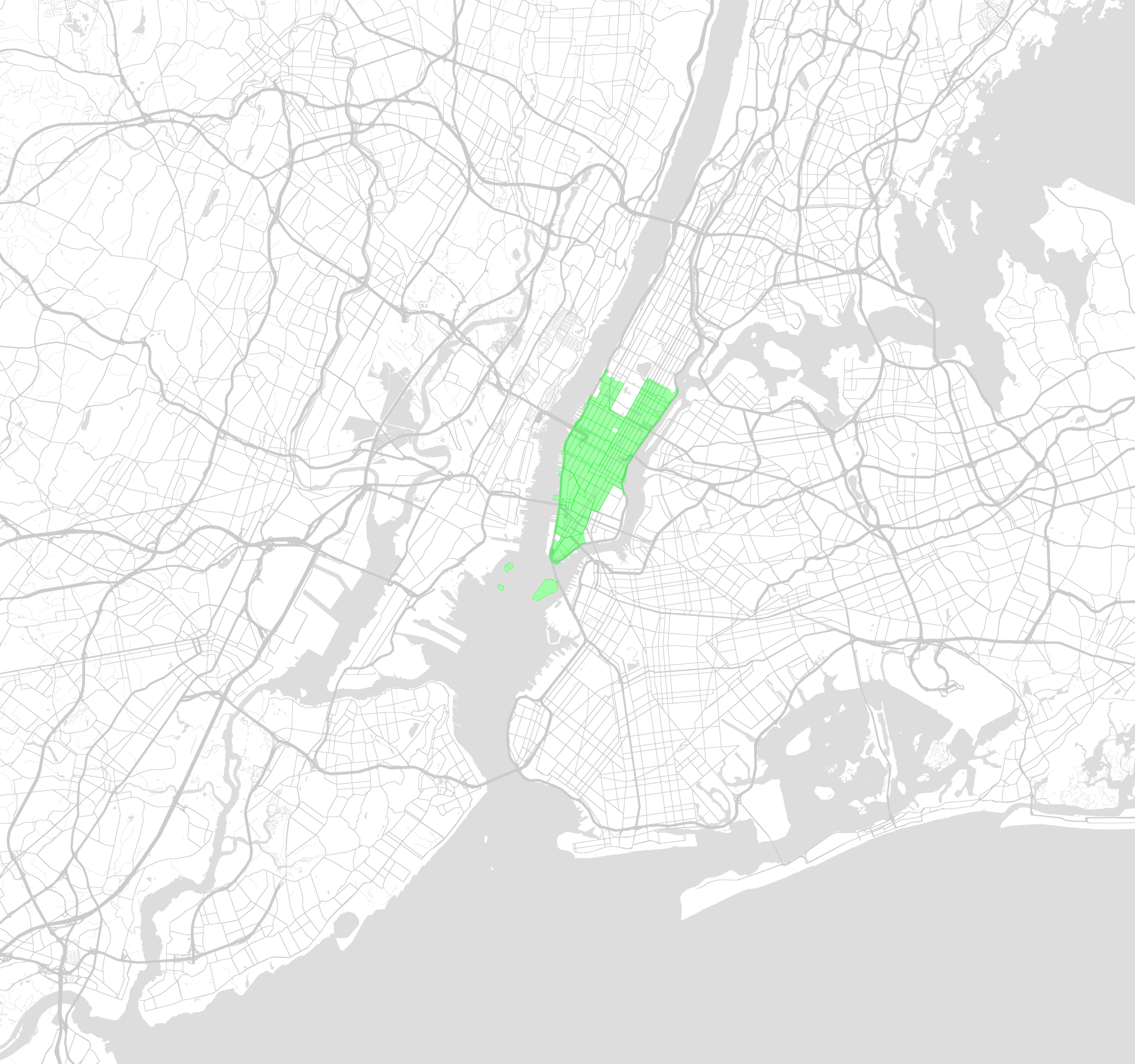
The smallest of the new boroughs as measured by both population and area, Minhattan is also the densest in several regards. In addition to being the most densely populated (with 69k residents/square mile), Minhattan has a higher density of most types of establishments (from museums to nightclubs) than any other borough. Alongside this incredible commercial, institutional and population density there is a corresponding absence of the natural world. Coupling these two factors, we can see that Minhattan is distinguished by d1 (discussed above), our first reduced dimension.
While the collection of neighborhoods brought together in Minhattan are tightly bound by geography, it is also interesting to consider the close-by neighborhoods that are excluded. In particular, Riverside South (Trump Place) stands apart from Minhattan (For a more in-depth discussion of the singular nature or Riverside South within the context of Manhattan?s westside, see our previous article Rethinking ?distance? in New York City)
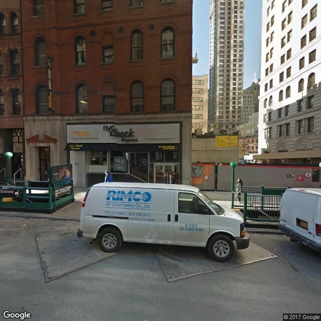
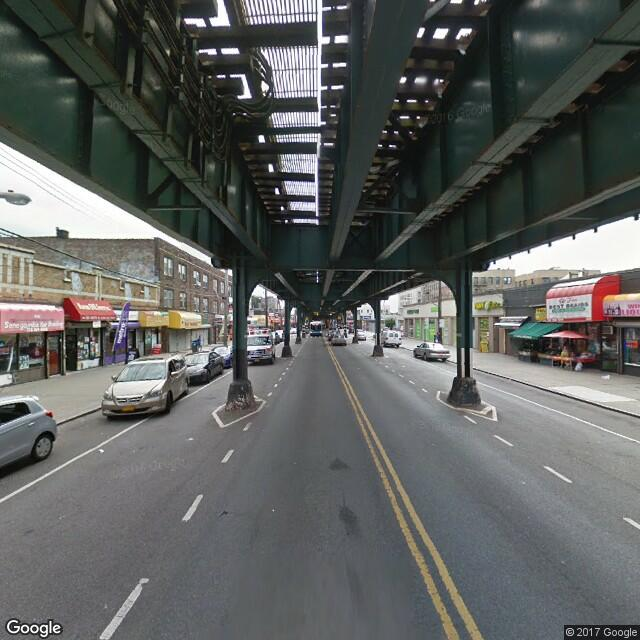
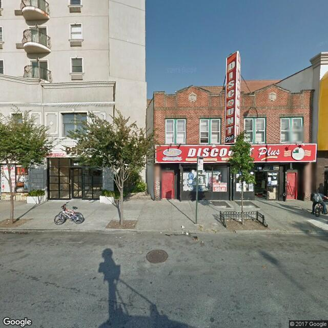
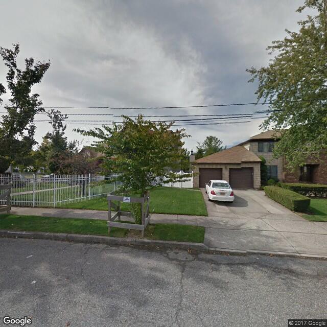
[2] Purple cluster ? ?The Ring?Expensive, Commuter-oriented
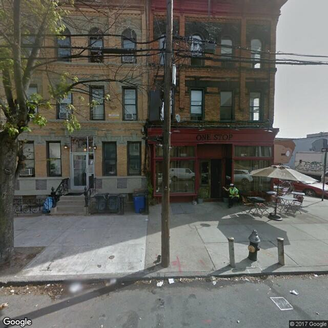
 Typical photos taken from The Ring
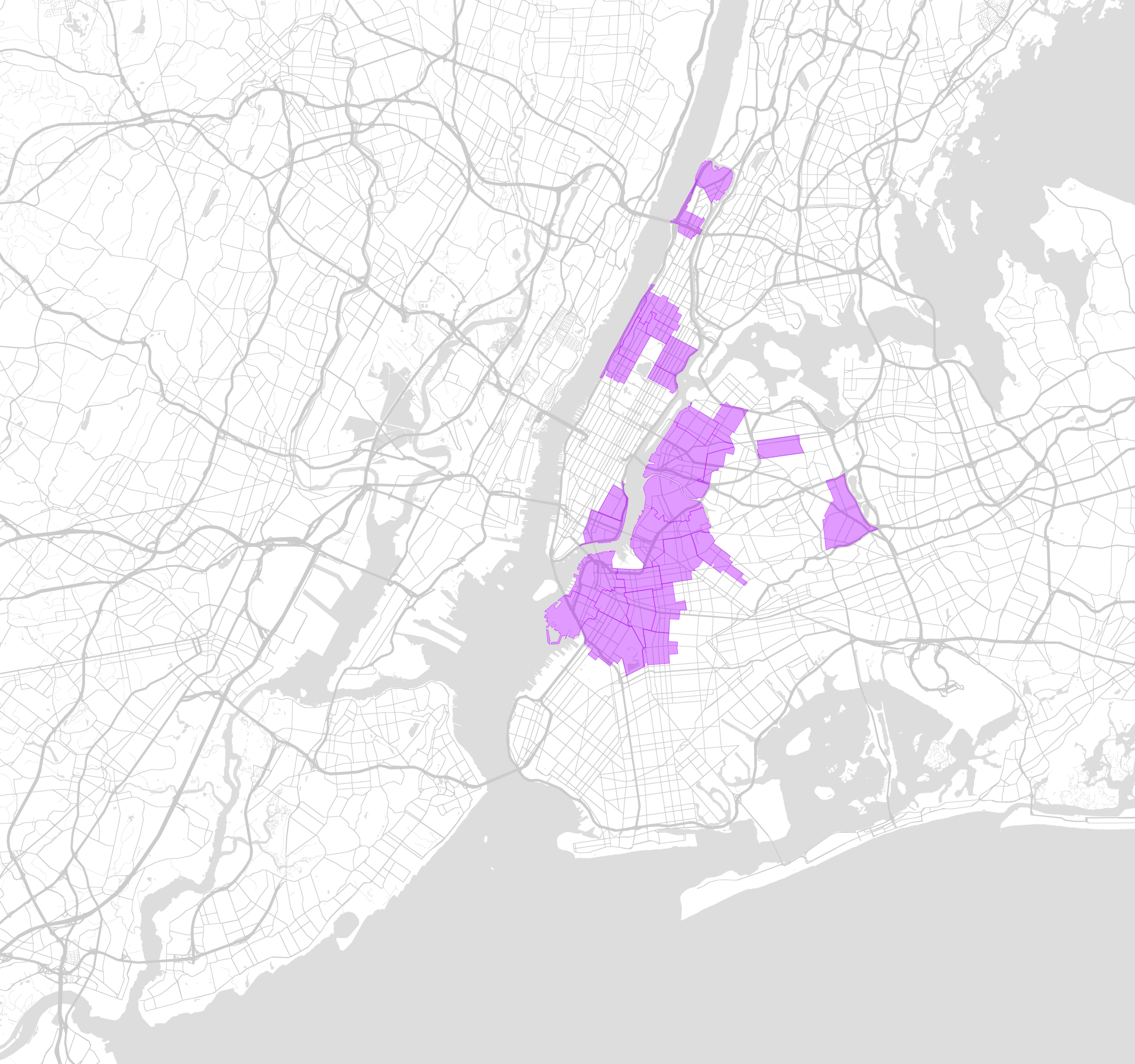
The Ring tightly hugs Minhattan, and on average is the closest borough to the center of Minhattan, with housing prices to match: after Minhattan, it is the most expensive borough to buy a house in. Unlike Minhattan, The Ring spans multiple rivers. It also unites isolated neighborhoods embedded in other boroughs that are quite far from the center of The Ring such as Forest Hills, Inwood and Hudson Heights. In general, The Ring has high densities across a range of establishments, and is the second highest borough along d1.
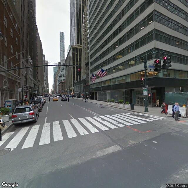
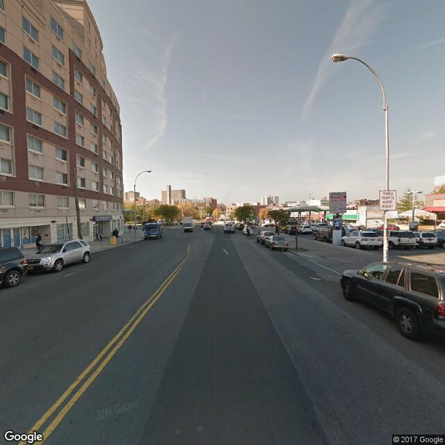
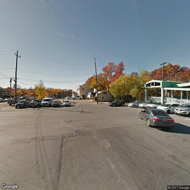
[3] & [4] Red and Blue Clusters??North Bend? and ?South Bend?Largely residential, Less commercial density
 Typical North Bend photos
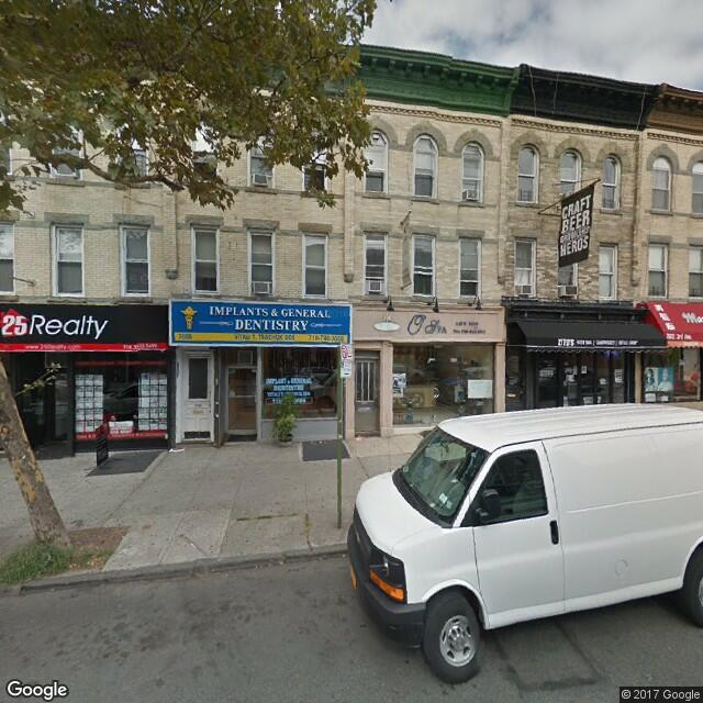
 Typical South Bend photos
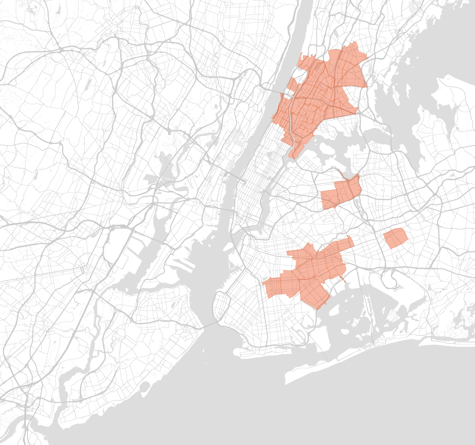
 Red ? ?North Bend? and Blue??South Bend?
Half of NYC?s residents live in North Bend and South Bend, with 27.6% of the population living in the North Bend and 22.6% in the South Bend. They share remarkably similar average distances to downtown Manhattan, with South Bend neighborhoods an average of 7.92 miles away and North Bend neighborhoods an average of 7.86 miles away. North Bend is more densely populated than South Bend (46,694 residents/square mile vs 33,367 residents per square mile) which may explain another aspect of what differentiates them: South Bend has a far higher frequency of noise and party complaints (and is generally higher on d2 than any other cluster).
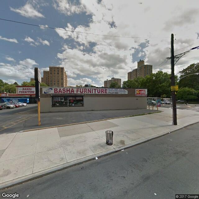
[5] Yellow Cluster??The Meadows?Leafy, Suburban, Spread out
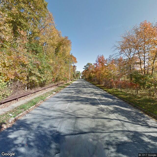
 Typical photos taken from The Meadows ? nature and suburban style homes are frequent subjects
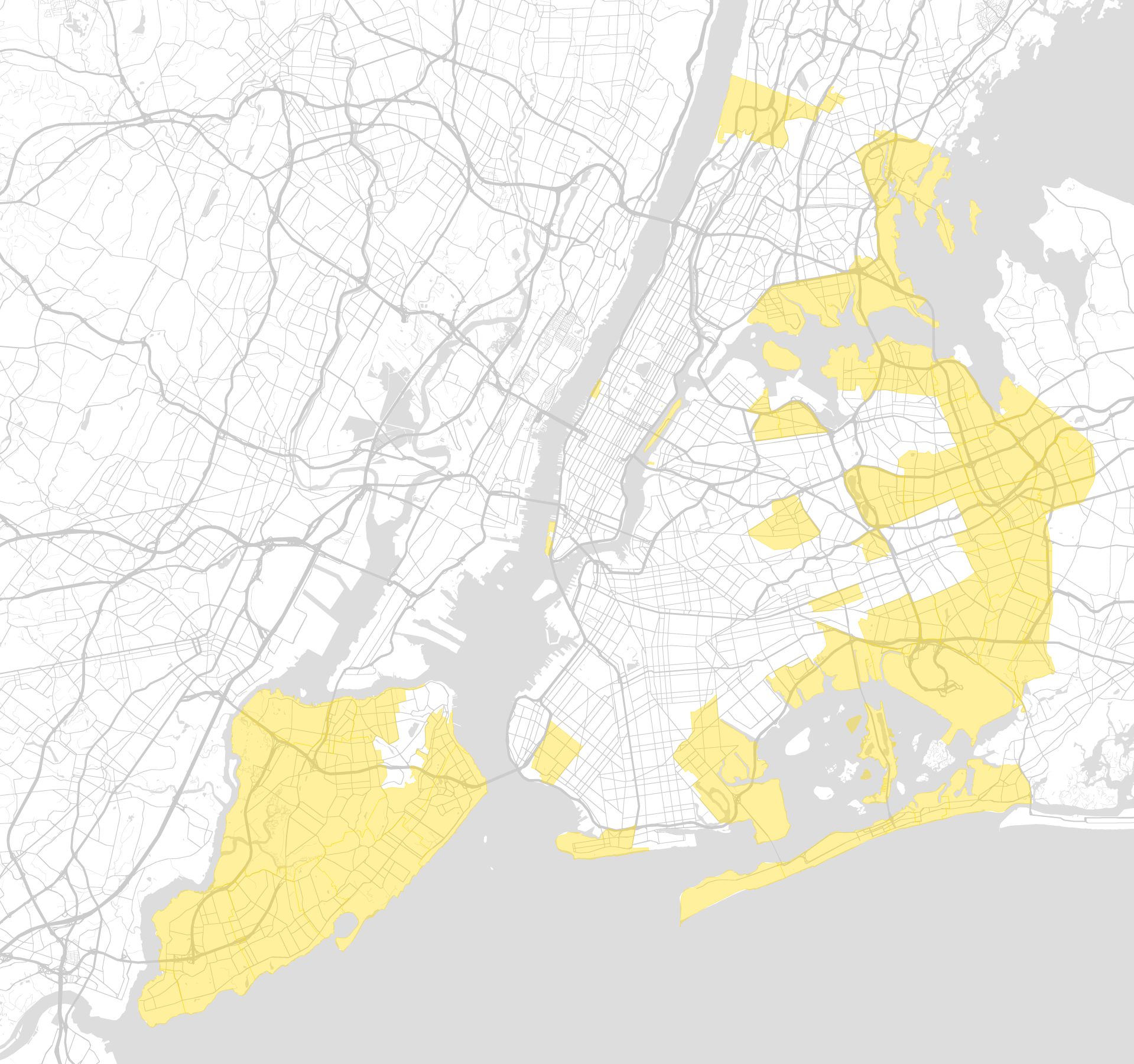
The Meadows is farthest away from the heart of Minhattan, and is sparser than the rest of the city in every regard. There are 12,050 people per square mile (vs Minhattan?s 69,390, a nearly 600% increase). Like Minhattan, The Meadows is clearly differentiated by d1; the natural environment asserts itself more strongly, as can be detected via image recognition technologies. Additionally, image recognition algorithms discern the frequent presence of traditional suburban style houses in The Meadows, revealing a side of New York City that is less frequently presented in depictions of the city.
Why Divide New York City?
As with many new technologies, data and AI based partitioning can be used to both positive and negative ends. Enabling a new level of strategic gerrymandering and malapportionment is an undeniable risk. We also believe the cultural, ecological, institutional and architectural diversity of New York City is an incredible strength and should be celebrated.
At the same time, understanding how groups of neighborhoods are connected by a common set of challenges, environmental conditions, spatial configurations, or cultures, enables a more informed, granular approach to the city ? whether this means developing strategies to address noise pollution, deciding where to open a farmer?s market or finding an apartment.
Furthermore, New York City is already divided. 119 years after their original formation, despite a significant diminution of political power within the New York City government, the boroughs of New York are semantic units that powerfully shape the way many people perceive the city ? not to mention the rest of the world.
At the least, we hope this data-driven partitioning challenges static simplifications of what ?The Bronx?, ?Brooklyn?, ?Manhattan?, ?Queens? or ?Staten Island? means. New York City has changed radically over the past 119 years, and will continue to do so, as will cities across the world. In this regard, we end with a correction of the title ? rather than ?5 boroughs for the 21st century?, a more appropriately dynamic title would be ?5 boroughs for June 19th, 2017?.
This post is part of an ongoing series capturing different insights we generate while developing our platform. We would love to hear your feedback. If you enjoyed this article please share and hit the ? to recommend.
?
Topos: Transforming the way we understand cities with Artificial Intelligence.
