 Thanks to Domaso for inspiration and this adorable cat!
No one enjoys waiting.
With a huge variety of excellent iOS apps, macOS tools, and well-crafted websites, people have a certain quality bar. By default, users expect a fast reaction from the digital products they?re working with.
Just a real example: recently we released a tool for providing feedback on iOS apps. As it always happens, the first version was not perfect and had a loading delay for 2?3 seconds.
Guess what?
People reported these 3 seconds as a bug. In a real-world development, you can face slow internet connection, not optimized code, long operation processing or just too much data. So the app might work not as fast as the users expect it. While early adopters can give your product a second chance, the vast majority of people will close it right away.
Unless the interface of your product provides clear immediate feedback on users? action. What has just happened ? a bug or a simple request to the server? How much time does the user need to wait for using the tool or a website? And why should the user wait at all?
Let?s have a deep dive into loading animation:
- A brief history of loading animations.
- Loading animations: 101
- Small UI detail can be different.
- Simple or well-crafted?
- Useful tools and Resources

A brief history of loading animations.
For such type of feedback, designers use progress bars, loading indicators, preloaders or spinners. They explain to users when something is happening or loading and ideally reduce mental waiting time.
When do you think designers start thinking about that type of feedback?I was surprised to see articles on Nielsen Norman, mentioning response times and loading animation in 1993 (with the reference to 1985 resources):
In cases where the computer cannot provide fairly immediate response, continuous feedback should be provided to the user in form of a percent-done indicator [Myers 1985, ? The importance of percent-done progress indicators for computer-human interfaces.?].
Progress indicators have three main advantages: They reassure the user that the system has not crashed but is working on his or her problem; they indicate approximately how long the user can be expected to wait, thus allowing the user to do other activities during long waits; and they finally provide something for the user to look at, thus making the wait less painful. ? Jakob Nielsen, on January 1, 1993
Since the Web 1.0 almost every website has preloaders. You might notice those moving spinners while the rest of the page?s content is still loading.
In 2007 website preloaders looked like this:
 Loading generator from 2007. Do you notice familiar spinners?
Back then you could also find guides on creating loading animations with Fireworks (2007) or Flash (2008) and some tools like ?Loading GIF Generator? (2009).
In 2010 things get quicker with CSS3. Appeared many guides teaching people how to make CSS3 animations, loading animations packs, YouTube learning videos. Designers could do loading spinners in Photoshop Cs5, which was quite popular ten years ago.
Loading animations was more a web thing because page loading time was an issue. Some sites got pretty creative with Flash preloaders and this was in 2010:
 30 Creative Flash Preloaders Examples, an article from 2010
From time to time progress bars and spinners got criticized in favor of Skeleton screens (Mobile Design Details: Avoid The Spinner, 2013). While designers started to pay more attention to the loading animations in 2014 -2016. So you could see be more in-depth tutorials on loading experience and the perception of time (Smashing Magazine, 2015), collections of free designed loaders, pluggings, and open-source projects.
 Meet Material Design in Preloaders (2016)
Design trends and approaches have changed but the need to give UI feedback to users is still here.
Loading animations: 101
In a perfect world, loading animation should:
Be shown to the user as least as possible.
If you can make your tool or site work fast enough, that will be perfect. Or at least make a perceived speed appropriate to the users? expectations. Showing adorable loading indicator an infinite amount of time will annoy users and decrease UX. While showing default animation without any time indication is definitely a bad idea (some funny tweet on this topic). So it?s better to solve content loading problems first.
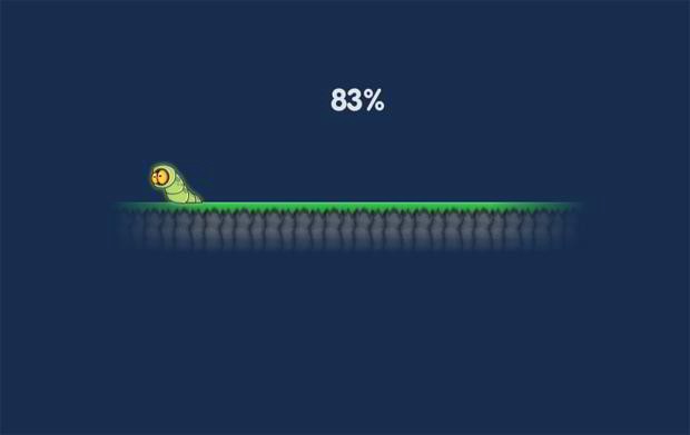
Give time estimation.
It can be a simple message of approximate time to wait or visual representation of work done. How many files have been uploaded from the whole amount? How many minutes the software update will take? How much progress has been done already? These UX details can set the expectation and reduce frustration.
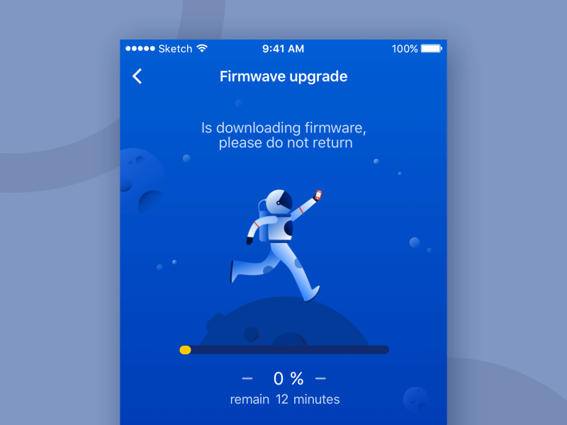 Loading-Astronauts by Cream M.
Explain why the user needs to wait.
It?s not always obvious why some apps or tools are not reacting instantly like it was initially with our tool. Smart loading animation can give a reason to wait and explain what?s happening under the hood:
 File fetching animation by Vinoth
Coming back to our example with the feedback tool. While we haven?t made loading less than 1 second, we decided to explain the waiting time. Animation specifies that the app is loading screenshots. Now it?s clear that our tool hasn?t crashed, it just working on the request:
 Flawless Feedback loading screen
Make the waiting process less frustrating.
It can be achieved by putting an engaging animation, which keeps the user’s eyes busy.
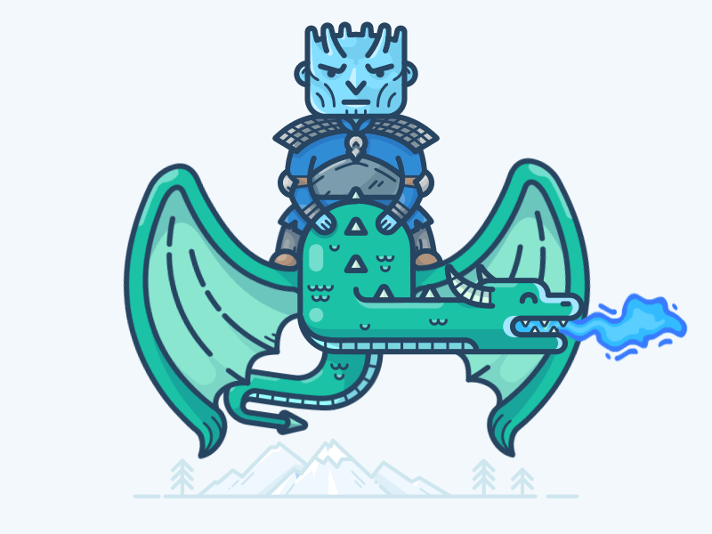 Any Game of Thrones fans here? Enjoy Night King loading animation by by Alex Kunchevsky
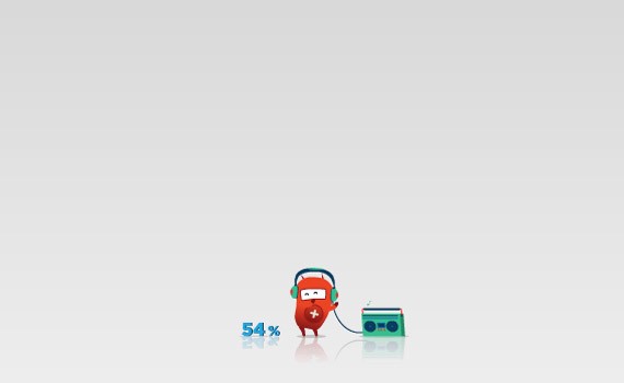
Reduce a user?s perception of waiting time.
It?s very related to the point mentioned above. If you find something to grab user?s attention while waiting, the mental time will pass faster. It can be a catchy color combination, interesting or cute idea, or just pancakes:
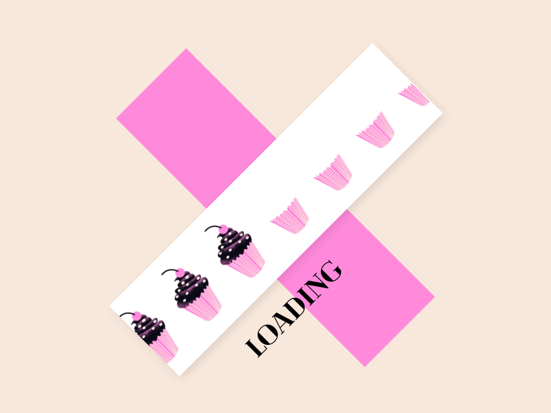 Cupcakes Loader by Pierre Kleinhouse
Emphasize branding and company voice.
If you the user will anyway look and wait while your app or website is putting the thing together, why not to use this time wisely? I?m not proposing you to make loading animations pushy or use some phycological tricks. Just make loading experience consistent with your brand voice and let it be a tiny little detail that matters:
 Loading animation for BVG?s ticket app by Antonin
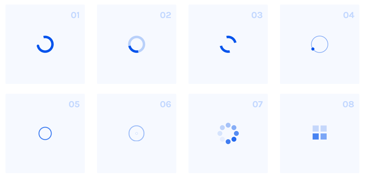
Small UI detail can be different.
While someone might think that loader is just a tiny UI detail, it has many types and variations. Although, there are several options to give UI feedback on loading content ? progress bars, loading spinner (infinite loading animations) and skeleton screens.
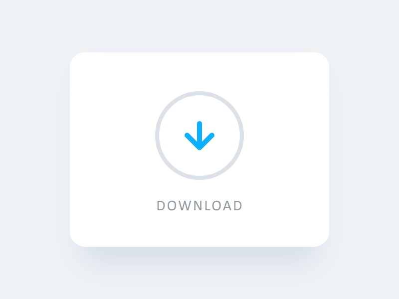
Progress bar
Used when it?s possible to define the loading time. Progress bars can be implemented with a numerical or visual indication and comes at all shapes and forms.
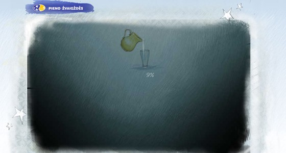
Those with numerical indication sometimes called percent-done indicator. They can be a straight forward or very creative, whatever works better for your users and business need:
 Loading screen visual for app by Nguyen Tran
You can also find interesting progress bars made as looped animation with percentage indication:
 Loading animation by Dragonlady
The main idea behind the progress bars is to show how long an action will take and the state of the progress so far. Depending on the UI tasks, progress bars can be a just linear without percent indicator.
Think about Gmail. It doesn?t show the percentage of progress but the user has a feeling of the uploading progress. Two examples, simple and creative:
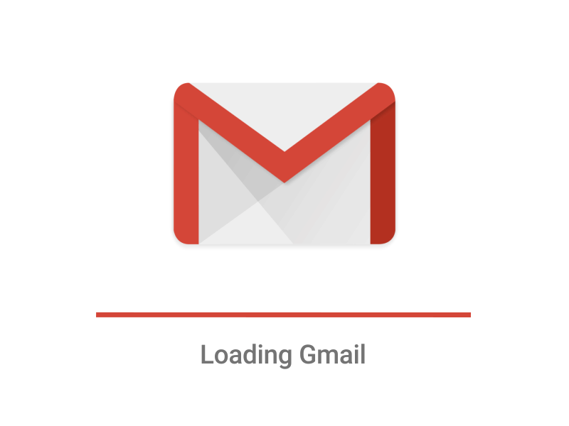
 Gmail loading animation and more creative loading example from Allen Zhang
Loading spinner or infinite loading animations
Used when loading time is unknown. It can be default spinners, creative indeterminate indicators, animations showing that your app is ?doing something? under the hood.
The last type of animations probably has less stressful for the user, as they try to explain why loading takes time:
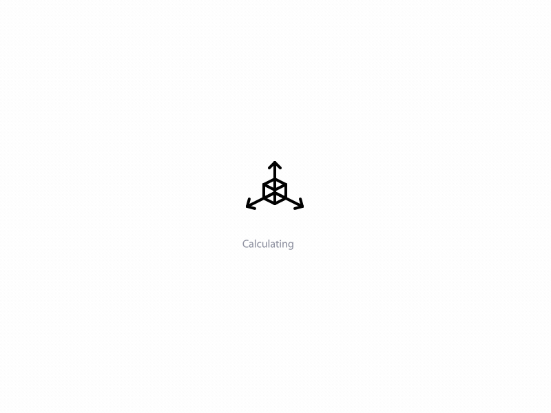 Calculating Loading Icon by Hoang Nguyen
Creative indeterminate indicators can be related to the business and help support your brand voice (that?s very true for progress bars as well). What app do you think might use such loading animation?
 LittlePin Spinner by Daniel Sofinet
Infinite indicators ask users to wait while something uploading or doing, but never specifies how long it will take. Historically, looped animations were used for this task. They could be pretty simple or very creative and adorable (for the first several minutes):
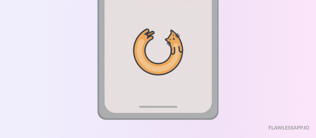
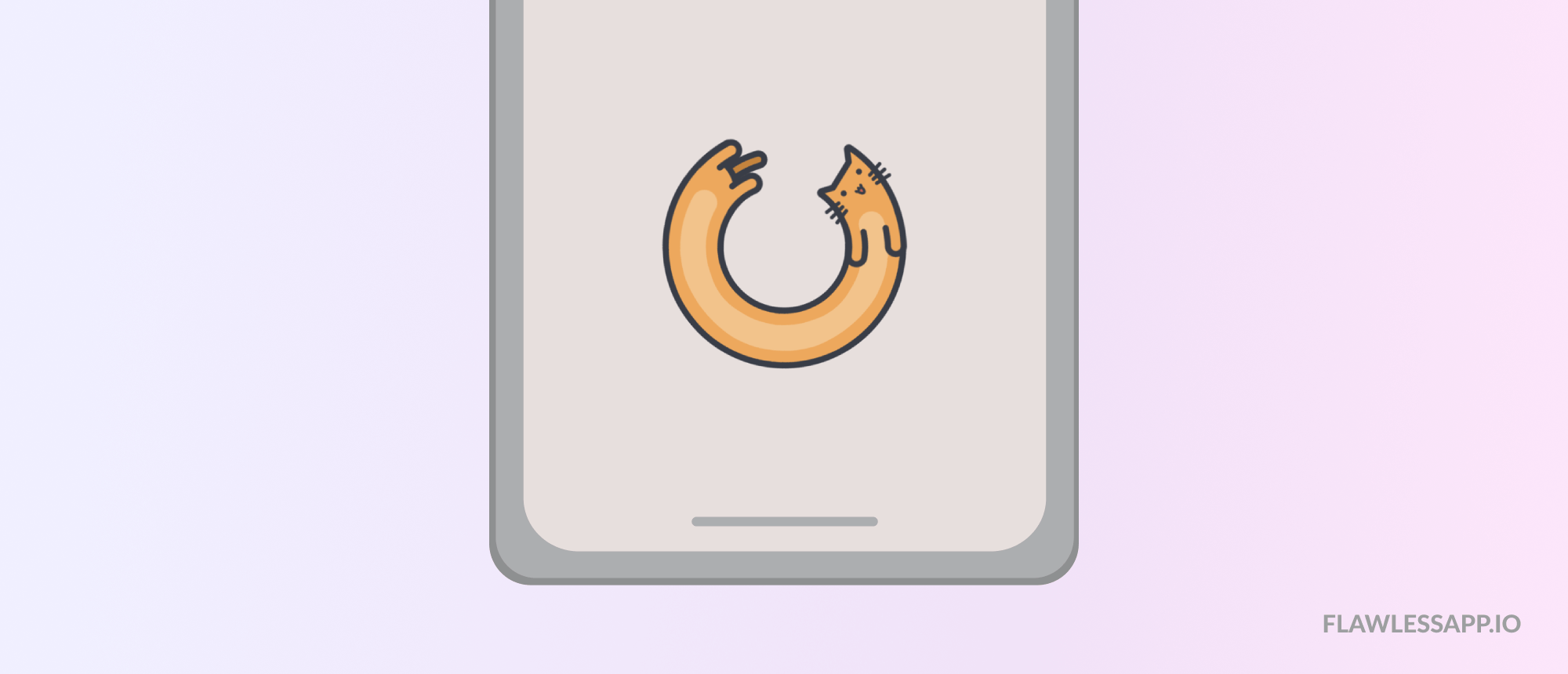
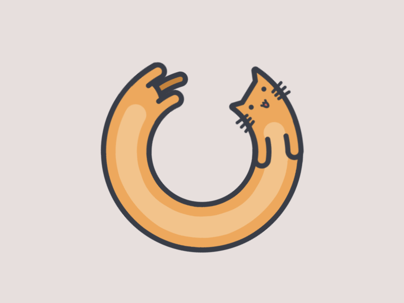 Loading cat by domaso. So cute!
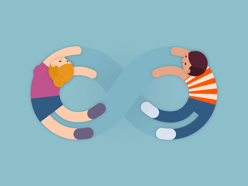 Infinity by Eszter Balogh. Looks cool but probably I will not be happy to look on it forever?
As you see, nowadays loading animations are more art than just a system status UI element.
Skeleton screens
Skeleton screens provide incremental progress in loading the interface. You can imagine them as black pages (placeholders) with step-by-step loading of images, text and other content you might see on the page.
This term firstly appeared in the Luke Wroblewski article, mentioned already (Mobile Design Details: Avoid The Spinner, 2013). Luke advised using skeleton screens for a better loading experience. This idea was supported by other designers in the space and used in the UI of Facebook, LinkedIn, YouTube, Google Drive & others. Some really cool findings on the topic you can read at Bill Chung guide.
Just to give a real example. If you use web design tool Figma, you saw a progress bar on the top of the page with gradual loading of UI ? firstly you see placeholders for projects, then available data there:
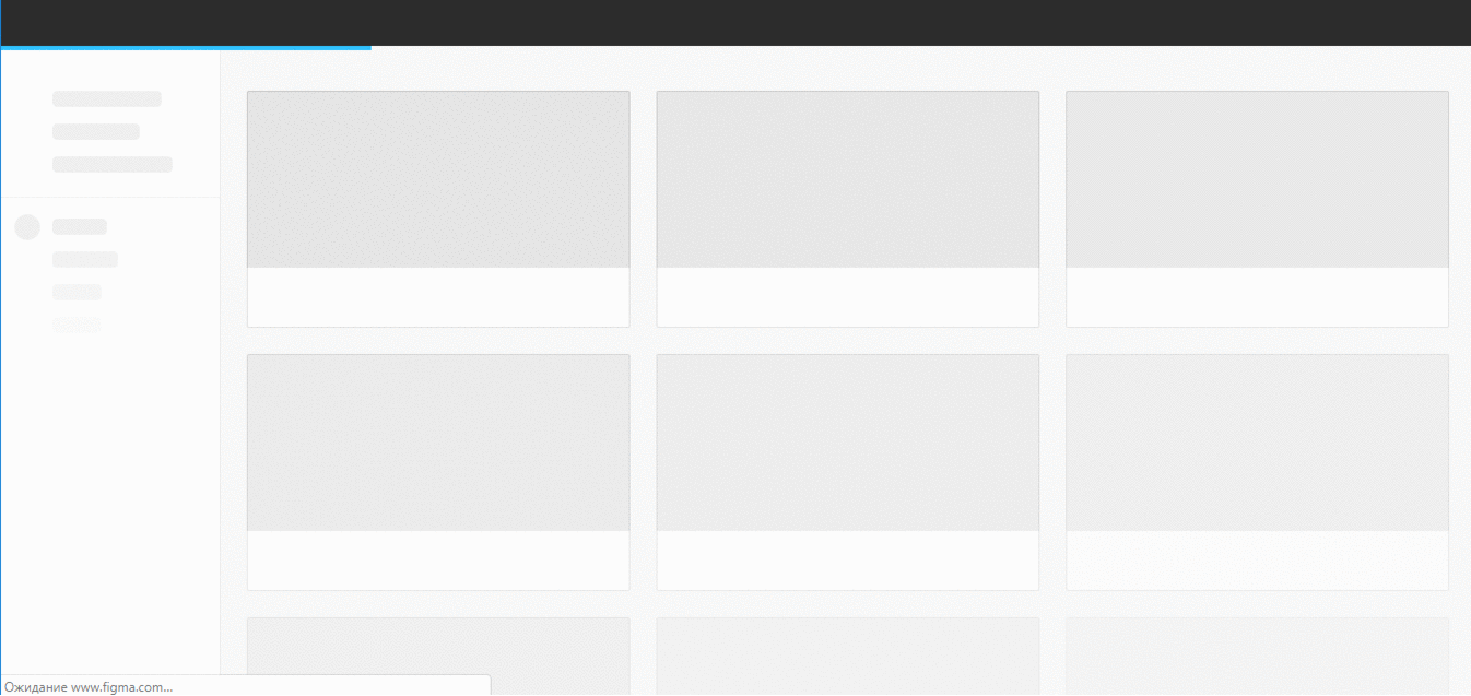 Figma UI
Simple or well-crafted?
Besides nice examples in this guide and design concepts on Dribbble, in most apps you will see a default or simple loader.
For some time, simplified loaders were recommended as best practice as they require less processing power (that?s true especially for web). It?s much easier to use default or open-sourced loading indicators and don?t spend designers? time to make custom animation and developers? time to implement it.
In the design community, I saw different views on using default loaders.
From one hand, default UI components suggested by the operating system, allow designers to make a better native design and get better UX. The users are familiar with native components and intuitively know how to use them and what the outcome will be.
Here is a handy example. iPhone owners know what to expect from platform-standard navigation controls, buttons or icons. We could guess, that when the user sees a default loading in some iOS app, the person might not even notice its existence and the waiting time.
From another hand, users could have negative previous experience with the default component, especially loader:
One more thing to mention, if an app uses the loading indicator of OS instead of a custom one, users are more likely to complain about the internet connection or physical device speed instead of performance of the app. ? Yi Gu, Software Engineer at Quora.
I couldn?t find research around this discussion but that?s definitely something interesting to consider.
In any case, if you are working on the MVP (minimum viable product) or the first release of your side project, it?s more logical to use simple, default or open-source loading animation. Even the most creative loading animation won?t save your product if it doesn?t solve the real need.
 A set of SCSS mixins for single element loaders and spinners, an open-source project.
Interesting enough, but in 2016?2019 we could see much more well-crafted loading animations. Attention to details, the growing maturity of design in the companies, better tech environment and ?vailability of many animation tools ? all that made system status UI elements more creative. If you scroll Dribbble, you could see dozens of inspiring loading shots, so it?s a way easier to design your own.
Even in our 5-person startup, we think about better UX and making our waiting experience more pleasant. Otherwise, our feedback tool can lose users. No one wants to lose users.
So how to make a loading animation?
Useful tools and Resources
If you’ve read so far, probably you?d love to make your first loading animation 🙂 From the beginning of this guide, you might remember that our 3 seconds delay has been seen as a bug and our initial animation wasn?t good enough.
To avoid such a scenario, learn more about designing and implementing loading animations before you actually make them (obvious, right?).
On Designing?
- Why Perceived Performance Matters, Part 1: The Perception Of Time
- UX Design: How to Use Animations in Mobile Apps by Tubik Studio and Animated Transitions in Mobile Apps by Nick Babich
- InVision Studio tip of the week: Loading animations with Timer Trigger by Charles Patterson
- Design a branded loading animation in After Effects by Andy Orsow and YouTube video on Circle Loading Animation in After Effects
- How to animate a skeleton loading state in Principle (YouTube tutorial)
- Inspiration: Loading animations on the web by Awwward team and Loading Animations over Dribbble
On Developing?
- For iOS development:A Beginning?s Guide to Lottie: Creating Amazing Animations in iOS Apps by AppCodaSwift Tutorial ? Animations with Lottie by Sean Allen
- For web: How to create a beautiful animated loader with nothing but CSS by Julien Benchetrit
- For web: 64 CSS spinners for your website from Icons8 (with the current state of JS and CSS3, you can get really nice loading spinners for your website)
Good luck with crafting the best ever user experience for your product!And if you succeed on your way, please share your learnings with me.

