Go behind the scenes with our new look and renewed purpose
Today, we publicly launched our refreshed Evernote brand into the world.
Brand refresh. Simple words for a complex process. Especially when it?s a brand that touches the lives of over 225 million people globally, and one that generates significant love from customers, positive sentiment from industry observers, and a strong internal commitment.
So why change? Why toy with something that?s unique, recognizable, and, dare we say, iconic? Our logomark, ?Mads? the elephant (named after an early Evernote customer and designed by Gabe Campodonico), has represented us well, standing strong while many brands have refreshed, redesigned, or simply ceased to exist. But a logo isn?t a brand.
The simple answer is, the brand needed to change because we?ve changed. The demands on people?s attention have changed. The ways they use our products have changed. And our brand no longer reflected the company it was built for.
We?ll always stay rooted in our heritage, and in the vision of our founder Stepan Pachikov: that Evernote is a way to remember everything, an extension of your brain, a place to manage an ever-increasing deluge of information that has outpaced biological evolution. But to be a company for the next hundred years required some introspection. Even though our brand was fronted by a great logo, it was underpinned by a system that lacked flexibility and a brand strategy that didn?t align with the direction of the company?s growth.
So it?s time to signal change. In the past decade, Evernote has grown and expanded on its original mission. Our brand now must not only reflect the core product but elevate and represent the business as it exists today?with over 225 million users, in 124 countries, speaking 25 languages?and where it is headed in the future. A brand that can grow with a company that?s poised to expand into new areas and reach new audiences. A brand that stands for something.
Defining our purpose
We want to provide a way to help you focus on what matters most.
When asking ourselves what we stand for, the question yielded an array of answers. None of them were wrong per se; all of them reflected aspects of what we do: We help you remember everything. Capture and recall what?s important. Get organized. Be productive. Turn ideas into action. Work together. Yes, we do all of that, but we needed to get to the why, not the what. Why do we strive to create products that allow people to achieve these things? Why do we come to work everyday? Because we care about what you care about. We want to provide a way to help you focus on what matters most. And when we agreed that was our place in the world, the process of building a brand system that reflected our purpose became clearer. We?d found our focus.
Keeping ourselves honest
It?s easy to write a lofty purpose and inspiring mission statement. To fall in love with powerful words or a flashy new logo. But what?s challenging throughout the process of a redesign is remembering why you started down the path. Change is hard. And keeping a team of talented, smart, passionate people moving in the same direction can be difficult. So at each stage of the process, we asked ourselves:
- Does what we?re doing signal change?
- Is it distinct (in and out of our category)?
- Does it embody the DNA of the brand? (We boiled this down to four words: Optimistic, Clever, Confident, and Clear)
- Is the system flexible and extendable?
- Is it better than what we have?
And so it began.
?So?are we killing the elephant??
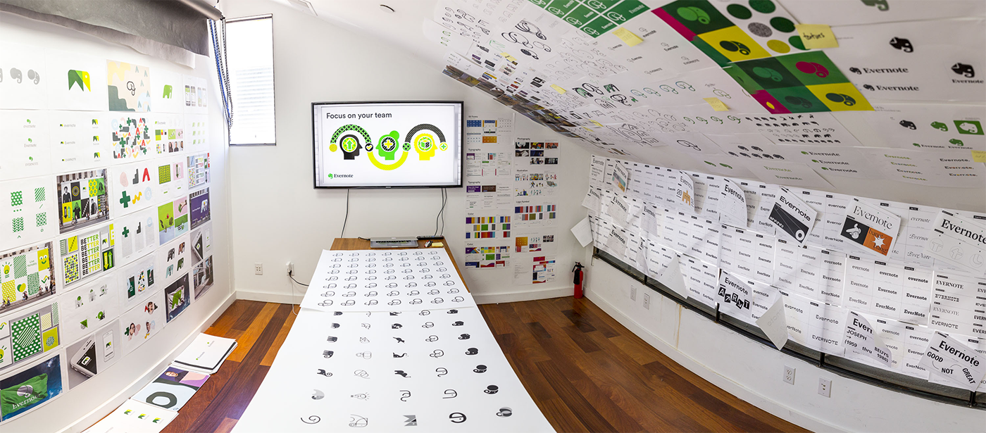
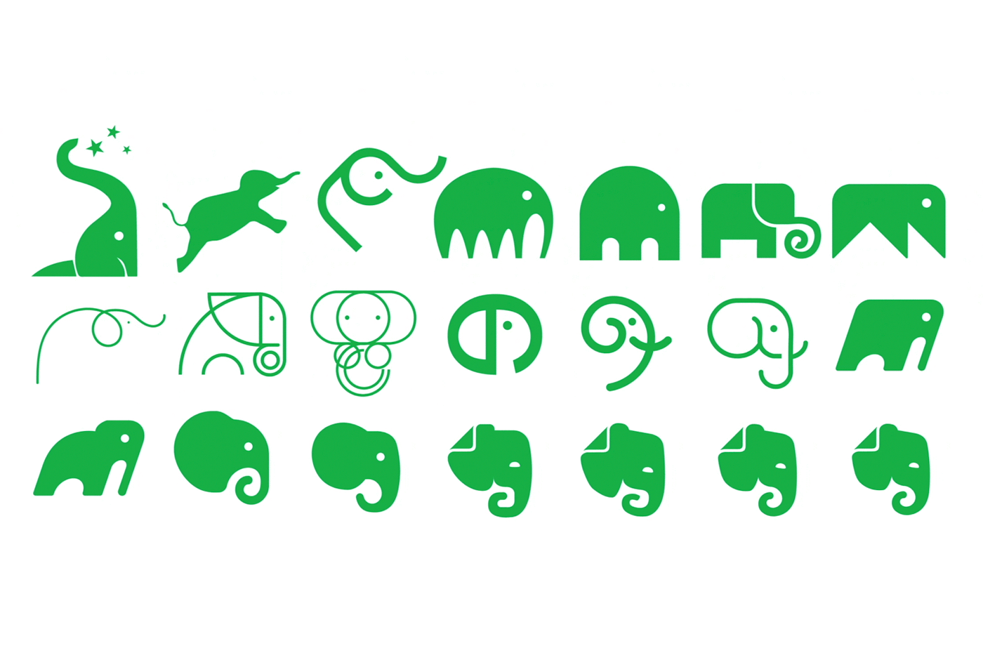
It was the question everyone had, with an answer some didn?t want to know. The possibility of massive change created a vague tension amongst the herd. Conversations were happening with strange agencies, behind closed doors, in mysterious ?war rooms.? People were nervous. And while our instincts ? as creatives and marketers ? always told us killing Mads would be foolish, we had to know: what would our brand look like without our lovable logomark? So we asked our partners at DesignStudio to go for range, to frighten us, make us uncomfortable. Explore everything from slight revisions to an outright ?rip and replace.? The exercise was exhaustive, from researching other elephant marks in use globally to pushing the boundaries of abstraction.
The exploration garnered plenty of strong opinions and debates, but ultimately, it brought us back to the idea of a considered design evolution rather than a radical shift. It was the right thing to do. We wanted to signal change, not shoot ourselves in the foot. Our customers, community, and employees had a soft spot for Mads. So after significant effort, and because we had a collaborative and understanding partner, the conversation turned to what was and wasn?t working in our current logo and wordmark, and how to refine it.
Mads gets a makeover
While Mads had aged fairly well, there were some structural issues to iron out. First, we wanted to round out his geometry, to soften the edges and make him feel more balanced. This provides for more flow in the negative space and ultimately optimizes white space around the mark. We looked at losing the fold in the ear ? which evokes both the dog-eared page of a book and the common icon for a document ? but chose instead to honor our past by doubling down on its significance and increasing the size. Both of these decisions helped with scaling and recognition issues. We rounded the trunk into a spiral, a symbol of progress, and added a more defined slope in the forehead to give a sense of forward momentum. We softened the eye as well, going for approachability and a sense of serenity as opposed to the previous crescent shape which had been described alternately as ?smiling? or ?angry.?
Finally, we addressed color. Given that our two most recognizable assets were Mads and the color green, the combination of the two was a no brainer. To our surprise, everyone thought Mads was already green. He?s wasn?t, nor had he ever been. He was always grey ? as elephants are. But his grey color against a green gradient had poor contrast and felt a little dated. So we made him our signature color, and changed that color to a more pure green than we?d used previously. After further shaping, finessing, and debating the tiniest details, we arrived at the place that felt right. Introducing? the new Mads:

Standing by the serif
Our old wordmark was an all-caps slab serif typeface (Caecilia) that had served us well over the years. But with the refinements made to Mads we needed something that was bold and balanced and could complement the strong, green logomark.
We debated and explored moving to a sans serif face. It seemed more modern and representative of the technology space as a whole. But when we saw those treatments next to Mads, they felt flat, lacked character, and didn?t seem like us. We liked the sophisticated literary feel of a bold serif font which, incidentally, offers another nod to our past and a connection to our founder, Stepan Pachikov, and his belief in the importance of digitizing the written word. We ultimately landed on Publico, a serif typeface that takes many cues from contemporary type design yet still has a timeless feel. Rendered in 100% black, it stands up to and accentuates the pure green logomark. It aligns perfectly with our DNA of confidence and clarity, and the balance between elements is beautiful.
What matters most isn?t the logo
While the logo is the most immediately visible and recognizable part of our brand, we also focused closely on developing an underlying system of colors, forms, shapes, patterns, and photography. These visual elements comprise most of what consumers see when interacting with a brand. Through repetition and consistency, they constantly convey meaning, establishing recognition and awareness of Evernote. The concept and application of this system therefore touches everything, from the simplest email to our most important brand asset: the product itself.
Illustration
Focus isn?t about the absence of everything else, it?s about addressing each thing in turn.
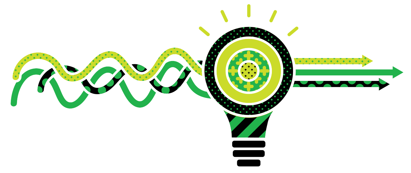
Like many global technology companies, we?ve always used illustration as a design element, in both our communications and our product. Our illustration style was on trend but not differentiating. As we audited our competitors and other brands that our target audience interacts with, we noticed that stylistically there was a ?sea of sameness? in both color palettes and illustration style. We wanted to be distinct while embodying our brand?s DNA through a concept rooted in our purpose.
When we talk about focus and organization, the truth is organization is about compartmentalization. Focus isn?t about the absence of everything else, it?s about addressing each thing in turn. Our partners at DesignStudio took that idea and ran with it, providing a unique and differentiating style using simple shapes and a limited color palette, textured with a system of patterns that have their own symbology. The design intent is to represent that each person has their own way of organizing a complex world.
We?re confident that our future is bright and we now feel like we?ve got a foundation to better represent that.
Color
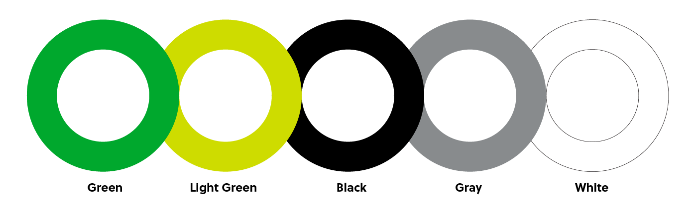
Once we?d decided to shift the logomark from grey to a strong, pure green, we committed to really owning that color. Green has always been unique to us in our space, and has been a visual differentiator since the day we showed up in the iOS app store. To accentuate and balance it we chose to stay within a limited palette, adding only a secondary light green as an accent color. We?ll also be using the strength of black balanced against white, allowing us to use the negative space for the strokes of our illustration style. Gray will also be in play since it?s important for more subtle contrast in product.
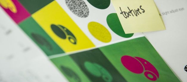
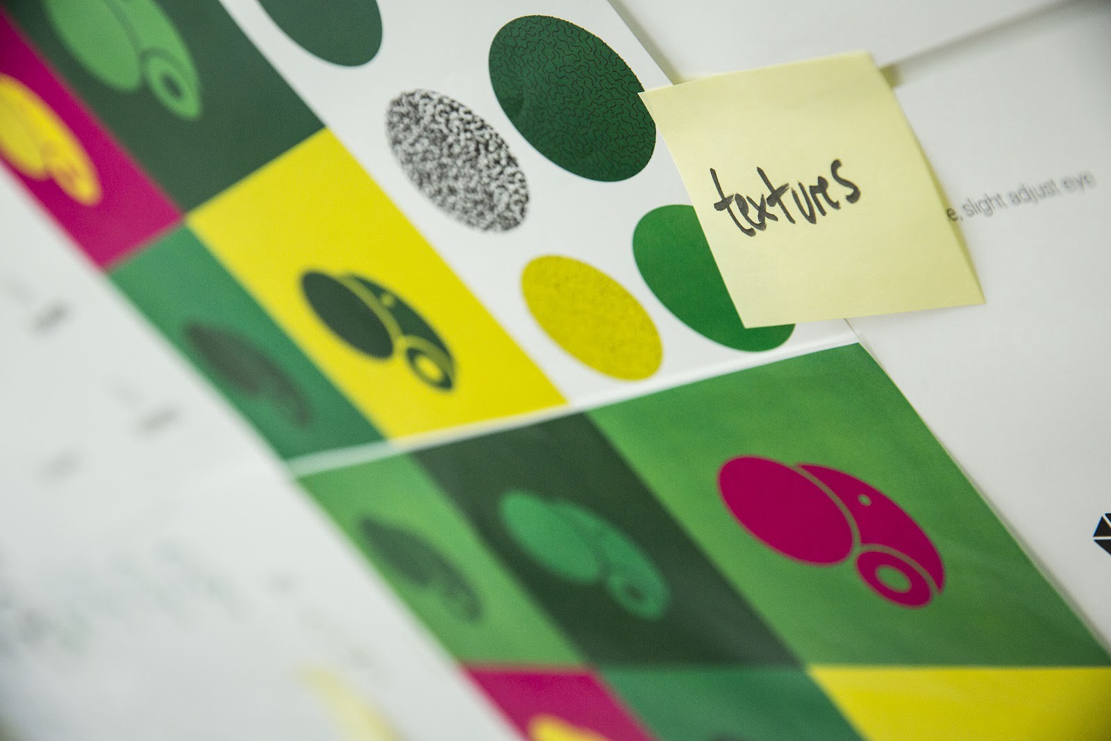
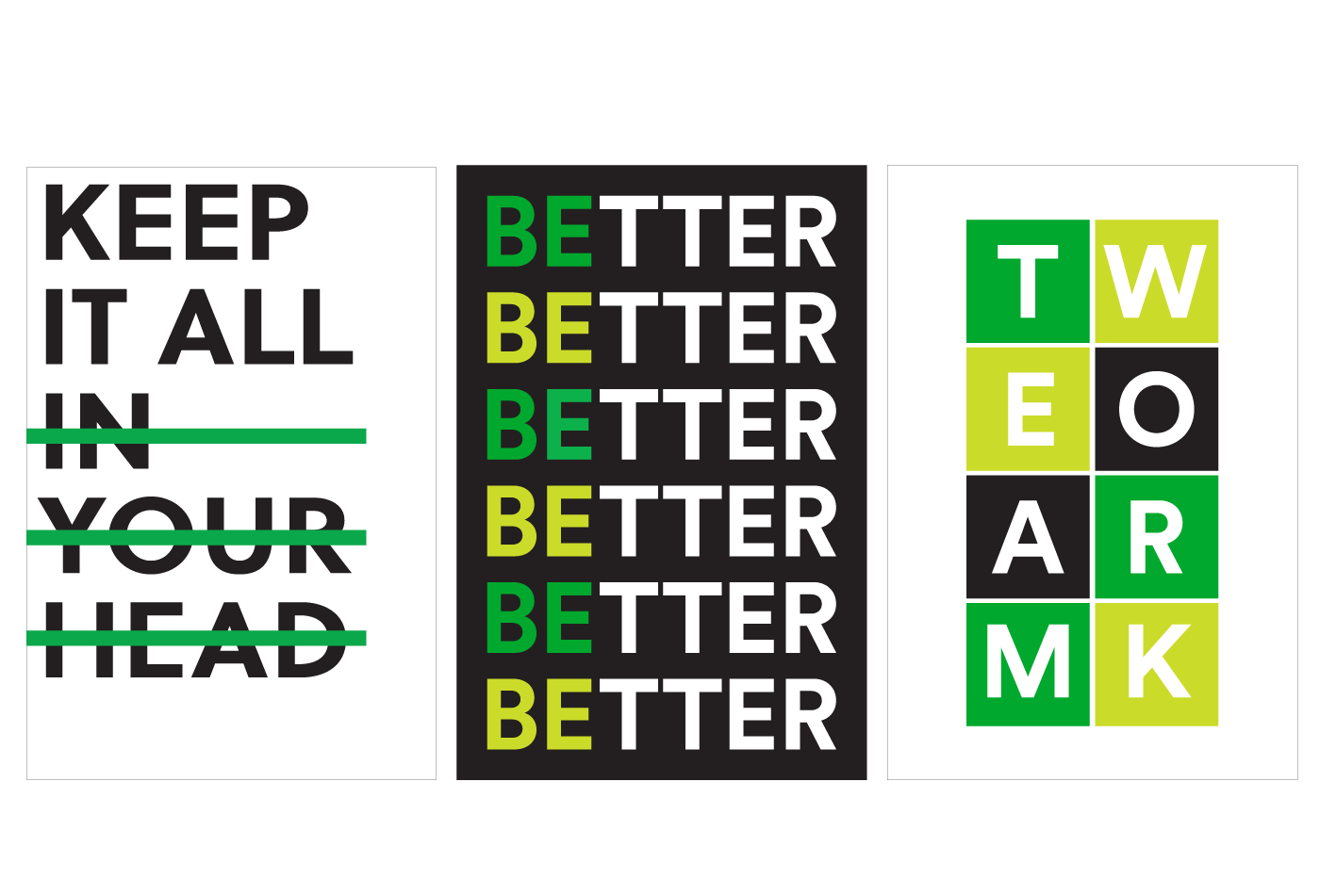
Patterns and textures
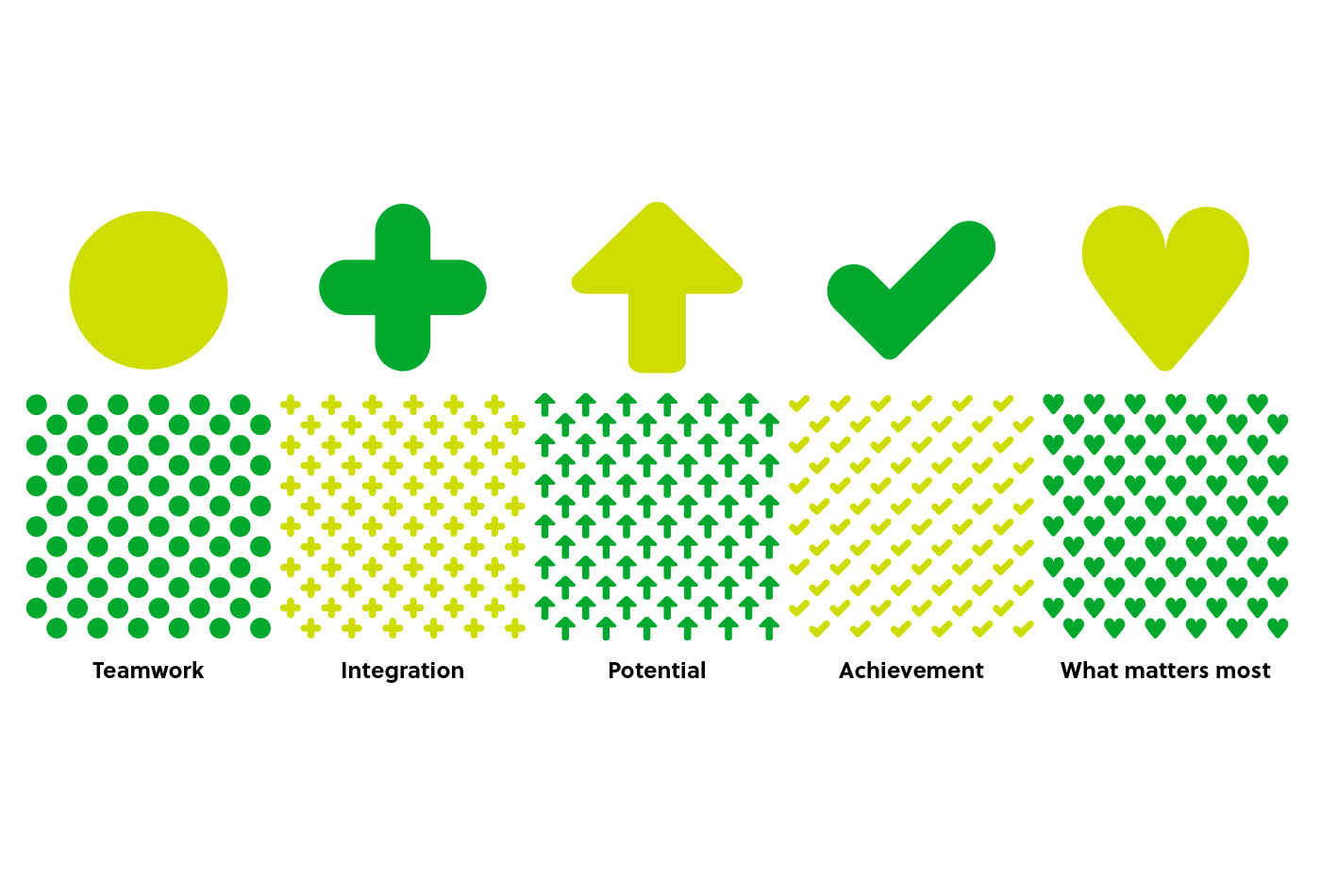
The patterns were inspired by ideas related to our brand: teamwork, integrations, potential, achievement, and of course, what matters most. The shapes that comprise these patterns have the flexibility to be pulled out as standalone graphical elements, scaled down to act as texture, scaled up and cropped for abstractions, and used as masks to highlight product screens or act as a container for photography. Most importantly, they?re meaningful, perhaps not consciously to the viewer but through clear associations that work on a deeper level. And from time to time we?ll just sprinkle them about. It?s a little something we call ?Ever Better Dust(TM).?
Typography
When considering typography, we wanted to limit the use of Publico to our wordmark, so when exploring a display typeface we fell in love with Soleil. It?s a geometric sans serif typeface, that?s open, clean, and fresh, truly reflecting our criteria of clarity.
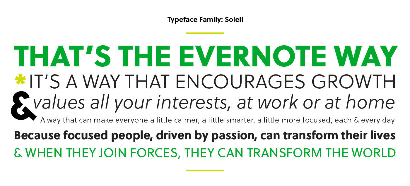
But beyond just using it on the web and in comms, we found a way to have some fun and show our personality through typographic art. These bold treatments allow us to communicate complex ideas easily and show our point of view in a clever way. And they make for cool T-shirts and great coffee mugs.
Photography
As our system and kit of parts took shape, we knew illustrations and a little ?ever better dust? couldn?t support nor sustain branded comms at scale. The power of Evernote is in the people who use our products and the ways it allows them to focus on what matters most to them. It was time to tell more of our customer stories. We needed a way to showcase people and bring their stories to life. We landed on a simple portrait style, something clean that would also provide a canvas we could adorn with some of our shapes and patterns. The combination is simple yet ownable.

When you need to show people and don?t have the luxury of the time it takes to produce a shoot, you have to turn to stock. And stock photography ? no matter how good ? is the great brand equalizer. Stock looks like stock. It?s bland and sterile. Everyone ends up looking the same. Our new system gives us the ability to ?de-stockify? photographs, which is important to creating cohesiveness when launching a new brand system into the world.
?So it?s finished, right??
Of course it?s not finished. We?re just at the beginning of this journey, opening the curtain on a second act, as a company and a brand. Now the real work begins. How does this system we?ve created apply to real-world marketing, product, and corporate situations? Where will it stretch, when might it break, how will it evolve? This is the fun part. The change. Focusing on our message and how our customers, partners, and prospects react to it.
We?re confident that our future is bright and we now feel like we?ve got a foundation to better represent that. A special thanks goes to everyone who got us here, especially our partners at DesignStudio for being incredibly collaborative and understanding. Thank you for helping point the Notable Herd in a new direction.
If you?d like to explore more of our brand, you can check it out here.
Written by Francie Strong, Evernote?s VP of Brand and Communications, and Jonathan Woytek, Evernote?s Executive Creative Director, on August 14, 2018.
