In the last post I talked about bar graphs and their implementation in Matplotlib. In this post I am going to discuss Histograms, a special kind of bar graphs.
What is Histogram?
From Wikipedia
A histogram is an accurate graphical representation of the distribution of numerical data. It is an estimate of the probability distribution of a continuous variable (quantitative variable) and was first introduced by Karl Pearson. It is a kind of bar graph. To construct a histogram, the first step is to ?bin? the range of values ? that is, divide the entire range of values into a series of intervals ? and then count how many values fall into each interval. The bins are usually specified as consecutive, non-overlapping intervals of a variable. The bins (intervals) must be adjacent, and are often (but are not required to be) of equal size.
Basically, histograms are used to represent data given in form of some groups. X-axis is about bin ranges where Y-axis talks about frequency. So, if you want to represent age wise population in form of graph then histogram suits well as it tells you how many exists in certain group range or bin, if you talk in context of histograms.
Enough talk, let?s make a simple histogram
import matplotlib.pyplot as pltimport numpy as npimport pandas as pdx = np.random.random_integers(1, 100, 5)plt.hist(x, bins=20)plt.ylabel(‘No of times’)plt.show()
This is a simple histogram code. I took a range of integers from 1,100, the first parameter is lowest, 2nd parameter is for highest and the last one is for how many numbers should return between 1 and 100. Every time it will return 5 random numbers between the range hence every time this histogram will vary.
One it?s done I pass x value in hist functions. bins as mentioned above about the slot or range, in our case it is 20 that is, whatever 5 values will be generated via random_integers will be divider by bin value and get plotted. When I run this code, it generates a figure like below:
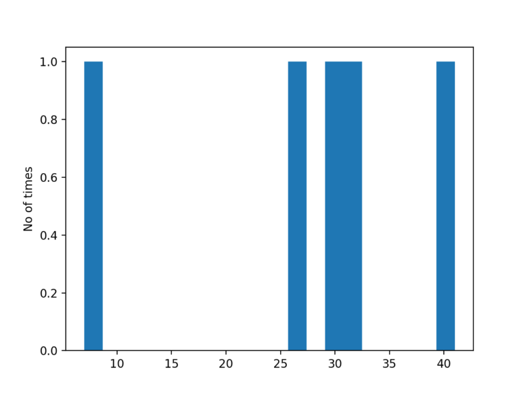
Y-axis tells about the frequency a certain number appears in data set. Since this data was random thus probability of appearing a number will not be more than once most of the time.
OK, let?s try some real data example as this toy example is not interesting. It took me a while to figure out which dataset should I pick and finally I got settled with dataset of Pakistan v India final in Champions Trophy 2017
The thing I want to know how many runs were made per delivery. The possible outcomes are: 0?6, provided we avoid wide and no-balls. So I want to find out the frequency of runs by both teams. Since this is just for sake of education purpose I picked stats of first four overs of both teams. Data I prepared looks like below:
Delivery,score_india,score_pk0.1 , 0,00.2 , 0,00.3 , 0,00.4 , 0,00.5 , 0,00.6 , 2,01.1 , 0,01.2 , 0,01.3 , 0,21.4 , 1,11.5 , 0,01.6 , 1,02.1 , 2,12.2 , 0,12.3 , 0,12.4 , 0,12.5 , 1,02.6 , 0,03.1 , 0,23.2 , 0,43.3 , 0,13.4 , 0,43.5 , 0,03.6 , 0,1
It is in CSV format. I read up by using Pandas read_csv method and create individual data frames for both teams.
d = pd.read_csv(‘runs.csv’)score_india = d[‘score_india’]legend = [‘India’, ‘Pakistan’]score_pk = d[‘score_pk’]plt.hist([score_india, score_pk], color=[‘orange’, ‘green’])plt.xlabel(“Runs/Delivery”)plt.ylabel(“Frequency”)plt.legend(legend)plt.xticks(range(0, 7))plt.yticks(range(1, 20))plt.title(‘Champions Trophy 2017 Finaln Runs scored in 3 overs’)plt.show()
hist took both teams runs as first argument in list format. color is assigned so the labels. I then assign range for both xticks and yticks. I tell you why. If I don?t do that and run the code, it shows graph like:
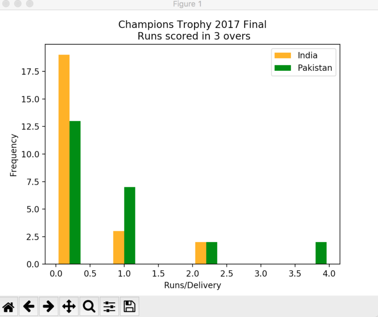
Both X and Y axes are displaying data in decimal format and it does not look good because our data will always be in integer format. After setting range for X and Y ticks the graph now looks like:
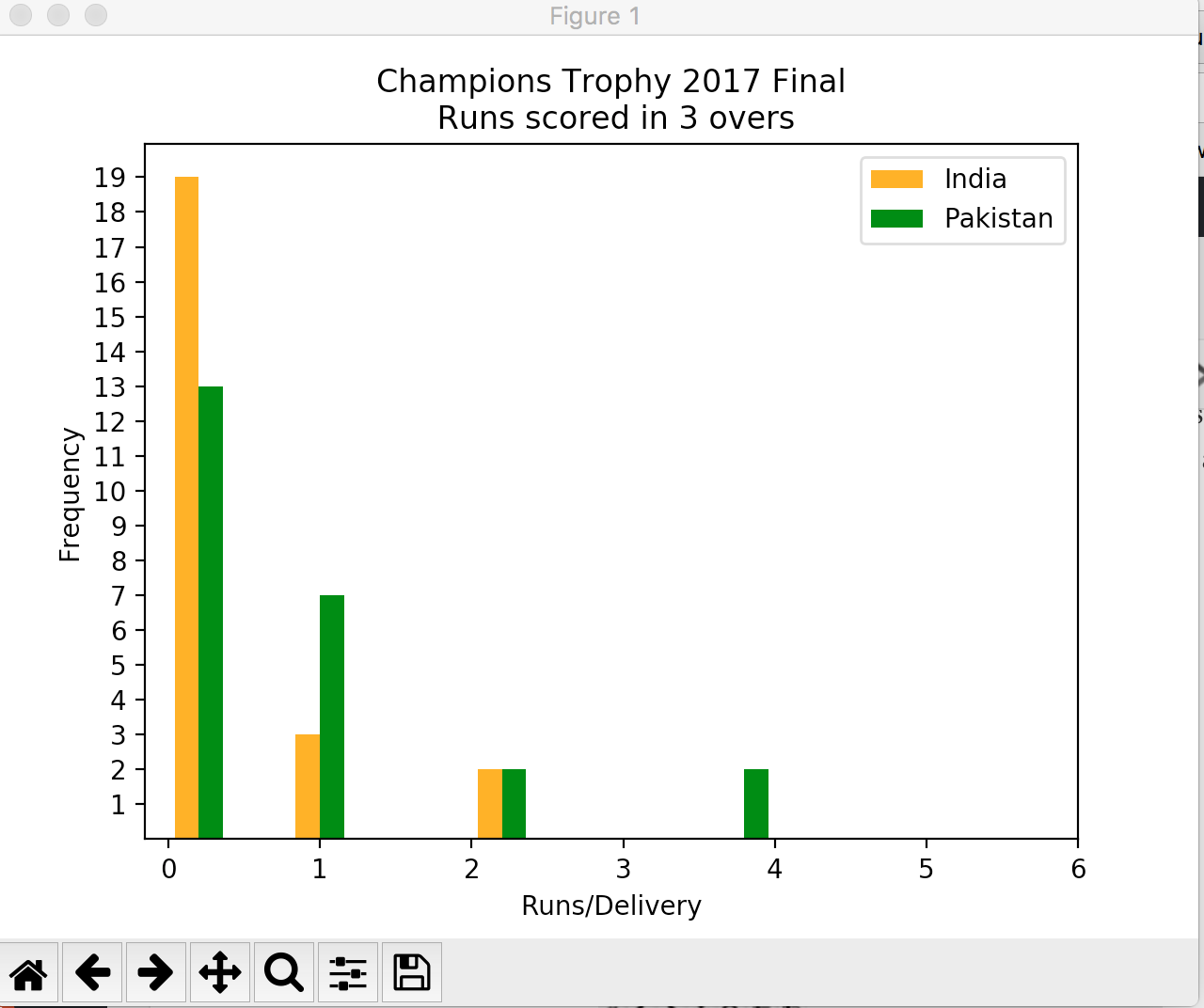
Much better, No? The graph tells Indian teams played more dot balls in first four overs than Pakistan (Kudos to Muhammad Aamir) while on other hand Pakistan took slow but steady starts and kept taking singles where needed.
That?s it for now. I will be coming with some other type of graph in next post.

