
A step by step tutorial to get started with Watson Analytics
Since childhood I have been an ardent Sherlock Holmes fan. Sir Arthur Conan Doyle, spun immaculate and detailed investigative stories around Holmes . Sherlock Holmes , according to me was the ultimate Data scientist. He cleverly sought out necessary data and made accurate inferences. Sherlock, however, could not have achieved this without his versatile and reliable partner Watson. Both of them made a great team.Like this fictional duo, the data science community today is made up of Sherlocks(analysts) and IBM?s Watson is filling in the shoes for its fictional namesake. Together they have the ability to provide solutions to great analytical problems.So what is actually IBM Watson?
IBM Watson represents a new era of computing called Cognitive computing. It is a cloud-based data discovery service intended to provide the benefits of advanced analytics without the complexity.Watson Analytics empowers even novice users to understand and make use of data science techniques ranging from machine learning and predictive modeling .
To have a better understanding of any technology or concept, it is always great to start working on a project from scratch. Ultimately, the best way to learn is by doing.Therefore, we will get into the details of Watson by actually working on a problem. By the end of this tutorial, you will have a sufficient understanding of the working of Watson and will be able to apply the power of Watson Analytics in new and different contexts.
To get the maximum out of this tutorial, read the steps first followed by Hands On ? part.Then recreate the same on your computers.
The flow of the tutorial is as follows:
Contents
- Introduction
- What is Watson Analytics
- Getting Started
2. Importing & Refining Data
- Intro to case Study
- Importing the Data
- Refining the Data
3. Discovering Insights
- Exploring Watson?s cognitive skills
- Using Watson?s Natural Language processing
- Creating Custom Visualisations
- Identifying Key Drivers
- Exploring Predictive models and Decision rules
- Exploring Decision Trees
4. Visualising the Findings
- The Display Interface
- The Dashboard
- Creating a Specific Visualisation
1. Introduction
i) What is Watson Analytics
Watson Analytics is a self-service, cloud-based business intelligence platform based on IBM?s Cognitive Technology.It provides unbiased analyticsand has three main elements called 3Ds: Data, Discovery and Display.
Whereas Watson is a Technology Platform for cognitive services, using machine learning to analyse all types of data(structured and unstructured), Watson Analytics is a cloud based self service offering . It uses Watson?s capabilities to analyse only structured data.
There are three different versions of Watson Analytics i.e
- Free,Plus, andProfessional.
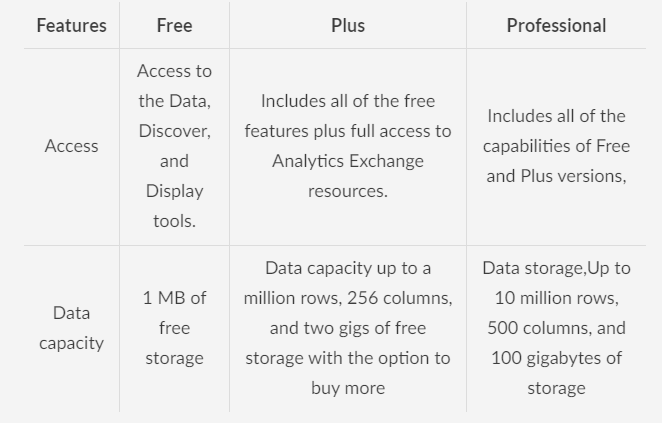
This tutorial covers the free version of Watson Analytics.
ii) Getting Started
Navigate to https://www.ibm.com/watson-analytics and sign in with your IBM account. In case you do not have one, click on the Try it for free sign and register yourself. This will be the final view.
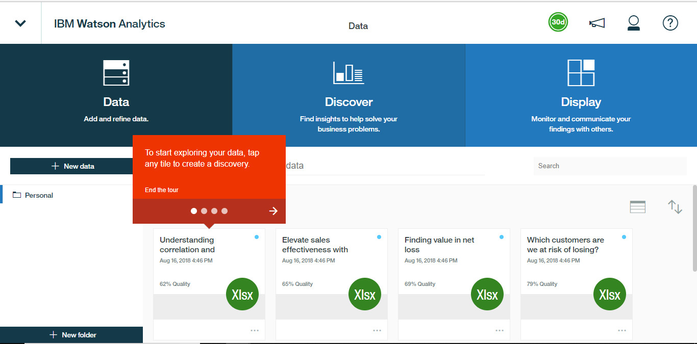
We begin by loading and shaping the data, exploring that data to discover insights, and use visualization and dash-boarding tools to display and communicate those insights to the end user. On the screen we see three Ds i.e Data,Discover, and Display, and together they form the core capabilities of Watson Analytics.
You can look into the account settings to get an insight about your current account. The Overview tab provides user info like username, type of subscription, number of licenses currently active, space used and a history of any purchases made.
There is also a help option in the top right corner with a ? symbol.Here, one can find the resource documents , as well as links to the Watson Analytics community.
2. Importing & Refining Data
i) Intro to case Study
Let us walkthrough an actual use case from start to finish, beginning with a raw data set. Our job here is that of a Market Analyst for a fictitious Airline called ABC Airlines. We are interested in understanding more about what drives customer satisfaction. The data that we have pertains to a third-party industry-wide customer survey data set, which includes roughly a 130,000 responses over the past 90 days.
Our aim will be to use Watson Analytics to identify the key drivers of satisfaction, explore customer profiles associated with particularly high or low average satisfaction ratings, and present our findings to the company.The data can be accessed from here.
Let us take a quick look at the data. We have got flight related information, like the date, airline, origin and destination, flight time, and departure delay. We have demographics like age, gender, flight status, and seat class. And behaviours, like the type of travel, business or personal, and airport shopping habits. Also we have the key parameter i.e customer satisfaction, where one is the lowest, and five is the highest level of satisfaction. Since we have everything sorted let us get to work.
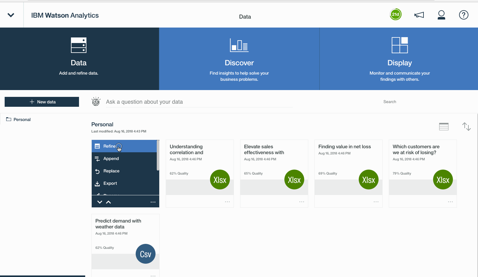
ii) Importing the Data
Download that csv file on to the computer and open up Watson Analytics.Head over to the data tab and select New Data and import our local CSV file. Once we?ve accessed the file we?ll just click Import from the lower right to load it up.
This file will take a few minutes to load. It is imperative to note here that only a fraction of this time is spent physically ingesting the data into the Watson Analytics cloud. In fact, the majority of the upload process is actually spent analyzing the data to identify potential relationships, auto-detect hierarchies, groups, and column types, and generate cognitive starting points to help guide our analysis.
Hands On ? :
In other words, the data modeling automation is in action. Once our file has been loaded and processed, it?s on to the next step, data refinement.
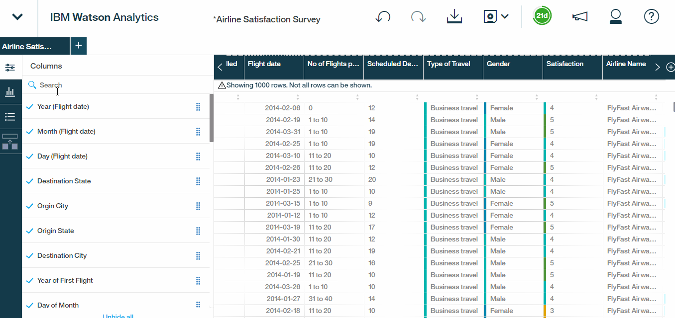
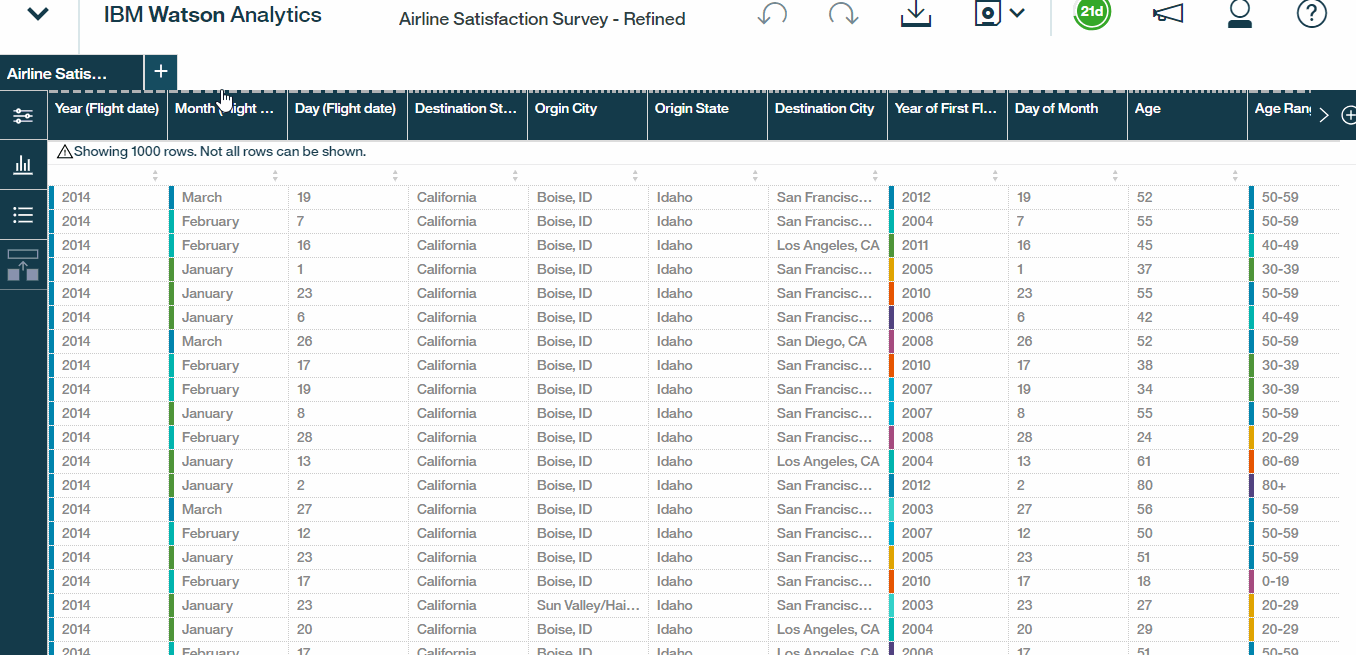
iii) Refining the Data
Once we have the CSV file loaded, simply click the ellipses to drill down into the refine options. Within the refine interface, the columns and rows of the data set can be viewed. We can select individual fields to view each value, set particular conditions, or click the ellipses to drill into additional options, like define and calculated fields, groups or hierarchies, or customizing properties, like data types, filters, and aggregation modes.
In the left pane, there are three expandable windows namely Actions, Data Metrics and Column properties.
- Actions enables us to expose a full list of available columns, including new, auto-detected hierarchies down at the bottom of the list. Here you can also create calculations, groups, and custom hierarchies using any fields in the data set.
- Data metrics provides a quick snapshot summarising data quality, missing values, and distribution.These little charts beneath the quality scores are basically small histograms, which give a quick sense of how the values within that column are distributed, This could help to expose outliers or unusual skews in the data.
- The column properties option simply reveal the data types, aggregation modes, and sorting options for each field.Feel free to tinker with them.
Hands On ? :
Hierarchies , Calculations $ Groups
Another useful feature in Watson Analytics is that we can easily build relationships between rows and columns which come in super handy.
Hierarchies
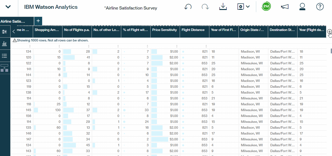
- Scroll to the left-most column. drill into the column list and enable the Rows column, by simply checking it.Rows will be a valuable tool that we can use to give us a count of observations under specific criteria.
- Also, If we scroll down it also looks like we have some work to do with the auto-generated hierarchies. Watson is grouping Origin States with Destination Cities and vice versa.Lets correct it. Select Destination State – Origin City, remove the Origin City level. We?ll add a new level for Destination City and then give our hierarchy a meaningful name. So let?s call it Destination State/City.We?re essentially structuring our data set such that a user can drill down into a particular destination state to reveal the destination cities within that state.
- Repeat that same process for origin hierarchy as well. We?ll remove Destination City, add a level for Origin City, and rename this hierarchy Origin State/City.
- Select the check marks to include both of the new fields into the data set.
Hands On ? :
Calculations
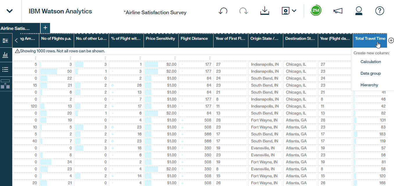
Watson also enables us to create a new calculated field . Let?s say we?d like to calculate the total travel time, i.e the departure delay plus the total flight time. To do this all we need to do is select Calculation,give it a name, let?s call it Total Travel Time, and insert the columns and operators that we need.
Hands On ?:
Data Group
Finally, let?s build out an example data group to categorize shopping spend-amounts. We can simply choose the Data Group option, select the field that we?re interested in, which in this case, is shopping amount at airport and customize how we want to bucket or group these values.Here we will create three distinct buckets , customising the thresholds for those who spend less than 100 dollars, between 100 and 300 dollars, or over 300. We will then rename the buckets as low, medium, and high and call it call it Shopping Spend Level. Last but not least, hit the save it as Airline Satisfaction Survey ? Refined so that we can preserve our original data set as well.
Hands On ?:
3. Discovering Insights
i) Using Watson?s cognitive skills
Now let us use Watson?s cognitive skills to find patterns, reveal insights, and develop visualisations to help build our story. Let?s get started.
- On the home screen, click on the Airline Satisfaction Survey ? Refined Dataset to reveal the cognitive starting points. These are trends and relationships that have been detected during the upload process.
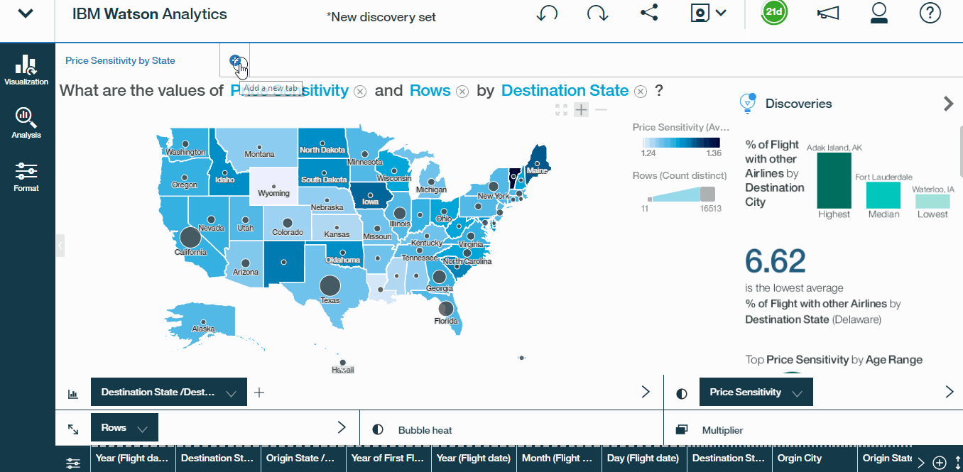
- We can choose from available paths or create our own visualisations from scratch. Let?s start by clicking the first one which calculates price sensitivity by origin state. This lands us in the first tab of our new discovery set, which is basically a collection of visualisations that we can later use as elements to assemble a dashboard. We?ve got some options here, all of which are specific to this particular visualization.
- We can make adjustments using the data tray along the bottom of the screen. For example, if we wanted to see price sensitivity by destinations, instead of origins, all we need to do is drag our destination state city hierarchy from the data tray, and swap out the origin state city and then drill down into the city level.
- To also get a sense of volume by state, in terms of the number of survey respondents, simply drag the rows tab from bottom tray it into the size tray, in the lower left. Here, we have a custom geospatial map that now shows price sensitivity and response volume by state. Name it as Price Sensitivity by State, and there we go, we?ve just created our first discovery.
Hands On ?:
ii) Using Watson?s Natural Language processing ability
Let us say , we wanted to explore that how does ABC Airlines fair in comparison to other airlines in terms of customer satisfaction For this we would take advantage of Watson?s natural language processing ability which is a great tool. Let us see how do we go about it:
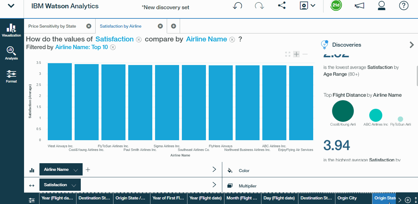
- Add a new tab and simply type the query. In this case, we type compare average satisfaction by airline name. Watson essentially identifies keywords and recommends a number of discoveries sorted by relevance.
The word compare allows Watson to focus in on charts that show comparisons, like bar charts, packed bubbles, word clouds, or tree maps. Had we used words like trend , It would display a completely different set of recommendations consisting of more line and area charts. This is a great feature . Watson?s pretty slick when it comes to interpreting these natural language queries, so even if you misspell a column, like name instead of nme, we should still see the same relevant results. Watson also provides a handy how to ask a question interface, so that we know how to ask meaningful questions.
- So, let?s go ahead and select the first recommendation, the bar chart showing satisfaction by airline name. This automatically creates a second tap, or discovery, within our discovery set.
- Now, we would like to modify the chart a bit. Simply, right click the airline name access label and sort the airlines descending by average satisfaction value. ABC Airlines falls roughly in the middle of the pack
- We can also change the summarisation modes by right clicking on the y-axis label. We can also edit the airline name field itself to set a particular condition. Here, let?s add a top bottom condition to show only the top 10 airlines by satisfaction.
- Finally, rename this tab as satisfaction by airline.
Hands On ?:
iii) Creating Custom Visualisations
Instead of going with the visualisation that Watson recommends, we can create one of our own too. We can go up in the top left, drill into the visualization options available.
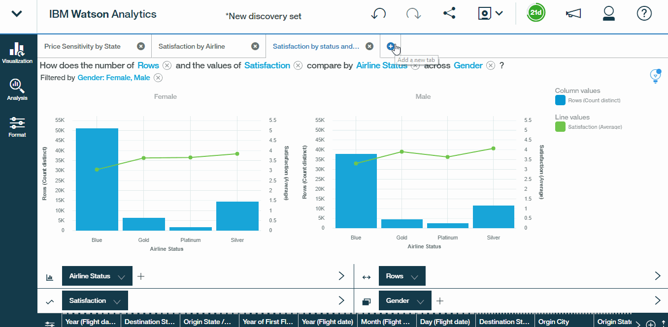
Let?s say we are curious to see how satisfaction ratings differ by airline status and so we create a visualisation for the same:
- Choose a combination chart and drag airline status onto the x-axis or column tray, and satisfaction into the line position tray.
- To get an idea of how many survey respondents fall into each airline status category, swap the Price Sensitivity with rows field.
Now we?re starting to reveal some really interesting insights.
Blue travellers, who make up the default lowest class, account for the largest volume and the lowest average satisfaction ratings, which we might expect. What?s surprising, however, is that platinum members, who have the highest airline status, aren?t even as satisfied as gold or silver members.
Lets test this scenario for our ABC Airlines too.
- Drill into the airline name and select only ABC Airlines. Since the visualization remains largely unchanged, it seems as though this is an industry-wide issue.
Can gender be a factor in satisfaction?
Adding gender to the multiplier tray reveals that on an average, male platinum members are less satisfied than female platinum members, relative to silver and gold.
So, let?s keep this visualization as it is, and name our tab as satisfaction by status and gender.
Hands On ?:
iv) Identifying Key Drivers
So far, we?ve been focusing primarily on descriptive analytics, which is all about explaining the what. Now it?s time to address the why and to do that, we?ll need to understand the key drivers of satisfaction.
- Create a new tab and try to find : What drives Satisfaction? click this discovery .Please Note, it will take some time to process.Watson Analytics is actually building a linear regression model behind the scenes, to quantify the impact that each field and each potential combination of fields, has on our dependent variable or target, which in this case, is satisfaction. Once the model finishes calculating, we?ll see a spiral chart laying out each factor, organised by strength.
Strength essentially captures how well each driver can explain the variance in our target.For example, Type of Travel , can explain roughly 34% of the variance in Satisfaction, while factors listed lower in this list have less predictive power.
- Hover over each factor to see where it falls in our spiral chart or vice versa.
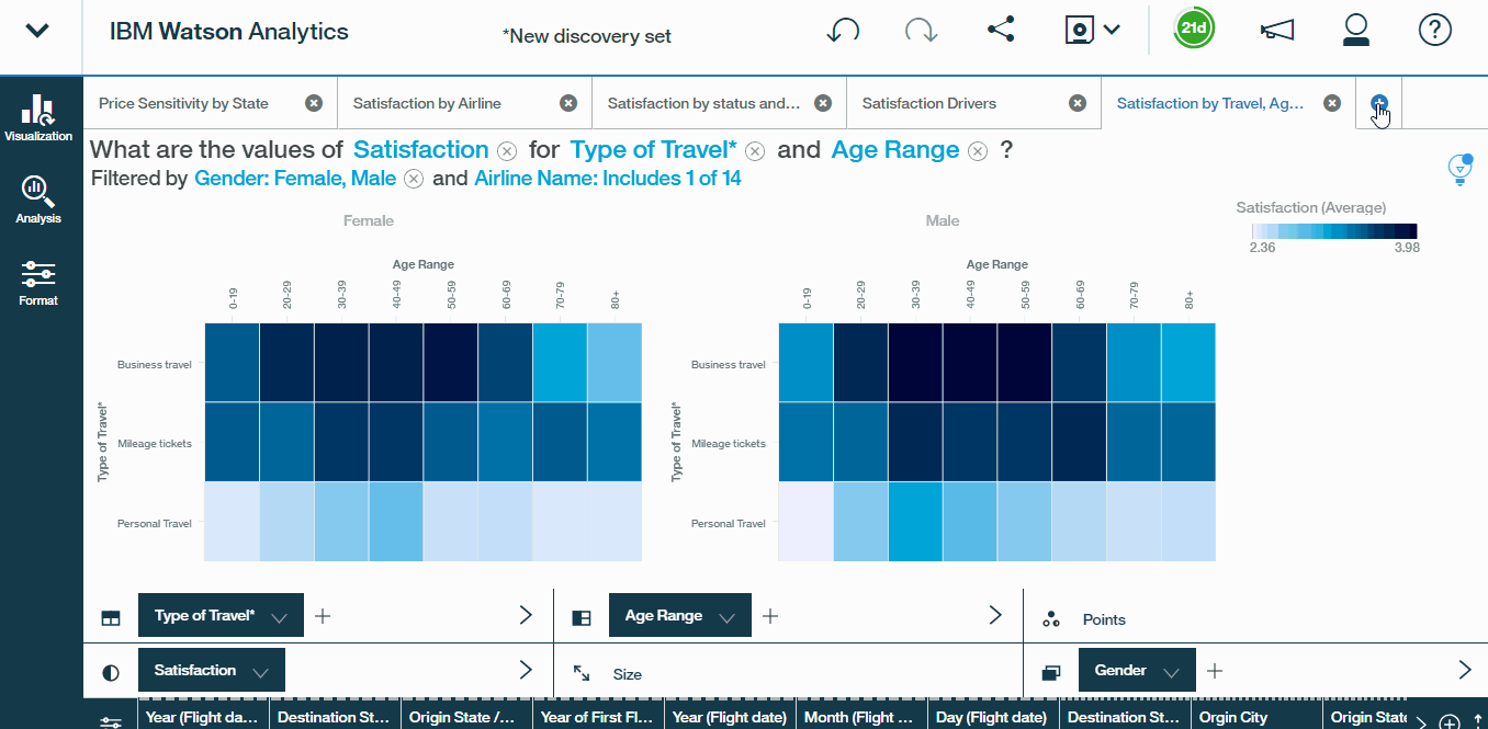
- Name this tab, Satisfaction Drivers, and then drill into one of the factors to keep exploring. In this case, let us see how Type of Travel is related to Satisfaction Click on the plus sign to create a new discovery tab, pre-populated with the visualization that Watson deems most fitting to represent this relationship.
- We get a Bar graph with Type of travel on the y-axis and Satisfaction on the x-axis. Now, if we want to see the impact of Age Range also on satisfaction, we can select Heat Map from visualisation tab. Then drag Age Range to the columns tray. The shading in our heat map reflects average satisfaction, where darker shades indicate higher values and lighter shades indicate lower values. So we can see that personal travellers, in the bottom row, are generally less satisfied, as are business travellers who are 62 and above.
- To dig a bit deeper, let?s filter only on ABC Airlines and further the gender. It becomes clear, that regardless of gender, personal travellers in the bottom row and older business travellers in the top-right cells, tend to drive the lowest satisfaction ratings.
- This is a great discovery, and let?s go ahead and name this tab Satisfaction, by Travel Type, Age, Gender.
Hands On ? :
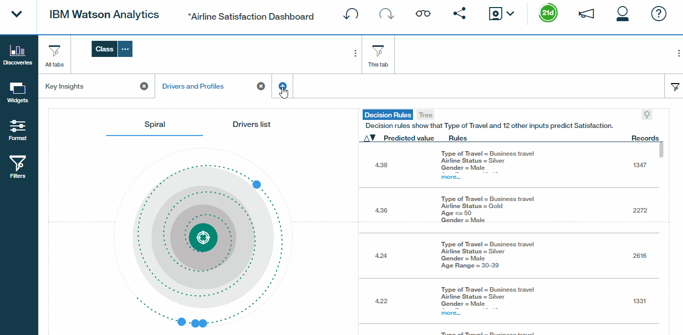
v) Exploring Predictive models and Decision rules
Watson analytics also enables us to generate predictive models and decision trees. In this case this will enable us to understand the specific customer profiles associated with particularly high or low levels of satisfaction. So let?s get working.
- Create a new tab and type : I want to know more about satisfaction or anything similar.You needn?t be too specific since Watson does a really good job extracting meaning from the query even if we do not use very specific words.
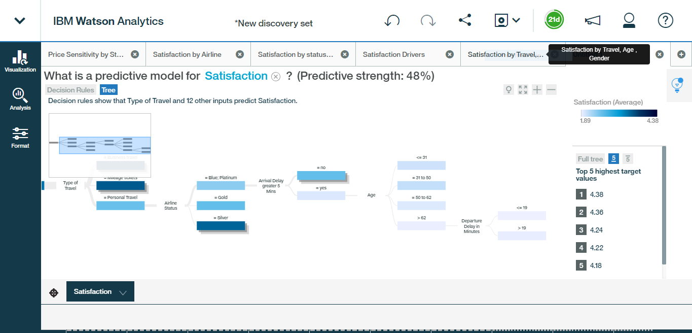
- Next, choose what is a predictive model for satisfaction, as the starting point . We can generate the decision rules and decision trees that will help us learn more about our most meaningful customer profiles.
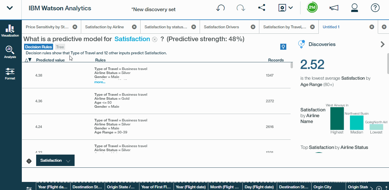
- Starting with Decision rules first, we see a list of profiles here, sorted in descending order by the predicted value of satisfaction, along with the number of records, or respondents, that fall into each profile. We can also see the consolidated confidence level of the model as a whole, which in this case is 48%.
- Scrolling through the first Decision Rules tells us that 40 to 49-year-old males with more than one loyalty cards have a predicted satisfaction of 4.38 which is the highest.
- If we sort by ascending satisfaction, we see that age is a condition present in most of these profiles, and that the top two profiles associated with the lowest satisfaction ratings overall include travellers above the age of 62,
Hence, Age is an important key driver which also validates our analysis of the last part.
Hands On ? :
So, now we know that older travellers, especially those who experience a flight delay, tend to be among the least satisfied customer profiles. Now, the last thing to note about decision rules is that the results will look slightly different depending on the type of variable that you?re using as a target. In this case, satisfaction is a continuous variable, meaning that it can take any value between one and five. That said, had we chosen to instead predict a binary or categorical target, Watson Analytics would use a logistic regression model, rather than linear, and return the probability of each resulting value.
This is the type of approach you might use to model something like the probability of employee attrition or whether or not the stock price will rise or fall.
vi) Exploring Decision Trees
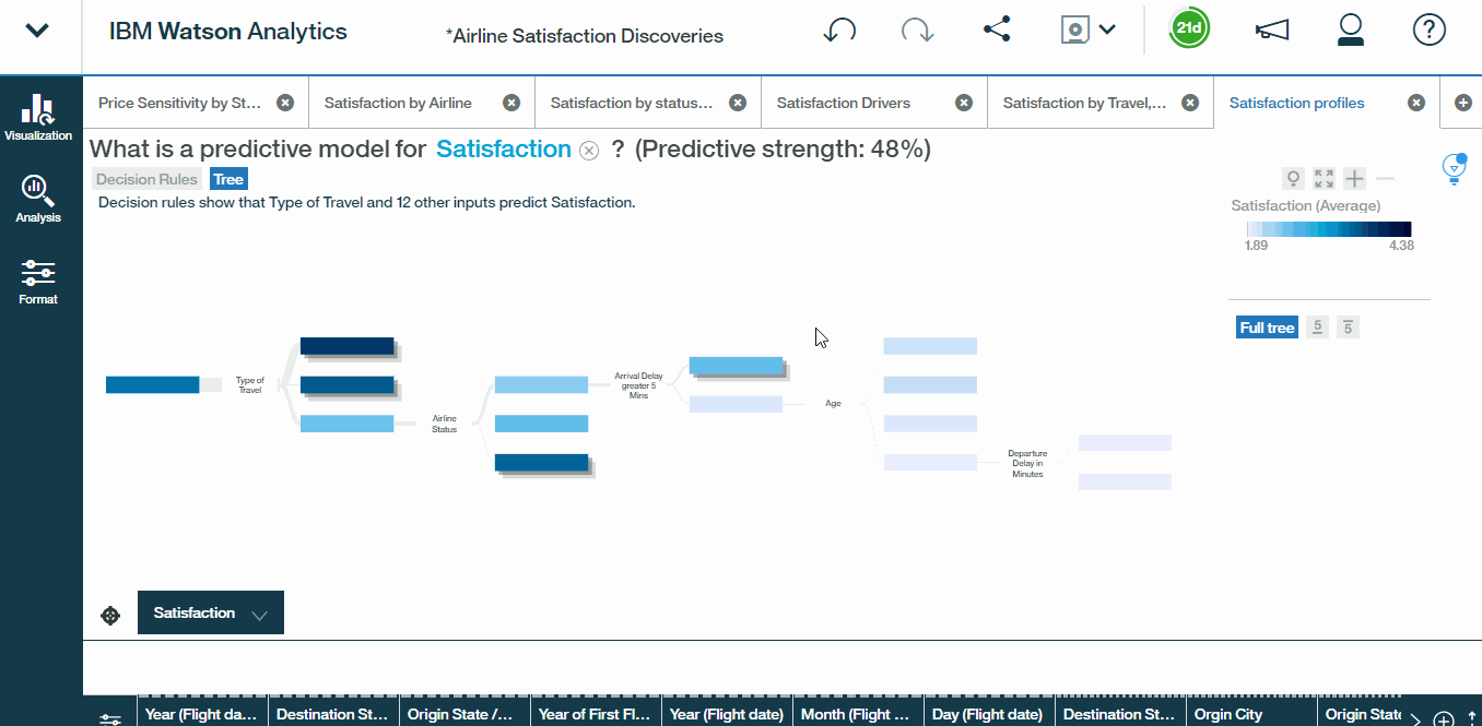
Now, let?s switch our output to a decision tree, which will essentially convey the same information as our decision rules, but in a more visually appealing format.
- Click the Decision Tree and a visualisation appears on screen resembling a decision tree. Starting on the left of the tree, each point at which the tree splits, represents a factor and these factors are organised from left-to-right based on predictive strength.So in this case, Type of Travel is our first and most predictive factor. And from there, among mileage ticket travellers, airline status is the next most predictive factor and so on. What this creates is a tree, where each branch represents a unique pattern or profile, that leads to a predicted satisfaction rating. Note that these darker shades represent higher satisfaction levels, and the lighter shades represent lower levels.
- The visualisation can be made more readable by collapsing the branches to only focus on particular paths. In this case, let?s focus on branches that yield the lowest satisfaction ratings. You will obtain a view like this:
This should look familiar based on our decision rules. We conclude that personal travellers, who are blue or platinum status, experiencing a delay greater than five minutes, who are over the age of 62. have the least satisfaction levels. A great insight.
- Let?s go ahead and save this entire discovery set as Airline satisfaction discoveries.
Hands On ? :
4. Displaying the Findings
After having worked through the part of analysis and exploration, It?s time to displaying our findings. Watson makes this task also very simple.Lets start with a basic understanding of the display interface first.
i) The Display Interface
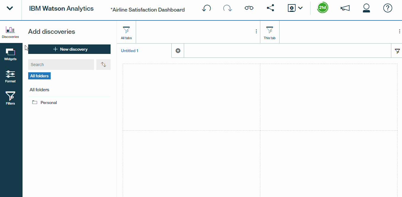
- Return to the home screen and switch over to the Display tab and click New display to get started. let?s call it Airline Satisfaction Dashboard and choose a type as Dashboards. We can also select from a number of preset templates or use free form mode. For this Dashboard, let?s go with four equal sections.
- On the left side of our screen we have several expandable panes, Discoveries, Widgets, Format, and Filters.Let us get to know a little about them.
Discoveries is where we can easily access all of the visualizations that we?ve built allowing us to quickly drag and drop them right into our Dashboard. Widgets are essentially just objects or things that you can add to your Dashboard, including text boxes, pictures, videos, links to webpages, and shapes.Format is where you can customize the look and feel of your Dashboard .
Hands On ? :
So now that we have a handle on all of our options, it?s time to start building the dashboard.
ii) The Dashboard
- Let?s start by diving into our discoveries pane, dragging satisfaction by airline into the center of the top right quadrant, and then adjusting some of the formatting settings. To make this fit a little better, let?s uncheck the show title, and show filtered details options, and also drill into the show drop down to remove the axis titles.
- Next drag the Price Sensitivity by State map into the top left corner and perform same steps as above.
- Finally, let?s go back into her discoveries pane, and grab satisfaction by travel type, age, and gender. We?ll drop it into the lower left corner, and apply the same formatting updates.We can even adjust the size.
- Add a few filters. Enable class as a global filter(for entire dashboard), and airline status as a local filter(for this tab only), specific to this particular tab.
- Name the tab Key Insights, by double-clicking the tab name.
- Click on the plus sign, to create a second tab with the same four box template. When we do this, note that our universal filter for class has followed us, since it will be applied to all tabs in the dashboard, not just the one that we originally added it to.
- In this new tab, feature the key drivers, and predictive model outputs that we?ve built. Drag satisfaction drivers to the top left, and satisfaction profiles to the top right. Apply formatting adjustments just like above.
Now, what?s nice about these visualizations is that they are completely dynamic. We can toggle between the spiral and the drivers list, switch from the decision rules to a decision tree, and change the profile sorting to view top versus bottom satisfaction ratings. This tab looks good, so let?s go ahead and name it Drivers and Profiles.
Hands On ? :
iii) Creating a Specific Visualisation
Say for instance our boss wants to see a line chart showing satisfaction by age and status among female travelers only. That?s a really specific request, and we don?t have a visualization in our discovery set that quite addresses his question, we can easily create one.
- Let?s create a third tab with a single box and name it Age & Status.
- Open the Discoveries pane and click New discovery from the top.
- From here, we can drill into our refined airline data set, type a question like satisfaction across age ranges, and select the first starting point, how do the values of satisfaction compare by age range. This will import the visualization directly into our dashboard where we can edit and customize it any way we see fit.
- Now, open up the visualization options, convert these columns to a line, and drag Airline Status from the data tray into the color drop zone to break out satisfaction levels among blue, silver, gold, and platinum travelers.
- Add a visualization specific filter here by navigating to Gender in the data tray and limiting the view to female travelers only.We can also customize the line and symbol options from within the Variations menu. So we?ll select smooth lines and triangle vertex symbols. our custom visualization has been added to the dashboard.
- Finally, let?s call it Satisfaction by Age & Status ? Female Travellers. Let?s close out our format pane, and there we have it. Our dashboard is ready to roll. let?s save it by selecting save as from the top menu, and we can keep the default name here, of Airline Satisfaction Dashboard
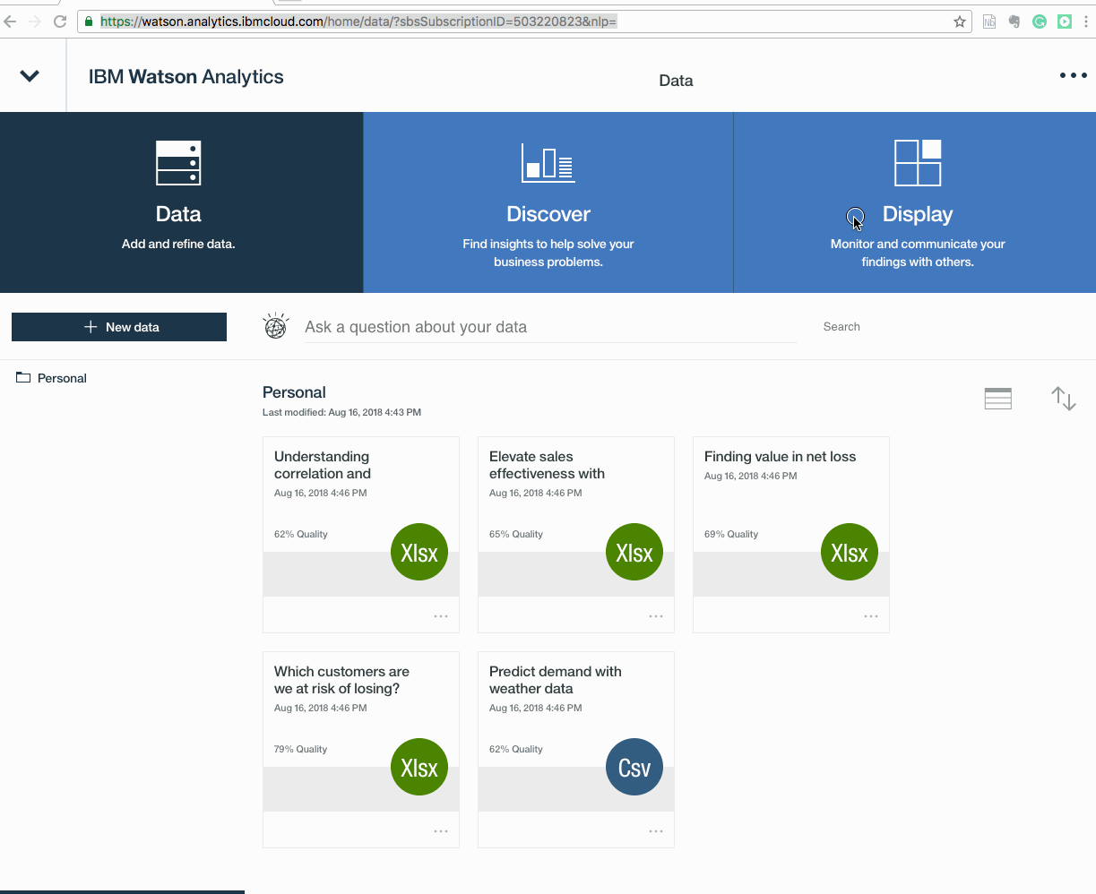
- Now, let?s return to the homepage,where we can see all of the assets that we?ve created over the course of this project. In the data section, we have our original CSV file, as well as the refined data set. In the discovery section, we have our full discovery set, with six individual tabs or visualizations, and in the display section, we have the dashboard that we just built.
- When we open up our dashboard, we now have the option to toggle between view mode(eyeglass symbol) and edit mode(pencil mode)by clicking on the pencil in the top menu.
Hands On ? :
iv) Sharing content
With Watson Analytics, sharing content is intuitive, and absolutely seamless. All we need to do is to click the share button, and determine what format we would like to use like e-mail, downloading the dashboard as images ,PDFs or PowerPoint, Tweeting the content directly, or generating a shareable link that we can pass along to other Watson Analytics users any way that we see fit.
Key Takeaway
We learned that type of travel, age, and airline status all significantly impact satisfaction ratings and that business travellers over the age of 65 years present the most immediate opportunity for improvement. From there, we gathered our discoveries, assembled a custom dashboard, and distributed our findings to the broader team. With the power of Watson Analytics, we exposed deep, meaningful insights in a matter of minutes.
Hence Watson Analytics is changing the way we interact with data and the opportunities to expose new insights are literally endless. Watson is revolutionising the analytics industry in a true sense.
Incase you liked what you read , hit on the clap button ? .This will encourage me to write even better articles in future.

