Would you believe it if I told you that switching to a different shade of blue netted Google as additional $200 Mn in Ad revenue?
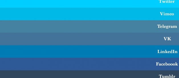
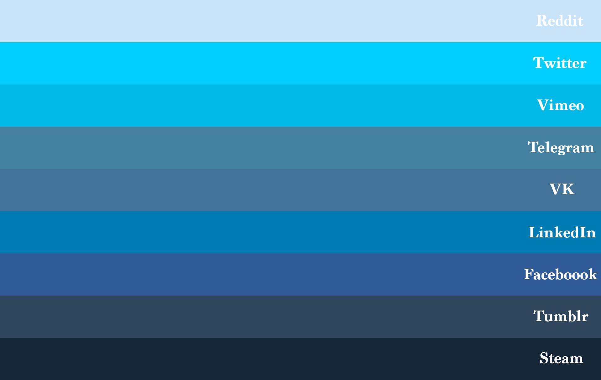 The shades of blue across other social platforms. https://imgur.com/gallery/uzzIs
When you do a Google Search, you have these ads with the links that lead to other websites. Does the colour of the links matter as long as we are getting what we are searching for?
Evidently, it does matter!
A question that was discussed:
What would make more users click on these links? The relevance of the ad and the external website apart, what else could be done to ensure more clicks?
Enter the ?50 shades of blue? experiment. Headed by Marissa Meyer herself when she was Google?s head of product, this experiment was first ridiculed at.
Could a slight variation in colour really have a sizeable impact?
Today, we do have a lot of data, but very less information!
How did a Data company such as Google come up with the ?right? shade of blue to use in its links?
The process:
In the world of user experience research, A/B testing is a commonly used methodology.
It consists of using two variants of a single variable ? it could be a screen, a web page, a form, anything that an individual is going to interact with. Based on the feedback, the variant with more acceptance is taken up for implementation.
This is an example of how it looks:
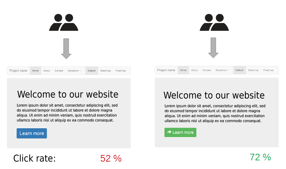
Image credit: By Maxime Lorant ? https://commons.wikimedia.org/wiki/File:A-B_testing_simple_example.png, CC BY-SA 4.0, https://commons.wikimedia.org/w/index.php?curid=52602931
In the above example, the Green ?Learn more? CTA would have been adopted by the organization for its final website design.
Usually, a task left to designers ? ?please choose the best shade of blue, we will go ahead with it!?, this however had an engineering bent to it.
Google ran a series of 1% experiments. Showing 1% of the users a particular blue, another 1% a different blue and so on. Over 40 experiments were conducted with all the shades of blue possible! The click metrics were available for analysis after each trial.
In the end, it was a purplish shade of Blue that won the contest!
The implication ? an additional $200mn in revenue that can be attributed to this colour change as well!
What would have seemed like a pointless experiment(who would care about what shade of blue it is!) is actually a great example, for how data driven customer experience design can work wonders!
When it comes to user experience, every little thing matters!
References:
- https://www.theguardian.com/technology/2014/feb/05/why-google-engineers-designers>
- https://www.bambrickmedia.com.au/blog/google-increased-revenue-200-million-just-finding-perfect-shade-blue/
