Example code for you to try out, change and make your own
CSS grid is now supported in Samsung internet v6.2 and many other modern browsers and has been the answer to many a prayer of web developers everywhere. In the same way that flexbox gave us a way to layout block elements next to each other, CSS grid lets us not only arrange elements in a row or a column, but in multiple rows and columns. Finally two dimensional layouts are becoming simpler!
When I was learning CSS and HTML the way that I learnt best was by copying layouts written by others and then changing bits, deleting bits and playing around with them until I understood what was going on. With that in mind, I?ve composed a few common responsive website layouts for you to copy, edit, mess around with. I?ll go over my thinking with each layout and will outline a few tricks from each one. (NB, you may have noticed that I?m not a designer, so I hope you like cats!). I?ve moved the CSS in each demo that is relevant to the layout up to the top of the CSS file in comment blocks so that you can see the important parts easily, don?t write your CSS like this.
Large Image followed by articles
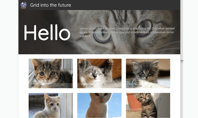 Large image and articles
https://grid-cats.glitch.me/ ? Demohttps://glitch.com/edit/#!/grid-cats ? Code
This is a responsive template that you?ll see all over the web, a large intro image followed by smaller images, buttons or articles. Have a look at the code from the glitch link above.
The smaller images (in a grid!) are in the perfect layout to get you started with CSS grid. Grid gives us control over how wide or narrow each of the ?grid cells? get. This allows us to maintain a sensible aspect ratio to their height. In this example I?ve used:
grid-template-columns: repeat(auto-fill, minmax(250px, 1fr));
There?s a lot going on here, so let?s break it down –
The repeat() function takes two arguments, the first will define the number of column tracks and the second, what width the tracks should be.
In this case, for the first argument, I?ve used auto-fill which will create a grid with as many tracks as will fit into the container. The second argument, which defines the width of the tracks, I?ve set to minmax(250px, 1fr). The minmax function will create track widths that can be a minimum of 250px wide and a maximum of 1fr. An fr is a ?fraction unit?, a unit of measurement to define a fraction of the available space of the container. The width of the elements in the row will increase from 250px until the point where another element could potentially fit beside the first. Try changing the width of your browser while looking at the example to see this in action.
Often when we put images in a responsive grid layout like this we come across the problem of the images stretching out of proportion. Using
object-fit: cover;
can help here, as that will stop the image from stretching, but it will cause cropping to happen. What we end up with is equally sized grid ?cells? which will fill increasing numbers of columns as the page width increases.
The final thing of note here is the grid-gap property. This defines the size of the space between the columns and the rows. This will affect the number of elements that will fit in a track, so you may need to adjust your minmax sizes accordingly. To create similar gaps between elements with flexbox we currently have to use a combination of margin and the justify-content properties, however column-gap and row-gap are in the works.
The rest of the position styling in this example has been done using flexbox, as these are one dimensional layouts. Flexbox is still my favourite tool for vertically centering elements on the page. Grid is brilliant for creating grids, but it doesn?t mean that our other layout tools are no longer necessary.
The Full Page Image Gallery
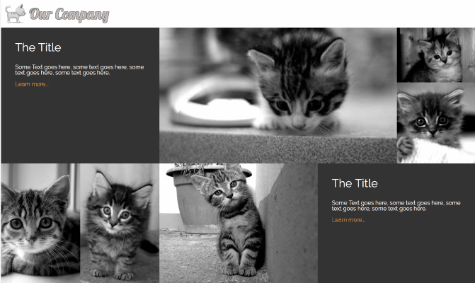 Full page gallery
https://cat-grid.glitch.me/ ? Examplehttps://glitch.com/edit/#!/cat-grid ? Code
This image gallery layout uses features of CSS grid to create different sizes of grid cells. I?ve used the span value on grid-columnand grid-row to make individual cells stretch over two or more slots in the track. The line
grid-template-columns: 1fr 1fr 1fr 1fr 1fr 1fr;
will create a grid with 6 columns which are each one fraction unit wide. They each share 1/6 of the width of the container. You could also use
grid-template-columns: repeat(6, 1fr);
to get the same result. Using the span value with a number will make a grid cell span that many rows, or columns . grid-column: span 2; for example, will create a cell that is two columns wide. I?ve used object-fit again to make the images keep their aspect ratio while filling the space of their containers. If the images in your gallery have more constraints than cat pictures, with regards to the space they?ll fit in then you can use media queries to change the number of rows or columns they span at different widths.
Card Layout
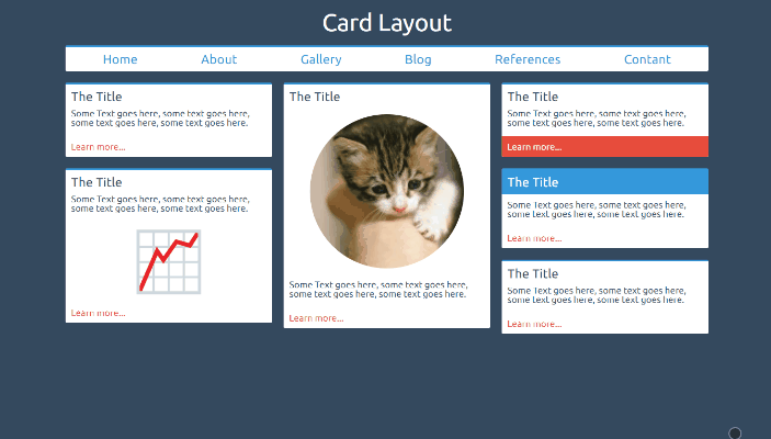 Card Layout
https://card-layout.glitch.me/ ? Examplehttps://glitch.com/edit/#!/card-layout ? Code
This is a column layout that fills each column with cards as the screen width increases. This is a great example of where, in my opinion, grid is not necessarily required. Here we have a column layout that is filling up with cards. We don?t necessarily know the size of each card, nor do we need the other card heights to change if a card is particularly tall. CSS colums are designed to do this.
column-count: 2;column-gap: 20px;
The above styles will create two columns with a gap between them of 20px. Media queries can be used to change the number of columns required when the page is wide enough to contain them. The columns will fill up with content and then spill content over into a new column when full. Using break-inside: avoid; will stop your cards from being split across multiple columns.
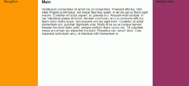
The Holy Grail Layout (with no set heights!)
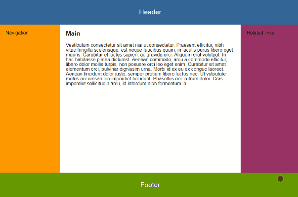 Holy grail layout
https://grid-grail.glitch.me/ ? Examplehttps://glitch.com/edit/#!/grid-grail ? Code
The ?Holy Grail? layout describes a page with a header and footer that stick at the top and bottom of the window respectively, and a content section that is split into two sidebars and the main content sits between them. This has been notoriously difficult to solve in an elegant way with CSS due to the need to stretch the content to push the footer down to the bottom of the page. With CSS grid, creating this layout requires very few lines of code.
body { display: grid; grid-template-columns: 200px 1fr 200px; grid-template-rows: auto 1fr auto; height: 100vh;}
This will create a 3 by 3 grid with fixed width columns either side and a center row that stretches to fill the space left after the top and bottom rows take up their content?s space. Setting the header and footer to grid-column: span 3; will make them take up an entire row each. In the above example I?ve used flexbox and flex-direction: column; at small screen sizes. The main element can then be set to flex: 1; which will cause it to stretch to fill the height of the window. The lovely thing about this method is that not only does it easily allow scrolling of the page if the window height is short, but it also doesn?t require us to set a height on any of the internal elements, meaning that they can contain any content without causing problems to the layout/design.
I hope you find these examples useful. Please feel free to remix the glitches/take the code and change it as much as you like, I?ve release them under MIT license. Have you got a common layout problem, or a particularly tricky design that you?ve solved with CSS grid? I?d love to see your work!

)
)