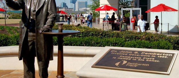
Coca-Cola brings people joy. It?s happiness in a bottle and enjoyed in 200 countries consuming a rate of 1.7 billion servings a day. The history of this world famous logo design began in 1886 in New York Harbor with John Stith Pemberton (1831?88). Join us in this article as we look at the Coca-Cola Logo Evolution ? Famous Logo History.
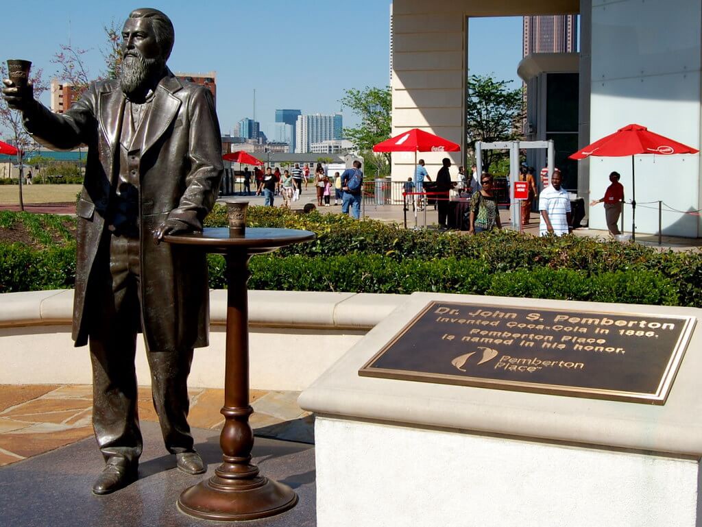
The Coca-Cola Company, was first founded in the year of 1892 and still to this day engages primarily in the manufacture and sale of syrup and concentrate for Coca-Cola, a sweetened carbonated beverage that is loved by people around the world. The company also produces and sells other soft drinks and citrus beverages. With more than 2,800 other products available in more than 200 countries around the globe. Coca-Cola is in fact the largest beverage manufacturer and distributor in the world today with is headquarters based in Atlanta Georgia it?s also one of the largest corporations in the United States of America.
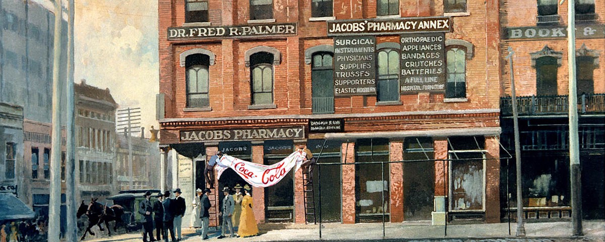
The Coca-Cola drink was originated in the year of 1886 by the Atlanta Pharmacist Dr John Pemberton. One afternoon, the pharmacist stirred up a fragrant, caramel-coloured liquid and, once completed he carried it a few doors down to Jacobs? Pharmacy. Here, the mixture was combined together with carbonated water and sampled by customers visiting the Pharmacy who agreed this new drink had something special about it. With such a positive reaction from the public Jacobs? Pharmacy put it on sale for five cents (about 3p) a glass.
John Pemberton, Pharmatics and the creator of the original Coca-Cola formula, was also a confederate soldier who was wounded in the battle of Columbus. This subsequently led him becoming addicted to morphine and later trying to discover a cure for that addiction.
One of the areas he looked for a cure was experimenting with coca and coca wines, Eventually, Pemberton came up with ?Pemberton?s French Wine Coca?. Being advertised as a nerve tonic cure-all.
Unfortunately for him, this cure-all remedy included alcohol, which was later banned in Atlanta in 1886.
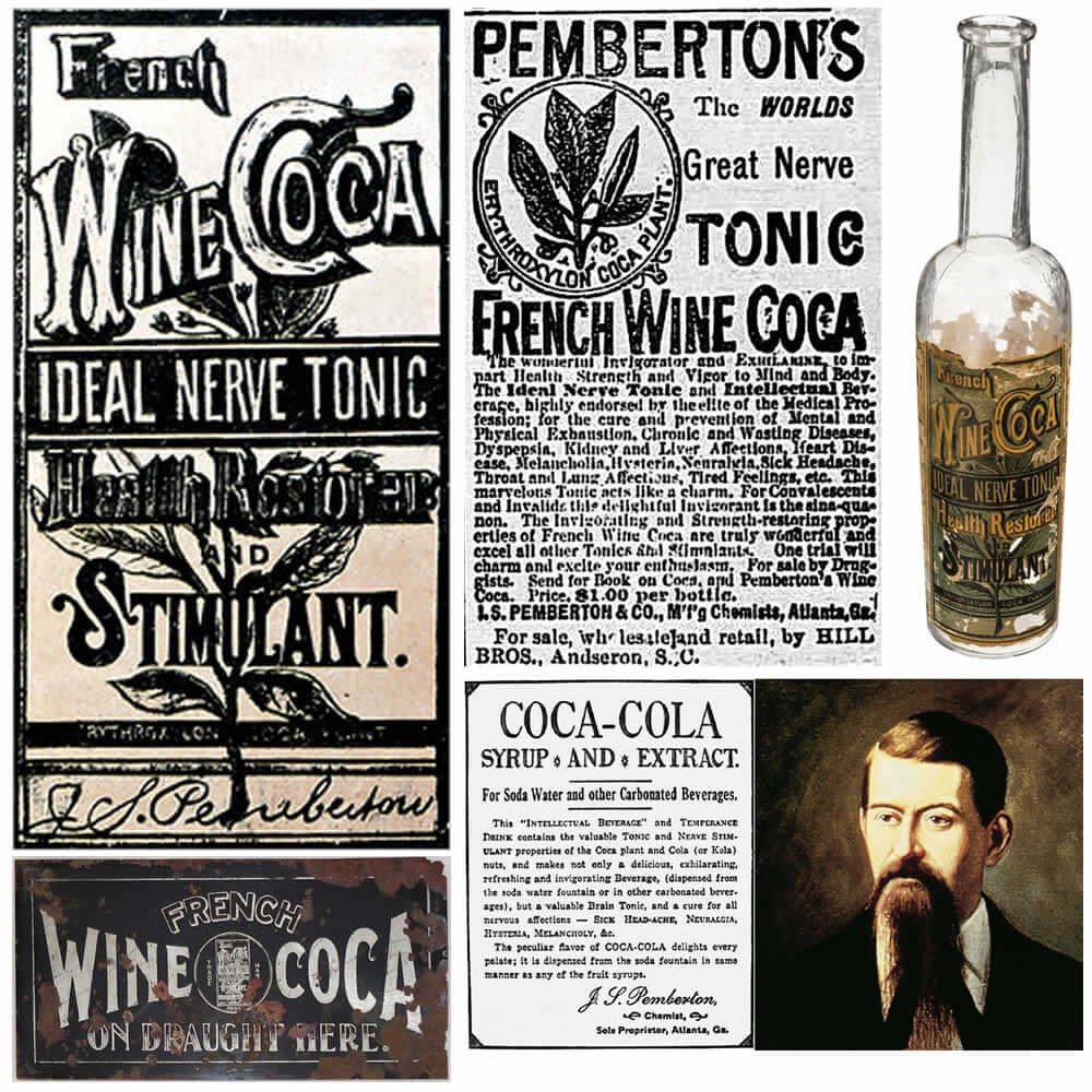
Not to be dissuaded, Pemberton modified his formula with the help of Willis Venable and Frank Mason Robinson. This new mixture was very similar to his original French Wine Coca, but without the alcohol and now being mixed with carbonated water (carbonated water at the time often being used in ?cure-all? mixtures as it was believed to itself be very good for your health).
Once again, this drink was sold as a cure-all, specifically advertised as a cure for impotence, dyspepsia, neurasthenia, headaches and morphine addiction as well as a general stimulant and health booster.
From the humble beginnings as a health tonic, Coca-Cola has grown into one of the best known brand names and beverages in the world, with sales of around 1.7 billion servings of Coke that is being enjoyed by people around the world.
The Coca-Cola Logo Design / LogoType
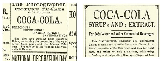
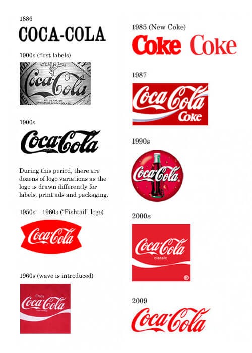
During the early days of Coka-Cola before the birth of the iconic identity as we know it today Pemberton opted to use a very simple serif font as shown below when advertising in local newspapers the new and popular soda fountain beverage.
Coca-Cola is one of the most famous logos in the world today, and its curvey flowing script was designed by Dr John Pemberton?s bookkeeper Frank Mason Robinson who realised that the two curly ?C?s would look great in advertising, he came up with the name previously and later flowing logotype in Spencerian script the exact date is not clear but during May of 1886, and officially registered as a trademark in 1887.
The Spencerian script was developed in the mid-19th century and was the dominant form of formal handwriting in the US during that period. Prior to the scripted logo at least one ad is known to have used the 86 logo including the hyphen to improve readability.
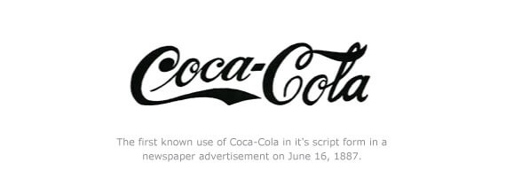
As the above version of the logo was the first scripted version that was used in advertisements in newspapers during 1986?1987 this early mark lacks a registration symbol as during this time the Coca-Cola company had not been registered at the patent office, and the trademark was officially granted a few years later. By this time various iterations of the brand mark existed in a rough and inconsistent look due to lack of the modern tools we use today.
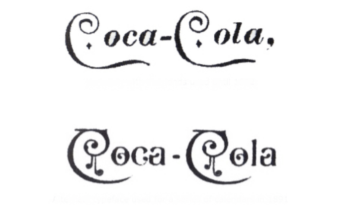
Above are variations of the logotype including the first one with diamonds used until 1982, and the typeface used for a series of calendars the year before in 1891.
Coca-Cola Trademark Granted 1893
In the year of 1893 on January 31st the Coca-Cola company was granted from the patent office it?s first trademark from this point the ?TRADEMARK? was applied with the ?C? tail curl. As shown below the first Coca-Cola logotype with the trademarking visible and below an advertisement for 1894 the following year.

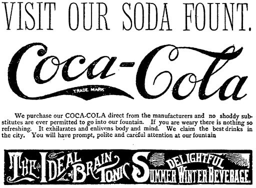
Below is a Coca-Cola Newspaper Advertisement, and this advert was featured in The Salem Evening News, Massachusetts, June 23, 1893 The front page contains a very nice advertisement for Coca-Cola, using the Coke trademark lettering, and noting: ?The Brain and Nerve Drink ? Cures Headache?. This would be one of the very earliest newspaper ads for Coca-Cola to be had in a northern newspaper. The ad measures about 2 by 2 inches.
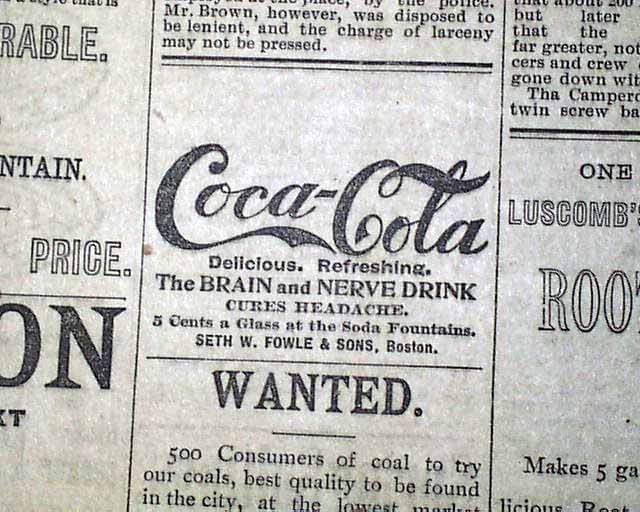
What?s interesting about this advertisement is that the trademark is not visible and this was printed after the trademark was granted and before Coca-Cola stopped applying the notification in the tail of the ?C? in 1941, The trademark notification was then later applied under the actual wordmark itself. In this image you can clearly see the letterforms are developing slightly more with the curls on the second Capital ?C?.
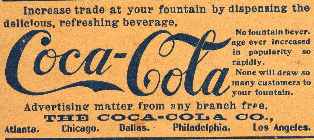
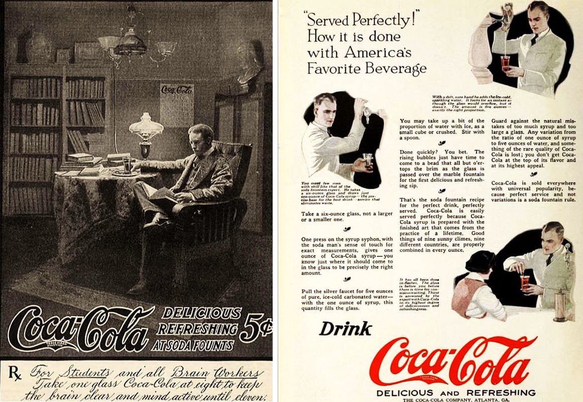
Again in this American Druggist Coca-Cola advertisement from 22 Oct 1900 the trademark wording is not present but the letterforms seem more refined.
Coca-Cola Posters & Metal Signage 1899?1900
This slideshow requires JavaScript.
Applying The Trademark Registered 1903 -1941
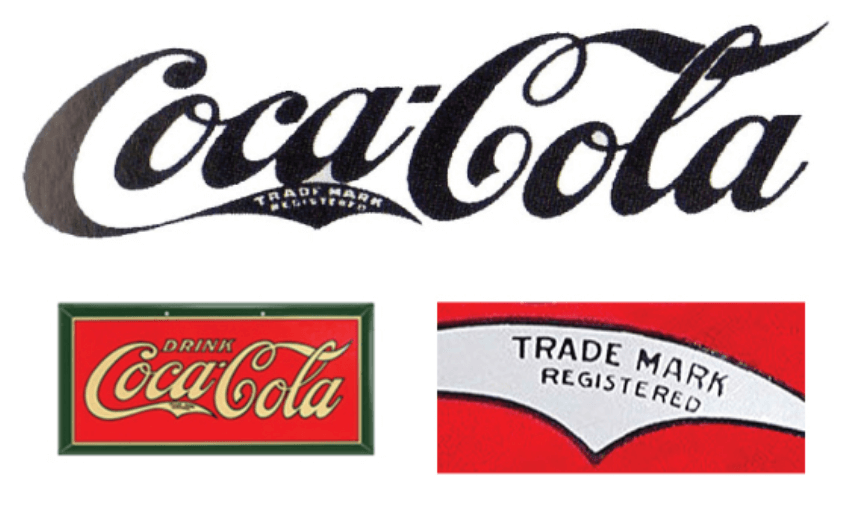
During 1903 ?trademark registered started to appear within the swooping tail of the Coca-Cola?s first ?C? letter. The reason for this change was in accordance with new laws that required companies to have to re-register their trademarks. The word ?DRINK would also start to appear in the mid 1920s above the logo mainly in signage and advertisements.
TRADEMARK REG. U.S PAT. OFF.
During 1941 Coca-Cola removed the tail ?C? trade mark notification and started placing it directly underneath the logotype. Although the official order for the notification to read ?REG. U.S PAT. OFF.? its actually appeared in several different variations,
The Simplified 1950s Trademark notification
During the beginning of the early 1950s the trademark had been simplified to state ?Trade-mark ? and became common practice to use in 1962. From the image below you can see how the trade mark changed overtime.
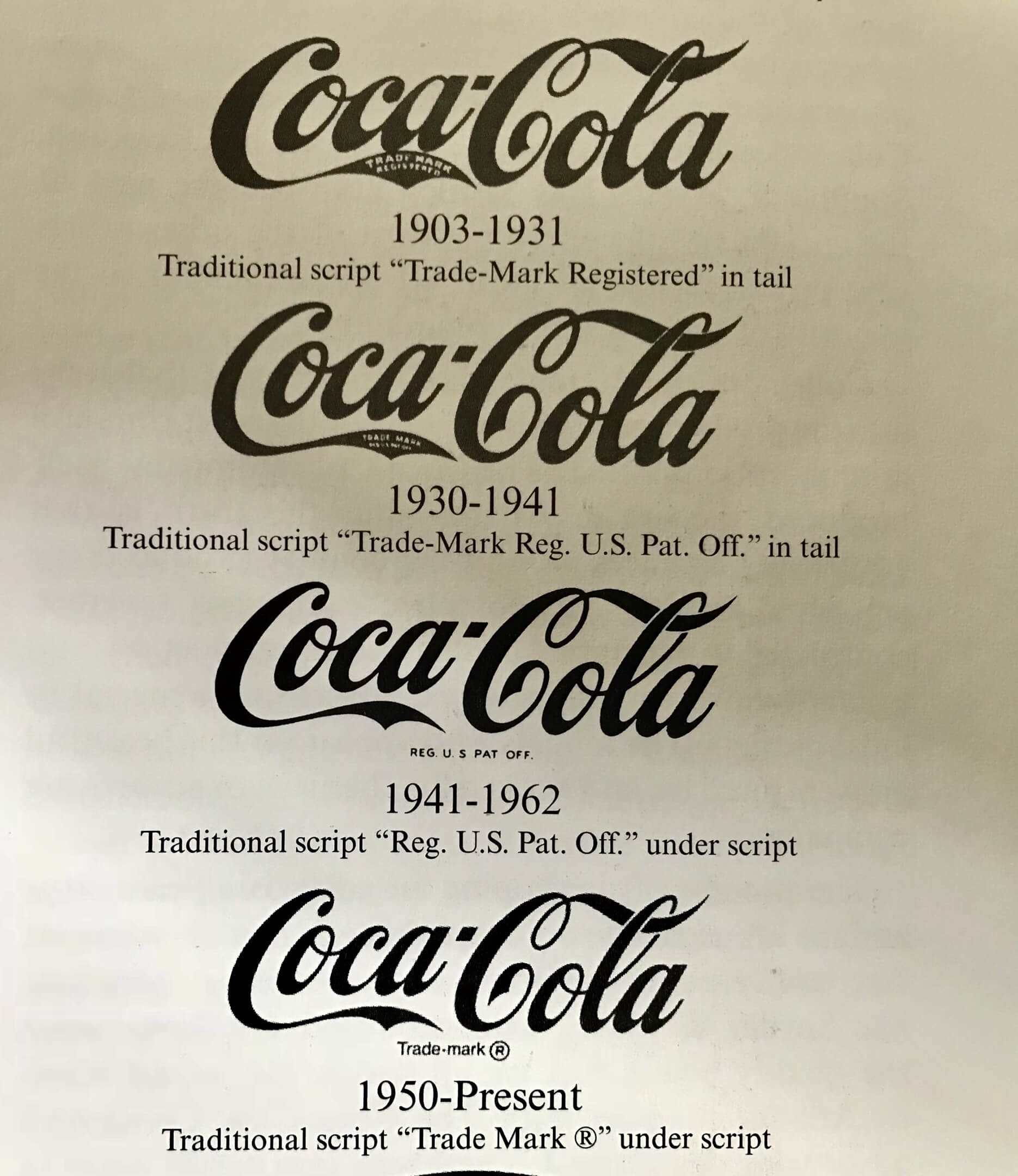
The Coca-Cola Logo Design Evolution at a Glance
Several versions of the logo were used in the brands very early days due to the fact that a lot of the advertising materials was hand painted the red and white colour scheme was kept simple and distinctive to attract younger customers. At the start of the 20th century more consistent image was developed which resulted in the 1940s logo type. However many variations have been invented over the years for the support graphics such as shields, waves and taglines with the end of keeping the brand relevant.
The Coca-Cola Soda Fountain
A French immigrant, by the name of Eugene Roussel, first added soda water flavours at his perfume shop in Philadelphia during 1839 and and soon after pharmacies across America also started serving flavoured soda from their very own soda fountains the flavours included orange, cherry and lemon. These soda fountains became the bars of their days acting as a meeting place for people to be sociable. The ?bartenders? who worked the soda fountains were known as ?soda jerks?.
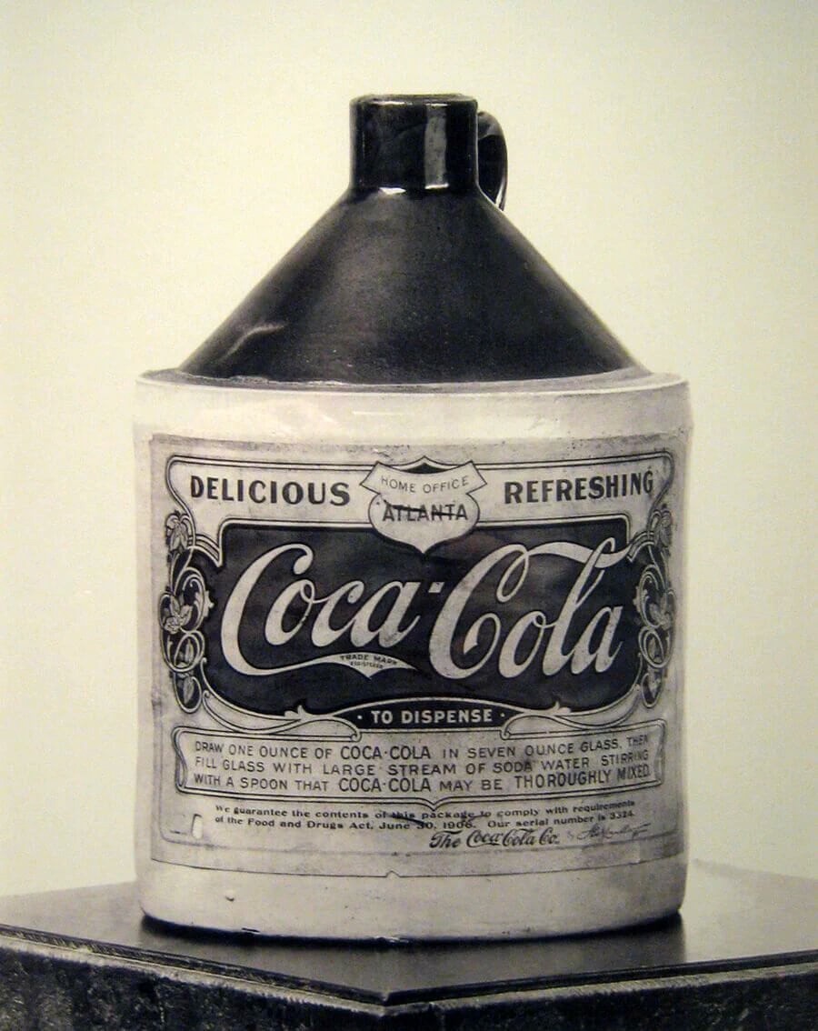
One of the first branded bottles of Coca-Cola syrup to be mixed with carbonated water via the soda fountain.
The soda fountain was a unique American phenomenon, they were particularly popular in hot southern towns such as Atlanta, Georgia, the place it was first created and the home of Coca-Cola. Through the 1870s and 1880s these soda fountains became ever more highly decorated as drugstores sought to outdo local competitors with many offering over hundreds of flavoured combinations. However, these flavours were mostly recognisable, simple and fruit-based. Coca-Cola was one of the first sophisticated proprietary flavours.
The Beginning of Coca-Cola Bottling
The Coca-Cola Company signed its first agreement in 1899 with an independent bottling company, this bottling company as part of the agreement was allowed to buy the syrup and produce, bottle, and distribute the Coca-Cola drink. These licensing agreements formed the basis of a very unique distribution system that now characterises most of the American soft-drink industry. Capitalised at $100,000 in 1892 upon incorporation, the Coca-Cola Company was sold in 1919 for $25 million to a group of investors led by Atlanta businessman Ernest Woodruff. His son, Robert Winship Woodruff, guided the company as president and chairman for more than three decades from 1923?1955.
During the post-World War II years this saw diverse change in the packaging of Coca-Cola and its development and acquisition of new products. The ?Coke,? trademark was first used in advertising in the year 1941, and was registered in 1945.
This slideshow requires JavaScript.
In the year 1946 the Coke-Cola Company purchased rights to Fanta, a soft drink THAT WAS previously developed in Germany. The famous and beloved contoured Coca-Cola bottle, was first introduced in the year of 1916, it was registered in 1960. The Coca-Cola company also introduced the lemon-lime drink Sprite in 1961 and its first diet cola, sugar-free version, in 1963. With its purchase of Minute Maid Corporation in 1960, the company entered the citrus juice market. It added the brand Fresca in 1966.
The Famous Coca-Cola Bottle
The Coca-Cola bottle with its iconic contour fluted lines is properly one of the most famous shapes in the world today. It was even renowned as a design classic, and also described by industrial designer and designer of the 1971 shell logo symbol, Raymond Loewy as the ?perfect liquid wrapper,? this famous Coca-Cola bottle has been celebrated in art, music and advertising world-wide.
When Andy Warhol who was known as the father to the Pop Art movement began painting his famous series of Coca-Cola bottles in the early 1960s, he had a vision and drew a shape to represent mass culture, when the German automaker Volkswagen wanted to celebrate the shape of the Beatle, they compared the car to the bottle.
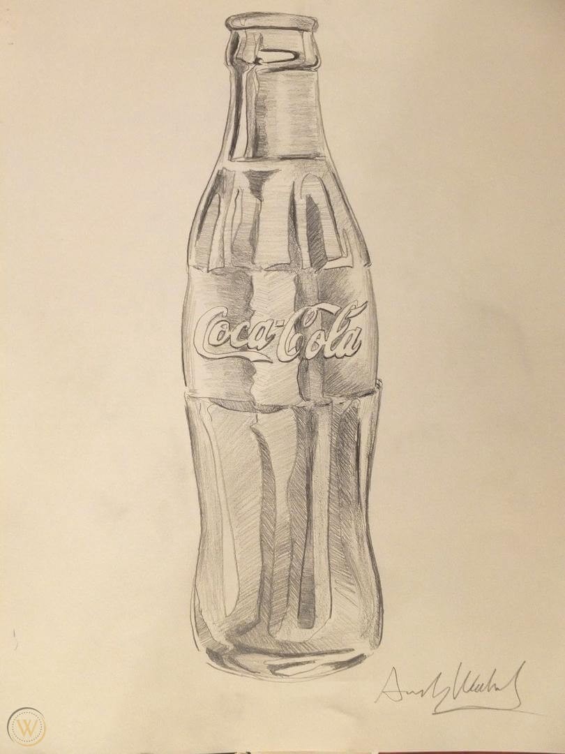
The famous bottles came to be with Coca-Cola?s desire to protect its brand becoming a cooperative project between The Coca-Cola Company itself and its bottlers.
Chattanooga, Tennessee lawyers, Joseph Whitehead and Benjamin Thomas, travelled to Atlanta the home of Coca-Cola in 1899 to negotiate the rights to bottle the Coca-Cola drink. The product had been an increasingly popular soda fountain drink established 13 years prior in fountain form, Coca-Cola grew from an average of nine drinks per day sold in 1886 to being sold in every state of the US by 1900. Thomas and Whitehead wanted to capitalise on the popularity of the drink by bottling it to be consumed outside the four walls of a soda fountain.
The contract signed between the two was a geographic one and The Coca-Cola Bottling Company began franchising the rights to bottle Coca-Cola in cities across America. By the year 1920, over 1,200 Coca-Cola bottling operations were now established. Sales in both fountain drinks and bottled form continued to increase and that popularity led to dozens of competitors trying to imitate the famous trademark of Coca-Cola to deceive the public into buying their drinks.
Revitalising The Coca-Cola Brand Presence
This slideshow requires JavaScript.
In June 2007 Turner Duckworth helped revitalise the Coca-Cola brand presence and created a visual celebration of the simple pleasure of drinking a coke anytime. Turner Duckworth identified five principles of iconic brands to guide the design thinking against the brand idea coke brings joy.
The principles of iconic brands that was developed by Turner Duckworth was
The Principles of Iconic Brands By Turner Duckworth
- Confidence to be simple
- Honesty (no other promising)
- In tune with the current culture
- Highly considered use of icons
- Attention to details
The goals set out for the Coca-Cola Rebrand Project
- Make Coca-Cola fresh and honest
- Visually leverage the trademarks Iconic enduring values
- Drive compelling cohesive 360 brand experiences
- Evoke meaningful and memorable consumer connections
This strategy inspired a multi-dimensional design language that amplifies Coca-Cola equalities across all consumer touch points
Research revealed that there was a cultural longing for Coca-Cola to be great again the branding process gave Coca-Cola the confidence to drive simplicity and communicate more emotion and meaning through iconography, wit and bold design.
The London and San Francisco based Design Company Turner Duckworth won a yellow pencil for graphic design: integrated graphics at the D&AD design and advertising awards for their Coca-Cola Identity, Coca-Cola Classic Can, and Coca-Cola Ident.
The award came a year after their redesign of Coca Cola?s brand which saw them win the Grand Prix for Design at Cannes International Advertising Festival in June 2008.
The revitalized visual identity has made a brand relevant to a new generation reconnected with people who grew up with the Brand and increased sales. They re-establish Coca-Cola potation as a global leading brand.
The Meaning Behind The Coca-Cola Name
More people can recognise the Coca-Cola wordmark than spell the name. Very few can explain what the name literally stands for. The name Coca-Cola was coined together to tell customers that the coca leaf and the kola nut are important ingredients in the drink.
The Brand Mark and its Visual Appeal
Coca-Cola focus is on the Iconic elements that no other brand can own the White Spencerian script on a red background the trademark contour bottle and the Dynamic Ribbon.
The design has the simplicity confidence and flexibility to work in different environments and media it was designed to be in tune with the culture. When it comes to colour as consumers we depend on the familiarity of Coca-Cola red.
Psychology of the Coca-Cola Red Colour and How it Captured Emotion World Wide
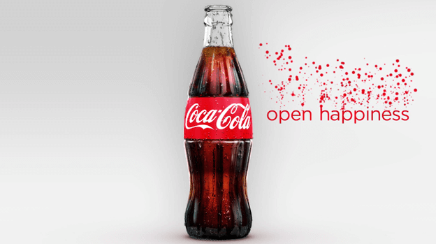
There is no denying just how powerful colour can be when using in advertising and marketing, speaking of colour it?s not strictly classed as a visual element; infact its very psychological and triggers different feelings and emotions within the human body and a persons mind.
When it comes to colour Coca-Cola is most famous and recognisable for its white scripted text on that distinct bright red coloured background.
Through research it is said that the red colour portrays power, excitement, energy and passion. While also stimulating a person?s appetite which is a good fit for branding a soft drink!
Research suggests red colour triggers impulse purchasing and that?s a good trait for any product and its manufacturer, and then there is that beautiful white swirling typography that simulate passion. White colour text on a striking coloured background like red is a fantastic choice for signage as this has powerful eye-catching qualities.
A report suggested that a staggering 94% of the entire world?s population recognised the red and white logo rather than the brand name itself to distinguish the brand and its product.
Due to Coca-Cola?s red and white mixture of brand colours there is a myth that they themselves invented Santa Claus as we are familiar with today wearing the red suite with white trim outline
I know it?s crazy to think but this is just a rumour as there are countless pictures of Santa in his red and white suite before Coka-Cola?s first Santa advert that was in 1931, and you have to give credit to Coca-Cola for its part in popularising Santa Claus at the time when colour was not regularly used in media.
Coca-Cola helped make Santa human with certain physical attributes we see to this day such as the big rosy red cheeks, his twinkling eyes and his large and jolly build. As we all know today Coca-Cola is synonymous with Christmas and the winter time due to these every adverts featuring Santa, advertisements we still see every Christmas time with the ?Holidays are Coming? Santa truck one.
Coca-Cola would have properly still been a very successful brand had they gone a different colour route but Coca-Cola knew exactly what they were doing when branding the product and in my opinion it was a smart branding strategy. Colour is such a powerful brand element and Coke-Cola used it to their advantage!
Coca-Cola Brand Essence
The Company Short tagline ?open happiness? communicates to the consumer that by opening and drinking a coca-cola they will feel happiness this catches the company?s brand essence personality and positioning and distinguishes the company from its competitors
And becomes stronger when you narrow down the focus and as the saying goes Less is more Coca-Cola?s big idea of happiness in a bottle seems so simple and fitting its very appropriate for the brands essence.
We hope this article about Coca-Cola Logo Evolution ? Famous Logo History, has been helpful and we would like to thank you for taking the time to read this article. If you would like to learn more about Famous Logo Design History see the links below.
- Nike Logo Evolution ? The $35 Swoosh
- Apple Logo Evolution ? It all Started With a Fruit
- Famous Logos ? Shell

Useful Links & Great Deals
- The equipment we use & recommend
- Quality Design Bundles
- Get 2 Months free Skillshare
- Get an exclusive 20% off Logo Package Express
- Learn Logo Design Online
Originally published at The Logo Creative | International Logo Design & Branding Studio.
