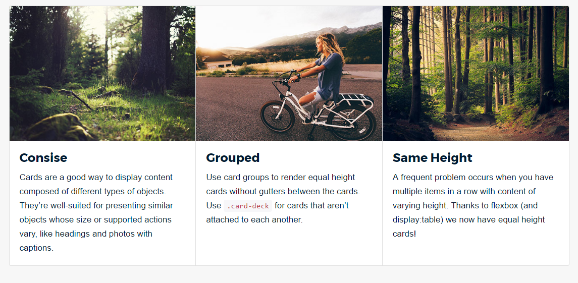
Why table-cell or negative margins DON?T work

Bootstrap is a framework intended for responsive design. The Bootstrap grid has multiple tiers (AKA breakpoints), media queries, and fluid column widths for a reason?
The reason is responsive design.
I know it seems I?m stating the obvious, but it?s really the most important consideration for equal height column solutions & workarounds.
Bootstrap Grid ? Responsive 101
Even if you think you know this, please read it anyway.
<div class=”container”> <div class=”row”> <div class=”col-md-4″>..</div> <div class=”col-md-4″>..</div> <div class=”col-md-4″>..</div> </div></div>
Shown above is a very simple 3 column layout. It renders like this?
 Bootstrap ? 3 columns across, 33% width each
As you may know Bootstrap?s grid has 12 column units. Notice that we used three col-md-4 column units, and each one consumes 4 out of the 12 units 12/3=4. So far, so good.
Next, we want another row of columns. The glaringly obvious markup?
<div class=”container”> <div class=”row”> <div class=”col-md-4″>..</div> <div class=”col-md-4″>..</div> <div class=”col-md-4″>..</div> </div> <div class=”row”> <div class=”col-md-4″>..</div> <div class=”col-md-4″>..</div> <div class=”col-md-4″>..</div> </div></div> Bootstrap ? 2 rows of 3 columns
Perfect. Can we make it better?
Right about here is when when I start to lose people, so be patient.
Can I do this intead? Can I put all the columns in one row?
<div class=”container”> <div class=”row”> <div class=”col-md-4″>..</div> <div class=”col-md-4″>..</div> <div class=”col-md-4″>..</div> <div class=”col-md-4″>..</div> <div class=”col-md-4″>..</div> <div class=”col-md-4″>..</div> </div></div>
Newbie: No, that won?t work. The Bootstrap grid has only 12 columns, so you should never have more than 12 columns in a row. You should have only 3 col-md-4 in each .row element, because 3*4=12.
Teacher: Ok, that sounds reasonable. But, suppose I want a responsive layout. I want 3 columns across on medium & large width screens, and only 2 columns across on the smallest width screens. I want my layout like this:
 Desired small width layout ? 2 columns across
 Desired large width layout ? 2 columns across
Newbie: Ok, so lets think ?mobile-first?, and build the smallest width layout of 2 columns across…
<div class=”container”> <div class=”row”> <div class=”col-xs-6″>..</div> <div class=”col-xs-6″>..</div> </div> <div class=”row”> <div class=”col-xs-6″>..</div> <div class=”col-xs-6″>..</div> </div> <div class=”row”> <div class=”col-xs-6″>..</div> <div class=”col-xs-6″>..</div> </div></div>
Newbie (con?t): Then, add the column widths for the large screen, ensuring that each .row never exceeds 12 column units. As I said before, ?you should never have more than 12 column units in a row??
<div class=”container”> <div class=”row”> <div class=”col-xs-6 col-md-4″>..</div> <div class=”col-xs-6 col-md-4″>..</div> </div> <div class=”row”> <div class=”col-xs-6 col-md-4″>..</div> <div class=”col-xs-6 col-md-4″>..</div> </div> <div class=”row”> <div class=”col-xs-6 col-md-4″>..</div> <div class=”col-xs-6 col-md-4″>..</div> </div></div>
Teacher: Ok, let?s see how it works.
First, let?s try it on a smaller width screen?
OK ? 2 columns across on smaller width screens
Ok good. Now, check the larger width screen?
Fail? only 2 columns across on larger width screens
Teacher: Oh No! That doesn?t work.
I want the layout to have 3 columns across on larger screens. Let me explain why it does not work. Earlier when I asked, ?Can I put all the columns in one row, like this??
<div class=”container”> <div class=”row”> <div class=”col-md-4″>..</div> <div class=”col-md-4″>..</div> <div class=”col-md-4″>..</div> <div class=”col-md-4″>..</div> <div class=”col-md-4″>..</div> <div class=”col-md-4″>..</div> </div></div>
The newbie?s answer was, ?No. The grid has only 12 columns, so you should never have units that exceed 12 in a row?.
It?s this misconception that made it impossible to obtain the desired layout.
The Necessity of Column Wrapping
Here?s the correct way to make the desired responsive layout. Yes, put all the columns in a single row element. It doesn?t matter that the total units exceed 12:
<div class=”container”> <div class=”row”> <div class=”col-xs-6 col-md-4″>..</div> <div class=”col-xs-6 col-md-4″>..</div> <div class=”col-xs-6 col-md-4″>..</div> <div class=”col-xs-6 col-md-4″>..</div> <div class=”col-xs-6 col-md-4″>..</div> <div class=”col-xs-6 col-md-4″>..</div> </div></div>
2 columns on small widths?
OK ? 2 cols across on smaller width screens
3 columns on larger widths?
OK ? 3 cols across on larger width screens
So, now you know, it?s OK to exceed 12 column units in a single .row element.
It?s not only OK, it?s often required for responsive design
This technique is known as column wrapping, and it?s one of Bootstrap?s most powerful responsive design features. The desired layout would not be possible (other than duplicating markup) if we tried to stick with the misconception that column units must add up to 12 in a single row. It also works better when you have an unknown number of columns, or columns are being generated dynamically.
Making Equal Height Columns
Onto the matter at hand. Now that you know about the necessity of column wrapping, let?s go back and look at equal height columns.
As we look at equal height solutions, we?ll consider these 2 layouts?
1: The Simple Layout ? a single row
<div class=”container”> <div class=”row”> <div class=”col-md-4″>..</div> <div class=”col-md-4″>..</div> <div class=”col-md-4″>..</div> </div></div>
2: The Responsive Layout
<div class=”container”> <div class=”row”> <div class=”col-xs-6 col-md-4″>..</div> <div class=”col-xs-6 col-md-4″>..</div> <div class=”col-xs-6 col-md-4″>..</div> <div class=”col-xs-6 col-md-4″>..</div> <div class=”col-xs-6 col-md-4″>..</div> <div class=”col-xs-6 col-md-4″>..</div> </div></div>
Equal Height Solutions
Now our columns have real content so they vary in height. The goal is to make each column same height as the adjacent columns. Equal height columns are often used to solve the irregular wrapping issue known as the ?height problem?.
1 ? Use `table-cell`(worst)
IMO, this and is not a solution. By setting the row to display:table, and the colums to display:table-cell we do indeed get a row of same height columns.
.row.display-table { display: table;}.row.display-table [class*=?col-?] { float: none; display: table-cell;}
However, if the columns contain a block of content (such as cards), there is no easy way to make the child block 100% height of the column. Additionally this solution is not responsive, and does not work for the responsive layout. I really have no idea why people suggest this as an option.__ it?s not.
Table-cell demo:http://www.codeply.com/go/Eoqeg1PDdR
2? Use huge negative margins & padding (bad)
Another common suggestion is to use very large negative margins and padding, like this:
.row.make-equal { overflow: hidden;}.row.make-equal [class*=”col-“]{ margin-bottom: -99999px; padding-bottom: 99999px;}
Again, if the columns contain a block of content, there is no easy way to make the child block 100% height of the parent column. Also, this solution does not work for the responsive layout.
Huge negative-margins demo:http://www.codeply.com/go/1EtD4QnDzF
3 ? Use flexbox (best!)
As of 2017, the best (and easiest) way to make equal height columns in a responsive design is using CSS3 flexbox.
.row.display-flex { display: flex; flex-wrap: wrap;}.row.display-flex > [class*=’col-‘] { display: flex; flex-direction: column;}
Now we have columns that are equal in height, and their content fills the full height ot the entire column.
Flexbox Demo!http://www.codeply.com/go/EskIjvun4B
The upcoming Bootstrap 4 grid will use flexbox by default, so equal height columns are now natively supported__ no extra CSS required!


