Customize the Navbar color, height, or alignment
New: This article was updated for Bootstrap 4.1
I previously explained how to change the Bootstrap 4 Navbar breakpoint, so next I?ll be looking at the Navbar color, height and alignment. Since the new Bootstrap 4 utilizes CSS 3 Flexbox, Navbar customization is now easier than ever! It?s easy to upgrade the Navbar from Bootstrap 3 to Bootstrap 4.
Change the Navbar Color or Transparency
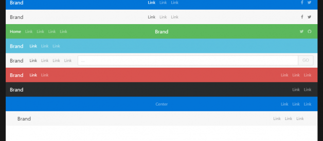
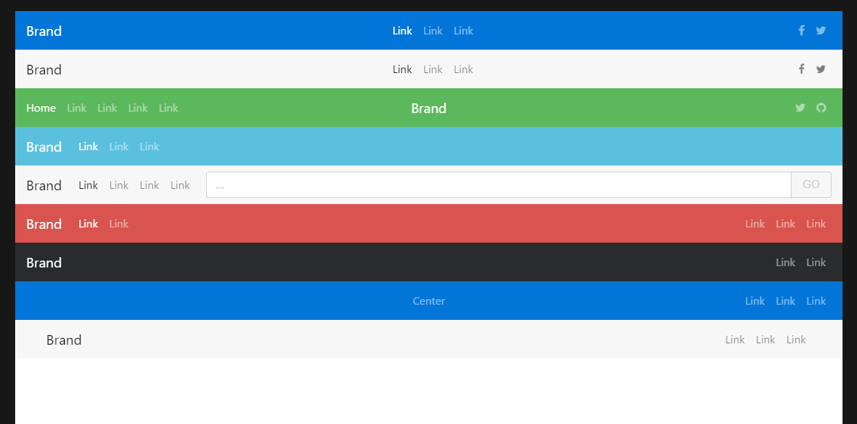
There are several included Navbar color schemes to Bootstrap 4. You can specify the background color using the bg- classes: bg-light, bg-dark, bg-info, bg-danger, bg-primary, bg-warning, or bg-success. Usenavbar-dark for lighter text color (white), or navbar-light for darker text color (black).
Bootstrap 4 Navbar Color Schemes
Of course, it?s possible to use any Navbar color with a little CSS?
.navbar-custom { background-color: #ff5500;}/* change the brand and text color */.navbar-custom .navbar-brand,.navbar-custom .navbar-text { color: rgba(255,255,255,.8);}/* change the link color */.navbar-custom .navbar-nav .nav-link { color: rgba(255,255,255,.5);}/* change the color of active or hovered links */.navbar-custom .nav-item.active .nav-link,.navbar-custom .nav-item:hover .nav-link { color: #ffffff;}
Then just reference the .navbar-custom CSS in the Navbar element?
<nav class=”navbar navbar-expand-sm navbar-custom”> …</nav>Bootstrap 4 Custom Navbar Color Example
Changing the color of the hamburger icon __ the navbar-toggler-icon is a little trickier. Unlike the old 3.x icon-bar, the navbar-toggler-iconin Bootstrap 4 uses an SVG background-image. There are 2 versions of the image: One for a light navbar .navbar-light, and one for a dark (inverse) navbar .navbar-dark .
// this is a black icon with 50% opacity .navbar-light .navbar-toggler-icon { background-image: url(?data:image/svg+xml;..?); } // this is a white icon with 50% opacity .navbar-dark .navbar-toggler-icon { background-image: url(?data:image/svg+xml;..?); }
So, if you want to change the color of this toggler image, you can customize the SVG image icon. For example, here I set the RGB value to pink (255,102,203). Notice the stroke=?rgba(255,102,203, 0.5)? value in the SVG data?
ccustom-toggler .navbar-toggler-icon { background-image: url(?data:image/svg+xml;charset=utf8,%3Csvg viewBox=?0 0 32 32′ xmlns=?http://www.w3.org/2000/svg’%3E%3Cpath stroke=?rgba(255,102,203, 0.5)? stroke-width=?2′ stroke-linecap=?round? stroke-miterlimit=?10′ d=?M4 8h24M4 16h24M4 24h24’/%3E%3C/svg%3E?);}
Navbar toggler icon custom color demo
OFC, another option to just use a different icon from another library (ie: Font Awesome) inside the .navbar-toggler .
Change the Navbar Height (Taller or Shrink)
Thanks to the new spacing utility classes, it?s also easier to change the Navbar height. The Bootstrap 4 Navbar doesn?t have a set height, so it?s rendered height (~54 px) is controlled by the size of the Navbar?s content (brand, links, text, padding, etc..).
The easiest way to change height is to use the padding spacing utility classes to decrease or increase the y-axis (top & bottom) padding. You can change the padding on the entire Navbar element, it?s content or both. The notation works like: {property}{sides}-{size} such as:
{property}=`p` for padding{sides}=`y` for y-axis (top & bottom){size}=0,1,2,3,4 or 5 (based on size scale)
Examples
Increase the Navbar height by 1rem:
<nav class=”navbar navbar-expand-md py-3″>..</nav>
Increase the Navbar height by 1rem (only on md & up):
<nav class=”navbar navbar-expand-lg py-md-3″>..</nav>
Decrease the Navbar height by 1rem:
<nav class=”navbar navbar-expand-sm py-1″>..</nav>
The padding classes py-* can also be used on the Navbar links, brand and other content?
<ul class=”navbar-nav”> <li class=”nav-item py-md-2″> <a href=”#” class=”nav-link”>Home</a> </li> <li class=”nav-item py-md-2″> <a href=”#” class=”nav-link”>Link</a> </li> <li class=”nav-item py-md-2″> <a href=”#” class=”nav-link”>Link</a> </li> <li class=”nav-item py-md-2″> <a href=”#” class=”nav-link”>More</a> </li> <li class=”nav-item py-md-2″> <a href=”#” class=”nav-link”>Options</a> </li></ul>
OFC, instead of changing the padding, you can simply set the navbar min-height for a taller .navbar:
.navbar { min-height: 80px;}
Taller Navbar Snippet
Bootstrap 4 Navbar Increase Height
Shorter Navbar Snippet
Bootstrap 4 Navbar Shrink Height
Change the Navbar Alignment
Flexbox enables us to easily change the alignment of the Navbar and it?s content (brand, links, forms or text).
For alignment we?ll be using the auto-margin or flexbox utility classes.
Don?t use the grid .row and/or col-* to align the Navbar content! The Navbar is meant to be used with supported content which doesn?t include the grid. The grid doesn?t provide any extra benefits. Using the grid inside the Navbar will mess-up the Navbar spacing and responsiveness. If you want to set widths on specific Navbar components uses the sizing utils.
The default Navbar content is left aligned. Of course there are many other alignment scenarios…
? Brand left (default), links center & right
? Brand center, links left & right
? Brand left and links right
? Brand, links and fill width form input
? No brand, links center & right
? Brand left, links right inside container
? Justified links (fill width) centered
All of these Navbar scenarios have other variations like using container or container-fluid (full-width).
Navbar alignment: Center, right, forms and other examples
Armed with the new Bootstrap 4 flexbox and spacing utilities you can get almost any Navbar layout you need. For example, here is a dual Navbar layout with 2 Navbars. The lower Navbar is controlled by the hamburger toggler in the top Navbar. The icons on the top menu are right aligned to the left of the toggler, and are always visible.
Bootstrap 4 Multiple Navbars Collapsed ViewBootstrap 4 Multiple Navbars Wide (Horizontal) View
Now you know how to customize that Navbar vertical breakpoint, or change colors, height and alignment. Keep on learning, and read more about how to use Bootstrap 4.
