How Responsive Display Works in Bootstrap 4 Beta
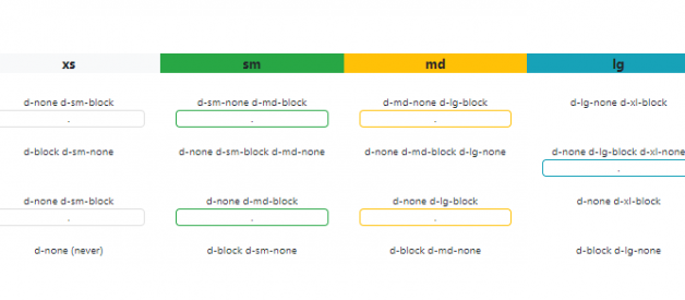
 Bootstrap 4 Responsive Display Matrix
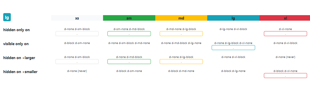
As of late, the Bootstrap 4 Beta responsive visibility classes have changed, and you?ll no longer find the hidden-* and visible-* classes from the older Bootstrap versions.
What is Responsive Visiblity?
There are many use cases for the responsive display of elements. You may want to show an element only on desktop screens, or hide an element only on phones and tablets, or show an element within a view-port range such as tablets.
Understanding Bootstrap 4 Tiers
To understand how this works, you?ll want to first understand the 5 Bootstrap 4 display tiers or ?breakpoints??
// Extra small devices (portrait phones, less than 576px)default (max-width: 575px)// Small devices (landscape phones, 576px and up)(sm) small (min-width: 576px) and (max-width: 767px) // Medium devices (tablets, 768px and up)(md) medium (min-width: 768px) and (max-width: 991px) // Large devices (desktops, 992px and up)(lg) large (min-width: 992px) and (max-width: 1199px) // Extra large devices (large desktops, 1200px and up)(xl)
Bootstrap 4 Responsive Display
If you want to hide an element on specific tiers (breakpoints) in Bootstrap 4, use the `d-*` display classes accordingly.
Remember extra small (formerly specified as `xs`) is the default breakpoint, which is always implied unless overridden by a larger breakpoint. Since xs is the default, there?s no need to use the `-xs-` infix. For example, it?s not d-xs-none, it?s simply d-none.
Here?s the full matrix of Bootstrap 4 responsive visibility that shows how to hide or show on a single breakpoint tier, or on a range of breakpoints?
Converting from 3.x or 4 Alpha to Bootstrap 4 Beta
Here?s the complete list of changes you can make to swap out the deprecated hidden-* and visible-* classes?
* `hidden-xs-down` = `d-none d-sm-block`* `hidden-sm-down` = `d-none d-md-block`* `hidden-md-down` = `d-none d-lg-block`* `hidden-lg-down` = `d-none d-xl-block`* `hidden-xl-down` = `d-none` (always hidden)* `hidden-xs-up` = `d-none` (always hidden)* `hidden-sm-up` = `d-sm-none`* `hidden-md-up` = `d-md-none`* `hidden-lg-up` = `d-lg-none`* `hidden-xl-up` = `d-xl-none`* `hidden-xs` (only) = `d-none d-sm-block` (same as `hidden-xs-down`)* `hidden-sm` (only) = `d-block d-sm-none d-md-block`* `hidden-md` (only) = `d-block d-md-none d-lg-block`* `hidden-lg` (only) = `d-block d-lg-none d-xl-block`* `hidden-xl` (only) = `d-block d-xl-none`* `visible-xs` (only) = `d-block d-sm-none`* `visible-sm` (only) = `d-none d-sm-block d-md-none`* `visible-md` (only) = `d-none d-md-block d-lg-none`* `visible-lg` (only) = `d-none d-lg-block d-xl-none`* `visible-xl` (only) = `d-none d-xl-block`
Remember, d-*-block adds display:block for that viewport, but this can be replaced with any of CSS display properties such as d-table-cell, d-*-inline, d-*-flex, etc.. depending on the display type of the element.
More Bootstrap 4 Examples & Tips?
Check out the home of Bootstrap 4 here on WDstack.

