Tab layout are visible below toolbar with View pager, used to create swipeable views on. Tabs are designed to work with fragments. Use them to swipe fragments in view pager. In this article, we are going to show you how to implement material design tabs in your android app.
After creating new project, open build.gradle of app level and add design support library because Tablayout is a part of Android Design Support Library:
compile ‘com.android.support:design:27.0.2’
Add Tab layout and View pager in you layout activity_main.xml
<?xml version=”1.0″ encoding=”utf-8″?><LinearLayout xmlns:android=”http://schemas.android.com/apk/res/android”xmlns:app=”http://schemas.android.com/apk/res-auto”android:layout_width=”match_parent”android:layout_height=”match_parent”android:orientation=”vertical”><include layout=”@layout/app_bar” /><android.support.design.widget.TabLayoutandroid:id=”@+id/tabLayout”android:layout_width=”match_parent”android:layout_height=”wrap_content”android:minHeight=”?actionBarSize”app:tabGravity=”fill”app:tabIndicatorColor=”@color/white”app:tabIndicatorHeight=”4dp”app:tabBackground=”@color/colorPrimary”app:tabMode=”fixed”></android.support.design.widget.TabLayout><android.support.v4.view.ViewPagerandroid:id=”@+id/viewPager”android:layout_width=”match_parent”android:layout_height=”match_parent”></android.support.v4.view.ViewPager></LinearLayout>
app_bar.xml for toolbar
<?xml version=”1.0″ encoding=”utf-8″?><android.support.v7.widget.Toolbar xmlns:android=”http://schemas.android.com/apk/res/android”xmlns:app=”http://schemas.android.com/apk/res-auto”android:id=”@+id/toolbar”android:layout_width=”match_parent”android:layout_height=”?attr/actionBarSize”android:background=”@color/colorPrimary”android:gravity=”center_vertical”app:layout_collapseMode=”pin”app:layout_scrollFlags=”scroll|enterAlways”app:theme=”@style/MyToolbarTheme”app:title=”@string/app_name”/>
style.xml
<style name=”MyToolbarTheme”parent=”@style/ThemeOverlay.AppCompat.Dark”> <item name=”colorControlNormal”>@color/white</item> <item name=”titleTextColor”>@color/white</item></style>
Create tab adapter which extends to FragmentStatePagerAdapter. Create two list for fragment list and title list. Create method for passing fragment and title that you want to add.
TabAdapter.java
package com.example.demoproject;import android.support.annotation.Nullable;import android.support.v4.app.Fragment;import android.support.v4.app.FragmentManager;import android.support.v4.app.FragmentStatePagerAdapter;import java.util.ArrayList;import java.util.List;public class TabAdapter extends FragmentStatePagerAdapter {private final List<Fragment> mFragmentList = new ArrayList<>();private final List<String> mFragmentTitleList = new ArrayList<>();TabAdapter(FragmentManager fm) {super(fm);}@Overridepublic Fragment getItem(int position) {return mFragmentList.get(position);}public void addFragment(Fragment fragment, String title) {mFragmentList.add(fragment);mFragmentTitleList.add(title);}@Nullable@Overridepublic CharSequence getPageTitle(int position) {return mFragmentTitleList.get(position);}@Overridepublic int getCount() {return mFragmentList.size();}}
Create Fragments for view pager. We will add fragments in adapter from activity.
Tab1Fragment.java
package com.example.demoproject;import android.os.Bundle;import android.support.v4.app.Fragment;import android.view.LayoutInflater;import android.view.View;import android.view.ViewGroup;public class Tab1Fragment extends Fragment {@Override public View onCreateView(LayoutInflater inflater, ViewGroup container, Bundle savedInstanceState) { return inflater.inflate(R.layout.fragment_one, container, false); }}
Layout for Tab1Fragment fragment_one.xml
<?xml version=”1.0″ encoding=”utf-8″?><RelativeLayout xmlns:android=”http://schemas.android.com/apk/res/android”android:layout_width=”match_parent”android:layout_height=”match_parent”><TextViewandroid:layout_width=”wrap_content”android:layout_height=”wrap_content”android:layout_centerInParent=”true”android:text=”Tab 1″android:textSize=”36sp” /> </RelativeLayout>
Similarly create more fragment that you want to add, Tab2Fragment, Tab3Fragment and so on.. with their layouts.
Define Tab layout and view pager from layout, define adapter, add your fragments with title, set adapter to view pager and tablayout setup with view pager as viewpager swipe with tablayout.
MainActivity.java
package com.example.demoproject;import android.os.Bundle;import android.support.design.widget.TabLayout;import android.support.v4.view.ViewPager;import android.support.v7.app.AppCompatActivity;public class MainActivity extends AppCompatActivity {private TabAdapter adapter;private TabLayout tabLayout;private ViewPager viewPager;@Overrideprotected void onCreate(Bundle savedInstanceState) {super.onCreate(savedInstanceState);setContentView(R.layout.activity_demo);viewPager = (ViewPager) findViewById(R.id.viewPager);tabLayout = (TabLayout) findViewById(R.id.tabLayout);adapter = new TabAdapter(getSupportFragmentManager());adapter.addFragment(new Tab1Fragment(), “Tab 1”);adapter.addFragment(new Tab2Fragment(), “Tab 2”);adapter.addFragment(new Tab3Fragment(), “Tab 3”);viewPager.setAdapter(adapter);tabLayout.setupWithViewPager(viewPager);}}
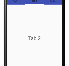
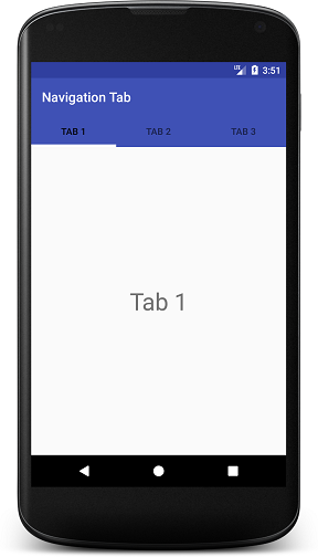
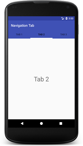
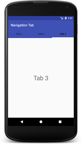
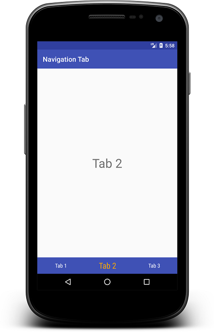
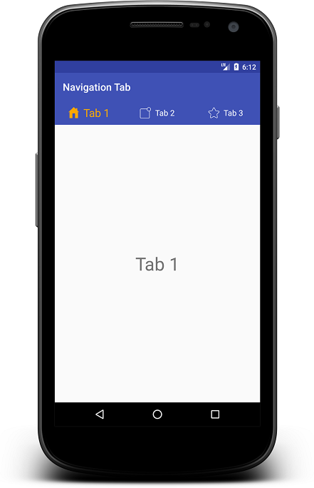
Run this code and you will find below output:
Some options to customize tabs appearance:app:tabGravity=?fill? for Navigation tab gravity. Other is center for placing navigation tabs from centerapp:tabIndicatorColor=?@color/white? for indicator in tabs. Here you can see white indicator.app:tabIndicatorHeight=?4dp? for indicator height.app:tabMode=?fixed? for tab mode. Other is scrollable for many more tabs.app:tabTextColor=?@color/semi_yellow? for unselected tab text color.app:tabSelectedTextColor=?@color/yellow? for selected tab text color.
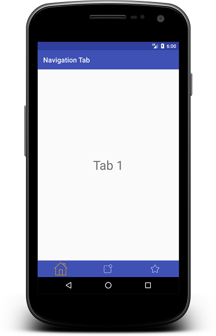
If you want to add icons to tab, you have to do is call setIcon() method of tab. Create icon array and assign each one for each tab like this:
private int tabIcons = { R.drawable.home, R.drawable.notification, R.drawable.star};tabLayout.getTabAt(0).setIcon(tabIcons[0]);tabLayout.getTabAt(1).setIcon(tabIcons[1]);tabLayout.getTabAt(2).setIcon(tabIcons[2]);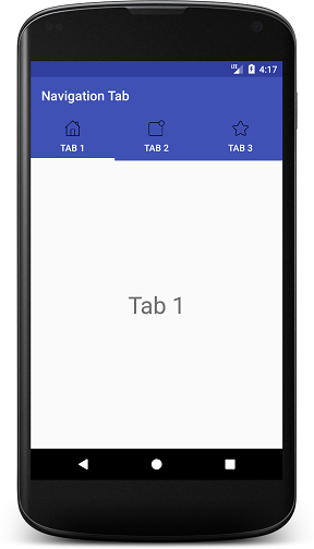
If you want to put only icons to tab, modify getPageTitle() method in adapter class as below:
@Overridepublic CharSequence getPageTitle(int position) { return null;}
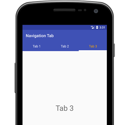
Output:

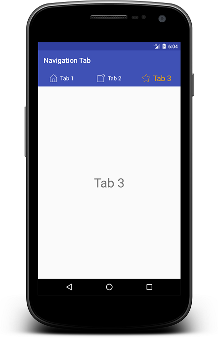
Here you can see there is no more customization after this. For more custom tabs, you have to create custom tabview for navigation tabs manually.
Custom Navigation Tab Layout:Create custom layout for tab custom_tab.xml
<?xml version=”1.0″ encoding=”utf-8″?><LinearLayout xmlns:android=”http://schemas.android.com/apk/res/android”android:layout_width=”wrap_content”android:layout_height=”wrap_content”android:layout_gravity=”center”android:gravity=”center”android:orientation=”horizontal”><TextViewandroid:id=”@+id/tabTextView”android:layout_width=”wrap_content”android:layout_height=”wrap_content” /></LinearLayout>
Add below method in your TabAdapter:
public View getTabView(int position) {View view = LayoutInflater.from(context).inflate(R.layout.custom_tab, null);TextView tabTextView = view.findViewById(R.id.tabTextView);tabTextView.setText(mFragmentTitleList.get(position));return view;}
Remove below code from your activity:
tabLayout.getTabAt(0).setIcon(tabIcons[0]);tabLayout.getTabAt(1).setIcon(tabIcons[1]);tabLayout.getTabAt(2).setIcon(tabIcons[2]);
Add below code in your activity after calling setAdapter() method:
for (int i = 0; i < tabLayout.getTabCount(); i++) {TabLayout.Tab tab = tabLayout.getTabAt(i);assert tab != null;tab.setCustomView(null);tab.setCustomView(adapter.getTabView(i));}
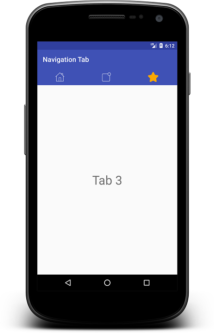
Now if you want to show big text on selected tab or change text color, then you can do this by creating separate method in your adapter like getSelectedTabView() as below:
public View getSelectedTabView(int position) {View view = LayoutInflater.from(context).inflate(R.layout.custom_tab, null);TextView tabTextView = view.findViewById(R.id.tabTextView);tabTextView.setText(mFragmentTitleList.get(position));tabTextView.setTextSize(26); // for big text, increase text sizetabTextView.setTextColor(ContextCompat.getColor(context, R.color.yellow));return view;}
Modify your DemoActivity.java code as below:
package com.example.demoproject;import android.os.Bundle;import android.support.design.widget.TabLayout;import android.support.v4.view.ViewPager;import android.support.v7.app.AppCompatActivity;import android.view.LayoutInflater;import android.view.View;import android.widget.TextView;public class DemoActivity extends AppCompatActivity {private TabAdapter adapter;private TabLayout tabLayout;private ViewPager viewPager;@Overrideprotected void onCreate(Bundle savedInstanceState) {super.onCreate(savedInstanceState);setContentView(R.layout.activity_demo);viewPager = (ViewPager) findViewById(R.id.viewPager);tabLayout = (TabLayout) findViewById(R.id.tabLayout);adapter = new TabAdapter(getSupportFragmentManager(), this);adapter.addFragment(new Tab1Fragment(), “Tab 1”);adapter.addFragment(new Tab2Fragment(), “Tab 2”);adapter.addFragment(new Tab3Fragment(), “Tab 3”);viewPager.setAdapter(adapter);tabLayout.setupWithViewPager(viewPager);highLightCurrentTab(0); // for initial selected tab viewviewPager.addOnPageChangeListener(new ViewPager.OnPageChangeListener() {@Overridepublic void onPageScrolled(int position, float positionOffset, int positionOffsetPixels) { }@Overridepublic void onPageSelected(int position) {highLightCurrentTab(position); // for tab change}@Overridepublic void onPageScrollStateChanged(int state) {}});}private void highLightCurrentTab(int position) {for (int i = 0; i < tabLayout.getTabCount(); i++) {TabLayout.Tab tab = tabLayout.getTabAt(i);assert tab != null;tab.setCustomView(null);tab.setCustomView(adapter.getTabView(i));}TabLayout.Tab tab = tabLayout.getTabAt(position);assert tab != null;tab.setCustomView(null);tab.setCustomView(adapter.getSelectedTabView(position));}}
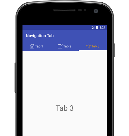
Output:
Now same as TextView, add ImageView to tab layout:
<?xml version=”1.0″ encoding=”utf-8″?><LinearLayout xmlns:android=”http://schemas.android.com/apk/res/android”android:layout_width=”wrap_content”android:layout_height=”wrap_content”android:layout_gravity=”center”android:gravity=”center”android:orientation=”horizontal”><ImageViewandroid:id=”@+id/tabImageView”android:layout_width=”22dp”android:layout_height=”22dp”android:layout_marginRight=”2dp”android:tint=”@color/white” /><TextViewandroid:id=”@+id/tabTextView”android:layout_width=”wrap_content”android:layout_height=”wrap_content”android:layout_marginLeft=”2dp”android:textColor=”@color/white”android:textSize=”16sp” /></LinearLayout>
Change to your DemoActivity.java code:
package com.example.demoproject;import android.os.Bundle;import android.support.design.widget.TabLayout;import android.support.v4.view.ViewPager;import android.support.v7.app.AppCompatActivity;import android.view.LayoutInflater;import android.view.View;import android.widget.TextView;public class DemoActivity extends AppCompatActivity {private TabAdapter adapter; private TabLayout tabLayout; private ViewPager viewPager; private int tabIcons = { R.drawable.home, R.drawable.notification, R.drawable.star };@Override protected void onCreate(Bundle savedInstanceState) { super.onCreate(savedInstanceState); setContentView(R.layout.activity_demo); viewPager = (ViewPager) findViewById(R.id.viewPager); tabLayout = (TabLayout) findViewById(R.id.tabLayout);adapter = new TabAdapter(getSupportFragmentManager(), this); adapter.addFragment(new Tab1Fragment(), ?Tab 1?, tabIcons[0]); adapter.addFragment(new Tab2Fragment(), ?Tab 2?, tabIcons[1]); adapter.addFragment(new Tab3Fragment(), ?Tab 3?, tabIcons[2]);viewPager.setAdapter(adapter); tabLayout.setupWithViewPager(viewPager);highLightCurrentTab(0);viewPager.addOnPageChangeListener(new ViewPager.OnPageChangeListener() { @Override public void onPageScrolled(int position, float positionOffset, int positionOffsetPixels) { }@Override public void onPageSelected(int position) { highLightCurrentTab(position); }@Override public void onPageScrollStateChanged(int state) { } }); }private void highLightCurrentTab(int position) { for (int i = 0; i < tabLayout.getTabCount(); i++) { TabLayout.Tab tab = tabLayout.getTabAt(i); assert tab != null; tab.setCustomView(null); tab.setCustomView(adapter.getTabView(i)); }TabLayout.Tab tab = tabLayout.getTabAt(position); assert tab != null; tab.setCustomView(null); tab.setCustomView(adapter.getSelectedTabView(position)); }}
Changes to you Tab Adapter class:
package com.example.demoproject;import android.content.Context;import android.graphics.PorterDuff;import android.support.annotation.Nullable;import android.support.v4.app.Fragment;import android.support.v4.app.FragmentManager;import android.support.v4.app.FragmentStatePagerAdapter;import android.support.v4.content.ContextCompat;import android.view.LayoutInflater;import android.view.View;import android.widget.ImageView;import android.widget.TextView;import java.util.ArrayList;import java.util.List;public class TabAdapter extends FragmentStatePagerAdapter {private final List<Fragment> mFragmentList = new ArrayList<>();private final List<String> mFragmentTitleList = new ArrayList<>();private final List<Integer> mFragmentIconList = new ArrayList<>();private Context context;TabAdapter(FragmentManager fm, Context context) {super(fm);this.context = context;}@Overridepublic Fragment getItem(int position) {return mFragmentList.get(position);}public void addFragment(Fragment fragment, String title, int tabIcon) {mFragmentList.add(fragment);mFragmentTitleList.add(title);mFragmentIconList.add(tabIcon);}@Nullable@Overridepublic CharSequence getPageTitle(int position) {//return mFragmentTitleList.get(position);return null;}@Overridepublic int getCount() {return mFragmentList.size();}public View getTabView(int position) {View view = LayoutInflater.from(context).inflate(R.layout.custom_tab, null);TextView tabTextView = view.findViewById(R.id.tabTextView);tabTextView.setText(mFragmentTitleList.get(position));ImageView tabImageView = view.findViewById(R.id.tabImageView);tabImageView.setImageResource(mFragmentIconList.get(position));return view;}public View getSelectedTabView(int position) {View view = LayoutInflater.from(context).inflate(R.layout.custom_tab, null);TextView tabTextView = view.findViewById(R.id.tabTextView);tabTextView.setText(mFragmentTitleList.get(position));tabTextView.setTextColor(ContextCompat.getColor(context, R.color.yellow));ImageView tabImageView = view.findViewById(R.id.tabImageView);tabImageView.setImageResource(mFragmentIconList.get(position));tabImageView.setColorFilter(ContextCompat.getColor(context, R.color.yellow), PorterDuff.Mode.SRC_ATOP);return view;}}
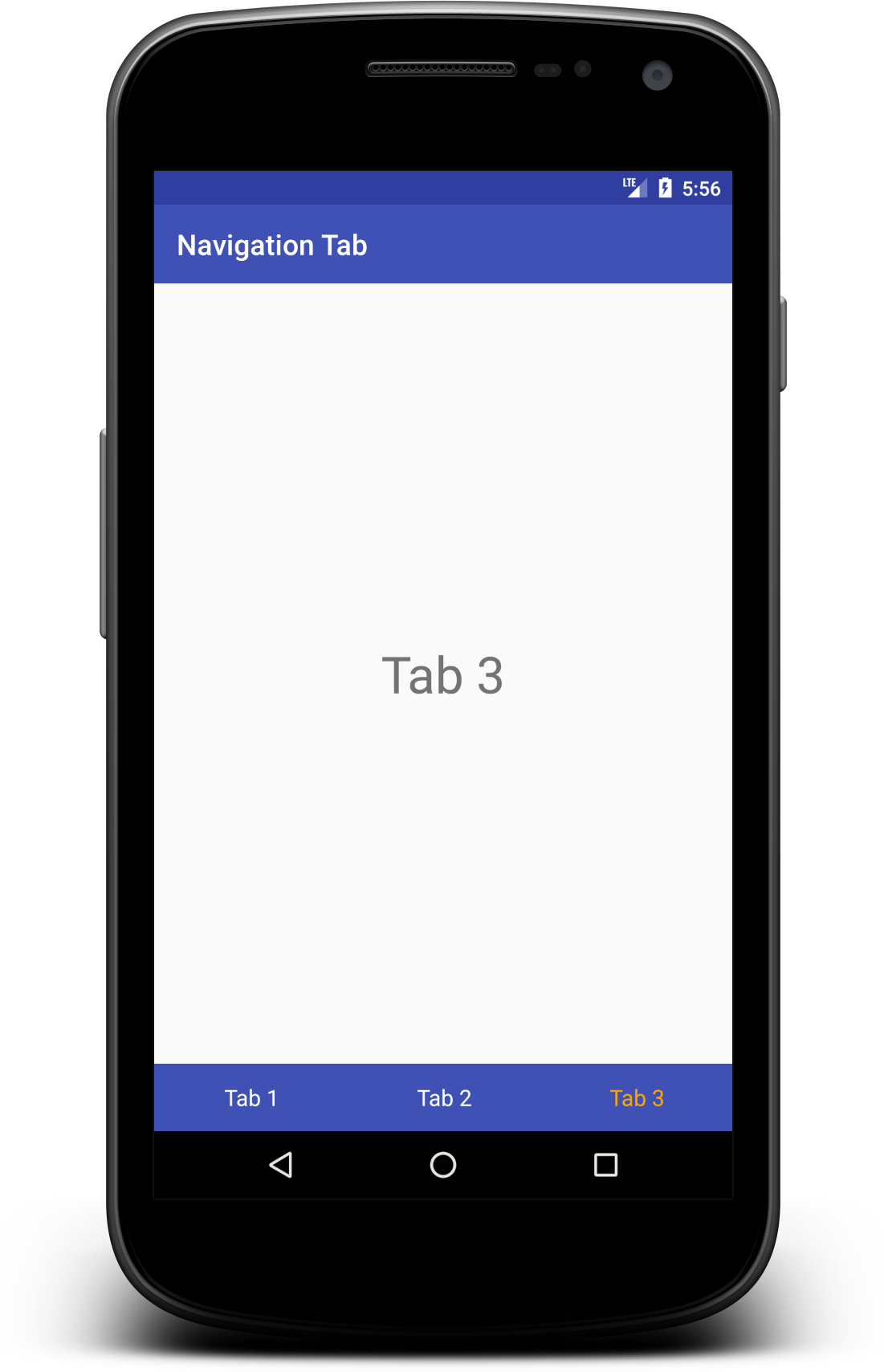
Here it is your output for custom navigation tab.
You can change tab text style using typeface, bold, italic, color, text size etc as well as for tab icon.
More examples are here for try your self.


 with Swipe)
 with Swipe)