If you want to center something horizontally in CSS you can do it just by, using the text-align: center; (when working with inline elements) or margin: 0 auto; (when working with block element). But when it comes to center something both horizontally and vertically the job can be a little tricky to achieve.
In this article, we?ll check out several techniques to completely center an element. You can find the complete code on codepen.io/jscodelover
Using Position and Transform property
.parent{ position: relative;}.child{ position: absolute; top: 50%; left: 50%; transform: translate(-50%, -50%);}
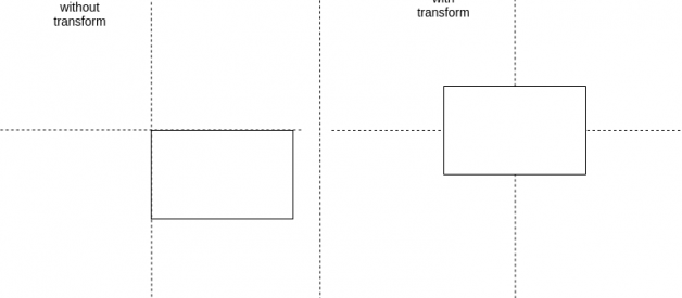
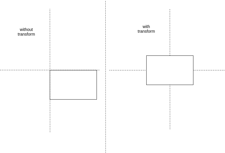
These properties are set on the child element. Absolute positioning bases the element?s position relative to the nearest parent element that has position: relative. If it can?t find one, it will be relative to the document. Add top: 50%; left: 50%; because the position is calculated from the top left corner.
 created using draw.io
You must pull back the item with the half of its width and height. You can achieve this with transform: translate(-50%, -50%);
Using Viewport Unit
.child{ margin: 50vh auto 0; transform: translateY(-50%);}
We use the margin-left/margin-right: auto; for the horizontal centering and use the relative vh value for the vertical centering. Of course, you have to pull back the item like in the absolute example (but only translate the height). Note :- This method only works if you are positioning to the main viewport.
Using Flexbox
.parent{ display: flex; justify-content: center; align-items: center;}
Setting the parent(or container) to display: flex; it let the browser know that we intend the children to use flexbox for their layout. Justify-content determines how to space your content in your row or column. Align-content is similar to justify-content, but controls where the items are on the cross axis.
Instead of using justify-content and align-items we can use margin: auto; in child.
.parent{ display: flex; min-height: 100vh;}.child{ margin: auto;}
Using CSS Grid
.parent{ display: grid; grid-template-rows: 100vh; grid-template-columns: 100vw;}.child{ justify-self: center; align-self: center;}
On the parent set display: grid;and specify the row/column width. On the child set the justify-self and align-self to center. The justify-self and align-self property set the way a box is justified inside its alignment container(parent) along the appropriate axis.
Follow me on Twitter, LinkedIn or GitHub.
I hope this article is useful to you. Thanks for reading & Keep Coding !!

