 Photo: Apple
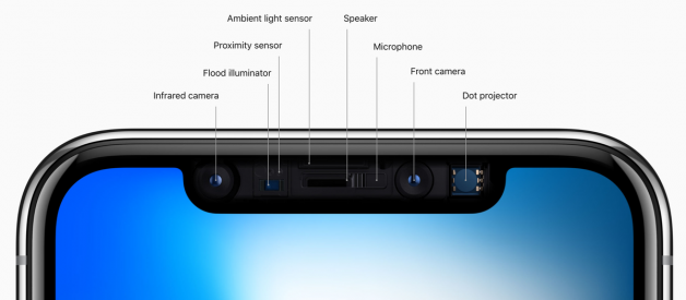
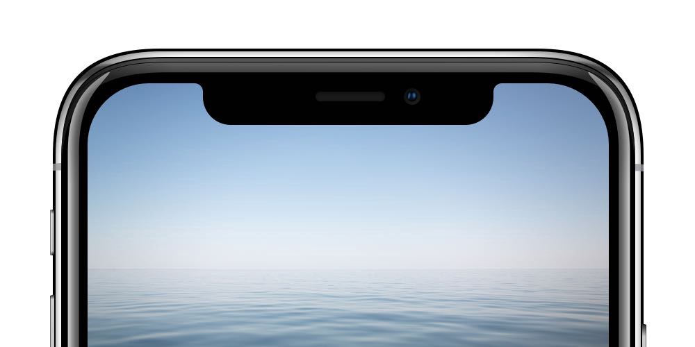
You?ve undoubtedly noticed the notch at the top of the iPhone X or iPhone XS display. It?s that black part that houses the top speaker, camera, and Face ID technology that cuts into the display, leaving it to extend into two corners.
The easy answer as to why it?s there has already been said. It houses the speaker and camera system. Obviously, they need to stick that stuff somewhere, right? But that?s the easy answer, and while it?s true, it does not address the full extent of Apple?s reasoning.
The reality is that the notch is a design compromise. It?s a flaw. But it foreshadows what is to come, something far superior that fits in perfectly with the same strategy Apple has held since its humble beginnings in 1976.
No Technology
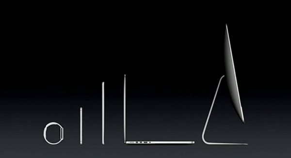
Apple has made no secret of its design and technology philosophy. It believes technology works at its best when it essentially fades into the background. When an average user makes a swipe on their iPhone, they aren?t thinking about all the processes happening under the hood ? all the software and all the hardware working together in that split second. They?re just swiping. On a screen. Doing something they need to do. Simple as that.
 Next to nothing. | Photo: Apple
Many often associate Apple with being obsessed with pretty, shiny looks and aesthetics. That?s true to a degree, but much of Apple?s design fits perfectly within this philosophy of invisible technology. Apple?s hardware design over the past several decades has been working toward a fundamental goal of being as minimal as possible, so as to not obstruct or distract from the core experience in any way.
Now enter the iPhone. Just about every user interaction is carried out via the display. It embodies the entire experience. Following Apple?s philosophy, the hardware that houses the display has slowly evolved to fade into the background as much as possible, letting the display take center stage.
The iPhone X is not the culmination of Apple?s philosophy, but the first major leap toward achieving their utopia since the original iPhone.
The Notch is a Stepping Stone
Understanding why the notch is there is to understand the purpose of the rest of the design. The iPhone X and XS displays reach edge to edge. They perfectly follow the curves of the hardware and fill as much of the device?s front screen as possible, once again in alignment with Apple?s philosophy that the display in this case should take center stage. But that?s the key ? the display fills as much as physically possible.
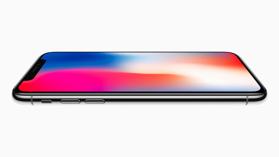 Photo: Apple
The front of the iPhone still needed a camera, speaker, and secure mechanism for unlocking your phone to then allow free interaction with the display. That was previously Touch ID on the Home button, but Face ID technology merged the Home button with the camera that was already there, eliminating the need for it entirely. Great! More space at the bottom for display.
Now that the remaining two components are speaker and camera, Apple reached a major obstacle in trying to achieve what it considers perfect design. There is no current physical way to build a speaker and camera into a display. Apple has plenty of money, but investing in R&D to invent a way would have been far too costly and time consuming, and would have significantly put off the release of the iPhone X.
Instead, Apple had to make a sacrifice. Rather than fill the entire front of the iPhone with display, it is instead filled only as much as it possibly can. Only two remaining spaces exist. One is the tiny black bezel that surrounds the edges of the entire display, again due to the limitations of what is currently possible in display technology. And the other is of course the notch ? the single, condensed home for the necessary iPhone tech that must live independently from the display. In that notch you?ll find the speaker, front-facing camera, sensors, and Face ID tech like the dot projector.
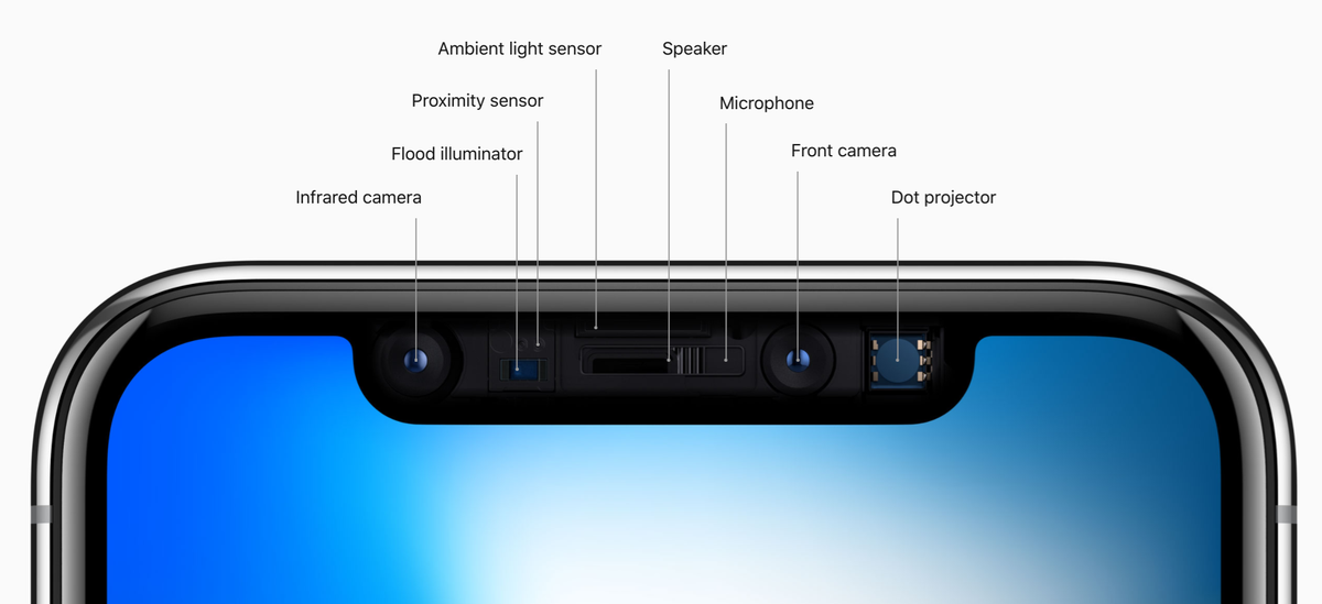 Everything that needs to be there and nothing that doesn?t. | Photo: Apple
So ultimately, the notch is there because it has to be. No other reason than that. That?s why phones like the Google Pixel 3 XL don?t make practical sense. It features a notch at the top of the display for the camera and speaker, but a huge chin below the display as well, which also has a small secondary speaker. Why cut into the display if you still have room at the bottom for more of it? The Pixel 3 XL?s notch is really just there to replicate the iPhone and attempt to diminish its ability to stand out design-wise. It follows no real big-picture philosophy.
Keeping Apple?s long-term goals in mind, you can expect the iPhone?s notch to get smaller and smaller in years to come, until eventually at some magical point, it disappears. The notch is the stepping stone to getting there.
As technology evolves and advances, it will slowly remove the need for even the tiniest notch. Maybe someday there will be a way to build a camera and speaker right into the display. Or maybe they?ll be so tiny, that they can fit in the small bezel that currently surrounds it. Who knows? But whatever the solution is, you can bet Apple is working on it.
Additional Notes
- This same display-takes-center-stage approach is also the reason why apps on the iPhone X and iPhone XS extend all the way to the edges, rather than just letting the time and status indicators in the top corners stay on a black background with apps bordering right underneath. That wouldn?t be making the most of the display, and would not highlight the work Apple put in to fill as much of the screen as possible with it.
- While the notch is still certainly a design compromise, it?s one Apple has been able to use to its advantage in branding. Much like the Home button gave the iPhone a distinct look that set it apart from the competition, the notch now does too. Sure other phones have notches and more are on the way, but the iPhone is sold in such massive quantities that it can still remain a unique identifier. And yes, that?s even if Apple wasn?t technically the first manufacturer to ship a phone with a notch. Power and influence trump being first to market.
