I know I?m late to the Hollow Knight party myself, but if anyone out there still hasn?t played this magical arthropod adventure, do yourself a $14.99 favor and fall into Hallownest ? you won?t regret it. And you do fall into it literally and otherwise; over 40 or so hours, as I descended down Hollow Knight?s subterranean realm of rain-soaked cities, cavernous sewers, and verdant gardens, so did my mind sink into perfecting its laser-precise combat system, deciphering its blink-and-miss story moments, and unraveling its interconnected worlds.
The premise of Hollow Knight is simple and light on exposition. You?re a small skull-faced wraith armed with a nail and charged with exploring the decaying, sparsely inhabited kingdom of Hallownest where something has clearly gone wrong. And Team Cherry certainly kept the theme of exploration as a guidepost while designing the game. Here?s Ari Gibson, co-director of Team Cherry in an interview with PC Gamer:
A lot of these decisions we?re making, a lot of the scale and the rooms we build, all of it?s built around this sense of discovery. Exploration and discovery.
In this article, I?ll be looking at how Hollow Knight crafts a navigation system that stays true to these themes of exploration and discovery by making players earn their progress in areas that are taken for granted in other games.
![]()
Plentiful navigational aids are the norm in video games today, almost to a point where they?re counterproductive. It?s a tough tightrope to walk ? provide too many map markers, waypoints, and HUDs and risk spoon-feeding players to the point of boredom, or provide too few aids and risk players banging their heads against dead-ends and cul-de-sacs in frustration.
Hollow Knight breaks this navigational dilemma into individual components and essentially lets each player walk their own customized tightrope.
Hollow Knight?s main navigational aids are a map, a compass to orientate the player, and pins/markers to highlight areas of interest in the map such as benches (which are checkpoints), stagways and tram stations (which are fast travel points), shops to buy and sell items, and so on. Prima facie, this sounds like a lot of navigational help, but they?re a final state that players have to work towards (if they so choose).
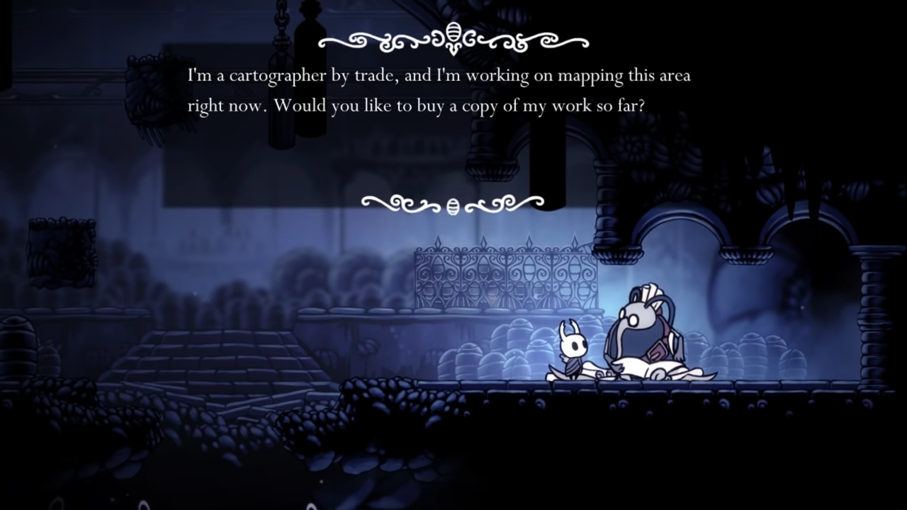
When the game begins, you have no map, no compass or markers, nothing. Just you and your raggedy nail plummet down into The Forgotten Crossroads, the first big area of Hallownest, and start exploring. After some puttering about, you run into Cornifer, a cheerful cartographer that offers to sell you a map of the area.
 Find Cornifer in each area to access that area?s (incomplete) map.
He mentions that a map alone will mean little and that his wife Iselda has a store in the village above ground that will help you make more sense of your surroundings.
 Find Iselda in Dirtmouth to fill in your map.
It?s in this shop where you can buy a compass that tells you where you are on the map, a quill to fill in parts of the map you explore, and markers for areas of interest that can be placed on the map (either automatically or by the players).
 Menu of markers and pins that can be purchased for your map.
Hollow Knight does a few things right here:
- It lets players choose the level of navigational support they want. If someone isn?t very skilled at mental models and spatial awareness, they can purchase every marker possible and have their map be a guiding light. If players are more confident of finding their way around (or if they just like the feeling of unforeseen dangers lurking around every corner), then they can choose not to purchase an area?s map from Conifer and go in blind.
- Even activating many navigational aids doesn?t make the game too easy to explore. The game does this by providing an incomplete ?fog-of-war? map from Cornifer every time ? it?s up to players to fill it in. Any markers that are bought from the shop also only identify areas of the map where players have already been. So you won?t know bench locations in a new area in advance.
 Buying the bench pin automatically updates the map with bench locations (that you?ve already been to).
Hollow Knight turns basic navigational questions (questions that are usually imperative for game design to answer accurately) such as?
- Where am I?
- Where am I?
- Where do I go from here?
?into player-driven choices that require effort and sacrifice. It?s a game about exploration and discovery, after all.
Exploration as a gameplay loop
Hollow Knight is a Metroidvania, although Team Cherry wouldn?t necessarily apply that label. This roughly means:
- It has large interconnected areas filled with obstacles and power-ups.
- The player is able to access new areas by gaining these power-ups and getting stronger in the process.
- There?s a fair amount of ?backtracking? (going through the same areas twice) and getting lost.
A simplified version of Hollow Knight?s main gameplay loop is shown below. Once players enter a new area, there?s usually a stiff test to overcome (either a boss battle or a platforming gauntlet) and a new player ability lies at the end of that test. Having gained the new ability, players can now access new areas by using that ability.

For example, you enter the Forgotten Crossroads?

?to ultimately fight the False Knight (a boss battle).

After defeating the False Knight, you gain a new spell-casting ability?

?and use this ability to defeat a hitherto invincible enemy?

?that was blocking entry into the next area, Greenpath.

While loops like this drive the overall narrative, Hollow Knight also has shorter, exploration-focused gameplay loops within each area to help instill a sense of progress as players move towards the end goal of that area.
 Hollow Knight?s shorter, exploration-focused gameplay loop.
When you first enter an area, you don?t have a map for it because you haven?t met Cornifer the map-maker yet. So you explore away, relying on mental models as you succumb to the wonders of the next room and the room after that.
 All on your own.
Hollow Knight never gives you anything for free, but that doesn?t mean finding Cornifer is a completely hit-or-miss exercise. The game provides signifiers of Cornifer?s presence in the form of a paper trail and the sound of him humming a merry tune to guide you along.
 There you are!
Once you have your admittedly rudimentary map, you continue to explore, but this time with a completionist?s itch to turn the rough pencil-strokes of your current map into the high-definition exhibit of penmapship that it?ll undoubtedly become.
 Turn this?
 ?into this.
Apart from the signifiers to Cornifer?s location mentioned earlier, Hollow Knight makes another design choice that, in my opinion, is meant to encourage exploration and map-filling as a gameplay loop. Once you have an area?s map (and your quill), new areas explored will automatically be filled in whenever you save the game or die.
This is a game that?s notoriously tough and follows some Dark Souls tenets like taking away all your Geo (currency) whenever you die and forcing you to go back to the location of your death to get it back. But while it takes away some progress as a punishment for dying, it lets you keep your map progress. It?s a stick-and-carrot balance that feels like the game?s telling you, ?Yes, this is tough, but now you know what?s around the corner. Try again.?
I don?t know what?s real anymore
I strongly think that how ?real? a game feels doesn?t depend on its graphical fidelity or accurate imitations of real life at all. A game feels ?real? when it makes you believe in its setting (however conventionally unrealistic that setting may be) with in-world consistency and a sense of personality. It?s tough to put this exercise into some standardized ten-step process, but executing correct UI choices will usually make the cut.
Hollow Knight combines two design considerations, one atmosphere-focused and the other gameplay-focused?
- Hallownest, a once-vibrant kingdom now swimming in its own detritus, would have had road signs to help travelers find their way.
- Players will need some guidance when they?re exploring new areas of the map
?by including in-game signs for benches, tram stations, stagways, and more.
For example, once you?re in the Royal Waterways, the winding sewers beneath Hallownest?s main city, you soon see a picture of a bench scrawled with chalk on the wall.
 Time for some well-earned rest.
Or if you?re mulling around in the Forgotten Crossroads, you see a sign with a bug and some tracks, leading you to a Stag Station that opens up fast travel to other areas of Hallownest.
 This sign?
 ?leads to this.
These signs are a good example of diegetic UI, which refers to UI elements that are part of the game world and can be seen by both you (the player) and the player-character. It?s not the right UI choice for every game, but usually hits the mark when it simultaneously helps players and builds a sense of consistency and depth in the game world.
How Firewatch?s UI enhances immersion
Firewatch slowly crept up on everyone and blew them away, like the video game version of a forest fire (erm, the good?
medium.com
Hollow Knight is filled with bits of diegetic UI and signifiers. Almost every bench and fast travel point is earmarked with signs. A swordsmith you can visit near the City of Tears is signified with a sign and a series of failed swords strewn along your path.
And your map itself is diegetic, since you physically acquire it within the game and update it with markers and tags that are also real within the game. The game doesn?t pause when you view this map , which is a small but important touch that makes Hallownest feel real.

This article is not meant as design truism. Maybe the design choices mentioned above won?t work for your game, and maybe they didn?t work in Hollow Knight for you. But for me, exploring a game?s world has rarely been so organic yet authored, tough yet fair, and mystical yet real.
For more stuff on game design, you can visit my Medium profile to read my other articles or follow me on Twitter. Thanks for reading!
 Header image by Steam User Evey.


