 Affinity diagrams and thematic analysis are a very popular method to make sense of UX research
What is an Affinity Diagram?
An affinity diagram is a tool often used to organize data and ideas. Affinity diagrams help you organize information into groups of similar items to then analyze qualitative data or observations.
Business and design teams have used affinity diagrams for a long time to organize ideas, complex information and even customer feedback into themes or groups. For UX researchers, affinity diagrams are often used for analyzing and synthesizing user research findings by patterns and themes. In this case affinity diagrams are sometimes referred to as the KJ method or an affinity map. Also in other broad application like business brainstorming or idea generation it may be called a cluster map.
Why Use an Affinity Diagram?
Affinity diagrams are a great way to make sense of qualitative user research or customer feedback. Unlike quantitative data which is expressed in numbers and counts, qualitative user research is often analyzed by creating connections between observations or finding patterns and themes in the data. This process in user research is called thematic analysis.
Teams will often use an affinity diagram to create groups, or themes, of user research data from things like contextual inquiry, user interviews and field studies. From there they can deeper analyze those themes and groups to uncover insights from their user research efforts.
User interviews, ethnography and field study often provide a large amount of rich qualitative data. Doing thematic analysis using an affinity diagram helps you find patterns, create themes and figure out what you learned from qualitative research by quickly grouping data and finding connections between those groups quickly and effectively.
Affinity Diagrams for User Research Analysis & Synthesis
Using an affinity diagram can help you analyze and synthesize user research findings. The most common method of analyzing user research is thematic analysis. In thematic analysis, researchers aim to make sense of all the user research notes and observations they made by creating themes to further organize and explain what they learned. Naturally an affinity diagram is a tool generally used to create groups and themes from user research data since it is an effective way to categorize qualitative data!
Themes from user research are entirely dependent on your research and goals. Here are some examples and ideas for creating useful themes from your UX research data:
- Answers to specific research questions
- Frequently seen or heard topics/ideas
- Summary of related notes, observations and data
Steps to Creating and Affinity Diagram
- Record all notes or observations on individual cards or sticky notes
- Look for patterns and notes or observations that are related
- Create a group for each pattern or theme
- Give each theme or group a name
- Bonus: create a statement of what you learned about each group (this is often referred to as a Key Insight in UX research)
Examples of Affinity Diagrams and Thematic Analysis for UX Research
Using an affinity map can help you quickly make sense of user research by finding patterns and themes in your data. Thematic analysis is the most common form of research analysis where you look for patterns and themes to group similar notes and observations together.

Below is a detailed example of how to use an affinity map using sticky notes on a wall.
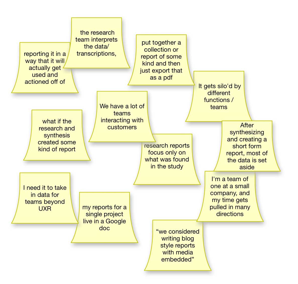
First, add each note or observation to a sticky note and put them on the wall:
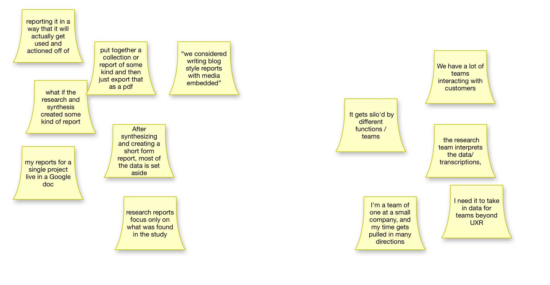
Next, organize the sticky notes together into groups of similar notes. Like this:
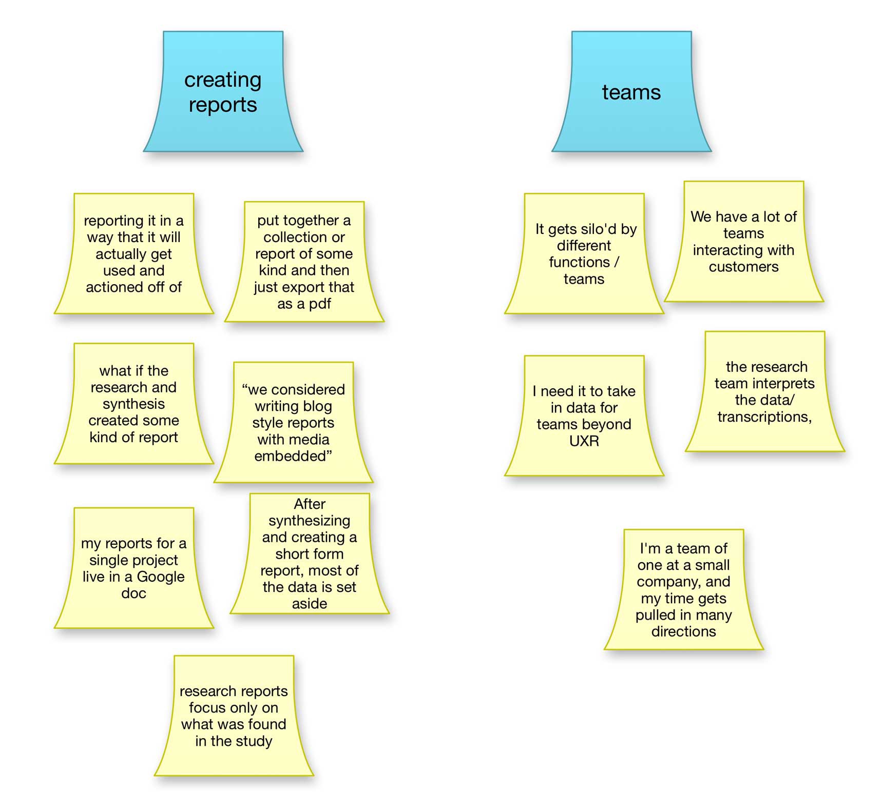
Finally, give each of those groups a name or label to represent what that group means:
There are some drawbacks to using an affinity map with sticky notes on the wall however. Some disadvantages of a traditional affinity diagram with sticky notes are:
- It?s not portable or searchable (like software)
- Tied to a physical location
- You have to manually copy sticky notes if you want a note in more than one group
- Your final insights end up somewhere else (and the raw data/notes still on the wall)
Make an Affinity Diagram Online with Aurelius
Now, let?s take a look at how you can do the same thematic user research analysis very similar to an affinity diagram but online.
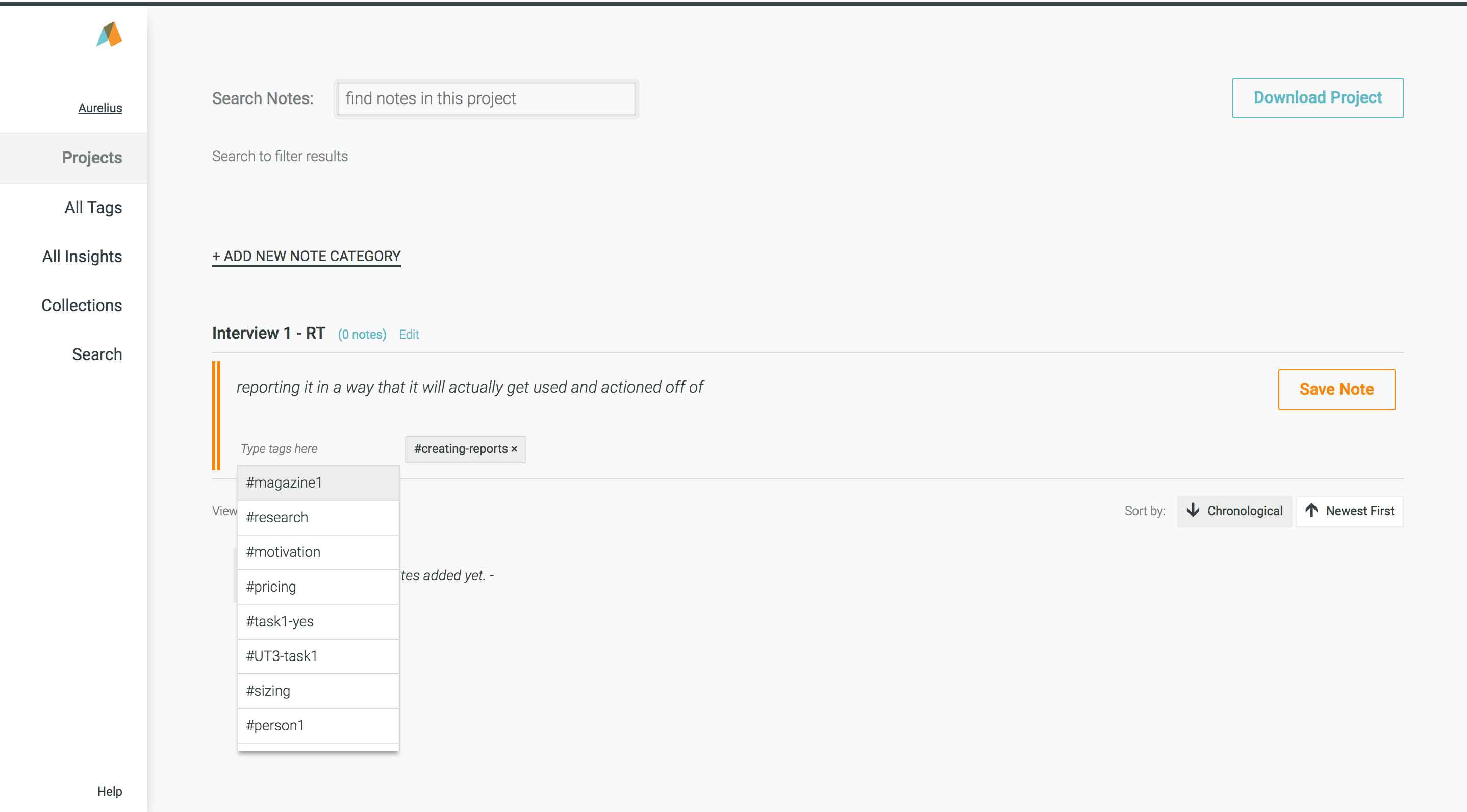
You?ll notice the example uses the exact same notes as data to demonstrate exactly how you?d do this using Aurelius.
Step 1. Take notes and add tags to those notes
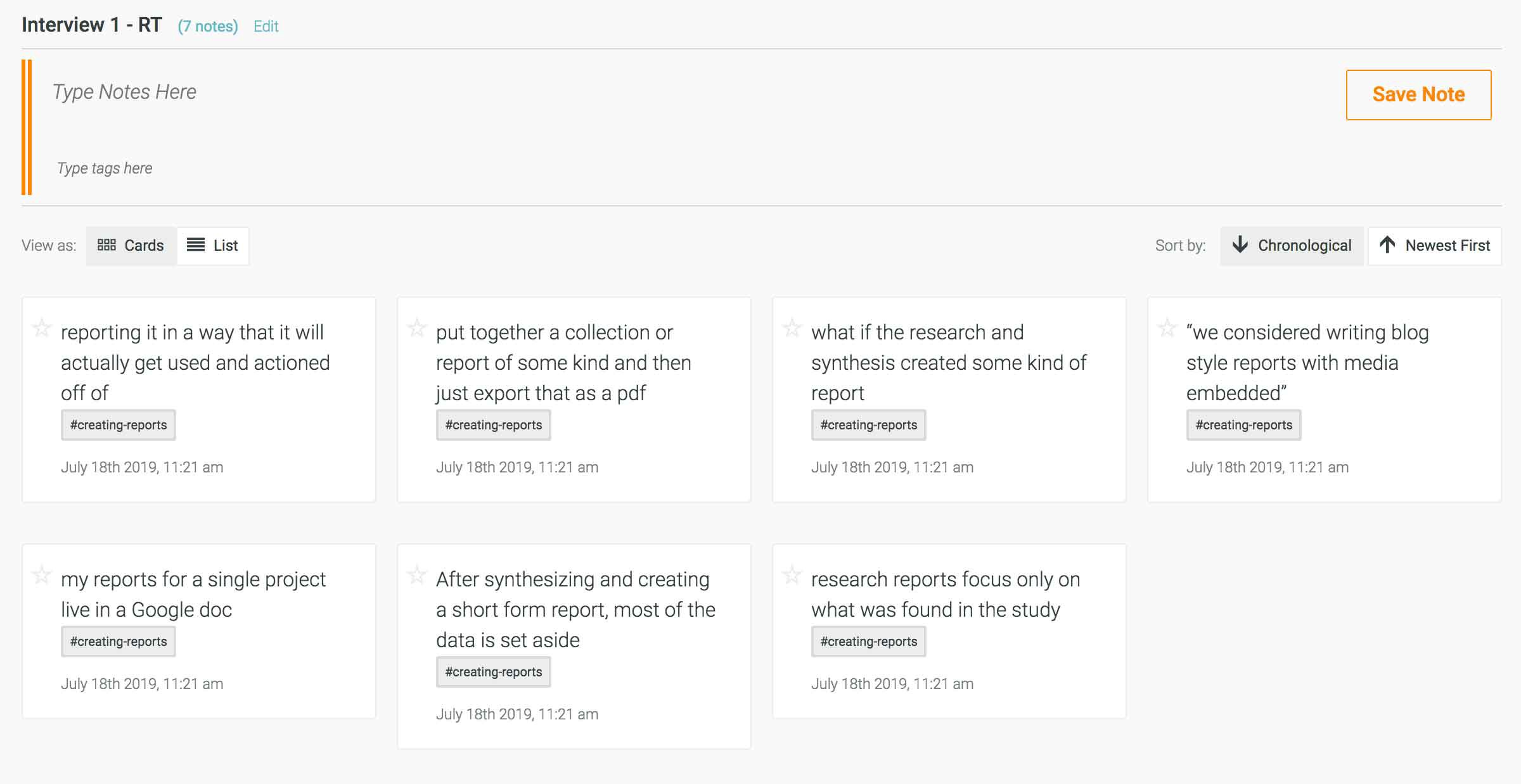
Step 2. View the tags page to see your themes
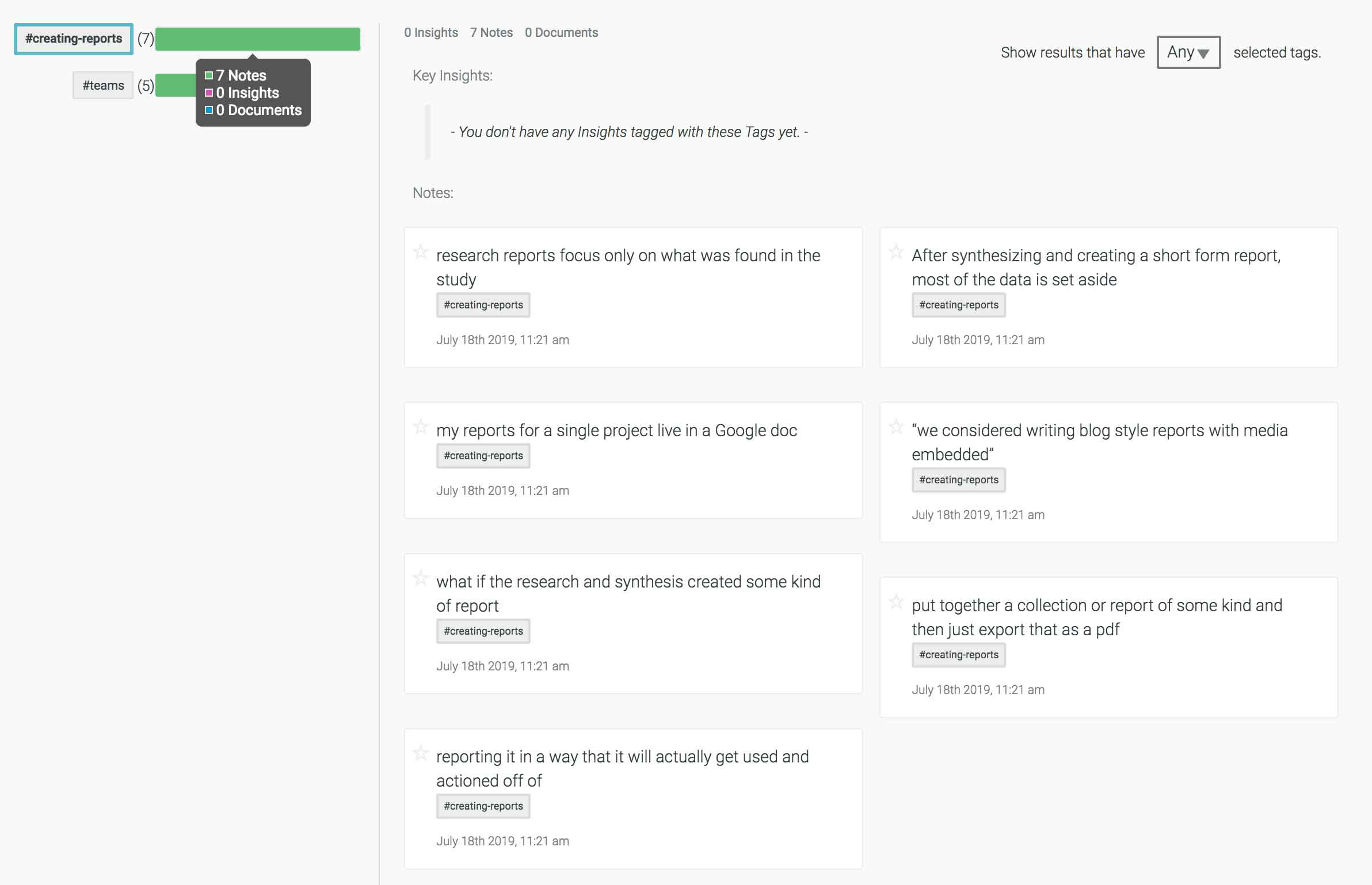
Step 3. Create a name for each group by making a key insight
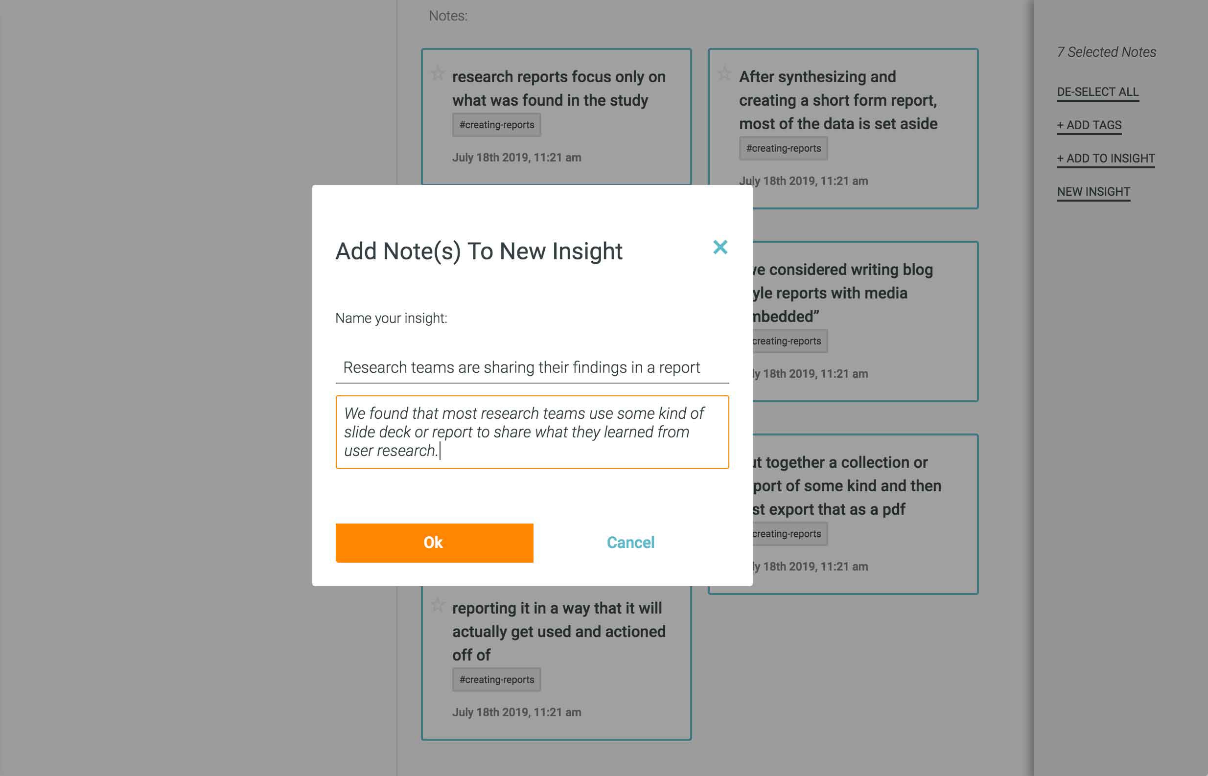
Step 4. Tag that key insight so it becomes part of that theme and findable by that tag to reference later, report and make more informed design, product and feature recommendations
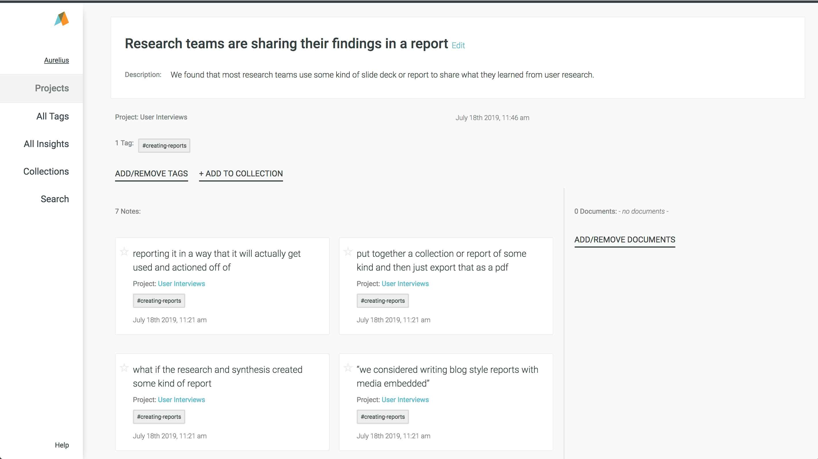
Watch a short video showing you step by step how to quickly organize and analyze user research in Aurelius:
Aurelius helps you tag, analyze and share your user research insights
Next Steps
Try thematic analysis on your next user research project using an affinity diagram to sort, group and make sense of all your notes and data.
In fact try Aurelius to help you tag, organize and analyze your user research data and insights. We?d love to hear what you think!
Sign up for a 30 day trial today.
This article was originally posted on the Aurelius blog.

