With the rise of Artificial Intelligence and their prevalence in everyday technology, Microsoft researchers took the initiative to develop guidelines for human-AI interaction.
In this post I will evaluate Snapchat?s friend suggestion feature against the aforementioned guidelines, ranking them from 1 (lowest, clearly violated) to 5(highest, clearly applied) through 4 interaction stages. The stages are Initially, During Interaction, When Wrong, and Over Time.
According to an article on TechJunkie, Snapchat supports users to add friends through a ?Quick Add? feature. It is essentially Snapchat?s equivalent to Facebook?s ?People You May Know,? based on factors such as number of mutual friends and/or location (if enabled). This feature is especially useful because users are restricted to seeing only their friends? stories, and there are no public profiles to browse to find more friends. Users are only identifiable on Snapchat by their unique username (or QR code). ?Quick Add? allows the user to efficiently find friends when 1)they do not know their username, and 2) may not know they use Snapchat.
 How ?Quick Add? suggests a user friends that they may know.
Initially: G1?3/5 Though ?Quick Add? helps users find friends, Snapchat does not explain how/why the friends are suggested. Users only see names and usernames of the people being suggested. Facebook at least indicates a number of mutual friends as justification. New users will probably wonder, why is Snapchat telling me to add this person?
During Interaction: G5?5/5 Since most users are Millennials and Gen-Z?ers familiar with social media, the user experience matches what a typical user would expect a friend-finding feature to look like. Users can quickly find friends at a glance which is very efficient.
When Wrong: G8?4/5 It?s easy for users to tell Snapchat who they do NOT want to add. Clicking the ?x? button will prompt a pop-up window asking if the user would like to hide the person. Answering ?yes? will actually remove them from the ?Quick Add? list. However, there is no way to re-generate a new list if user wants immediate, different results.
Over Time: G14?5/5 Results of the ?Quick Add? list updates over time as a user?s friends changes. Snapchat does not notify the use every time the list updates, which limits the amount of push notifications user receive from the app. The algorithm continues to look for more people you may know. It?s up to the user on when to check the list to find more friends.
Other interfaces that excel or fail in different stages of interaction
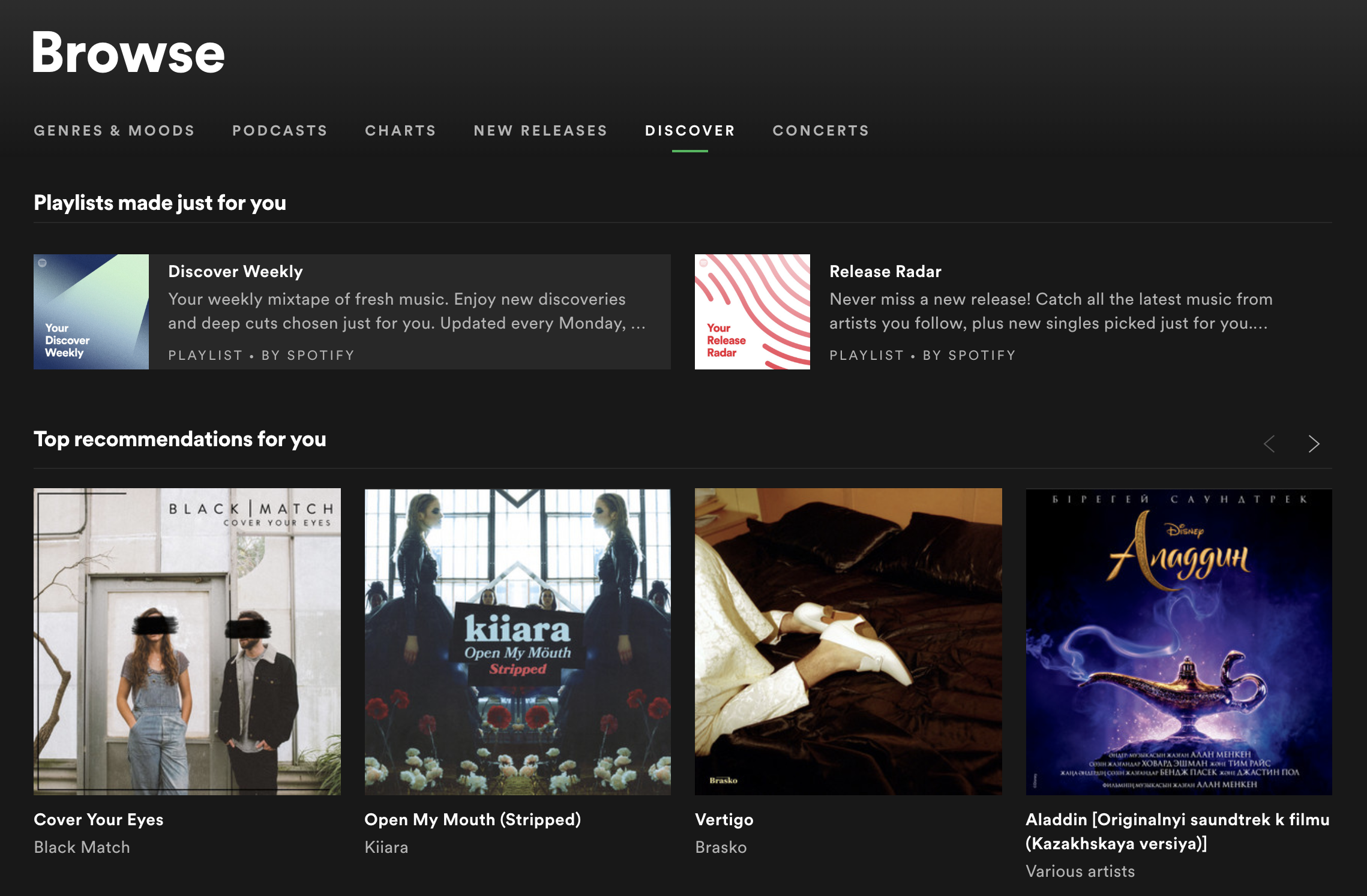
Initially: G2?4/5 Spotify Browse is somewhat clear as to how well it performs. Spotify recommends music based on the albums, artists, and songs that I save which makes dicovering new music more convenient. However, labels like ?Top Recommendations? and ?Playlists just for you? does not tell me the basis of their recommendations. If my liked songs come from diverse genres and even include songs of different languages, it?s unclear to me why Spotify would suggest me a particular song.
 Spotify Browse suggests both albums and playlists for me, but it doesn’t tell me why. Something of ?Because you enjoy XYZ, try?? can be more informative.
During Interaction: G4?5/5 Google search is excellent at trying to show contexually relevant information. This specific case is when Google suggested ?dinner recipes? for me at 4:50 PM! The fact that the search engine considers a user?s timezone and the activities usually associated with that time of the day is extremely helpful and considerate. These suggestions often remind users what they should be doing but haven?t considered yet, as well as provide inspiration for everyday topics.
 When Google thinks that I should start cooking dinner soon
When Wrong: G7?4/5 Hey Siri! Siri is one of the most popular example of how a AI-powered product supports efficient invocations by voice command. For Apple iPhone users, a ?Hey Siri? will evoke the personal assistant almost 100% of the time. However, sometimes the service can be hypersensitive, catching everyday phrases that sounds like ?Hey Siri? and automatically turn on even the user did not intend to. This issue sometimes can be problematic espcially when the user is in a quiet setting.
Over Time: G13?4/5 The new Macbook Pro?s touch bar feature displays word predictions, word corrections, and even work-matching emojis as the user type. The device personalizes each user?s Mac experience by learning their word frequencies and sentence structure over time. However, the touch bar only displays the top three suggestions and does not allow me to scroll left/right to see more matches (like what I can do with emojis). This lack of flexibility and scope is inconvenient and inefficient since most of the time I have to type out 75% of a word to find the right match.


