Examples of website dashboards user interfaces for your inspiration. They are designed by top web designers and developers.
Last updated: September 1, 2020
Digital dashboard is one of the key elements of today?s digital internet environment. We use them for tracking web analytics, for working with our sales leads, for managing our client base and much more.
Digital dashboards may be laid out to track the flows inherent in the business processes that they monitor. Graphically, users may see the high-level processes and then drill down into low level data. This level of detail is often buried deep within the corporate enterprise and otherwise unavailable to the senior executives.
Three main types of digital dashboard dominate the market today: stand alone software applications, web-browser based applications, and desktop applications also known as desktop widgets.
We decided to create a weekly series of inspirational feeds that showcase some of the best examples of web dashboards. Here they are:
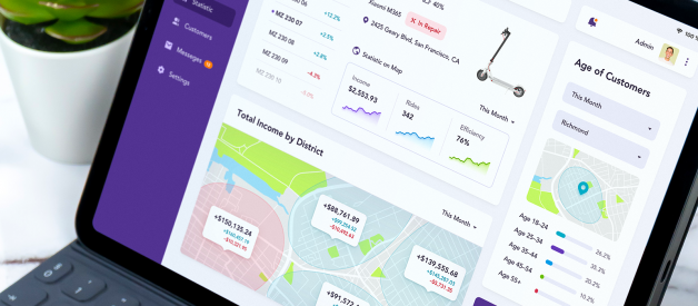
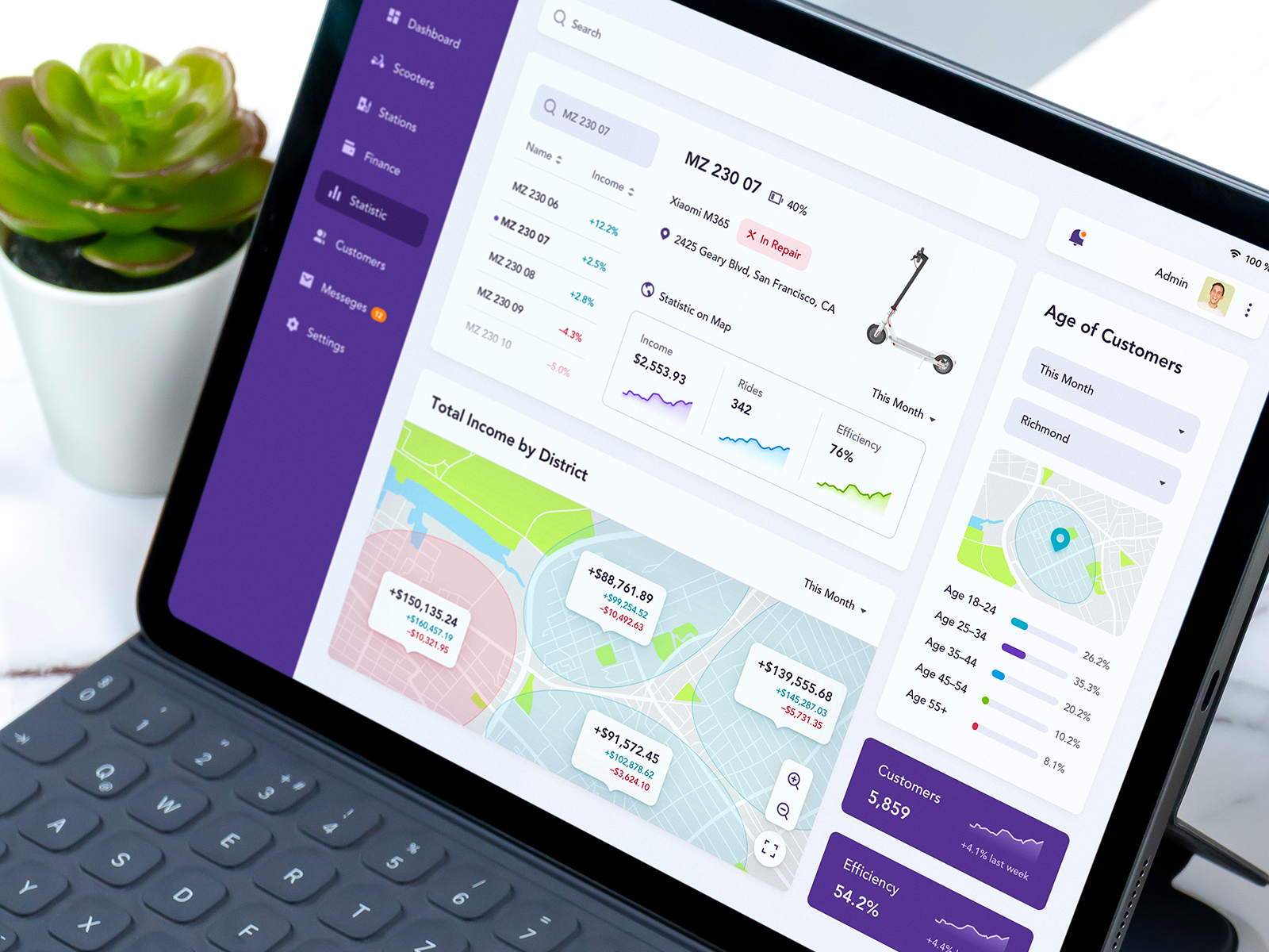
MICROMOBILITY WEB DASHBOARD??? Ramotion
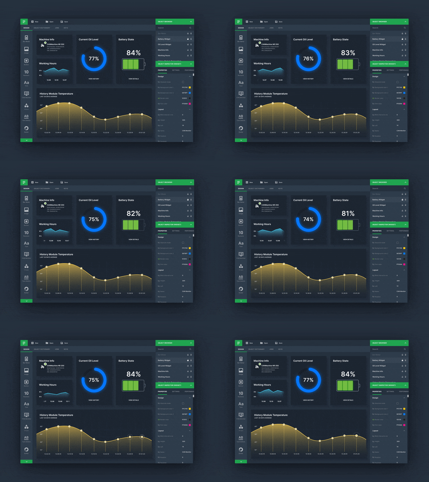
Desktop App Dashboard: Dark Mode??? Ramotion
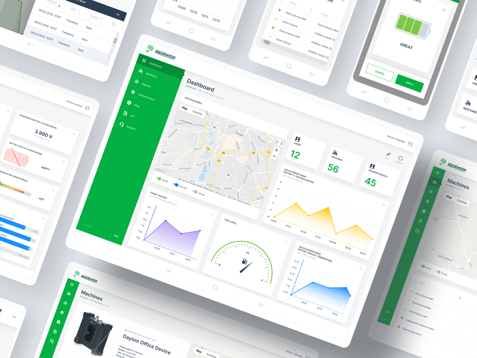
Proemion Data Portal Web Design??? Ramotion
QUIZ PORTAL??? Divan Raj? Quiz Portal
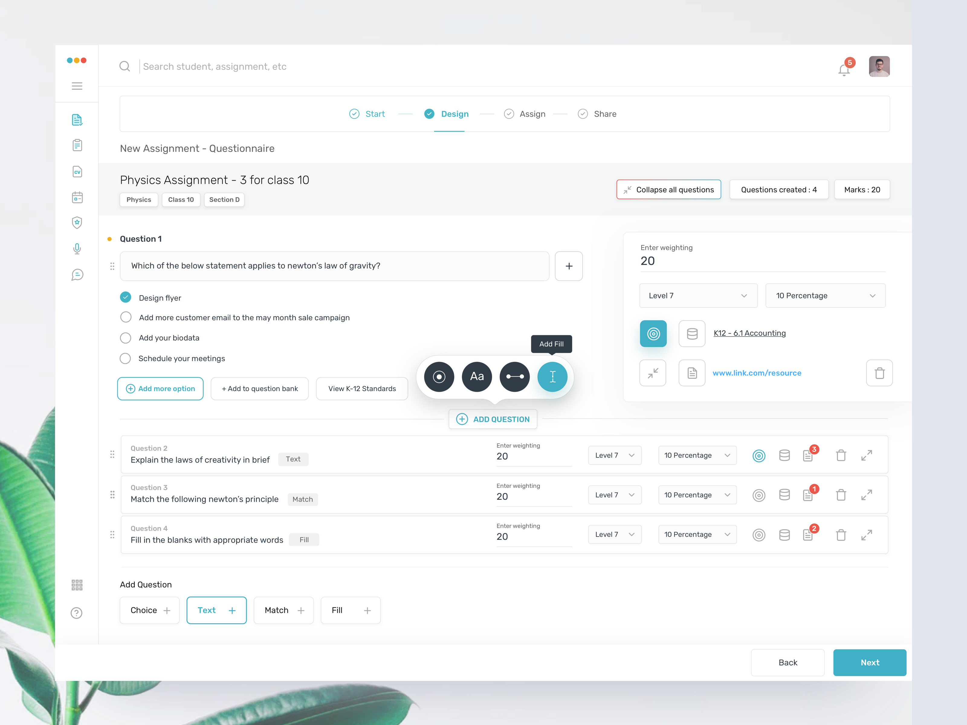
DASHBOARD FOR SCHEDULE AND MONITORING PLATFORM (VERSION 3)??? Prakhar Neel Sharma
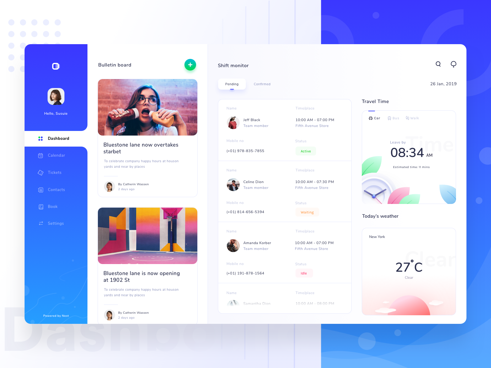
DATA DESIGN??? Never-stop? RaDesign
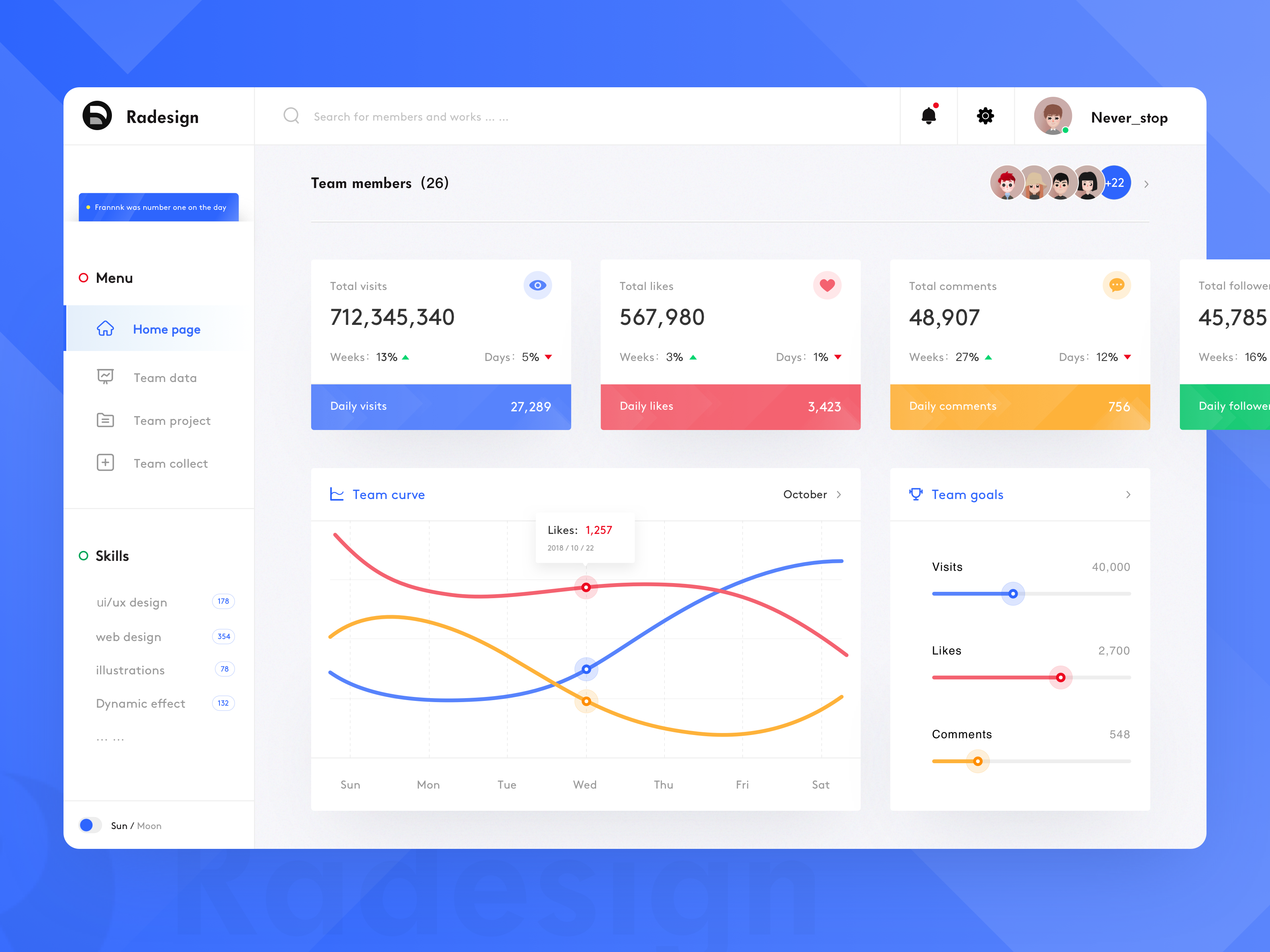
TASK MANAGEMENT DASHBOARD??? Sulton hand? Pixelz
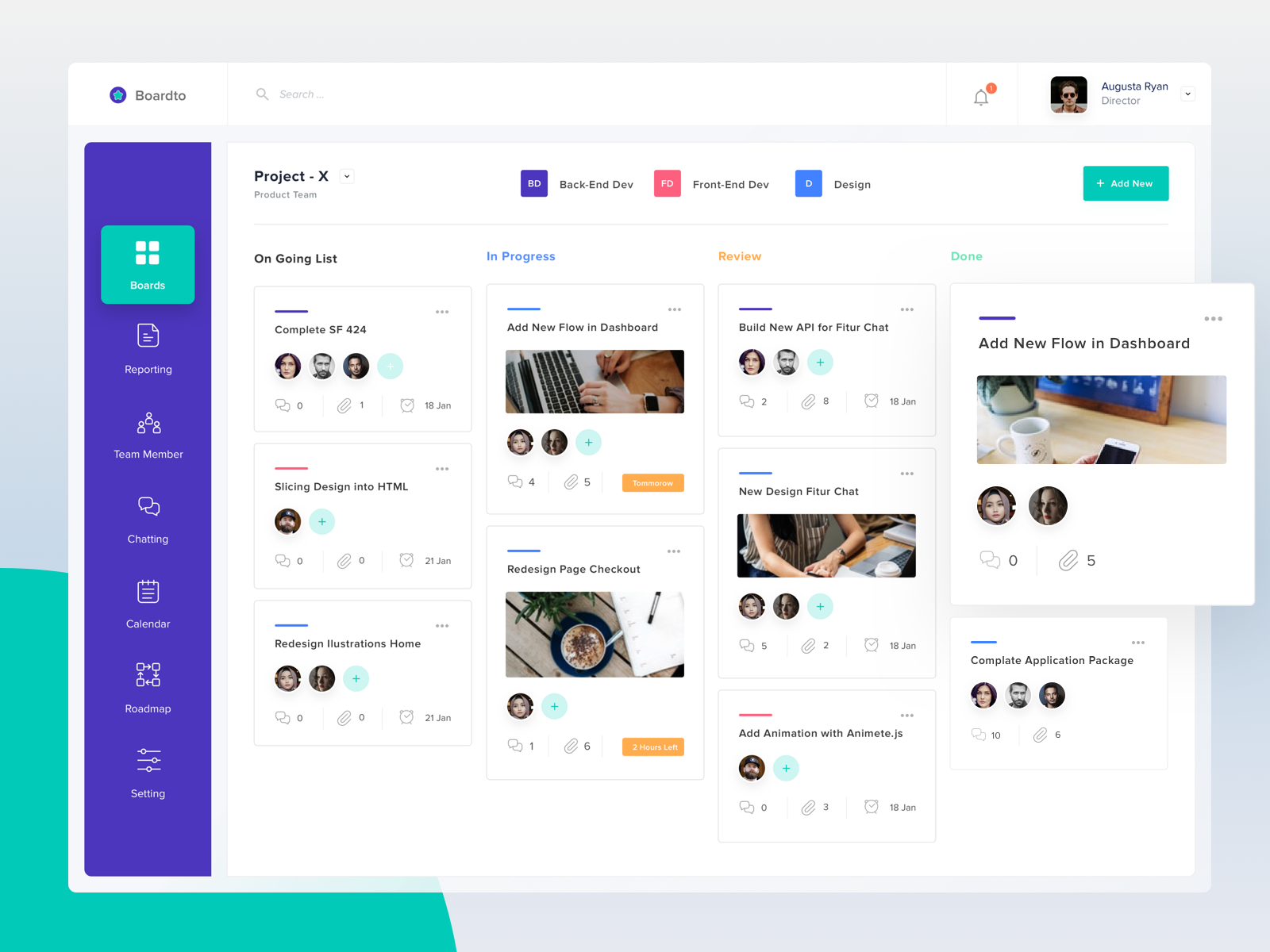
EMPLOYEE PAGE??? Brave Wings? Internia
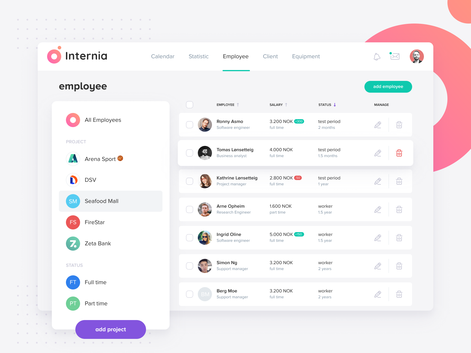
MODERN DASHBOARD??? Outcrowd
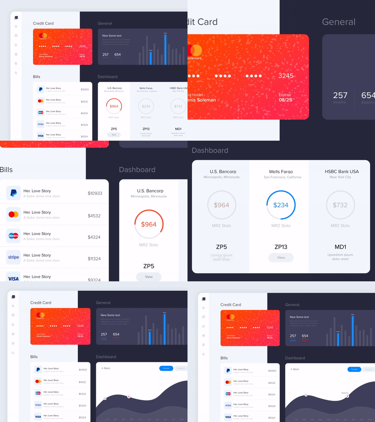
CRYPTO CUSTODY 2??? CJ__Alex? DCU
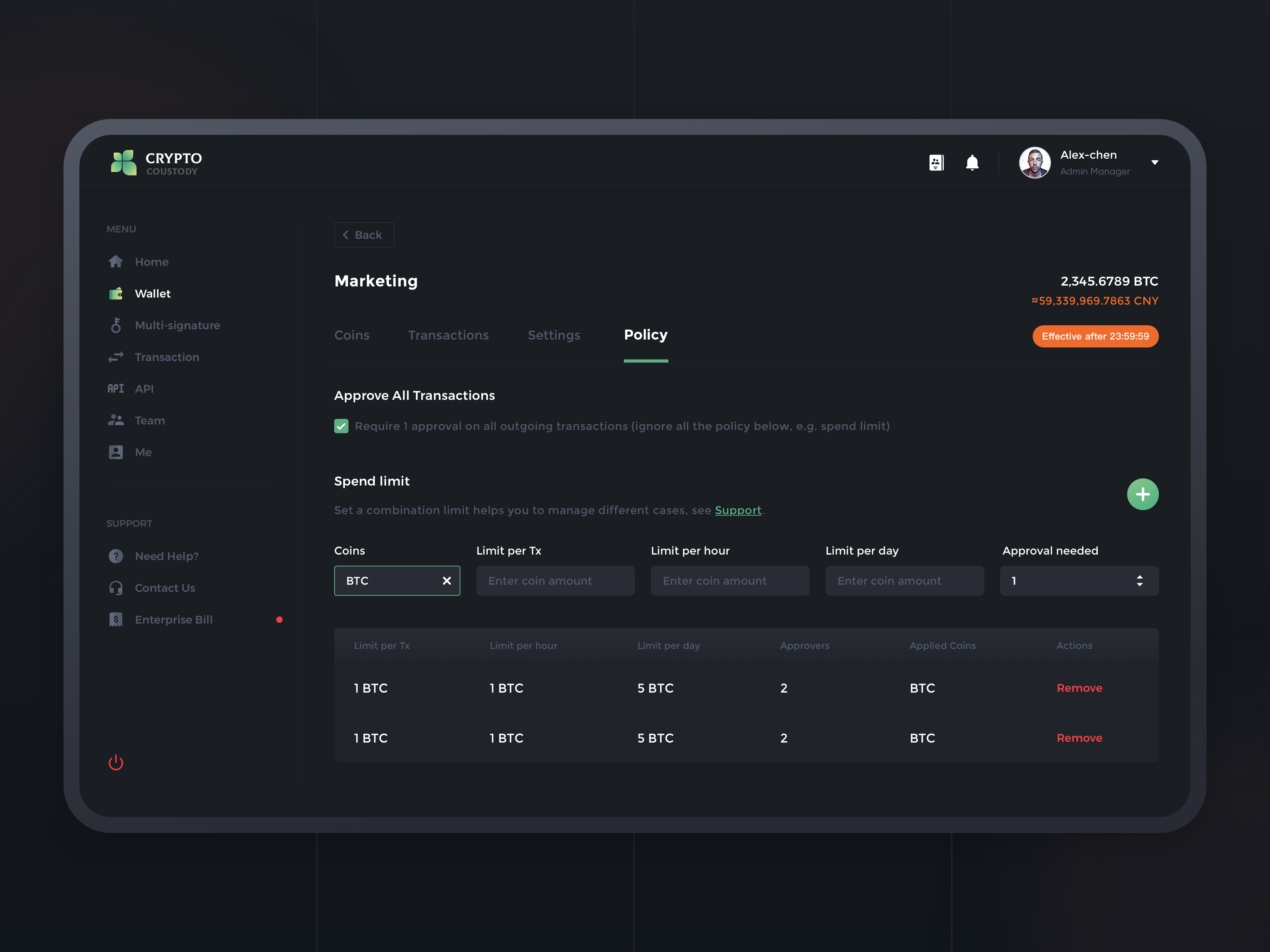
PRODUCT ANALYTICS MANAGEMENT SYSTEM DASHBOARD DARK VERSION??? Kostia Varhatiuk? Fireart Studio
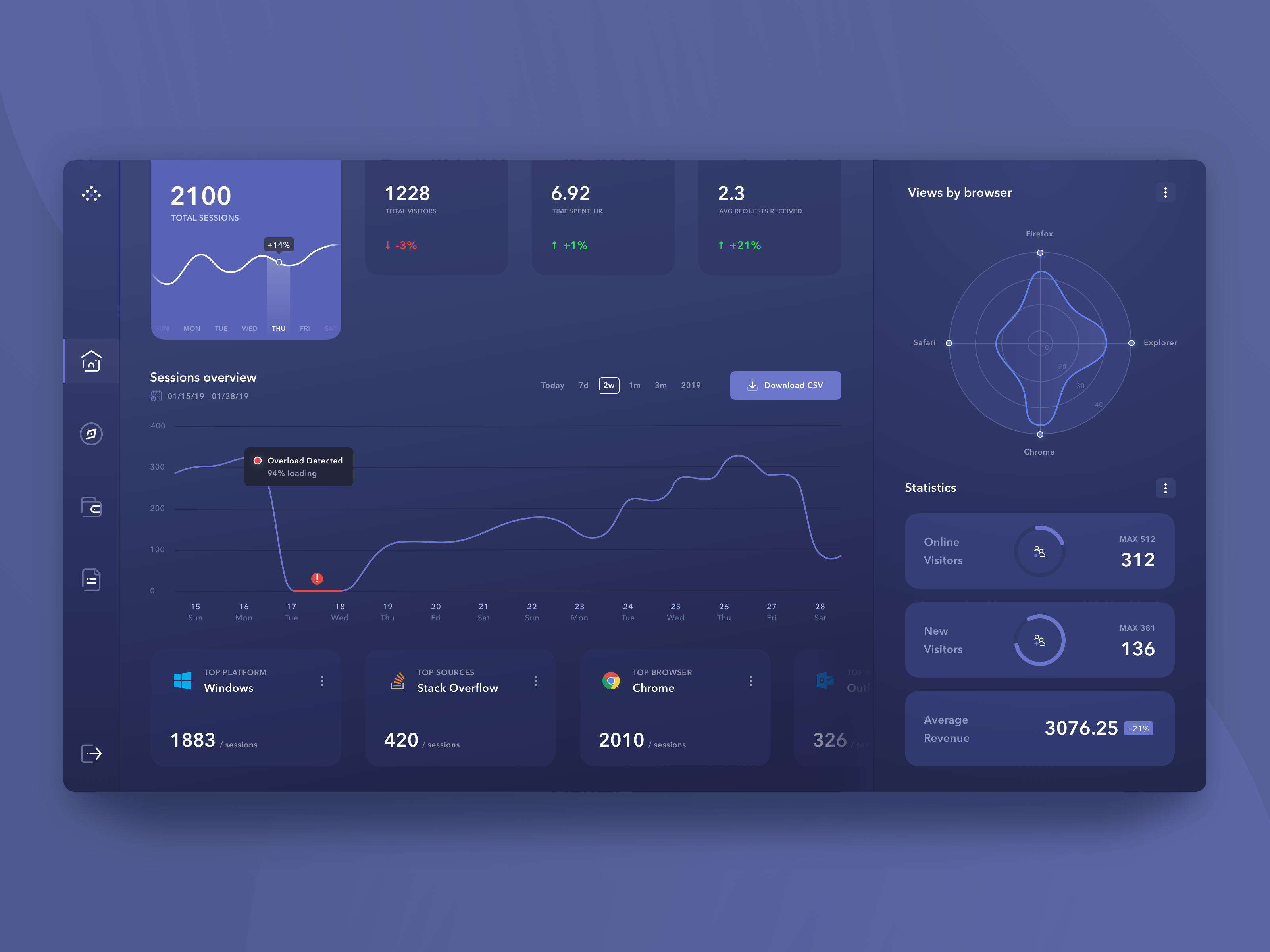
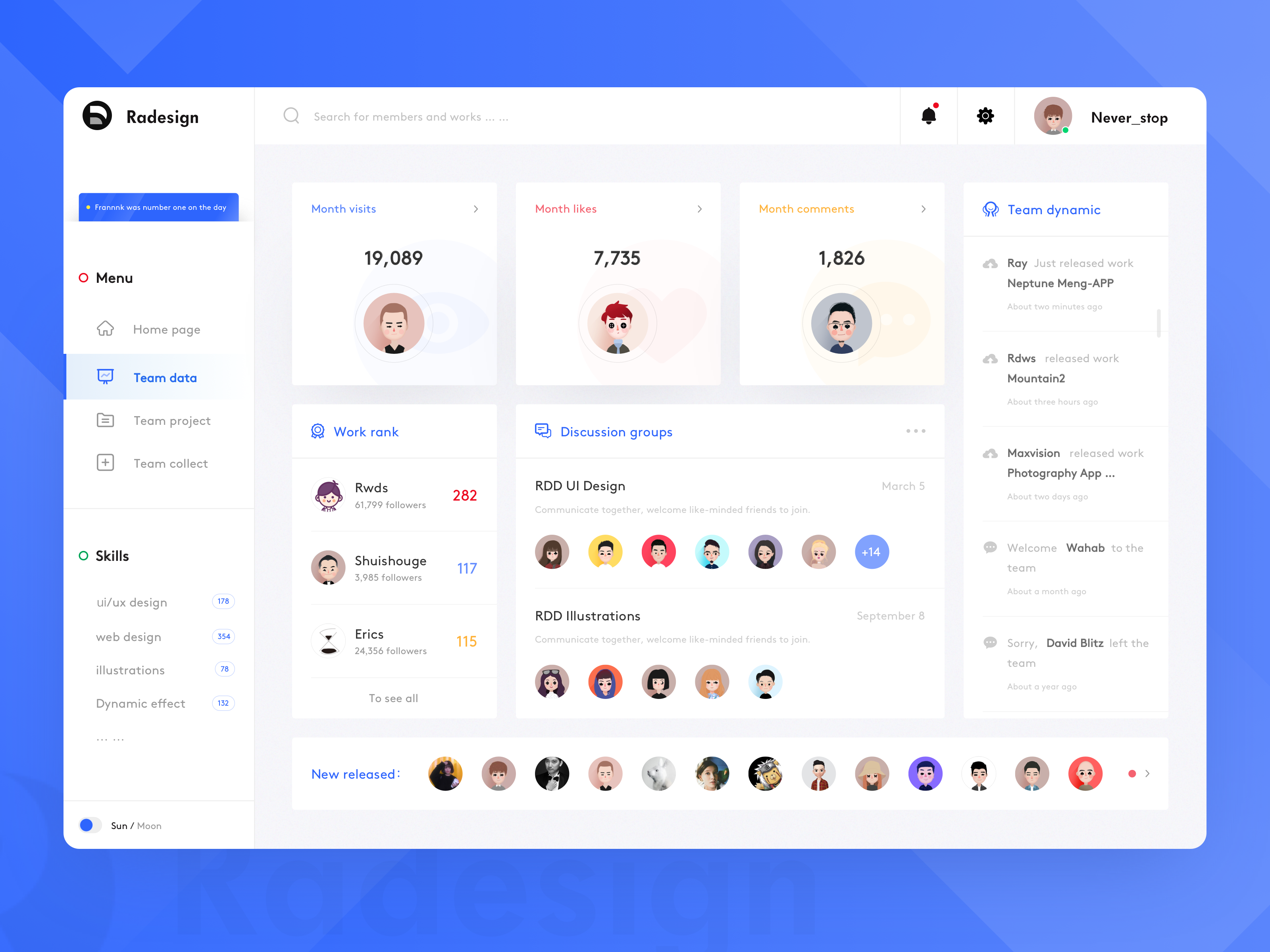
TEAM DATA??? Never-stop? RaDesign
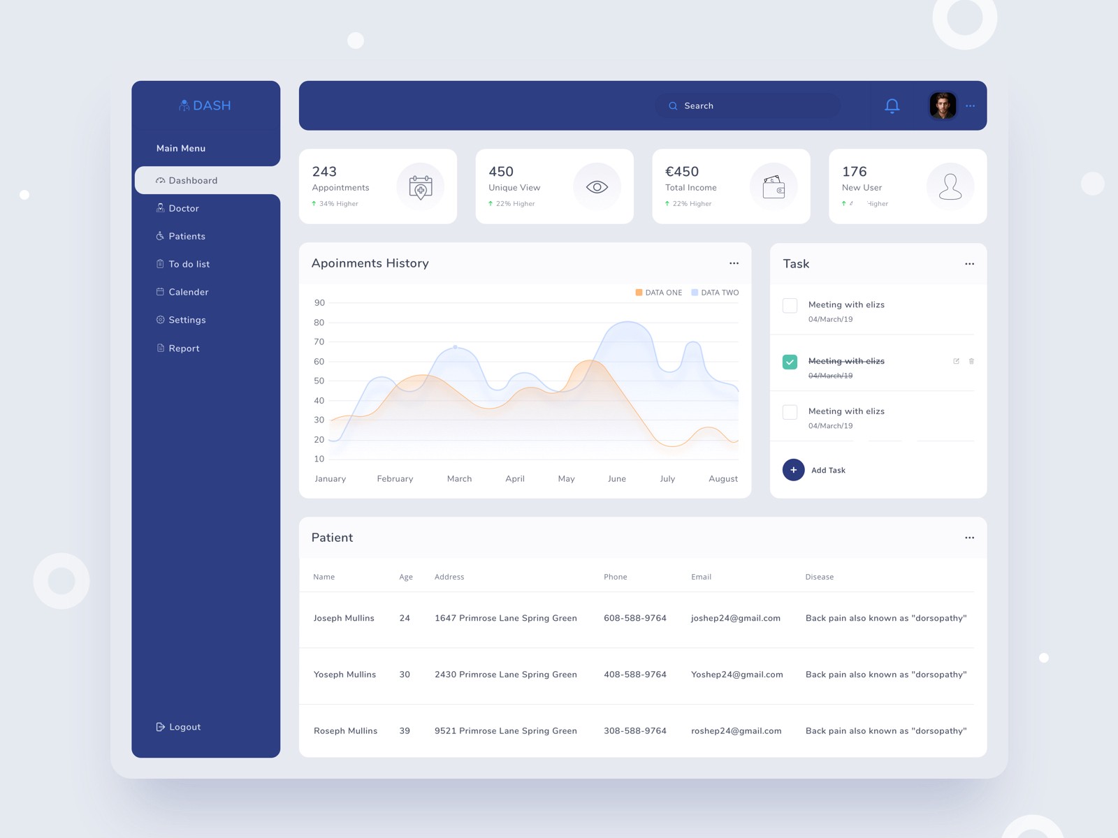
DASHBOARD FOR MEDICAL ? SIDE MENU EXPLORATION??? Mufidul Islam Tapadar? Hiwow
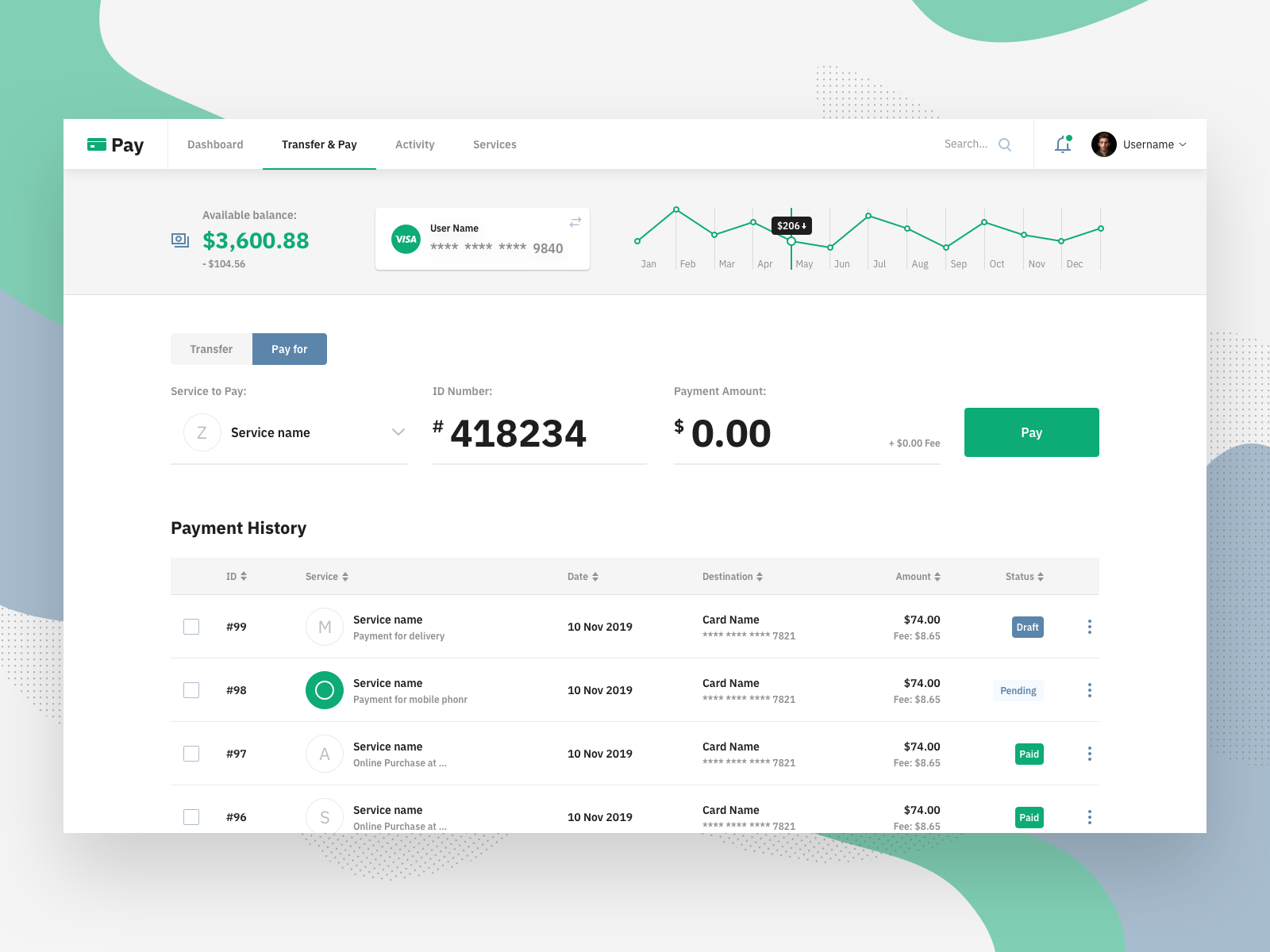
TRANSFER & PAY??? Artyom Khamitov
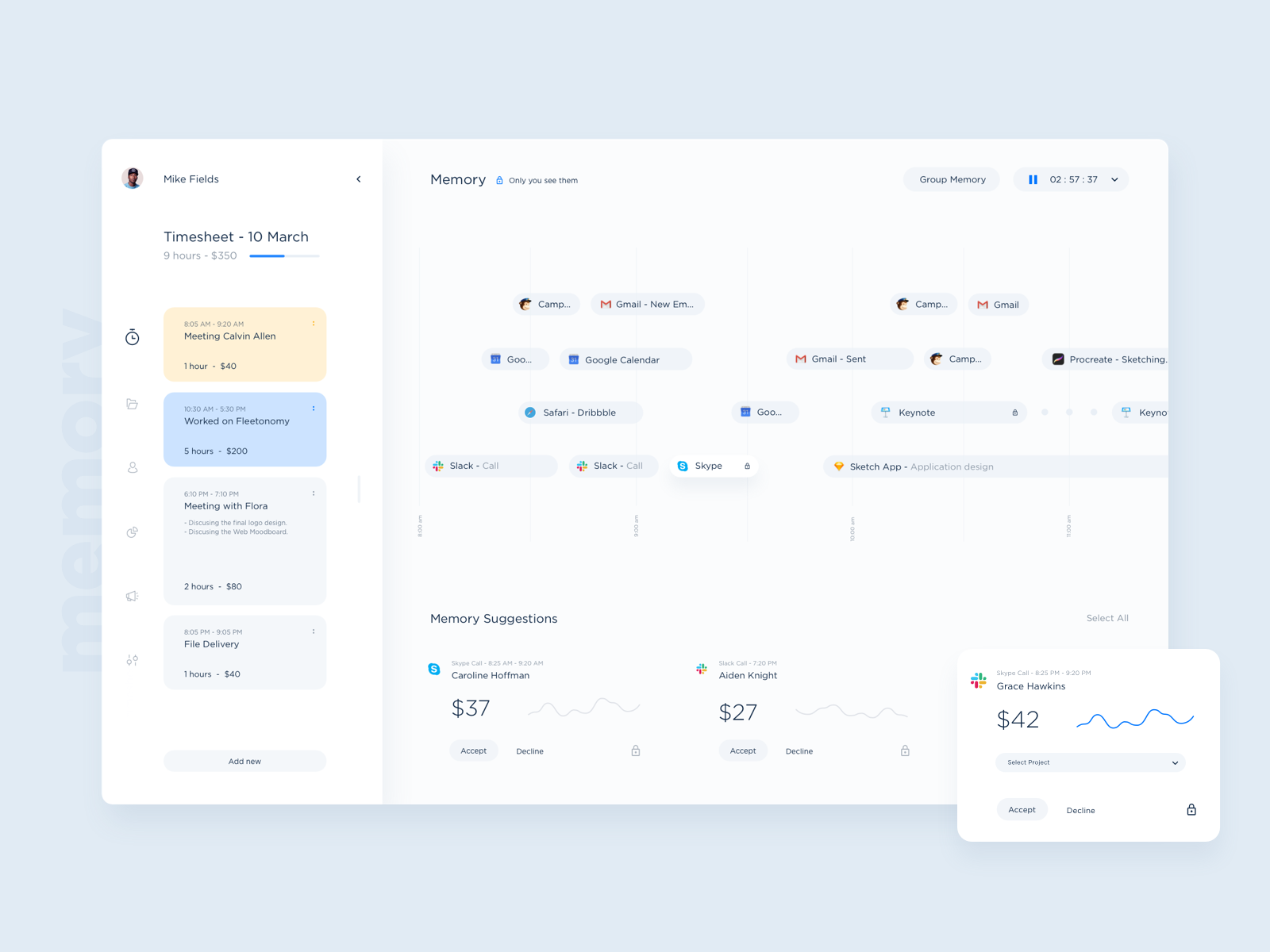
MEMORY UI SHOT??? Stan? Dtail Studio
Get Inspired: Dashboard Design
Dashboards help your users get a quick view of critical information at a glance. They have been used in business applications for a long time, but they have useful applications in consumer products as well. Health tracking, personal finance, and academic progress for our kids have become commonplace.
If you?ve been asked to create a dashboard for a product, you may be wondering where to start. Each dashboard has a specific purpose and audience, but the common element is simplicity. Clear data points, graphs, charts, and trends are essential and should be tailored for the information type. It should be limited to just a handful of numbers that fit on a single screen, especially if the target device has a tiny screen. Here are some ways to get inspiration as you work on your dashboard design.
Ask Your Users
Just like any UI/UX design project, you need to start with the users. They will be your best source of inspiration because they can tell you what data they want to see most. Try asking them to imagine they are vacationing on a beach with no WiFi or cell signal. If they could get a single page letting them know how their business (or child, or bank account) is doing, what 5?10 items would be on it?
Dig deeper too. Ask what each of those pieces of information is telling them, how they use it, and where it comes from now. Asking a lot of questions will help you understand what they are really after and generate ideas for other ways to accomplish their goals. Do they have any issues with their current data? What do they love about their current data sources?
Ask the Pros
Data analytics companies like Tableau specialize in data visualization and helping their customers to create dashboards. They offer whitepapers and other educational materials related to selecting the right visual representation for a particular type of data. Some even let you play around with the possibilities without buying their product, though you may have to fill out a form and dodge sales calls later.
UI/UX professionals and design agencies often offer examples or educational materials like case studies. For example, Nielsen Norman Group has published a case study of Tesla?s actual dashboard, which has more in common with websites than traditional car dashboards. By consulting expert design sites, you can tap into valuable research and insights on creative data visualization, as well as types of dashboards and effective dashboard design. Another Nielsen Norman Group article, ?Dashboards: Making Charts and Graphs Easier to Understand? highlights some common graph and chart types, along with recommendations for how and when to use them.
Ask Google
Pinterest will work for this technique as well. Try searching for whatever the domain your product is in with ?dashboard? tacked on the end. For example, searching for the phrase ?health tracking dashboard? results in ?About 47,300,000 results?. Examples range from hospital applications to fitness tracking, and devices range from desktop to smartwatch. This is a great way to start looking at competitive benchmarking as well.
It can be helpful to check out other industries and domains as well. They may feature a particular way of presenting information that would lend itself to something your users are looking for.
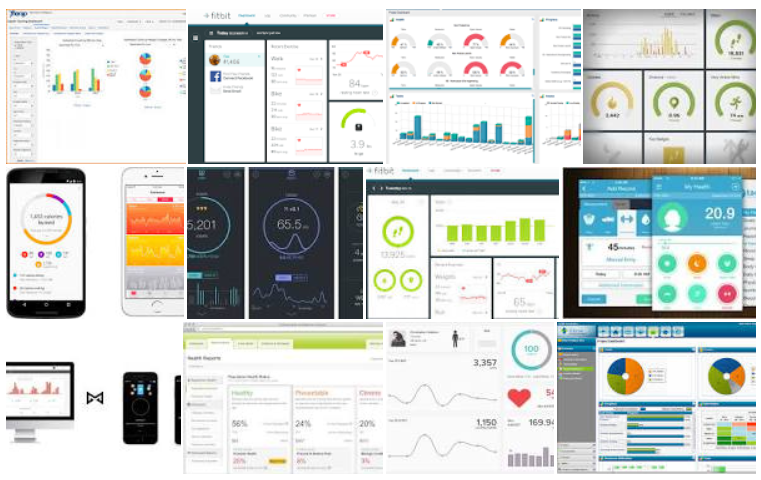 Google Search Results for ?health tracking dashboard?
Ask Your Favorite Design Site
Whatever your favorite design site is, chances are it will have dashboard examples in addition to website design and other design examples. As with basic internet searching, you can search for just the term dashboard, or get more specific with your search terms to find a variety of inspiring dashboard designs on these types of sites. Some even aggregate ?best of? lists that point out successful solutions and not-so-successful ones.
Dribbble
Dribbble is a great source for visual design inspiration. You don?t usually get much detail into the design process, design decisions, or individual modules but for strictly layout, color, or themes there are many options to peruse.
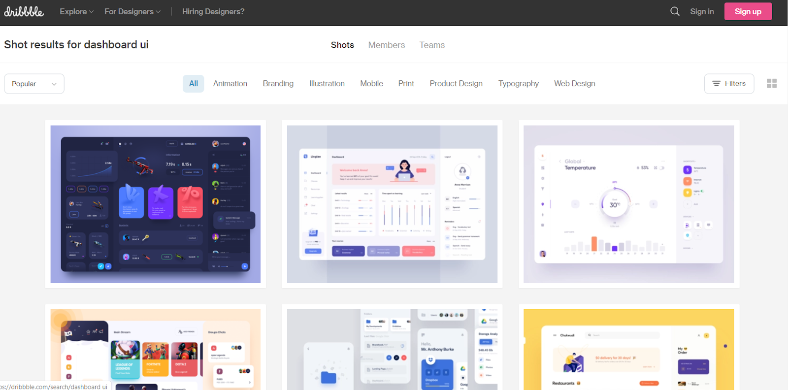 https://dribbble.com/search/dashboard%20ui
Muzli
The Muz.li online magazine gets a little deeper into topics related to design. You can find good visual design examples, but also learn more about what makes different approaches successful in different use cases. Some articles dig deep into design choices for a variety of applications.
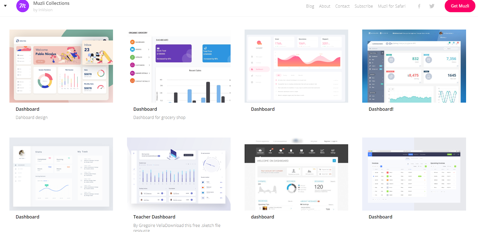 https://medium.muz.li/search?q=dashboards
Behance
Behance also contains informative articles and aggregated ?best of? lists. Again, this site gives a little more depth than strictly visual thumbnails. Some designers even offer templates or technical how-to?s.
Summary
Whatever product your dashboard design is intended for, there is plenty of inspiration out there. Data is big business, and data visualization is no exception. Take advantage of other people?s research and expertise, while keeping an eye on the trends and new ideas to design a beautiful, useful dashboard for your users.
See also:
The Best Web Design Companies and Agencies
Top Website Design Companies for startups, B2B, SMB, enterprise, SaaS and small business
medium.com
Top UI/UX Design Agencies
Top UI/UX Design Agencies in 2020
medium.com
By supporting and sharing this article you help the designers
UI Design Works for Inspiration ? mobile, web, apps, iOS.
UX & UI Design Inspiration
uxplanet.org
Web Design Inspiration ? Best Marketing Websites
Selection of web design works for inspiration. These are marketing websites created by top web designers.
medium.com
Branding and Logo Design Examples for Inspiration
A selection of Brand Identity and Logo Design works for inspiration
medium.com
Thanks for watching!
