On designing experiences that encompass your wellbeing

Productivity is personal.
Who we are as human beings deeply influences productivity as both a process and an outcome. Our values and beliefs, the needs of our families, our personalities and preferences, how energized or deflated we feel when seeing our Calendars or To Dos ? these are key facets of productivity.
And because nobody knows your external circumstances or inner emotional state better than you, achievement needs to happen on your terms to be sustainable. This is perhaps truer than ever because, for many, 2020 swallowed whole the proverbial work/life divide. Understanding this propels us to craft Microsoft 365 experiences that support our lives in all their unique complexity.
We?re also crafting experiences that acknowledge the broader ecosystem that Microsoft 365 lives within. As the world wakes up to racial injustice, the economic gap between ?essential? and ?non-essential? workers, and the long-term cost of a digital learning divide, we?re intentionally and ethically designing digital spaces to support a diversity of lived experiences.
As product makers, we go where human need takes us and strive to navigate the nexus of timeless needs and current realities. Three years ago, we launched Microsoft 365 and began holistically rethinking how our products could work together as an intelligent and connected suite of services. We implemented flexible designs and over time evolved our ecosystem to facilitate not just modern work, but modern life.
That ecosystem increasingly decouples app capabilities from the apps themselves, leaving you free to use functionality whenever, however, and wherever you need it. New generations? embrace of mobile devices for their ease, simplicity, and joy has inspired us to create cross-platform Microsoft 365 experiences that scale gracefully and feel natural to whatever device you choose.
Today, the future of Microsoft 365 blends our planned trajectory with real-time changes based on the remarkable complexities that 2020 dropped at the world?s feet. We center our efforts around four key experience pillars, and the work that you?ll read about below is itself a hybrid. While some of these changes will roll out within a year or two, others are still very much exploratory.
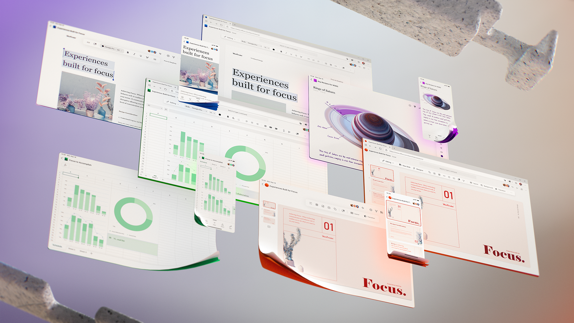
Designing for focus
Most of us are viscerally aware of the modern-day challenge to find focus amid a sea of distraction. Externally, notifications pop up or your newest coworker (aka your child) vies for your attention. Internally, we check social media on autopilot or our minds wander from tasks because, well, we?re human.
To reduce the stress and anxiety that distractions create, we ask ourselves as product makers how we can throw less tasks your way or reduce the number of notifications. How can we help you feel good about taking a break from work so you can return with a refreshed ability to focus? What extraneous visuals can we remove so your content, not the UI, becomes the sole focus?
We?ve been on a multi-year design journey to create more focused, immersive experiences, from the single-line ribbon, to Dark Mode, to Fluent. The next wave of Microsoft 365 UX changes will go even further by fading brand colors from app headers and exploring adaptive commanding. A flexible ribbon that progressively discloses contextually relevant commands at the right time just where you need them.
We?ll further advance our seamless, cross-suite Search to bring relevant information to your fingertips, and myriad forthcoming experiences will leverage Fluid Frameworks. Microsoft 365 will bring the power of Office to wherever you are, ensuring you won?t need to interrupt your creative process to open a different tool.
Throughout, we?re grounding everything we build in deep research about the nuances of attention. We?re often presented with a false dichotomy ? you?re either focused and in flow or distracted and unproductive ? but we traverse a broad attentional spectrum while achieving our goals. Some moments call for lengthy, sustained concentration. Others, such as many mobile scenarios, are optimal for microtasking. By designing for multiple cognitive states, focused experiences throughout the Microsoft 365 ecosystem minimize external distractions, lessen self-interruptions, and jumpstart flow.
 Early explorations for evolving Fluent Design to enable a greater sense of focus in our experiences.
Designing for amplification
In tech, intelligence with capital ?I? refers to artificial intelligence, but as we go about our day, many types of intelligence come into play. Intelligent design within nature ties our sleep cycles with lunar and solar movements. Among ourselves, intelligence encompasses everything from intuition to interpersonal awareness to musical abilities.
Contextualizing AI within this broader picture helps us holistically design intelligent Microsoft 365 experiences that don?t just leverage what our powerful AI can do, but what it should do to serve human needs. There are times to champion solely human abilities and times to amplify them with AI.
To meaningfully collaborate or be productive, we often need a degree of context our brains just aren?t equipped to handle. Chat histories, the background of a project or the people involved, related workstreams ? the rapid rise in learning and working from home has increased this contextual complexity. But AI?s superpower in retaining, recalling, and analyzing massive amounts of data can help parse signal from noise as you move through your day.
Across our product suite, Cortana experiences leverage AI to help you navigate your days more smoothly. Solutions like Project Cortex will evolve to alleviate cognitive fatigue and energize projects by helping you learn, upskill, and innovate more effectively. Project Cortex uses AI to create knowledge networks based on relationships among topics, content, and people, turning overwhelming amounts of information into digestible bites that you can act on.
AI also proactively assists you within individual app experiences. Excel will catch errors as you write formulas. It can also collect existing errors and store them in an easy-to-find place so you can correct them when you?re ready. In Planner, we?re exploring how AI can auto-suggest end dates for tasks based on their descriptions, which is akin to how Forms currently leverages AI to auto-populate questions based on the title you entered.
 An example of AI proactively identifying an error in Excel and suggesting a solution.
Designing for connection
As the world adapts to learning, living, and working from home in unprecedented ways, we?re seeing a broader array of human experiences lived online than ever before. This elicits unique perks and stressors. While acute meeting fatigue is on the rise, it?s also humanizing to join a Teams meeting and see pets, sports gear, or other interests you never knew about someone. To amplify the benefits and minimize the challenges, we?re designing Microsoft 365 experiences that consider both the logistical and emotional aspects of connectivity.
Logistically, we want apps to seamlessly communicate so experiences are cohesive and collaborations are fun and fluid. Within Teams, we?re crafting more dynamic and contextual experiences like Planner, PowerPoint, and Whiteboard, as well as lighting up Teams for Life and its Skype integration. Microsoft Fluid Framework powers much of this ? it helps us break apps into bite-sized components that are live, mobile, and connected across experiences.
We?ll also be adding more asynchronous abilities throughout Microsoft 365 so you can connect when and how it works best for you. This reduces meeting fatigue, and when you can use video in async scenarios (imagine commenting via a quick video response), sides of you shine through that people might overlook in written chats or live meetings with complex group dynamics.
Our tools have long supported the expression of your ideas, but as work and life converge, you may want to communicate who you are beyond an avatar photo. From more artful themes and backgrounds to exploratory UX around how someone might express their gender, culture, or hobbies, we?re designing for more authentic and inclusive connections between people.
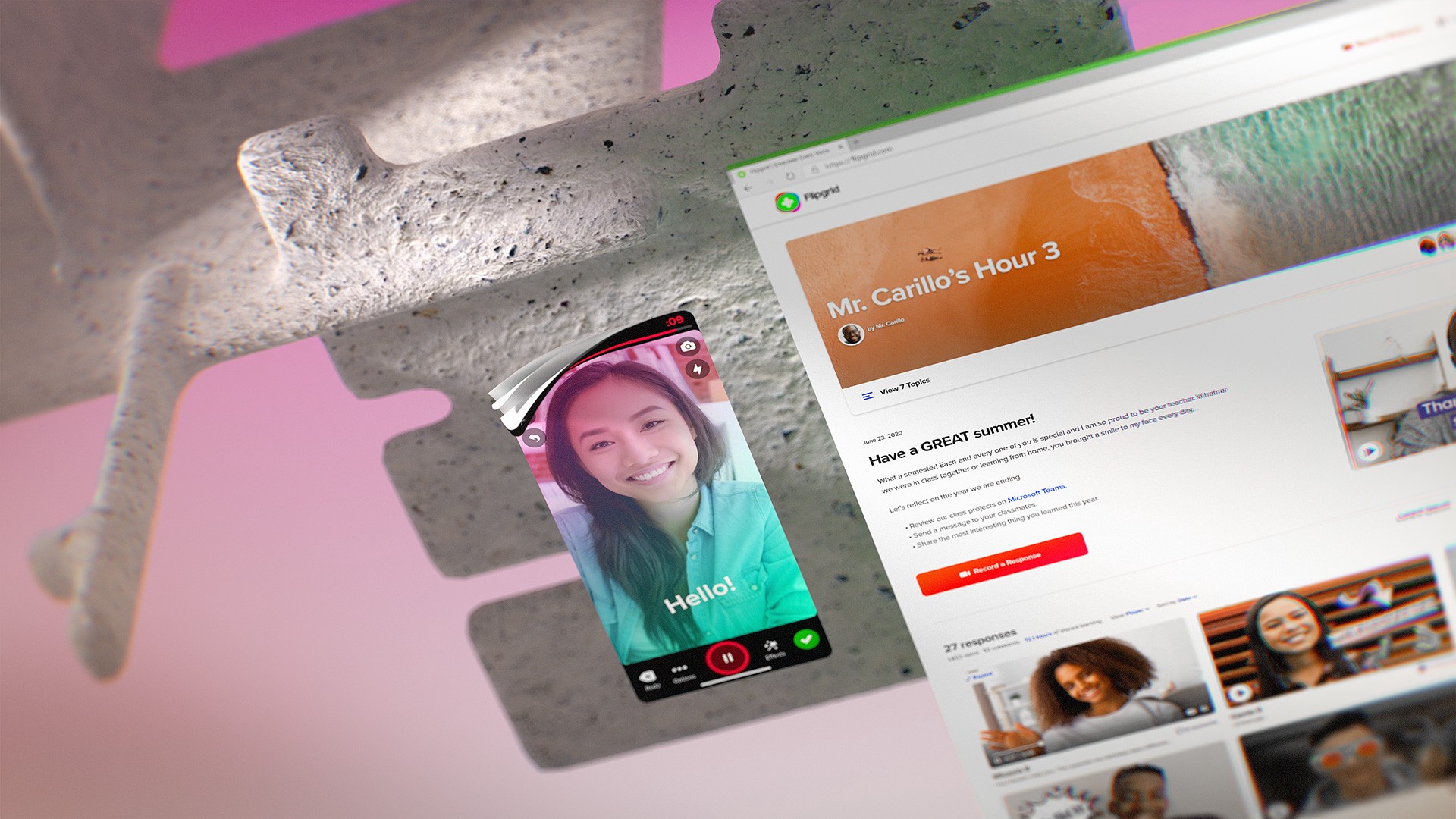
 Live and recorded video in Flipgrid intuitively connects learners and educators across the world.
Designing for protection and peace of mind
Trust is a multi-faceted notion, and when we say that Microsoft runs on trust, it?s not just a corporate motto but a privilege that everyone working here takes incredibly seriously. From understanding what you?re approving when you check privacy boxes, to confidently propagating policy throughout your business, to supporting the wellness of you and your loved ones, we?re deeply invested in delivering protection and peace of mind.
From a UX perspective, document classification exemplifies this emphasis on trust. Security measures may prevent documents from being hacked, but that?s moot if an overeager coworker shares a confidential file. We?re designing experiences that empower file owners to communicate levels of sensitivity to others so you can collaborate with confidence and control what people can or can?t do within documents. On a larger scale, this also means IT admins and other decision-makers can confidently propagate policy to keep their organization secure.
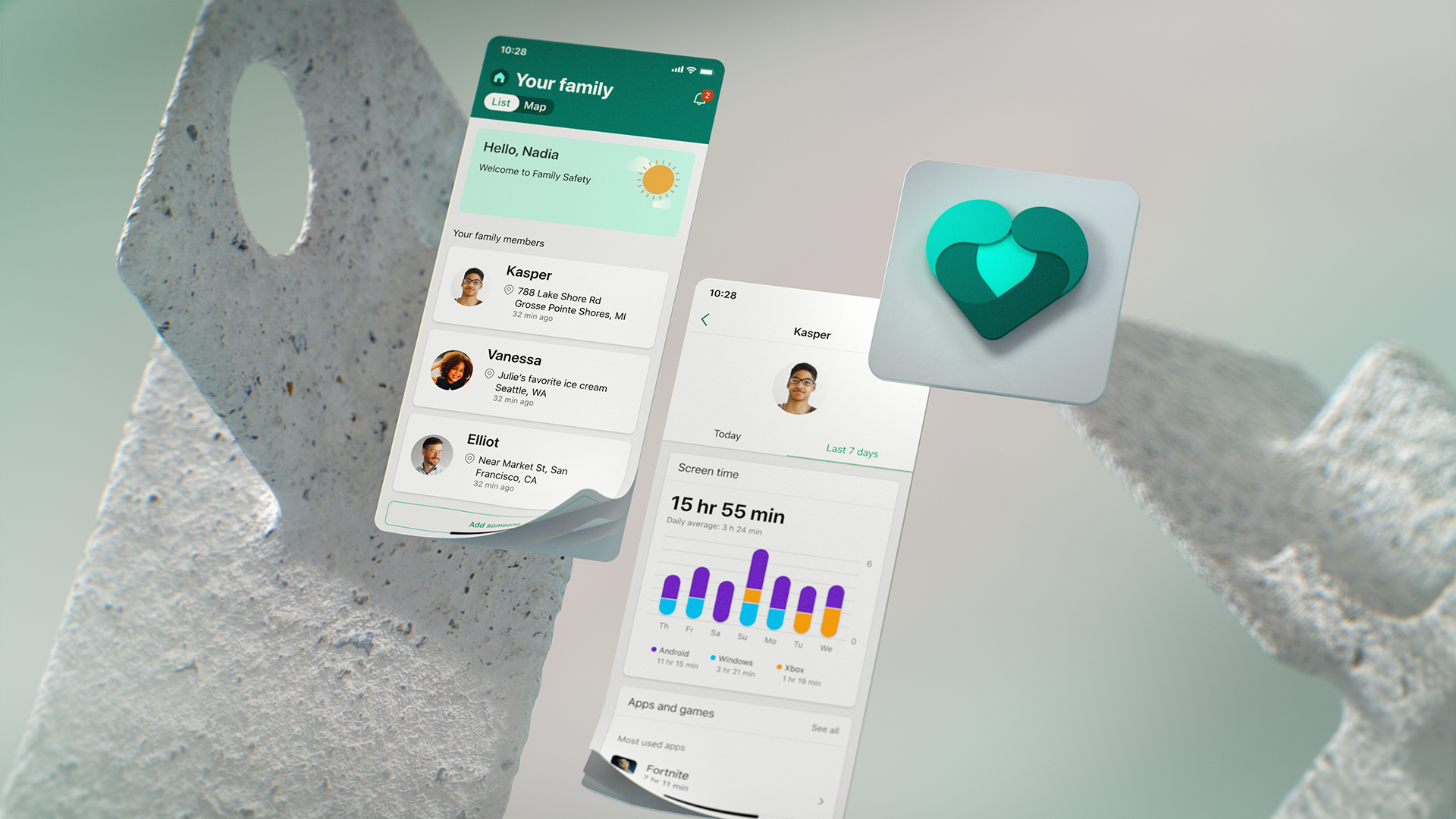
Beyond evolving current experiences, we?re also creating wholly new solutions like our Family Safety app. Family looks different for everyone, but we all want our loved ones to be safe, healthy, and connected. This includes the nuts and bolts of our modern digital lives ? limiting screen time across different surfaces and devices, awareness of physical contexts, filtering out undesirable content ? and wellbeing at a deeper level. To empower you and your family to build healthy digital habits together, the app fosters self-awareness and agency in children (and their parents) so they?ll grow to make healthy decisions.
Finally, there?s a core ethical component to peace of mind, which is why we champion Responsible Innovation and actively create and publish guidelines on things like how to ethically design AI.
 The Family Safety app helps families balance screen time, select appropriate content, and collectively develop healthy digital habits.
Designing for the future, together
We?ve always valued the reciprocity with our customers. As much as you?ve trusted us to help you achieve, we?ve looked to you to guide us as we design toward focus, amplification, connection, and peace of mind. That?s why, even as you read this, we?re conducting global studies to help us understand how human needs are changing in real time amid such an unprecedented landscape.
One thing we?ve repeatedly observed, however, is people?s ability to rise to the occasion. Using Teams to host your wedding, using Forms for wellness check-ins with peers you no longer see in person, creating emergency response solutions for frontline workers ? people show resiliency, creativity, and collaboration every day.
As we design the future of Microsoft 365 experiences, we?ll continue to champion these qualities so that we can move the needle forward, together.
To stay in the know with Microsoft Design, follow us on Twitter, Instagram, Facebook or join our Windows Insider program. And if you are interested in joining our team at Microsoft, head over to aka.ms/DesignCareers.


