Composition is where all the fun and creativity really gets going in our photography adventure. This is where all the magic happens!
We?ve nailed the photography basics, gotten familiar with our camera settings and the Exposure Triangle, and we?re rotating some dials and getting used to shooting RAW images in Manual Mode.
But we?re still missing a vital ingredient in our photography. Our photographs don?t look as compelling as those we?ve been admiring online or in galleries, and that?s all down to light and composition.
Composition is one of the most important aspects of photography, whether you?re trying to master landscape photography or start up a wedding photography business.
Composition is what we?re going to cover here, and it?s where all the fun and creativity really gets going in our photography adventure. We can set ourselves apart from the crowd here and really introduce a sense of individuality into our images. This is where all the magic happens!
What is Composition?
Composition
noun
- The nature of something?s ingredients or constituents; the way in which a whole or mixture is made up.
The dictionary definition of composition pretty much sums it up with regards to photography composition as well. The composition of an image is simply the way all the individual subjects within our frame combine to form the final image. We can alter our composition by moving around, zooming in or out, changing lenses, or even just crouching down.
The possibilities are almost endless with regards to composition, and even the slightest tweak can make a big difference to the finished photograph. Once you get the hang of it you?ll start seeing every scene as a potential compositional goldmine.
This is the creative side of photography; a rabbit hole of endless opportunity. Here?s five quick tips to get you started thinking about composition:
1. Movement of the Eye
 Note how the eye moves around this image ? Along the rocks and crashing waves at the bottom and up to the castle before circling back around.
This is the number one thing you should think about before taking any photograph. How will the viewer?s eye react to this scene? Top to bottom, left to right, how will a person?s eye move around your photograph?
What we want is for the eye to flow around the photograph, and ideally stay within the frame. If a viewer?s eye is drawn outside the frame then we?ve lost their attention for all intensive purposes. We can utilise a number of techniques to try and keep the viewer?s attention, but this is the first question to ask yourself before taking a photograph.
One important aspect to note is distractions. Are there any distractions that take away from your main subject(s)? If so, think about ways to remove them from the image.
2. Rule of Thirds
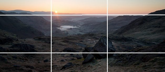
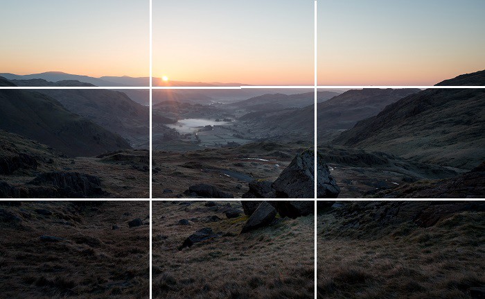 Note how the major focal points in this photograph are placed at or close to the intersections of the gridlines.
No compositional list is complete without mentioning the rule of thirds. It?s about as ingrained in photography as anything, and while it?s definitely not something to abide by 100% of the time it?s a perfect framework when starting out.
Basically, you should image your frame divided up into nine equal rectangles, so there?s an overlaid grid on it. The most important aspects of your image should be placed at the intersection of these gridlines, with any lines within your image trying to follow the gridlines as well.
See the image above for example. The main foreground material are these huge irregular boulders, placed on the intersection in the bottom right. The horizon runs along the top third of the gridlines, with the rising sun and mist shrouded valley occupying the important space around the top left intersection and creating a more balanced photograph.
The theory is that it creates a more balanced photo and allows the viewer?s eye to drift around more naturally. There are many studies showing that people?s eyes tend to go to one of these intersection points first rather than dead centre. That?s why Auntie Beatrice?s family photographs look so dull ? Because she?s placing everyone dead centre of the frame!
I must stress, and I will mention it later on, that this isn?t a rule to follow all the time. It?s simply the best way to get started thinking about composition, and it does work a lot of the time. However, if you use it in every single one of your images they start to become a bit sterile and predictable, and nobody wants that!
3. Border Patrol
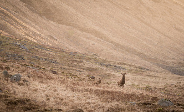 Just outside the frame in this photograph is an unsightly telegraph pole, and had I zoomed out a bit more there would have been a tiny corner of bright sky in the top right. Careful zooming allowed me to eliminate these distractions.
This is a fantastic piece of terminology that I heard one of the UKs top landscape photographers use once, and it?s stuck with me to this day. The premise is about as simple as they come: Skirt your eyes around the edges of your frame in every photo and make sure there are no unwanted subjects invading from the borders.
This means any stray tree branches, half of a rock that looks unsightly, or a disembodied hand floating around. These invaders become unwanted distractions, and with them being so close to the edge of your photo they inevitably lead to the viewer?s eye leaving the frame. And remember Rule 1 ? We don?t want that happening!
4. Leading Lines
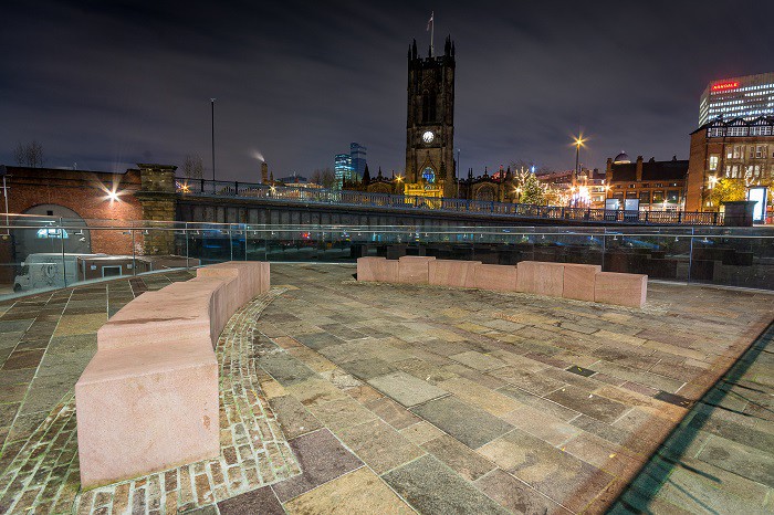 Leading lines can be used in all varieties of photography to create an added sense of depth.
This is another very traditional rule of composition that ties in very closely with Rule 1. We want to look for lines within our image that draw the viewer?s eye into the scene rather than away from it.
These can be physical lines such as fences or walls or more metaphorical lines such as shadows, or even a hand pointing into the image. Many subjects can be used for leading lines, and they can really add a sense of depth to a photograph.
That, in fact, is one of our main challenges as photographers. We are trying to portray a three-dimensional scene with a two-dimensional photograph, so anything we can utilise to enhance the sense of depth is very useful.
Take the image above, for example. The stone benches in the foreground curve around and lead the eye into the scene, pointing you towards the towered background. All this worked in conjunction with the rule of thirds on this occasion as well.
5. Rule of Odd Numbers
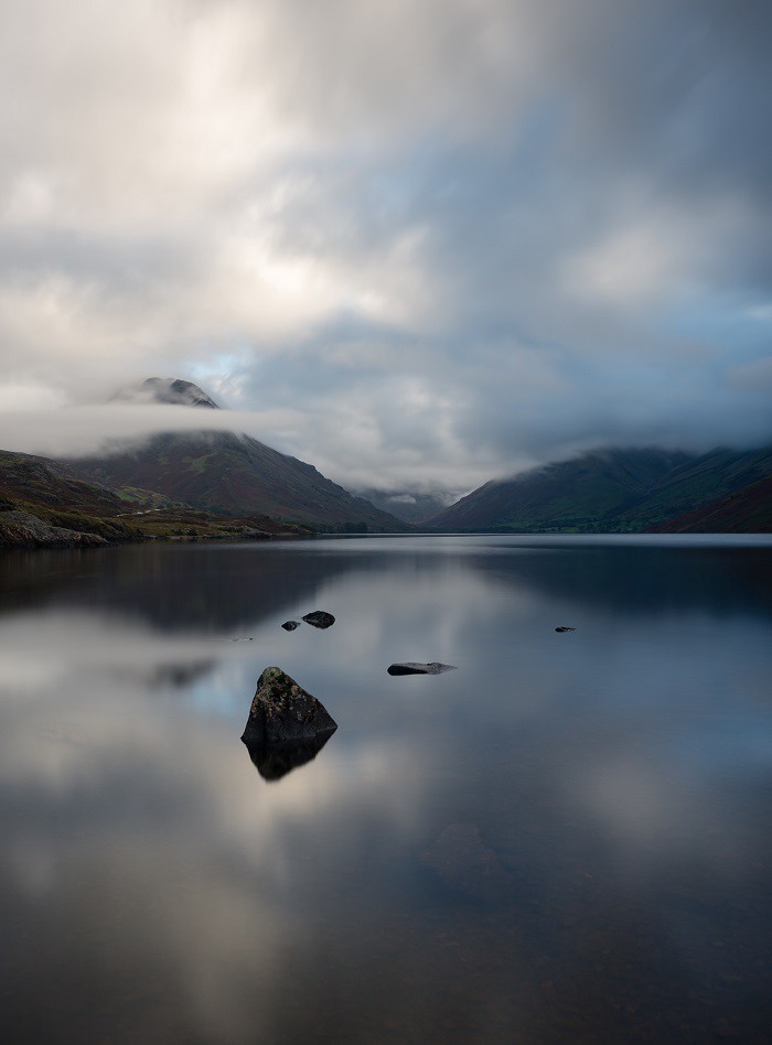 Three rocks work much better than four in this scene, and because of this I waded out until I was knee deep in the lake to eliminate another rock from my composition.
Studies have shown, and I actually have no idea why, that people prefer odd numbers over even numbers when looking at something. For some reason people feel more at ease when looking at photographs with an odd number of subjects, so it?s something we can utilise to further enhance our photography composition.
Obviously there are some areas where this just doesn?t work, such as wedding photos to take one big example. However, a lot of other scenes can use this guideline, such as including just three trees instead of four, or getting a candid group shot of five people instead of six.
This might not seem like such a big change, but I guarantee that now I?ve put it in your brain you will start to notice it everywhere!
Bonus Tip: Break the Rules and Have Fun!
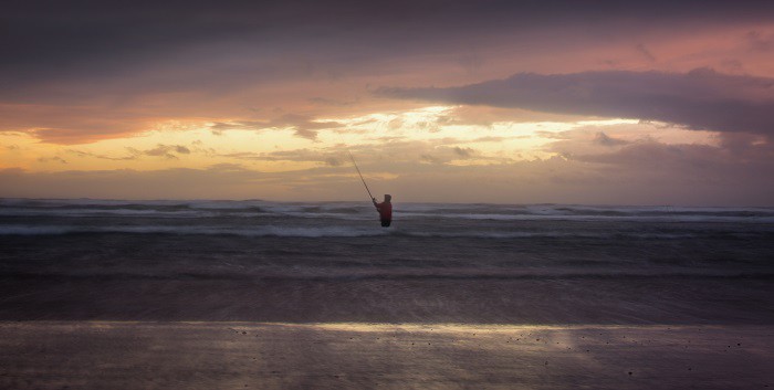 The subject is central, the horizon is central, the eye doesn?t have much scope for movement within the scene. Yet I still think it works, and sometimes it?s fun to go against the grain!
This is something I always try to convey to students. These are called ?Rules of Composition? but in my eyes they are nothing but guidelines or starting points. There are occasions when we want to break out of the traditional mould and go for something different, and I encourage you to get creative and experiment.
Tried the rule of thirds and the photo still didn?t look right? Go completely against it and place everything dead centre instead. Get out there and practise, and soon composition will become like second nature for you!
Have any of these compositional tips helped you improve as a photographer? Or have we missed out your favourite tip? Either way let us know in the comments!
Read the next in the series here!
