Have you ever wondered why some websites just draw you in, make you linger on their page, read the blogs, capture the elusive ?know, like and trust? holy grail and?oh?compel you to buy their stuff?
Yep, sure of course good design and great images all combine to help, and some websites rely almost exclusively on visuals. Likewise conversion techniques such as well placed (and the right amount of) calls to action and an optimized visitor journey (user experience) all play a very important part.
However, this article is focusing on the copy employed, where the words do the ?heavy lifting?.
What do I like most about these examples? They are written so well, you don?t even notice the words are doing such a wonderful job.
Here are 6 examples of websites with well placed compelling copy and my reasons why.
1. Immediately Know Where You Are
One Week Website
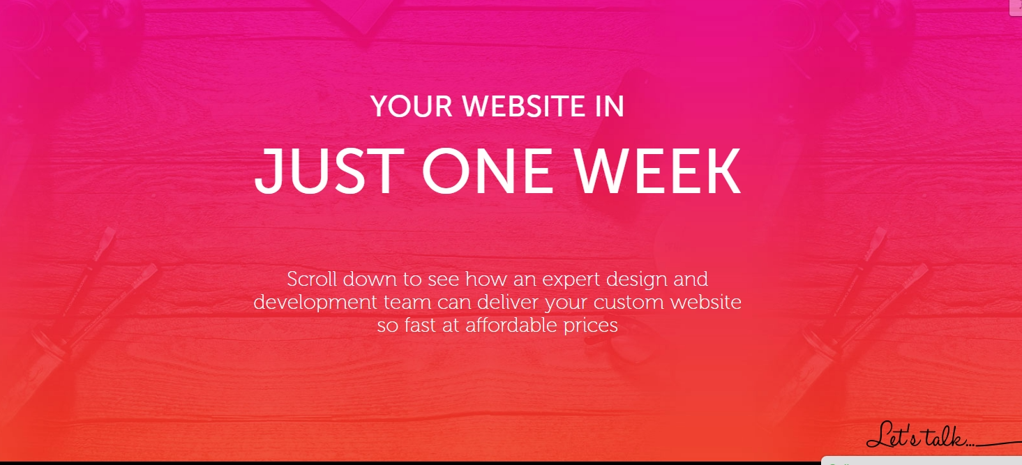
With this website you know where you are straight away.
The landing page tells you all you need to know:
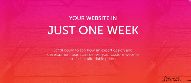
?Your website in just one week?
There is no confusion here. Plus it talks directly to you. It doesn?t say WE design websites in a week, it says YOUR website in a week.
Simple, clear and easy to understand.
You know if you are on the right page for you straight away.
2. Answers Your Questions?Relieves Your Pain (and makes you hungry)
Gousto
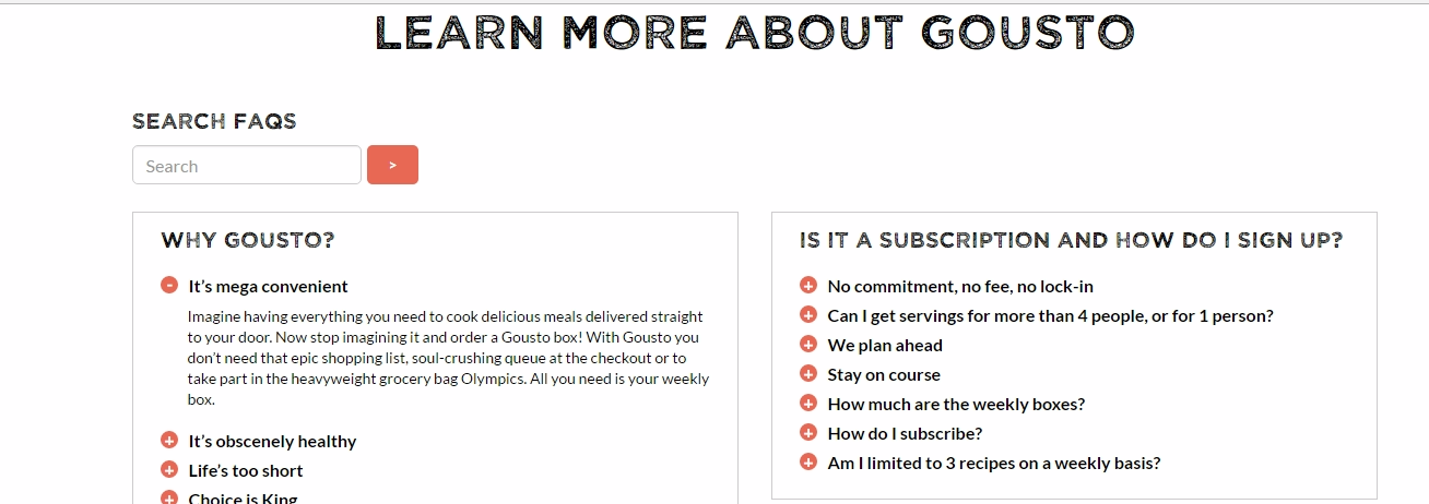
Clearly a good FAQ page should answer questions, but this one caught my eye as it does so in a fun and appealing way which suits the brand?s voice.
I love this comment:
?With Gousto you don?t need that epic shopping list, soul-crushing queue at the checkout or to take part in the heavyweight grocery bag Olympics. All you need is your weekly box.?
Yum!
If I had a criticism, it would be I would place this text on the front page. I have seen Gousto?s marketing materials in real life, and was really impressed with the packaging too (and the recipes).
3. Says What It Does On The Tin
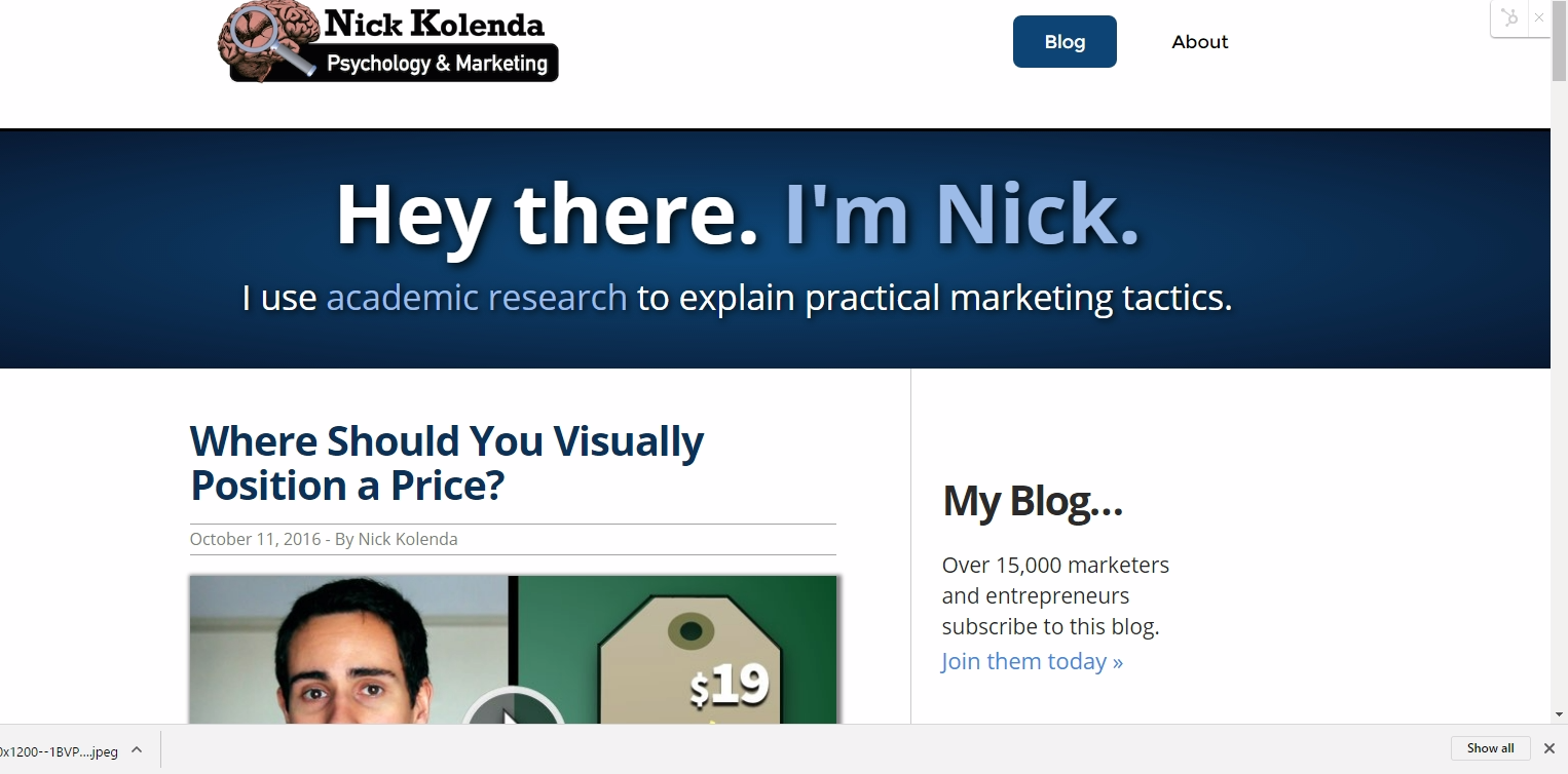
Nick Kolenda
This great and super useful site tells you exactly what it does on the tin.
?Hey there, I?m Nick. I use academic research to explain practical marketing tactics.?
That?s it?and really that is all you need to know.
There are no ?power words?, no ?special? persuasive language. Just simple, clear and specific copy.
You don?t even have to scroll the page and your eyes are drawn to the fact that over 15,000 people subscribe to his blog?giving him instant authority (and appeal).
Kerching!
4. About You But About Them
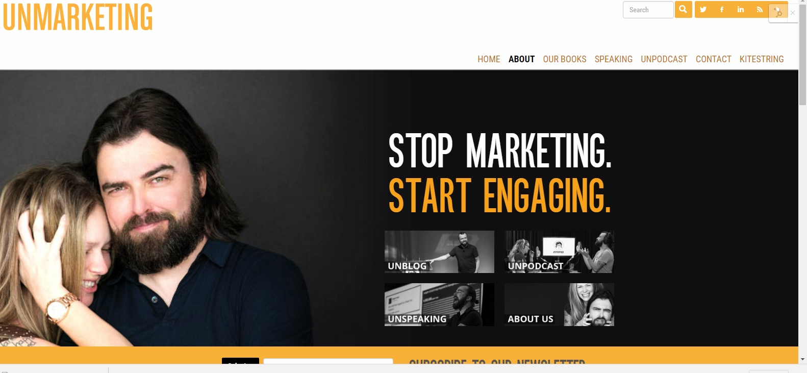
Unmarketing
You?ve heard that your About page shouldn?t be all about you, but about your target audience and what you can provide them with, right?
Here?s one that is about them but about you at the same time?but you don?t even know it.
There?s a bit of personal stuff, a bit of humour, and a bit of pro. What?s more, not only do they come across as an authority but also as friendly and likeable, the sort of people you know you would get on well with over a few drinks down your local.
It?s what they don?t say which is appealing.
On the face of it they are going against all you have been taught regarding About pages?or are they?
ROI job done!
5. Leverage The Power of The Tribe (and become part of a winning squad!)
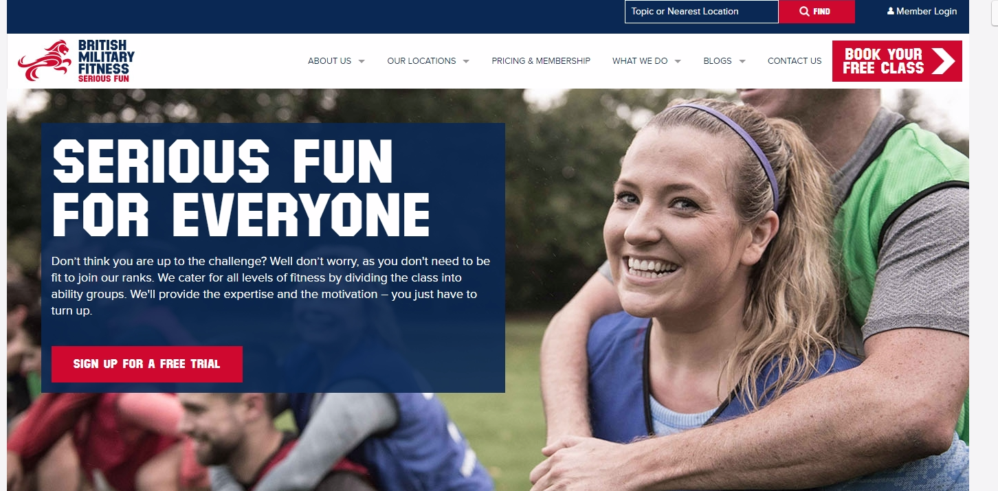
British Military Fitness
?Serious fun for everyone?
Serious and fun. That spells results.
The copy then goes on to allay your fears about your fitness level, no matter what your ability?you are part of the squad.
Being part of a tribe is very compelling, and who doesn?t want to be part of a team of A list fighting fit warriors?
It?s all about being part of the ?Team?, and they don?t even mention that 4 letter word above the fold.
Now that?s what you call military precision.
6. Live There
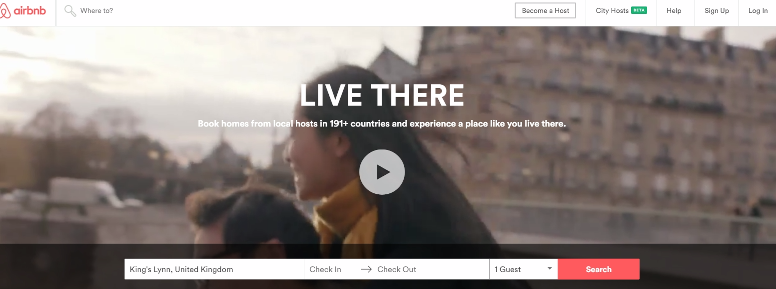
AirBnB
I so tried not to add this one as Airbnb gets quite enough coverage. But the fact of the matter is, although it is a very visual website, the copy does a lot of the lifting but you barely even notice it.
Don?t believe me?
Imagine the site without the copy, it simply does not work. The images alone do not tell the whole story.
The copy allows you to ?belong anywhere?.
The Wild Card
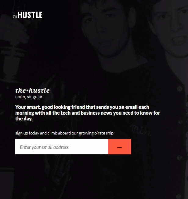
The Hustle
?Your smart, good looking friend that sends you an email each morning with all the tech and business news you need to know for the day.?
This is a personal little favourite of mine.
Who doesn?t want to pop their name in the sign up box? If I were to write it?well, I might turn the emphasis on you being the smart, good looking one.
Because you are. 😉
A Final Word
The above examples illustrate just some of the components I liked about the websites from a copywriting perspective.
Of course, a ?one size fits all approach? doesn?t work for everyone, each business is different with a different brand voice and a different audience.
When it comes to copywriting, sometimes the ?rules? you have learned in theory can be turned on their head in practice, although generally speaking the underlying principles remain the same. All these examples include some key copywriting fundamentals; features tell ? benefits sell, scarcity, social proof, desire etc.
As I have said before, if you want to be a successful copywriter you need to be looking at copy all the time?never stop learning. I am forever viewing other peoples websites, it?s the way I learn and evolve. I can then pass that value and knowledge on to my clients.
Copywriting is more than just writing, it?s about ideas and problem solving.
You will know you are doing it ?write? once your copy starts converting.
It?s not rocket science, but it does require a little word magic.
