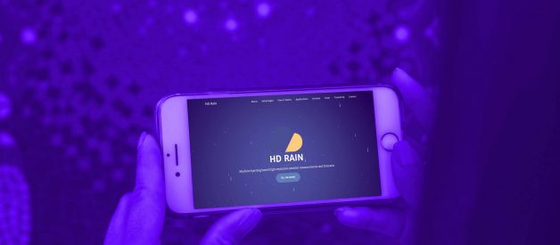
Get your visitors to stay 25% longer on your page, reduce your bounce rate and make people come back to your website thanks to an interactive website background.

Your website is your main showcase and it should reflect your culture in the best possible way. Moreover, it?s also your main objective to attract visitors? attention, inspire them, get them interested in your business while introducing your products and/or services. Multiple ways to do that exist and one of them is to provide an interactive website background. Indeed, this kind of effect has multiple advantages: increasing 25% the time spent on a page, reducing up to 35% the average bounce rate and hence, making people come back to your website (+40% returning users rate).
In this article, we focus on 6 examples using great and efficient interactive backgrounds for websites and build with different methods. Let?s discover them!
?
1. Veritystudios, luminous particles ?
Creating a brand universe is one of the top priorities for both B2C and B2B business nowadays, and before spending too much in an agency, you can give your universe some substance with just a background.
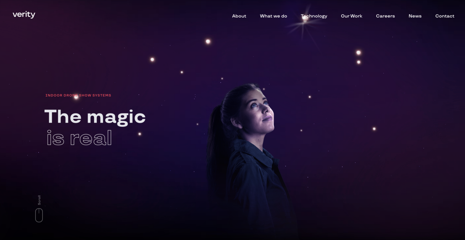
Veritystudios website using Three.js
Verity does not only sell indoor drone solutions but magic. They designed an interactive background using custom code to make visitors feel it, with particles moving and a light synchronized, giving a cool depth effect, and a slight animation on the background when moving the mouse. Using code languages such as BabylonJS or Three.js allows creating your own experience which perfectly fits the atmosphere you want to offer but requires more technical abilities.
?
2. HD Rain makes it rain ??
Usually, backgrounds are abstract, pieces of art and shapes. But sometimes it gets more real, and when it matches with what the company does, it creates an amazing experience.
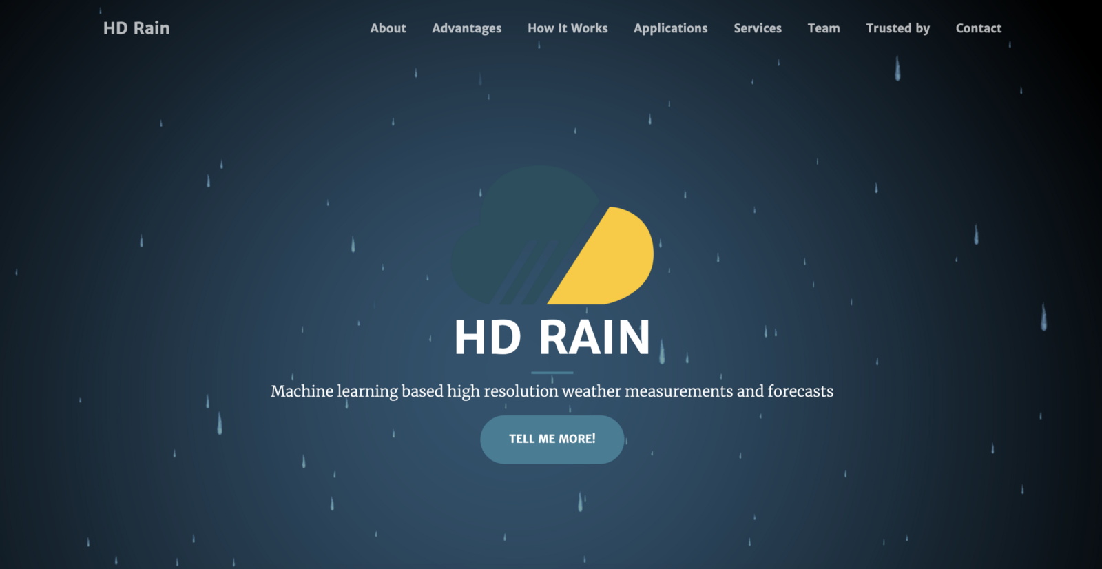
HD-Rain provides a rainy effect on its website with Naker.Back
HD Rain is a weather forecast startup based in StationF in Paris, and wanted to give an experiential boost to their website, to make weather cool again!
Using Naker.Back, our nocode & free tool to create interactive backgrounds from just an icon, they made it rain in less than 5 minutes from creation to embed, and as a result, saw an increase of time spent and returning users!
?
3. The networks of Fabio Lamanna ??
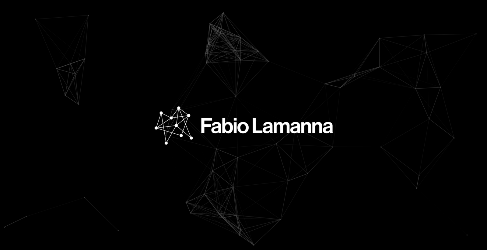
Website build by Fabio Lamanna using Particle.js
Using your logo as an inspiration for your background is always a good idea. Great web experience is not only a sum of different things but a coherent combination. In this case, Fabio lamanna used well Particle.js, a JS library to create particle effects, well known for its nice network effects.
It?s super effective especially because Fabio works in the transportation networks field. The interactive background is the icing on the cake of its website/ portfolio!
?
4. Fly in the sky! ??
When you navigate on the web in 2020, you sometimes need a pause. All these lookalike websites, all these marketing pop-ups, and everything? So you close your eyes, you are above the clouds, flying in the sky!
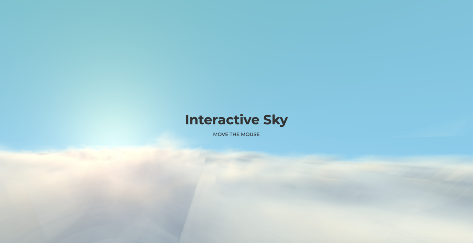
Interactive sky using Vanta.js
But you can also visit the interactive sky made on Webflow with Vanta.js! This amazing performance is a poetic break, to show you how far we can go with a background. Vanta.js was a project made by the guys from Strikingly and is a list of templates like this one, which you embed with a few lines of code.
?
5. My bubbles, my bubbles! ?
If you ever have seen Finding Nemo, you know some fishes (I guess it?s the same for human beings) love bubbles. So why not using them on your website?
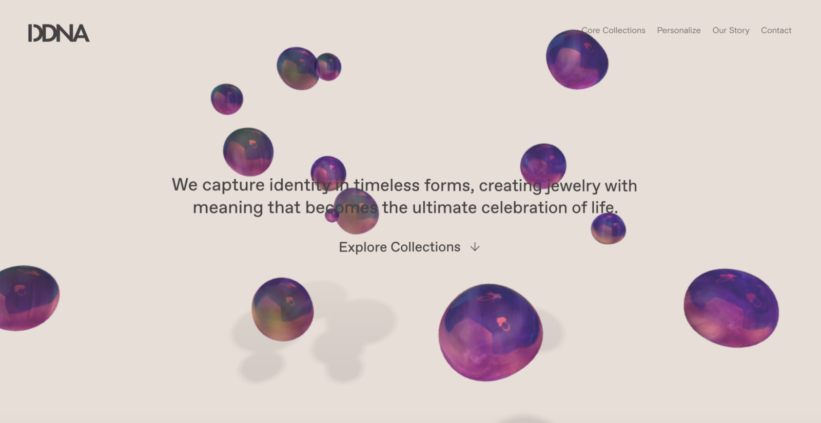
DDNA using custom code for their interactive background
DDNA is a Jewelry company that decided to play with shapes and colors to have a very minimalistic but efficient website background. The bubbles, who can represent somehow the spirit of future jewels, are floating around in ecstasy (so DON?T STOP ME NOOOOW) with nice colors and a cool shadow effect. Really not the typical jewelry website you are used to visiting, that?s why you will remember them!
?
6. The universe of Damian ?
We usually say that creating an experience implies to create a universe. That?s maybe why astronomy is a quite common source of inspiration for many designers.
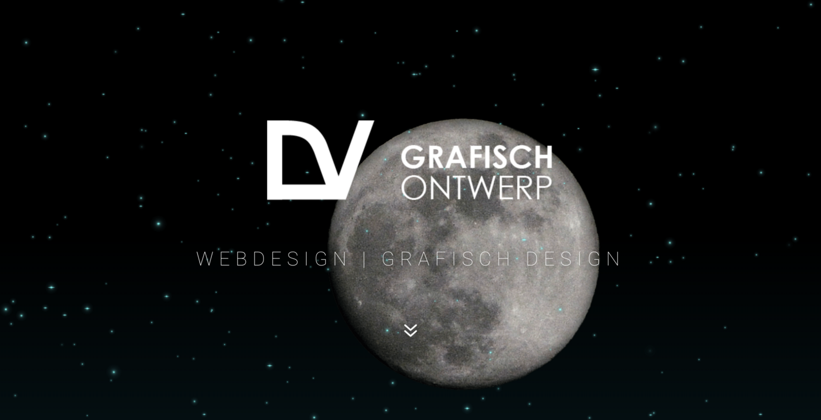
Spatial design for Damian Devos, keeping its background image with Naker.Back particles
But to stand out, Damian Devos decided to give an interactive boost to its stars, creating instantly a wow effect and giving a depth feeling on its homepage. It?s also a way, on a portfolio like this, to show the technical capabilities of the designer. This background was also made with Naker.Back, using a star icon, give them two different directions and adding mouse sensitivity, all that super quickly and for free.
?
