
 Illustration by Dominik Korolczuk
I work as Senior UI & UX Designer for App?n?roll ? a Warsaw based venture building company.
As you may know, today?s design requires taking care of various types of screens and sizes so we designers have to make the results of our work as responsive as possible. That may cause some problems, especially when it comes to fitting a huge amount of data into narrow mobile phone interfaces.
The reason I decided to share the solutions with you is the fact the most common things I struggled with were data tables.
How to fit a wide data table on mobile screens without losing its purpose and readability?
I found 5 common solutions to handle data tables on wide screens such as smartphones or tablets in vertical mode. You can use it immediately in your daily work as a designer ? let?s go!
Shorten
The most straightforward one, it?s just about cutting out unnecessary columns and keeping the table concise by leaving the crucial data only. The example below shows the Bloomberg website with only 4 of 9 columns on the mobile view.
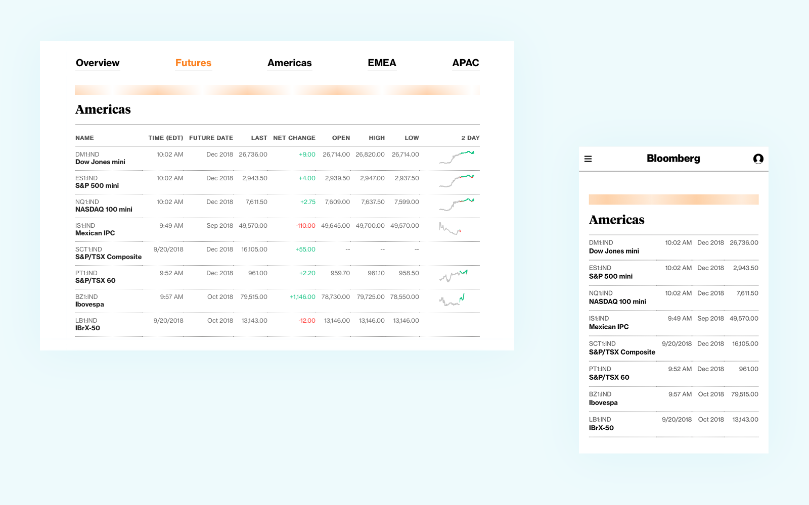 Source: https://www.bloomberg.com/markets/stocks/futures
Applicable
- any kind of data
- various types of content
Pros
- easy to use
- easy to develop
- simplicity
Cons
- limited space for data presentation
- need to resign from part of the data
If you don?t want to drop any of your data, the other solutions may be a better fit for you.
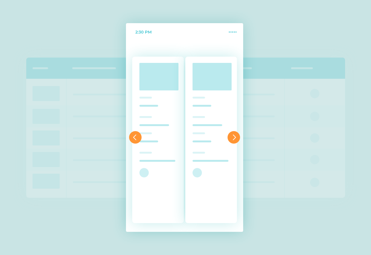
Moveable
This solution is not quite responsive but easy to use and fast in development. It?s just about using swipe gestures to scroll through the whole table horizontally.
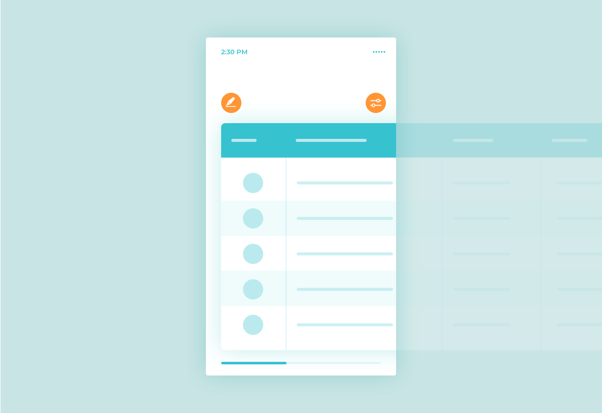 Moveable responsive data table
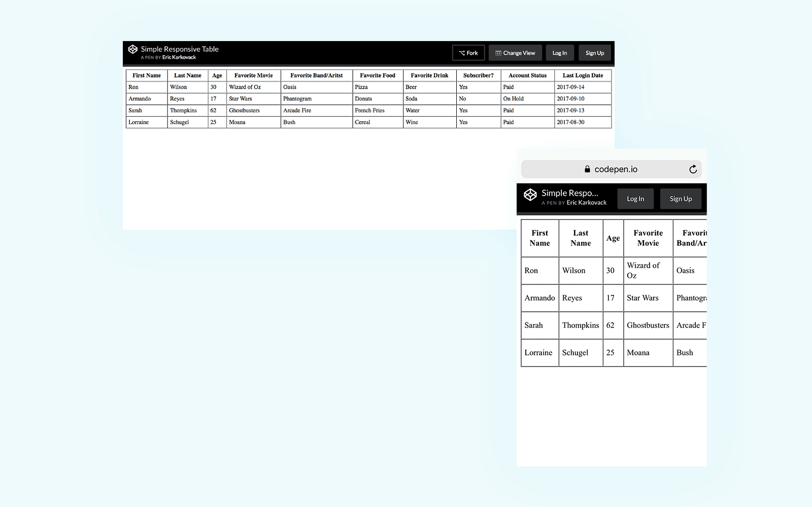 Source: https://codepen.io/karks88/pen/jGrjdW/
Applicable
- for wide tables (3?8 columns)
- for short tables (recommend to keep all height of the table above the fold)
Pros
- easy to develop
- easy to use
Cons
- not for large amounts of content
- the legend is not visible after scroll
Extras
- focus mode to markup the whole row to make sure that we?re looking at the proper data while scrolling
- filter columns ? hide and show particular columns
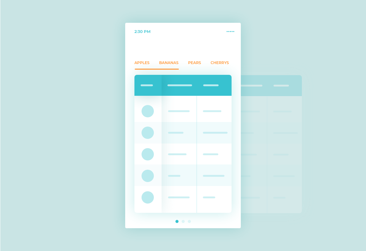
Collapsed
This solution is fully responsive, everything is visible without scrolling and columns are navigated using swipe gestures. The primary column (legend) can be fixed in one place so we don?t lose the context of data.
 Collapsed responsive data table
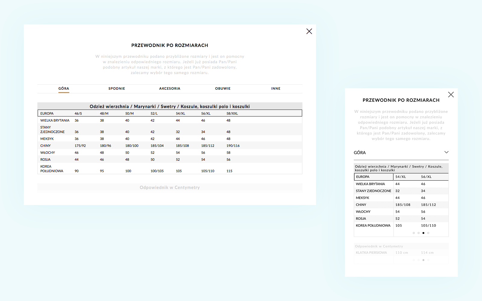 Size guide table at http://massimodutti.com
Applicable
- for short columns
- for short tables
- useful when swapping columns into rows
Pros
- easy to use
- the legend is visible all the time
Cons
- for short data only
Extras
- tabs representing columns can be used to navigate quickly
Transformed
It?s a bulletproof solution for the toughest tasks. The main rule is a collapsing of the table rows into separate cards.
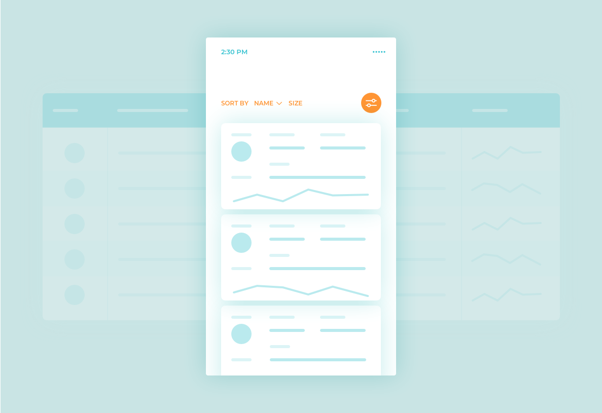 Transformed responsive data table example
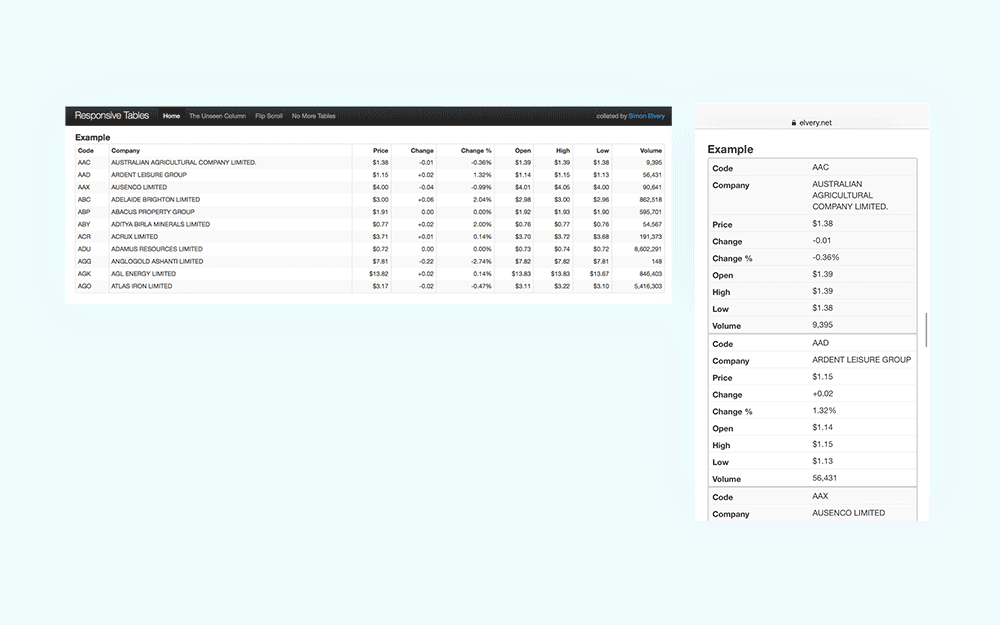 https://elvery.net/demo/responsive-tables/ (No more tables)
Applicable
- a huge amount of data
- various types of content
Pros
- useful with a huge amount of data and its size
- ability to collapse and hide some data
- a versatile form of data presentation
Cons
- repetitive column names
- hard to compare particular data between rows
Extras
- ability to filter and sort the content with ease
- ability to divide the content into separate pages
Comparing
This one is strictly related to the Transformed example but it deserves to be explained more. This solution may be very helpful when we want to compare the columns. For example, an offer or product functionalities.
It?s also a similar to the Collapsed one I described above but it is ready for a larger amount of data. All we need to add is easy navigation through the whole table, displaying only two columns at a time.
 Comparing data table
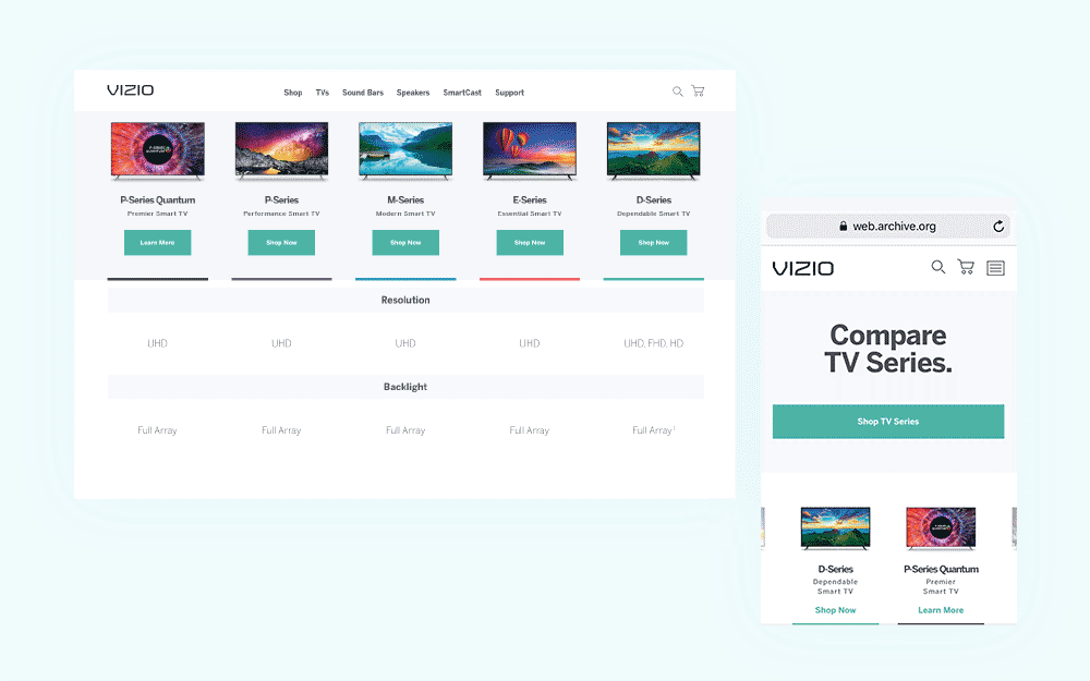 Source: http://vizio.com
Applicable
- various types of content
- large amounts of data
Pros
- easy to compare the columns
- useful in e-commerce
- help making decisions faster
Cons
- you see only two columns at a time
- requires additional navigation
Final thought
The type of solution you choose mostly depends on what kind of data you have. A good practice is the close cooperation with a front-end developer to pick the most reasonable solution in terms of time consumption and technical requirements needed to apply.
If you find this article useful please don?t hesitate to share it. I?m going to write more in the future. If you have questions or would like to give me some feedback, please comment below.
