Let?s be honest. The user interface (UI) of a video game is one of the least likely things about it to leave a lasting impression on you. You?ll likely remember the tense atmosphere, the intriguing story, the intense combat, a cool quest, or some funny character over some clunky interface that you occasionally pull up to perform tasks that often feel like chores: buying and selling items, upgrading your equipment, or reading up on the lore.
Fortunately, the gaming medium has matured very rapidly in the past two decades. Both players and game studios are aware of the stark difference it makes when an interface is tightly integrated into the game to one that?s slapped on as an afterthought a few months before it ships. The games on this list have contributed greatly in pushing interface design forward, so here?s a countdown of the best video game UIs that completely flipped expectations about what the medium was capable of delivering on.
Developed by Retro Studios
 Immersion of the Space Pirates kind.
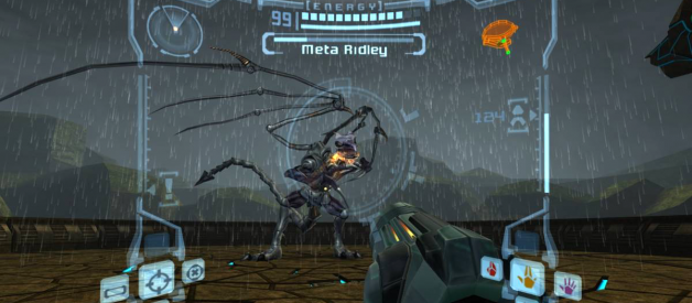
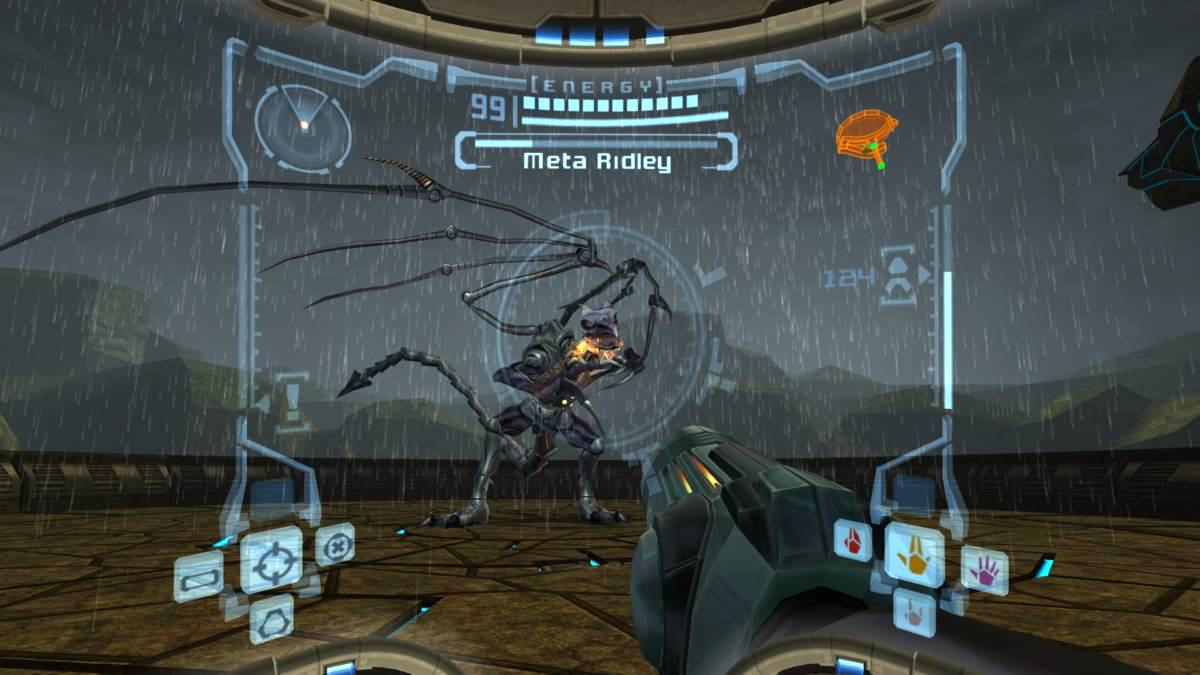
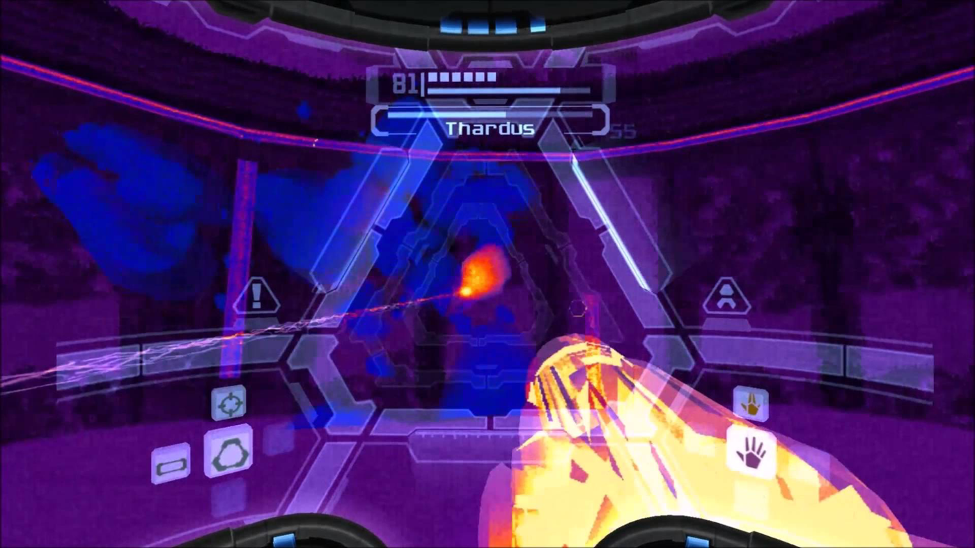
Kicking things off is the game that truly sold designers on how important the interface of a game ends up being to the overall player experience. More than sixteen years after its initial release, Metroid Prime remains a high point of interface design in games and is one of the first successful executions of a diegetic UI in a video game, one where all the interface elements exist directly in the game world (in this case, projected in perspective onto the player?s helmet) as opposed to being layered on top of the gameplay screen.
 Scan-and-learn on the go with the new Helmet 5000.
All the game?s information and systems are communicated to the player directly through the helmet HUD, almost never breaking out into its own interface screen. It even had subtle counter-movements when you turned the camera around, and each individual interface element had offset jitter movements every time some intense action was happening around you, adding up to one of the best ?screen shake? implementations in a video game.
 When your helmet doubles as your pocket mirror.
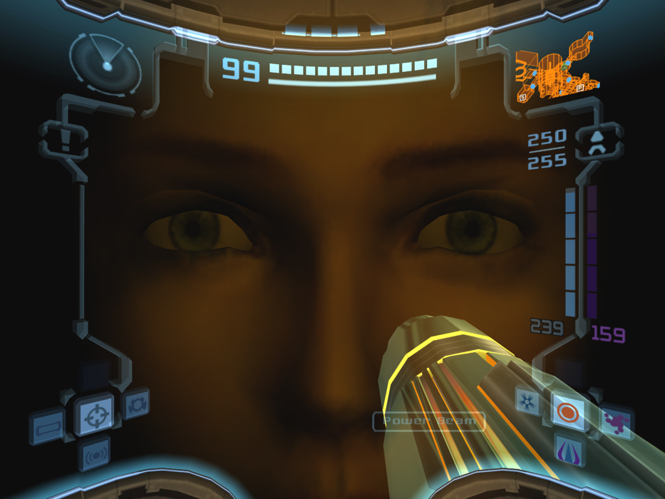
This really sold the immersion in the game, as it truly made you feel like you were looking at the world from inside the helmet. The cherry on top was that certain flashes of light would occasionally allow you to see a reflection of Samus?s terrified face on the inside of the helmet, leveraging it brilliantly for emotional tension and character building beyond simply having the helmet be a glass veil that existed just for the sake of projecting UI elements onto it.
 Pop on the Thermal Visor to apply a retro ?70s color palette theme to your UI.
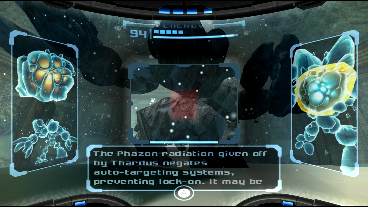
The game?s true UI flag bearer is its Scan Visor. Scanning objects and enemies in the world is sort of an optional game mechanic that you do at your own pace. The game rarely ever forces you to do it. If you see something interesting, you scan it, and the Visor HUD does all the lore exposition about the enemy or the object. It never made you navigate to a lore menu buried in the interface or read up on it in a bestiary. Everything happened on the Scan Visor HUD. This aligns perfectly with the character design of Samus and the gameplay intent of the world, making her feel like a true explorer uncovering the mysteries of the world by scanning things around her.
 X-Ray Visor: For the times you really wanna double-check the negatives.
There was a very tight and satisfying integration between the controls and the visual feedback on the UI here. It made interacting with the elements in the world feel like a little mini-game in itself, as you were always on the lookout for interesting things in the world and would want to scan them to see what the Scan Visor would do in response. It truly made you feel like you had agency over the interface. Source Gaming has a great article on it further detailing the triumphs of the Scan Visor HUD as a gameplay mechanic.
 Fallout 4?s translucent Power Armor HUD: It?s a car dashboard but in a massive exoskeleton stomping around in the wasteland.
Revolutionary for its time, Metroid Prime influenced an entire slew of games to aim for diegetic interfaces in its world as an immersion mechanism. You can trace the inspiration for the Power Armor HUD in Fallout 4 directly back to Metroid Prime, where all the futuristic bars and status indicators in the game get temporarily replaced by analog dials at the bottom of the screen, simulating a helmet HUD that shakes with every powerful footstep.
Metroid Prime has one of the most memorable sci-fi interfaces in a video game and is still cited by veteran designers to this day as the catalyst for their decision to create and build game UIs for a living. Check out Space Ape?s UI Breakdown of Metroid Prime for an in-depth analysis of the HUD and a glimpse of how the game?s art direction plays directly into the interface?s strengths and enhances its gameplay effectiveness.
4. Assassin?s Creed II
Developed by Ubisoft Montreal
 Random access memories: Casually assassinating famous Renaissance figures.
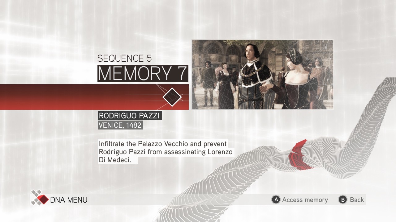
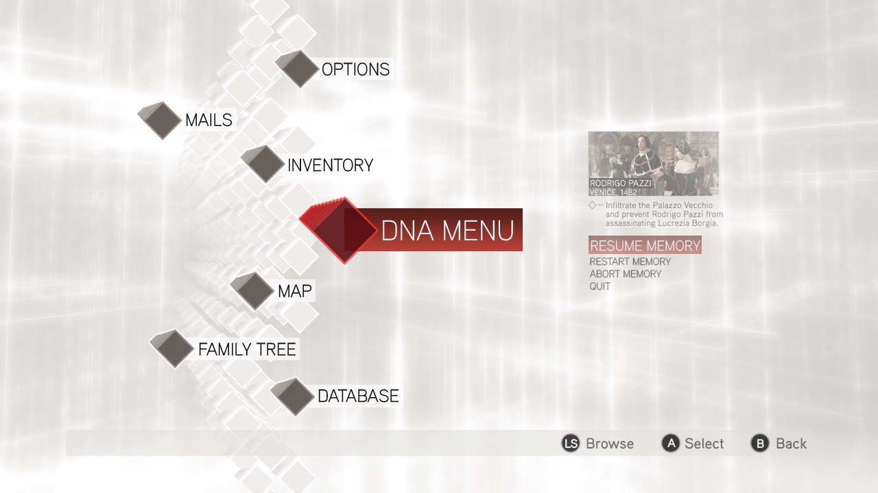
The Assassin?s Creed franchise has always had a really polished UI. The way it contrasts the medieval-era worlds that the player is usually running and climbing around in with the techno-futurist aesthetic of Abstergo Industries is both striking and fantastic. But there?s one Assassin?s Creed game whose interface went way above and beyond what was necessary and delivered an incredibly slick experience while navigating the in-game menus: the Animus interface of Assassin?s Creed II.
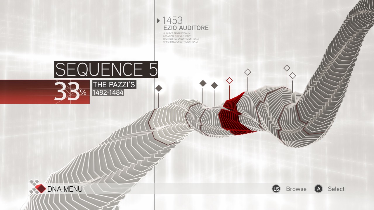 Watch me swirl and twist: This DNA strand had some seriously cool animations.
Taking center stage is one massive, abstracted DNA strand whose ?memories? you slowly filling in by playing through the game?s main story events. There?s a thematic tie-in to the game here, where the player character is physically reconstructing past memories of his ancestor, hence the DNA strand filling-in and updating as you make progress throughout the game. The DNA Menu heightens the importance of this reconstruction by tagging along for the ride the entire way through, visually updating the strand with every major change.
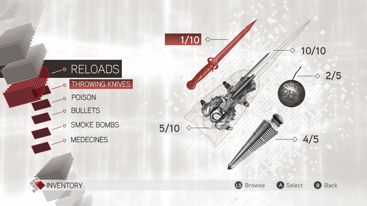 Lemme just re-spec my loadout in this snazzy UI while sitting down on a bench in 15th-century Venice.
The Animus UI isn?t without its jarring moments. When you?re fully immersed in the world of medieval Florence and are running around the rooftop of the Duomo and need to check your inventory before engaging in combat, there?s a weird dissonance when a futuristic interface pops up reinforcing that you?re not really there and that you?re just playing through a simulation. The game usually weaves this into its world well but at times hand waves it away.
 Remember Desmond, none of this is real.
Every time you interact with a merchant or need to buy and upgrade equipment, the Animus UI pops up again where you?re buying Renaissance-era armor in a sleek, modern interface. It?s both cool and strange at the same time. It?s a great concept and when it does yank you away from the world you were in just a few seconds ago, it does so smoothly and elegantly, trying its best not to abruptly interrupt the immersion of the game.
Aesthetically speaking, the Animus UI is gorgeous, at times feeling like an abstract art museum come to life. It?s beautiful, well constructed, and feels good to use. All the translucent reflections and clean lines are incredibly pleasing to look at. The relaxed type hierarchies, minimalist color palette, and the subtle background animations add a lot of flair and style to the interface. The full collection of Animus interfaces from Assassin?s Creed II is available to view on Louis Auger?s Behance gallery.
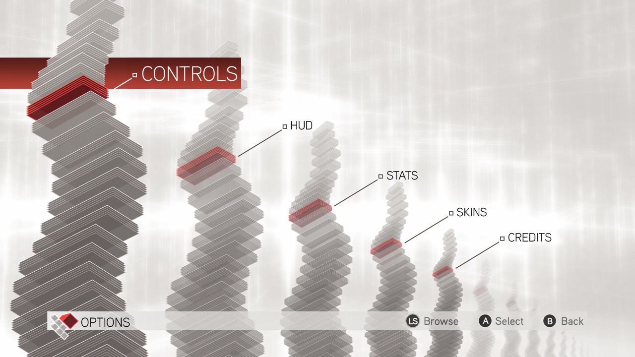 When messing with your controls is so mesmerizing that you forget the button mapping.
The game doesn?t stop there. Every sub-menu and every nested fourth-level menu also does something different or interesting with the Animus theme. Some try to add visual interest to an otherwise boring menu through abstraction and others try to redo the layouts of classical menus to add a fresh spin on it. It really hits home the idea that the entire thing is taking place in a simulation, including you messing with the HUD and controls of the game.
 Just be glad they didn?t force diagonal controller stick movement to select these options.
Overall, the Animus UI was a big hit amongst players and they embraced it with open arms. It became so cherished as an icon of the Assassin?s Creed franchise that players even created custom Animus themes for their phones and desktops. It certainly influenced other games to shoot for thematic UIs within their games as well. The Animus UI evolved quite drastically over the next few games in the series, but none quite matched the refined elegance and restraint with which Assassin?s Creed II treated it.
3. Destiny
Developed by Bungie
 Such simplicity! Such contours!
When Destiny was first announced to be a console exclusive, gamers were highly skeptical. It showcased deep RPG systems in its core gameplay which were usually reserved for hardcore PC games. The menus for those PC games have dense groupings of selectable objects intentionally because it?s quicker to navigate through them with a mouse pointer. So the question on every designer?s mind was how Bungie could possibly translate this to a to a controller layout targeted to a mainstream console audience.
 Less is more: the joystick mouse is back, boys!
Destiny?s interaction design solution to this problem was the free cursor. No longer were you stuck to a rectangular grid of items that you had to painfully navigate through one by one. In an award-winning case study, Bungie even mentioned that they didn?t want players to wear out their thumbs by mashing the D-Pad to navigate through a grid inventory. The free cursor promised speedy selection and highlighting, with contextual hover menus.
It?s got some neat things going on under the hood as well, where it slows down the mouse acceleration as you?re hovering directly over a UI element and then speeds it back up so that you can quickly highlight something on the other end of the screen without accidentally overshooting too quickly or slowly dragging a high friction cursor to the item you want to select.
 Game UI 2.0: The return of fancy hover effects.
Better yet, it even has screen counter-scrolling as you?re moving the cursor around. If you move it to the top-left, the entire screen moves down to the bottom right, making it quicker to access items and allows for more real estate to be displayed on the inventory screens. David Candland has a fantastic GDC talk where he discusses how the team optimized the movement speed of the free cursor in order to have it play well with the flyout menus that pop up while also ensuring that the screen counter-scrolling doesn?t feel jarring.
The practicality of this free cursor design solution is impressive. In Bungie?s internal research, the feel and speed of the free cursor was playtested extensively, ensuring that both FPS and MMO players would understand how to use it and that it wouldn?t get cumbersome after a hundred hours of play. This was a first on a console game and Bungie totally nailed it.
 Attack. Just pick the one with the highest attack.
Inventory management is another aspect that the free cursor handles well. Again, this is tricky in RPGs but Destiny does a great job optimizing it for a console. There?s very little cognitive load on the loadout screens, and most of the dense information is only displayed when the player indicates an intent to view it. Screen transitions to the detail views of items are fast, allowing you to commit button presses to muscle memory and execute actions quickly in a fast-paced multiplayer environment.
 Reach for the Light: Destiny?s cartographic star map.
The visual design of the game is no slouch either. Bungie could?ve easily gone for a sci-fi interface with techno-slanted text, but instead they went for a look influenced by clean Swiss typography and ancient cartography. The goal was to shoot for clarity and mystery. This also works out really well, with beautiful typographic proportions and large 3D models taking up a majority of the screen space that gently guide the player?s eyes through the interface. It all looks like a really well put-together infographic. A gallery of select screens from the game are available to view on Ryan Klaverweide?s Behance page.
 No Man?s Sky with a grid-based inventory free cursor (left) and Assassin?s Creed Origins rocking the slot-based inventory free cursor (right). RIP Animus.
Many other console games with similar mechanics have taken note of Destiny?s success and are starting to replicate the free cursor in their interfaces. A flat design trend is also starting to pop up in where the interface tries to reduce the complexity of a game?s systems by simplifying and nesting its visual display of those systems, thus reducing cognitive load on the player.
Destiny?s UI ended up being highly acclaimed, winning awards from all over the interactive design world with special praise directed towards the free cursor mechanics and the typographic layout of its menus. Many players cite the UI as being one of the most memorable and unique parts of the game.
2. Persona 5
Developed by P-Studio (Atlus)
 Hello chaos, my old friend.
You saw it coming. This list wouldn?t be the same without it. Persona 5 has by far the most stylish, chaotic, insane, over-the-top UI to ever grace a video game. It oozes personality and visual spectacle in every menu, every animation, and every screen transition. The interface is such a big attraction of the game that it keeps players going just to see what the UI for a new gameplay feature looks like. It?s so good that players are cosplaying the menu.
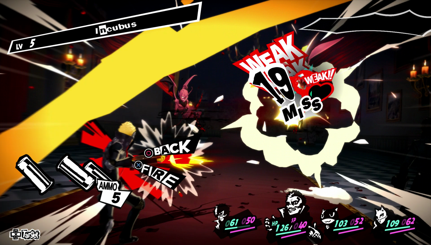 Blink and you?ll miss it! Skull with the critical weakness exploit.
If you haven?t played the game, it might come across as wild and messy. But if you have, you?ll understand why it is this way. There?s a very strong thematic tie-in to the game?s lore with the menus. A large part of the gameplay takes place in an alternate dimension, where everything is a manifestation of the distorted and twisted desires of a person?s mind. The menus to reflect this sense of disorder and chaos perfectly, with its punk-frenzy aesthetic morphing and streaking across the screen with extreme visual flair and elegance.
 Breaketh thy chains of captivity: Persona 5?s overstylized, full-bleed UIs for maximum impact.
The game breaks a lot of design rules when it comes to interface layouts. For instance, it keeps switching up what the shoulder buttons do depending on what menu you?re in. There?s a lot happening with the character customization menus, the in-game economy menus, and the battle menus. It?s important for a game to realize when to break the rules and it?s even more crucial to do it right. Ridwan?s excellent analysis on the UI/UX of Persona 5 comes highly recommended, which summarizes in great detail the tradeoffs the game often finds itself making between aesthetics and usability.
 No prescription needed: having a chill time at the doctor?s office with mood lighting.
Despite having a set red-and-black primary color scheme, the game occasionally breaks its own color palette to really make specific menus and areas of the game stand out. It works in its favor quite well and makes certain actions feel very unique. Regardless of whether or not you like the overall visual presentation of the game, there?s no denying that it certainly grabs your attention and begs you to play around and tinker with its interface elements. Jiaxin Wen has another great analysis geared towards the graphic design of the game, going deep into colors, layouts, and JRPG inspirations.
 When the menus for riding the subway look so good that you just spend all day underground.
It?s hard to imagine how tedious it must have been to conceive a UI like this, much less develop and localize it. The developers themselves even mentioned that they wanted the interface to be a selling point of the game. It?s not uncommon to find yourself staring at a menu for five whole minutes counting the number of typographic styles being used on the screen, and being in awe at how they managed it make it all work. It?s truly impressive how the game maintains practicality throughout some sixty or so unique menus without ever sacrificing its style.
1. Dead Space
Developed by Visceral Games
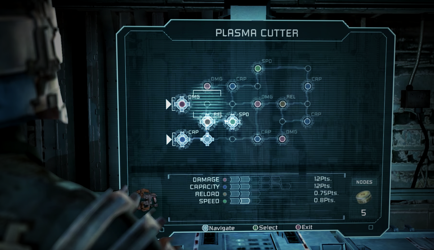
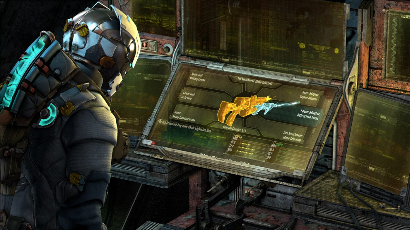 Come on over and mod your weapon on this creepy abandoned spaceship! We have a WYSIWYG interface.
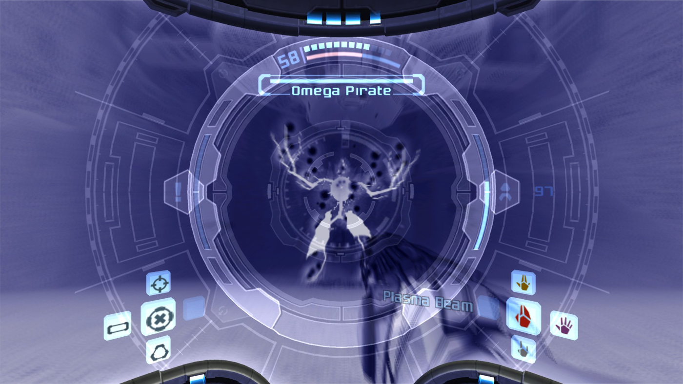
Dead Space is the poster child flagship example of how a diegetic UI can truly harness the power of the gaming medium. It takes inspiration from Metroid Prime?s HUD and extracts the UI out of the helmet directly into the game environment. UI elements aren?t stuck to the corners of the screen anymore, but instead are living in the world all around you. Playing Dead Space was the moment when gamers truly understood how an interface can not only play into the atmospheric immersion of a game, but elevate it to new heights.
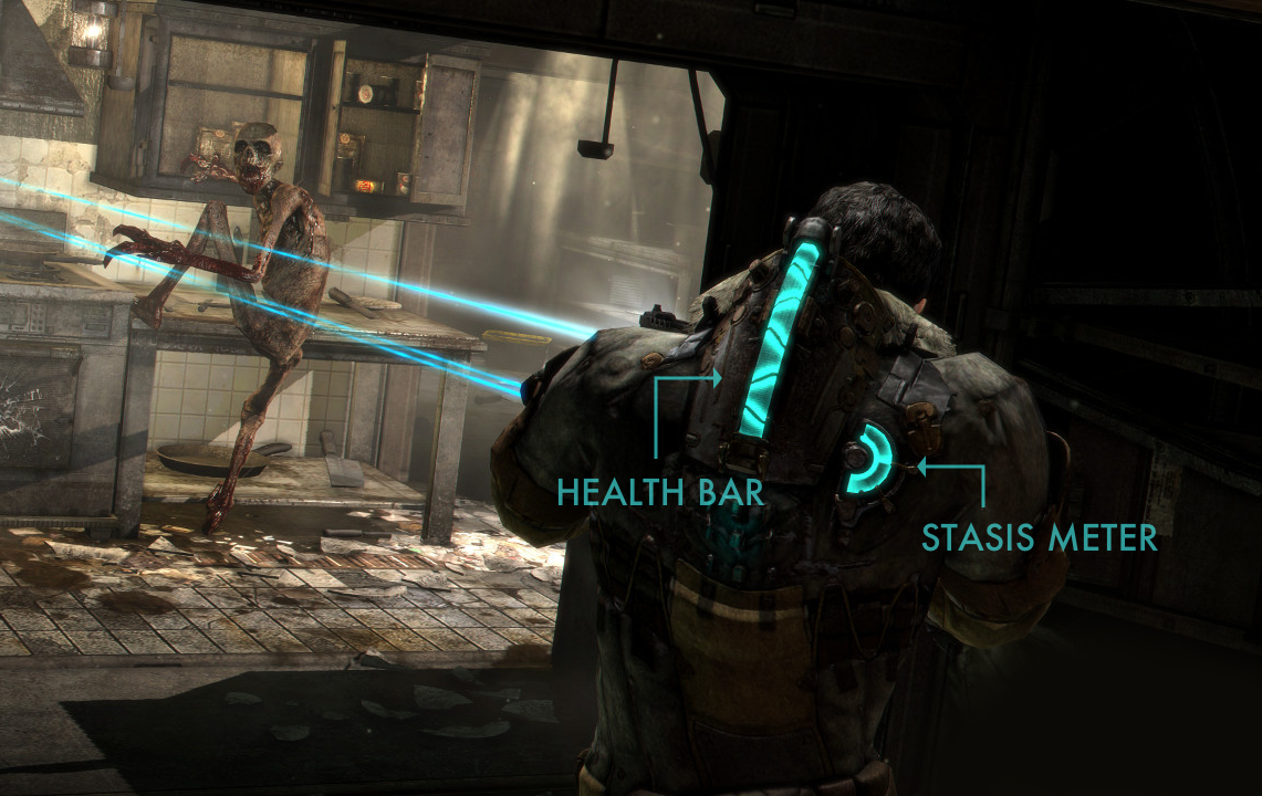 Sup Necromorph: Keeping track of your battery life with a helpful status indicator on your back.
In Dead Space, the player?s health and stasis are displayed directly on the character model itself, with the neon blue bars on the spine showing health and the semi-circle to the right representing the level of stasis. Since the player model?s back is always facing the camera, your eyes are always on it. The game uses a dark/neutral color palette for everything else in the world and with some help from clever lighting, it ensures that these bars stand out no matter what environment you?re creeping through in the game.
 When the Minority Report UI actually works.
Nearly every menu in the game is a holographic pop-up display that we?ve seen so many ?fantasy? versions of in sci-fi movies, but in this case, it?s actually usable. You can pan around it and zoom into it, and its depth and parallax really sells the 3D feel. The player model?s head and hands also interact and react very believably with the floating UI elements.
The brilliant part about this is that it never pauses gameplay. Your interaction with the UI is all realtime. In a sci-fi isolation horror game like Dead Space that relies so heavily on the moment-to-moment tension created by its unsettling atmosphere, this works directly in the game?s favor. The ambient ghostly soundtrack keeps playing in the background and the eerie environment effects continue to swirl around you, making you feel like you?re never safe. This takes the immersion in the game to a whole new level.
 Modding your suit in pitch black darkness, what could possibly go wrong?
While the UI in Dead Space may not be as visually stunning as the runners-up on this list, it?s the tight integration into the game that makes it work so well. The studio planned it this way from the very beginning and made every gameplay element work in conjunction with it. In an interview, the designers even mentioned that the intent was to maintain the tension and thrill of gameplay in every aspect of the game, including interaction with menus.
 Go for the critical path: Upgrading weapons in the holographic UI.
In a developer diary, the UI Design Leads even mentioned that they wanted the interface to feel like they were there for Isaac (the player character) to interact with, not just have it exist in separate screens to serve some specific gameplay purpose. It needed to make sense in context of the game.
At the end of the day, it?s not the flashiness of the UI, but instead how well the interface blends in to the game?s tone by perfectly complementing the atmosphere and feel of its world that makes Dead Space sit comfortably at the top spot on this list. This is what every game interface should strive to do, and Dead Space set the bar so high that it?s been tough to match it ever since.
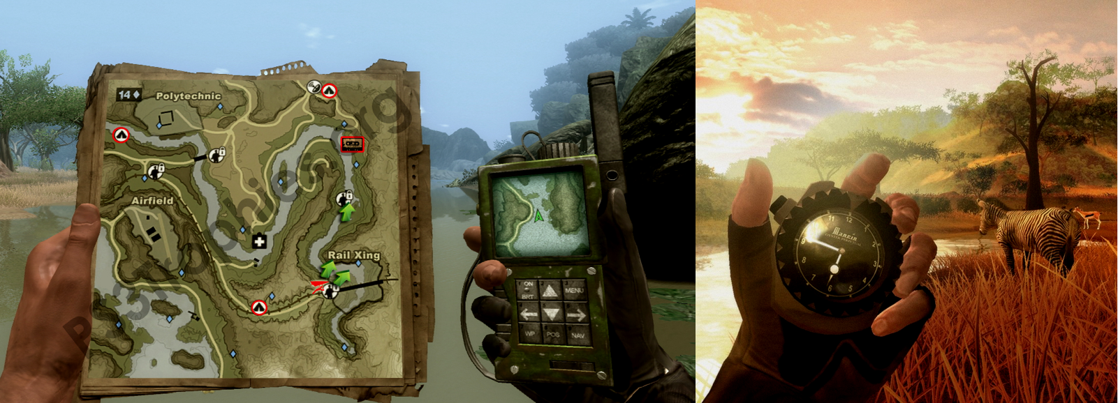 The real reason why you can?t dual-wield weapons in Far Cry 2.
You don?t have to be a sci-fi game like Dead Space or Metroid Prime to pull off a diegetic UI. Notably, Far Cry 2 implemented a version of it very well, where the in-game map and compass are actual 3D game models that the player pulls out to reference repeatedly. Watch Dogs also managed to pull off a stylish, semi-diegetic overlay UI successfully with its ctOS interface.
To learn more about how the UI of Dead Space came together, check out this fantastic GDC talk by Dino Ignacio about the work involved in conceptualizing it and how it evolved over time into the version that shipped with the game. There?s no denying the impact Dead Space has had on the games that came after it, and it?s going to be an interesting day when a better integrated diegetic interface finally topples it from the top spot on this list.
Good design is invisible
The most obvious contenders for the best game interfaces are the ones that are most visually striking ? like Assassin?s Creed II and Persona 5. Then there?s Destiny that adds a unique interaction which makes navigating the menus so playful and intuitive that you forget it even exists after a few hours. And finally, there?s games with diegetic interfaces like Metroid Prime and Dead Space that integrate the UI into the game so well that you don?t even think of it as a separate element of the game. It all blends in seamlessly.
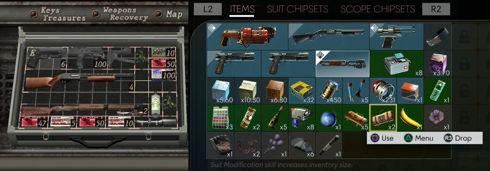 Resident Evil 4 popularized the ?visual grid? inventory system (left) where better items take up more space, forcing players to do some mental tetris optimization in their heads. Organizing your inventory turned into a minigame in itself. Prey does the same thing with a modern spin on it (right).
Beyond the ones listed above, there?s an incredible wealth of games out there that do some truly out-of-this-world stuff in their interfaces. Many of the fascinating ones are one-offs in a specific screen or interaction in the game?s menus. YouTuber Design Doc has a great compilation video series that sums up most of them (along with examples of bad interface design in games). Over time, game UI designers have been riffing off of each others? ideas from different games and have been improving upon it, resulting in better and more refined interfaces that we?re seeing in modern games.
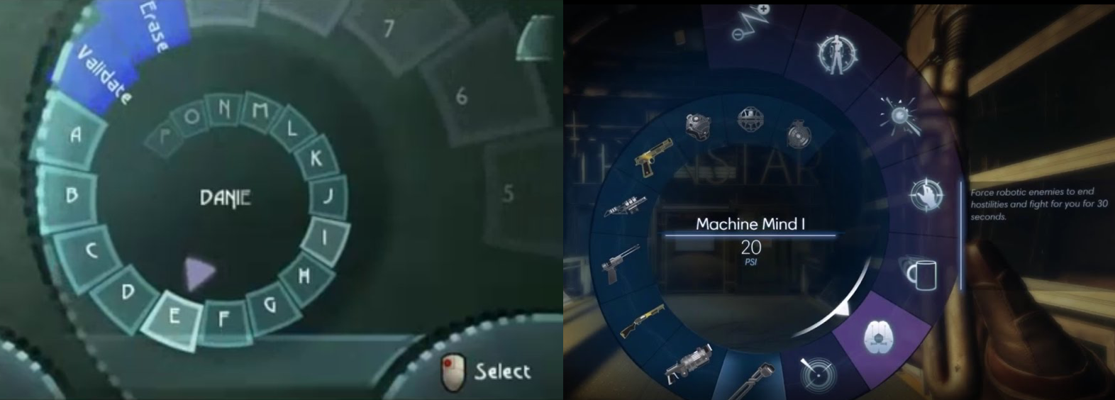 Beyond Good and Evil?s keyboard input wheel (left) attempted to ease the friction of keyboard text inputs with a massive alphabet spiral that you spin through. Prey?s favorites wheel (right) does the same thing when you start acquiring too many weapons and powers, scaling infinitely into the screen.
Interface design in games is an under-appreciated aspect of the medium in general, and the games on this list serve as a testament to their power when executed right. Some of them have great HUDs, some have fantastic menus, and some are just downright delightful to use. You can go broad integrating a consistent interface across the entire game or go deep into one specific interaction model and tweak it to perfection. Either way, a thoughtfully implemented interface only serves to heighten the sense of immersion and engagement that players feel in their relationship to the game, which is exactly what we?re all trying to shoot for at the end of the day.

