This just in! Check the all-new Web & Graphic Design Trends post for 2017!
As a web & graphic design agency with an accent in visual storytelling, my team and I need to pay close attention to the everchanging trends of design, on and offline. These are what I believe will be the 16 most prominent trends of graphic design in 2016.
Why is this important to you, even if you?re not a designer? Well, if you spend lots of hours writing your blog, wouldn?t you like to stand apart visually? Jump on board these trends before everybody does:
In 2016, design will be all about the user. User experience (UX) will indeed be the new black.
No one will care about how cool your design looks, if it?s not usable.
Engaging your users really comes at the front in 2016. It will be really difficult for you to grow your online business if you don?t take user experience into account.

Google?s algorithmic changes, customer behavior data? They all point in the same direction, and that is ?your website needs to load fast and be easy to use?.
Page Load Speed is a great issue with ecommerce sites. Adding just one second of bloat to your site means sales drop by 27%. So while everybody wants a site that looks cool, they will surely choose fast over too cool.
2. Responsive Design
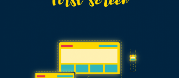
We all know a responsive site is not optional anymore. Today, mobile is already the ?first screen?. When it comes to rankings, Google is literally crushing sites that don?t offer a mobile-friendly experience (their latest Quality Search Guidelines For Raters say so).
Usability is very important in all platforms. And since mobile is now the first screen, user experience on mobile phones is key. A good responsive design will have perfect usability on mobile screens. Hiding a desktop function for mobile users is not an acceptable solution anymore.
As a rule of thumb, if your users can?t fully experience or enjoy your website while using their phones on their daily metro commutes, then your whole site needs to be revised.

In 2016, all your graphic design and artwork will have to adhere to the rules of responsive. Which means ?no one size or format fits all?.
Responsive design will reach logos, banners, hero images and just about any piece of visual content you can think of.
The best example of this is the recent Netflix brand redesign. They unveiled a new visual identity, rebranding their logo and all graphic materials, but they did it following responsive design principles.

Image credit: Webdesigner Depot
What matters to designers is that branding assets don?t need to be awkwardly squeezed onto mobile or tablet screens anymore. The cropped logo used by Netflix is a way of achieving this. By offering just a glimpse of the brand identity, you get rid of all the noise or white space that doesn?t need to be there, staying 100% responsive at the time.
Expect to see a lot more brands going this way in 2016.
3. App inspired web design
Not surprisingly, people are getting more and more used to faster browsing experiences in native apps. Designers have long proposed that websites should learn from app design?s quick wins (speed, zero distractions, tailored user experience).
Now, marketers are catching up on this trend. After a time in which login areas were frowned upon, more businesses will bring them back, either to add app-like functionalities or to add a level of ?exclusivity?, as the web becomes a more and more saturated place.
Remove all unessential information and let the user interact with your content as fast as he can.

4. Clever menus
Some people hated the now omnipresent Hamburger Menu or navicon. It was just a first step, if a bit awkward, in the direction of more intuitive navigation. Now, say hello to clever menus.
Hidden navigations that appear out of nowhere depending on the user?s actions will soon be the norm. Again, the key concept here is that users shouldn?t be distracted from what?s really important at any given time.
Even if we can?t see it at the moment, experience tells us that there is a menu on every website. So no need to worry, it will just appear when we need it.

Experts are predicting that clever / hidden menus will be fully responsive to multi directional scrolling. So how will this look like? As this is a new, evolving trend, there is no clear standard, but a variety of shapes and forms.
Designmodo has compiled a complete list of top-notch websites with hidden menus, so take your pick.
5. Modules and modular text
No one likes to read a dreadfully long blurb of text, right?
The first trick to breakdown long texts in the web was to try to write in short paragraphs (see, I?m doing it here all the time?) But later, design came to the rescue and offered a modular approach to web page layout.
Modular design is a technique where everything is built using a block grid pattern. But this doesn?t mean a boring pattern, like a chessboard. In fact, it can mean exactly the opposite: hard to anticipate patterns, that make it easy for us to read and be interested in the different parts of a website / brochure / book, etc.
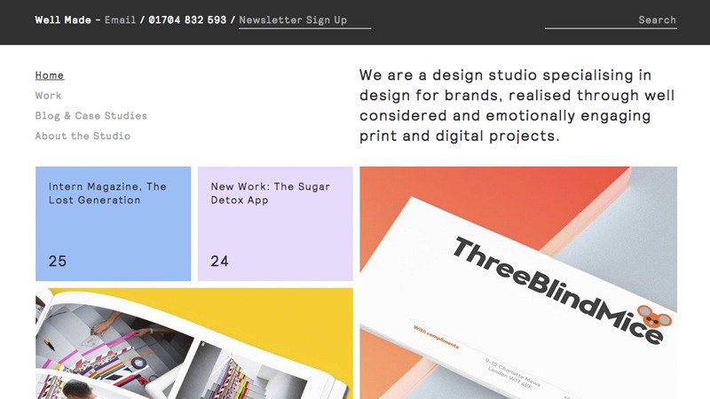
Image: Well Made Studio
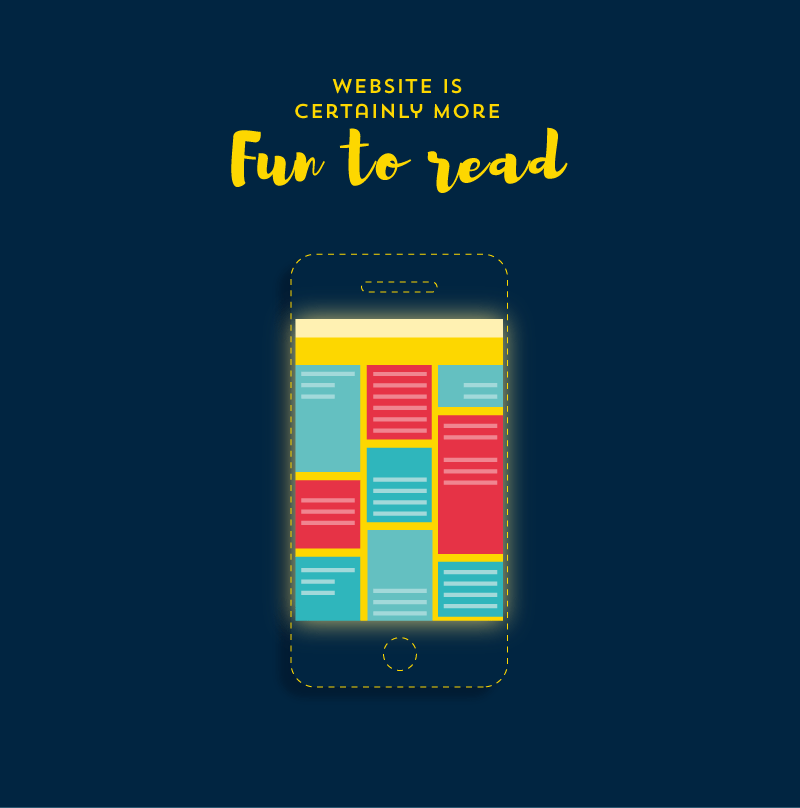
Just like reading a magazine, a website is certainly more fun to read when our eyes can jump from one module to another, and the type of content changes as we hop along.
6. Modular and infinite scrolling
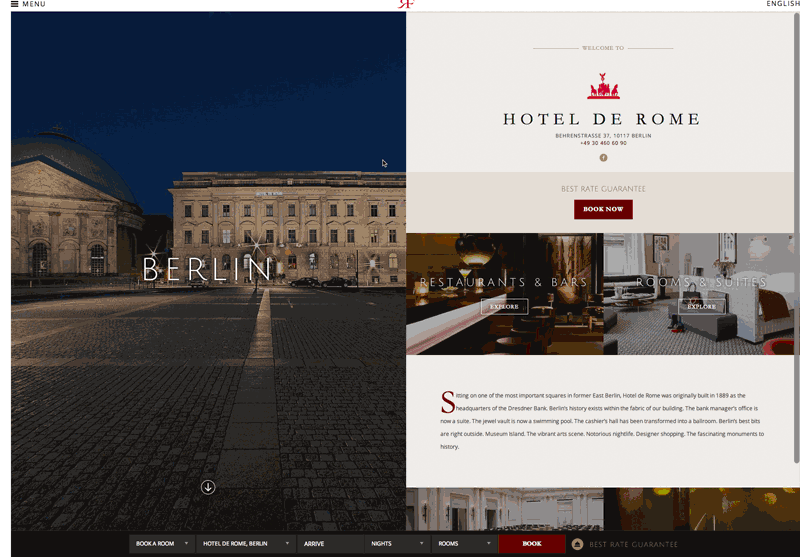
What is the latest move in the whole modular trend? Modular scrolling. Meaning every module on a website may scroll on its own, independently from the other modules.
Sounds too complicated to handle? It really isn?t. In fact, you may have already seen it (though sometimes it?s hard to notice) in sites with a sidebar that doesn?t scroll at the same speed than the main content.
But it?s about to get better. Picture a website divided in two columns with independent scroll, as you can see here:
It all began with infinite scroll. A trend that you may have noticed in 2015. Some of the most popular sites on the world today, like Pinterest, Twitter or Facebook already use it, so why shouldn?t everybody else?
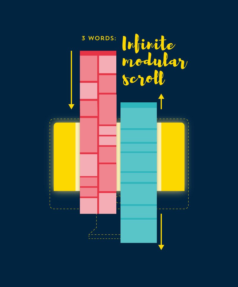
Infinite and modular scroll work on the same premise: scrolling down is easier and faster than clicking and it doesn?t interrupt user experience by stopping and loading another page. This is done by automatically fading in new content as the user scrolls down.
It?s no wonder that social sites like Pinterest and Facebook boast amazing average times on page per user. When the content is right for the audience, infinite scroll may feel extremely addictive.
Time.com?s bounce rate dropped 15 percentage points after they adopted infinite scrolling (source).
7. Material Design
Material design has been appearing in this kind of lists and predictions since 2013, but it wasn?t widely adopted until 2015.
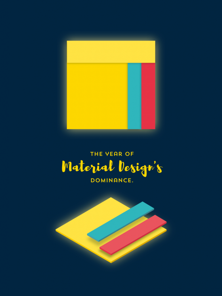
But If you thought 2015 was the year of material design, think again. Material as a trend that you?ll find in websites, apps, artwork, etc. will be adopted massively during 2016. It will be the year of material design?s dominance.
Which means that Google will have won a big battle to Apple ? in the design sphere! Shocking, I know.
So expect to see those long, solid shadows virtually everywhere.
8. Flat Design
Even though material design came along to fix some of flat design?s usability problems, that doesn?t mean flat is dead. In fact, flat design will also grow to be even more popular during 2016.
With a lot of big brands adopting flat design in the last few years, mass audiences are more and more aware of the fact that less is better when it comes to visual style.

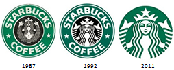


Images credit: Brafton
What?s more, flat web design has another UX advantage: image files weigh less and do not add an unnecessary burden to page load time.
The general guidelines of flat design will be widely spread around small brands and blogs artwork all over the web (eg, ghost buttons). At the same time, those on the know on graphic design will be moving on to Flat 2.0 (an evolution of flat design that incorporates some three-dimensional effects to make it more usable).

9. Visual Storytelling
You?ve been hearing marketing gurus here and there talk about storytelling as the next big thing. Well, guess what the next really big thing is? Visual Storytelling.
Did you ever hear the saying worth a thousand words? So then you know why visuals will work much better than just text to make your story feel true and alive.
Some data:
- 100 million people worldwide watch at least one video per day.
- Website visitors are 64% more likely to make a purchase after watching a video.
- 80% of viewers recall watching a video ad up to 30 days after seeing it.
- 92% of those watching video on mobile devices share the content with others
- Human beings process visual elements 60,000 times faster than reading words. (Source)

10. Infographics
Do you know a better way to convey stories or pieces of information than with a neat infographic?
There?s a reason why infographics have been a hot trend on just about any digital marketing channel: social media, SEO, content marketing? Everyone loves a good infographic, and above all, they love the results: infographics are shared 3 more times than any other piece of visual content.
Alright, I may be a bit biased here, as infographics is what I do for a living.
Anyway, what kind of infographics are we going to see generating buzz in 2016? I think the time of boring old infographics based on the same old templates are about to fade away. Putting three or four bullet points and adding a few cute icons just won?t cut it anymore.

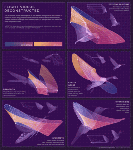
It?s time to mix infographic storytelling capabilities with the deep insight of data visualizations. Infographic and big data together? Sounds like the wildest dream of trendy online marketing gurus, but it?s already here.
Just see some of these pieces of art by some of my most talented peers:
The Sleep Schedules of 27 of The Greatest Minds In History

How 5 Different Animals Flap Their Wings
Maps Of Countries Made From Regional foods
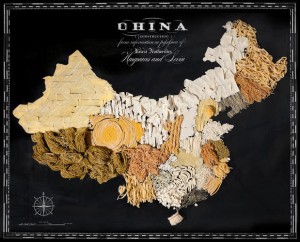
Luckily, we?ll be seeing more and more of these in the near future.
11. Cool Typography
One thing that a good infographic almost always has is one or two cool fonts.
With typography becoming a key element in any serious branding efforts, broad audiences are getting used to seeing artistic typefaces pop up everywhere.
Typography is a language in itself. A few years ago, only graphic designers were able to talk and understand that language. Today, more people are gaining access to it, thanks to the wider range of available web fonts.
Again, another success for Google, since Google Fonts is a big reason more people have ditched Arial for cooler and newer fonts (though Lobster is already overused; please stop it now, thanks).

2016 will see a comeback of big fonts, italic and all caps for logos and headings. Another big trend here are typefaces that appear to come from someone holding a pen. Accordingly, hand-drawn graphics will also be in (see below).
12. Modern retro
Modern retro is cool. What started as a trend in logo design, is already permeating to every other aspect of web and graphic design.
But there?s a subtle difference in what retro will mean moving forward. Old retro refers to early 20th century, up until the 60s. Modern retro is all about the early days of computer age: think vintage video games, pixel art, big cell phones, Tron, MacGyver? Ok, maybe not MacGyver. But anything that was big in visual style between the late 70s and early 90s is back!
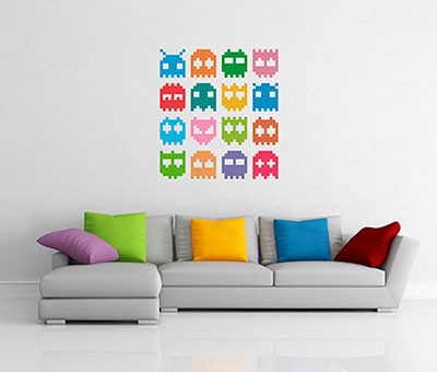
Image credit: Oxygen Agency
Some people refer to this as nerd culture. Call me a nerd, then.

13. Rich colors
When it comes to the choice of colors, the 80s will rule. Prepare for a world of bright pastels and rich, bold accent colors.
?A happier, sunnier place where we feel free to express a wittier version of our real selves?, in the very influential words of the Pantone Fashion Color Report For Spring 2016.
The Top10 2016 spring colors according to Pantone look like this:

Whatever you do, just don?t pick a boring, washed-out color. You?ve been warned.

14. Grids and geometrical shapes
As I said in #5, web design will be more grid based than ever in 2016. So much so, that grid layout is about to become a spec in CSS language.
But grids will not only dominate web design. The same can be said for any piece of graphic work, and this trend also permeates to another big thing going on right now: geometrical shapes and patterns.
This is hardly surprising, since modern minimalist design draws inspiration from the Swiss Style. One of the main principles of Swiss Design is that everything must be planned on a grid system.
Pinterest and all the other card-based web designs out there have paved the way, and now everybody is following suite.
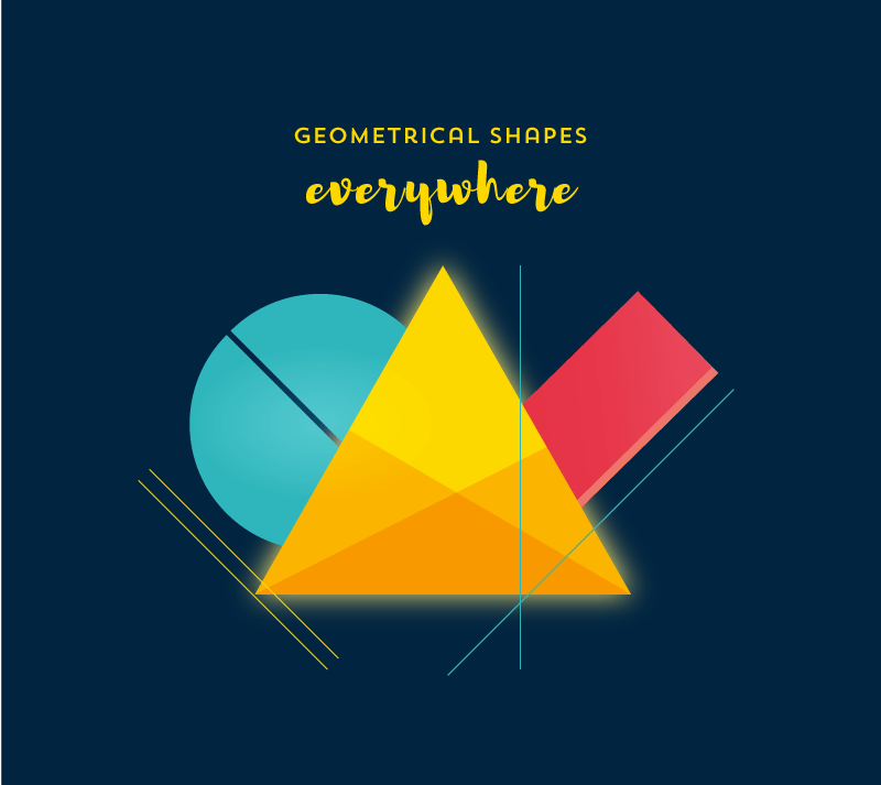
But every trend has its flip side, and experts also predict that, as a response to geometrical shapes everywhere, there will be a rise in free-form shapes. These are just like geometrical shapes, but with dents.
Rough edged and hand-drawn shapes are a signature of neo-grunge, another trend that will gain prominence in 2016.
15. Kill The Stock Photo!
People are finally realising that stock photos are one of the most boring and unoriginal things you can include in a website. This should have happened years ago, but 2016 will be the year that web designers and online businesses start ?killing? the stock photo.
Funnily enough, 2015 was the year that a host of free alternative stock photos sites tried to make it more accesible for anyone to get quality stock images in their sites. Guess what? Everyone ended up picking the same photos and you found them everywhere online, over and over again.
Why use stock photos? You have millions of alternatives. Please use images custom made for your site, either by yourself or by a professional. What about a hand-drawn illustration? (You?ll see a lot of these in 2016) Or a custom graphic?
Or even better, what about video?

16. Video & GIFs
You?ve probably noticed all those cool websites with video backgrounds. Granted, most of them take a long time to load, but that will change once people understand they have to compress the video as much as possible (here?s 10 guidelines for making awesome background videos).
What?s more important is that video will replace images in lots of places, other than website backgrounds. Vine, Snapchat et al have gotten us into the habit of staring at short video loops.
Watch out for profile pictures that are not pictures anymore, but a short video (you making a duck face, you squinching?)

And above all, watch out for the invasion of animated GIFs. Facebook is to blame for opening the Pandora Box and they will soon be EVERYWHERE (3 of the images in this post are GIFs, by the way).
Here?s the 15 funniest animated GIFs of 2015, by the way.
There, I made it to 16. If you want to stay on top of what?s trending on web & graphic design, I can point you to a few cool tools.
So what do you think: Will my predictions be spot on, or will they utterly fail? Please let me know in the comments.
(More stories on Medium: The 10 Simple Rules of Visual Storytelling)
PS. If you liked this post, feel free to share it in Slideshare presentation format:
